SmakenVan is a Dutch culinary platform that connects people with restaurants driven by passion, craftsmanship, and quality. The brand operates across multiple touchpoints — printed books featuring regional restaurants, an online discovery platform, and an active social media presence that shares stories from the Dutch hospitality scene.
The goal of this project was to refine the existing brand identity and create a cohesive visual system that supports SmakenVan’s growth. The new identity needed to stay recognizable while becoming more consistent, modern, and suitable for a broader ecosystem including books, digital platforms, and social media.
SmakenVan already had strong foundations: a recognizable logo, a distinctive color palette, and a clear positioning within the Dutch culinary world. However, the brand lacked consistency across different materials. Typography varied between platforms, visual styles were not always aligned, and the overall system needed to be structured into clear brand guidelines. At the same time, the identity had to remain familiar because the logo and colors were already used in physical materials such as books and printed assets. The challenge was to evolve the brand — not redesign it completely — while building a flexible system that works across print, digital platforms, and social media.
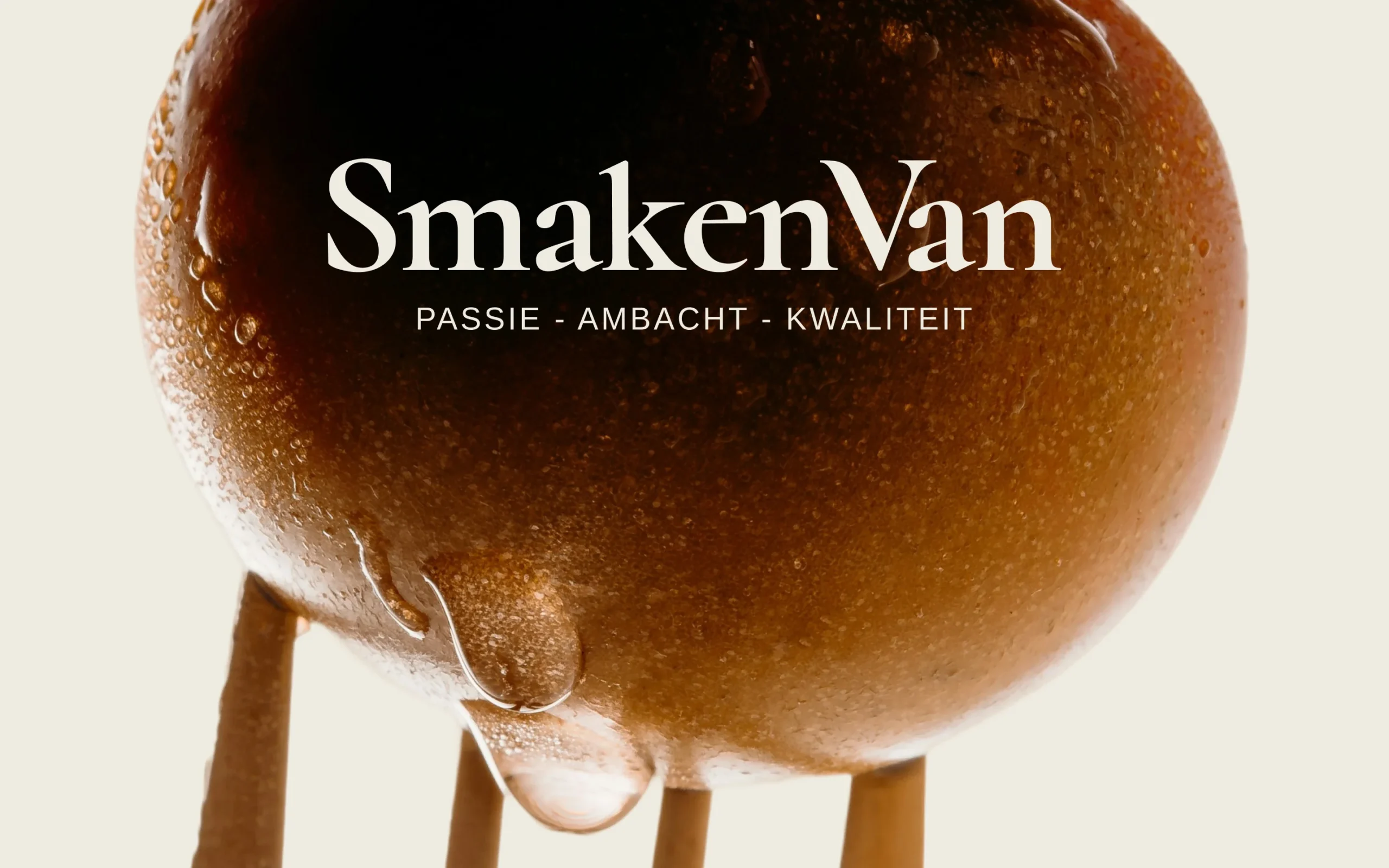
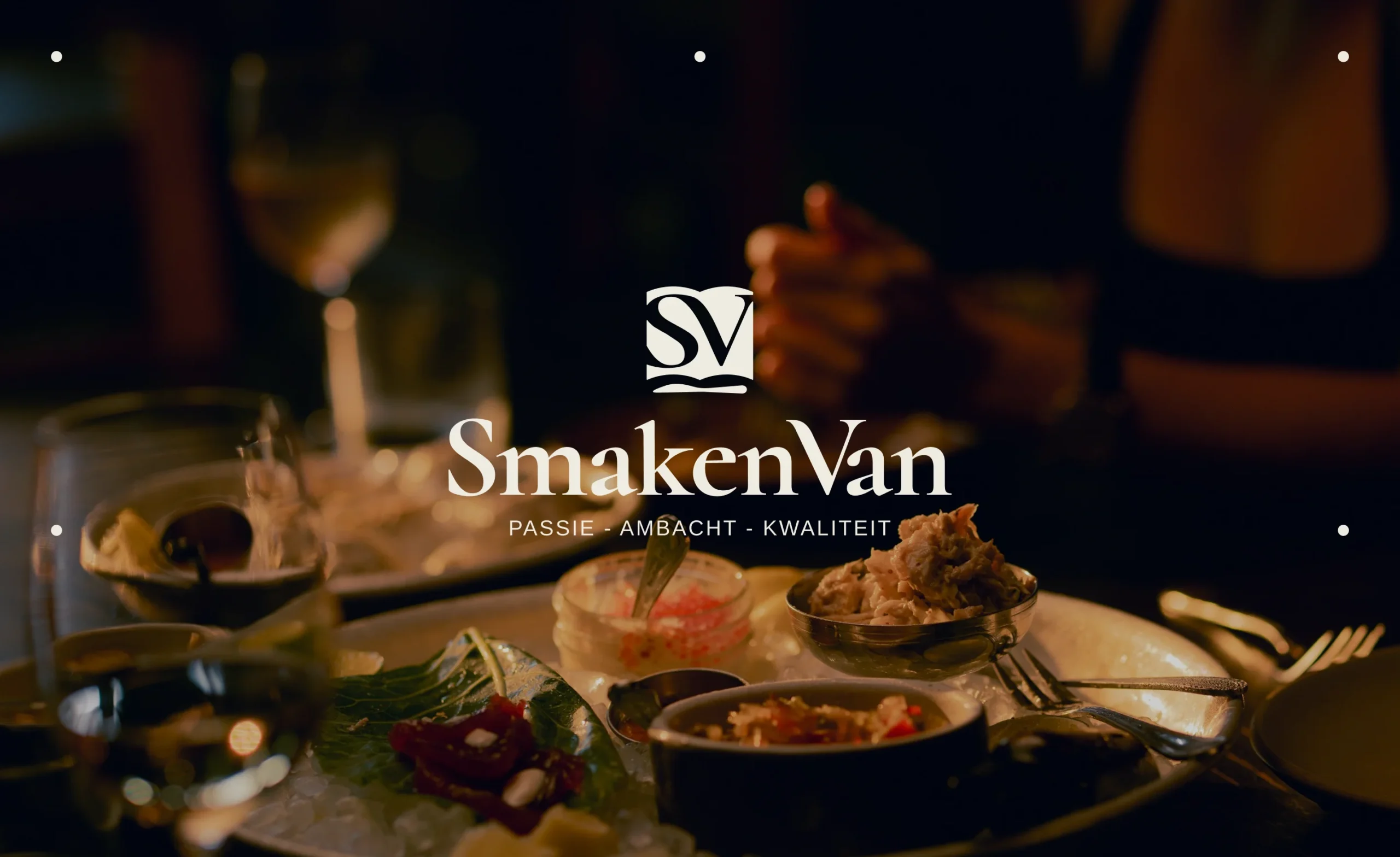
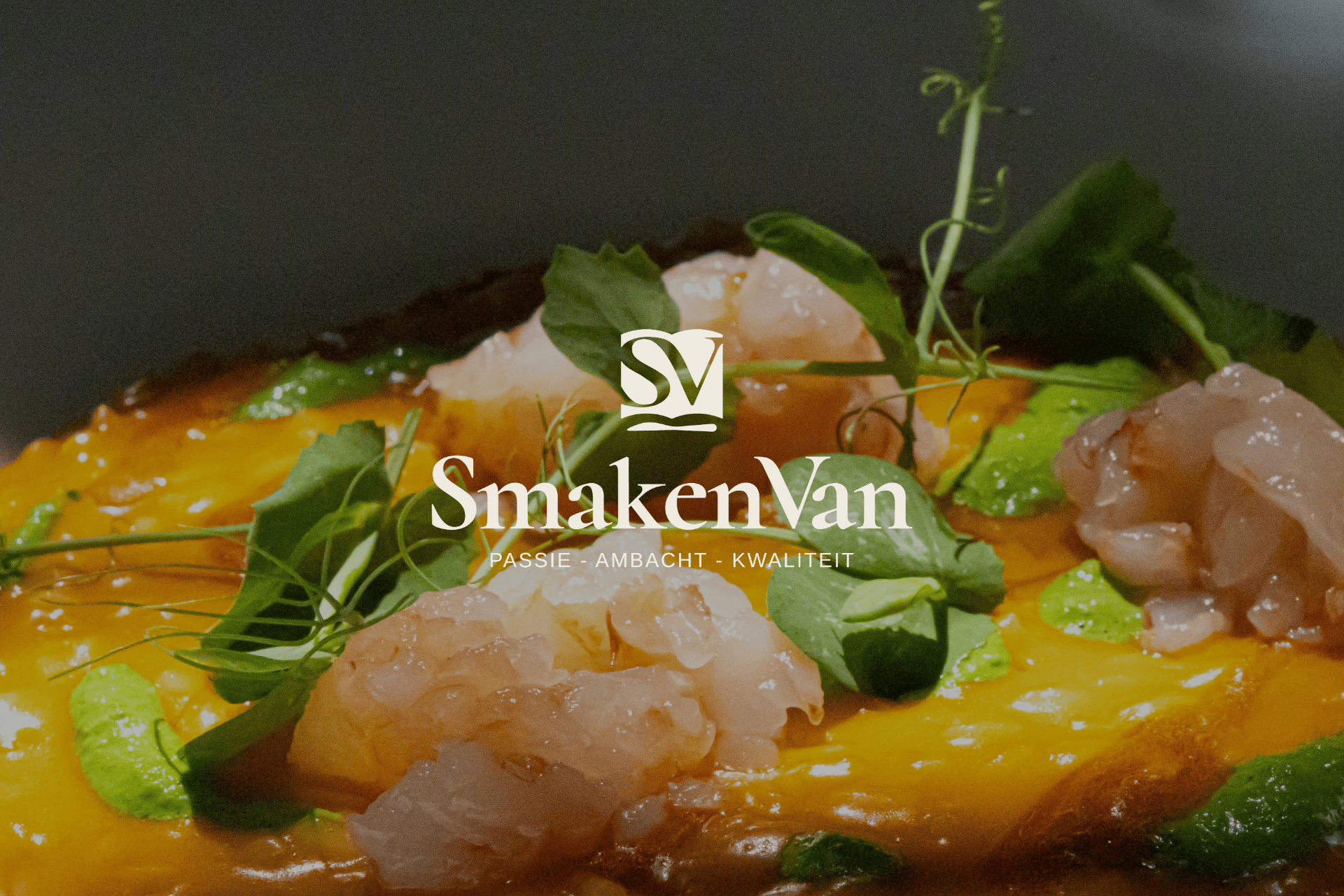
Logo System — The existing SmakenVan logo was carefully refined while preserving its recognizable structure. The typographic wordmark remains the core element of the identity, supported by a compact monogram used for smaller applications such as social media avatars and icons. This approach keeps the brand familiar while introducing a more structured and scalable logo system.
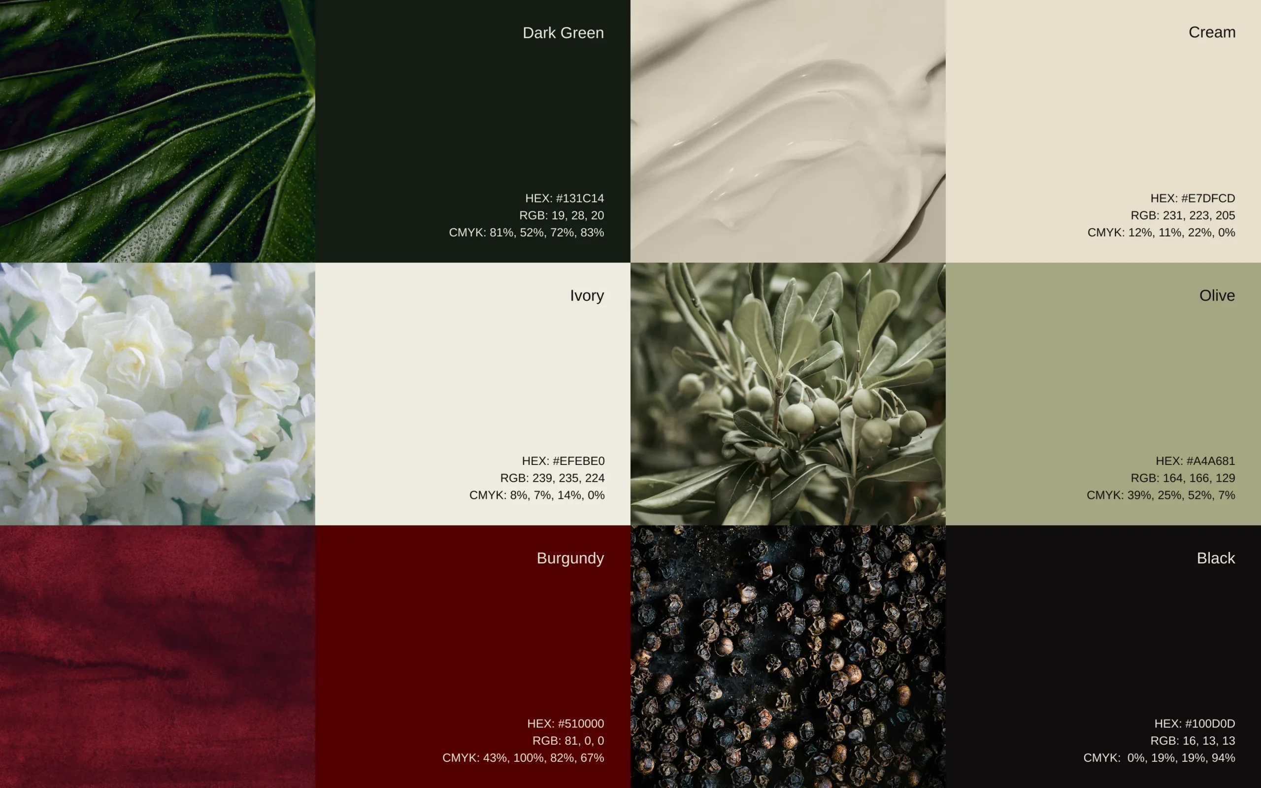
The updated color palette builds on the existing brand colors while refining their balance and combinations. Deep green serves as the primary color, communicating quality, authenticity, and connection to local ingredients. Warm neutrals and burgundy accents add richness and warmth, reflecting the atmosphere of restaurants and culinary storytelling. Together, the palette creates a premium yet welcoming visual tone that works well in both light and dark environments.
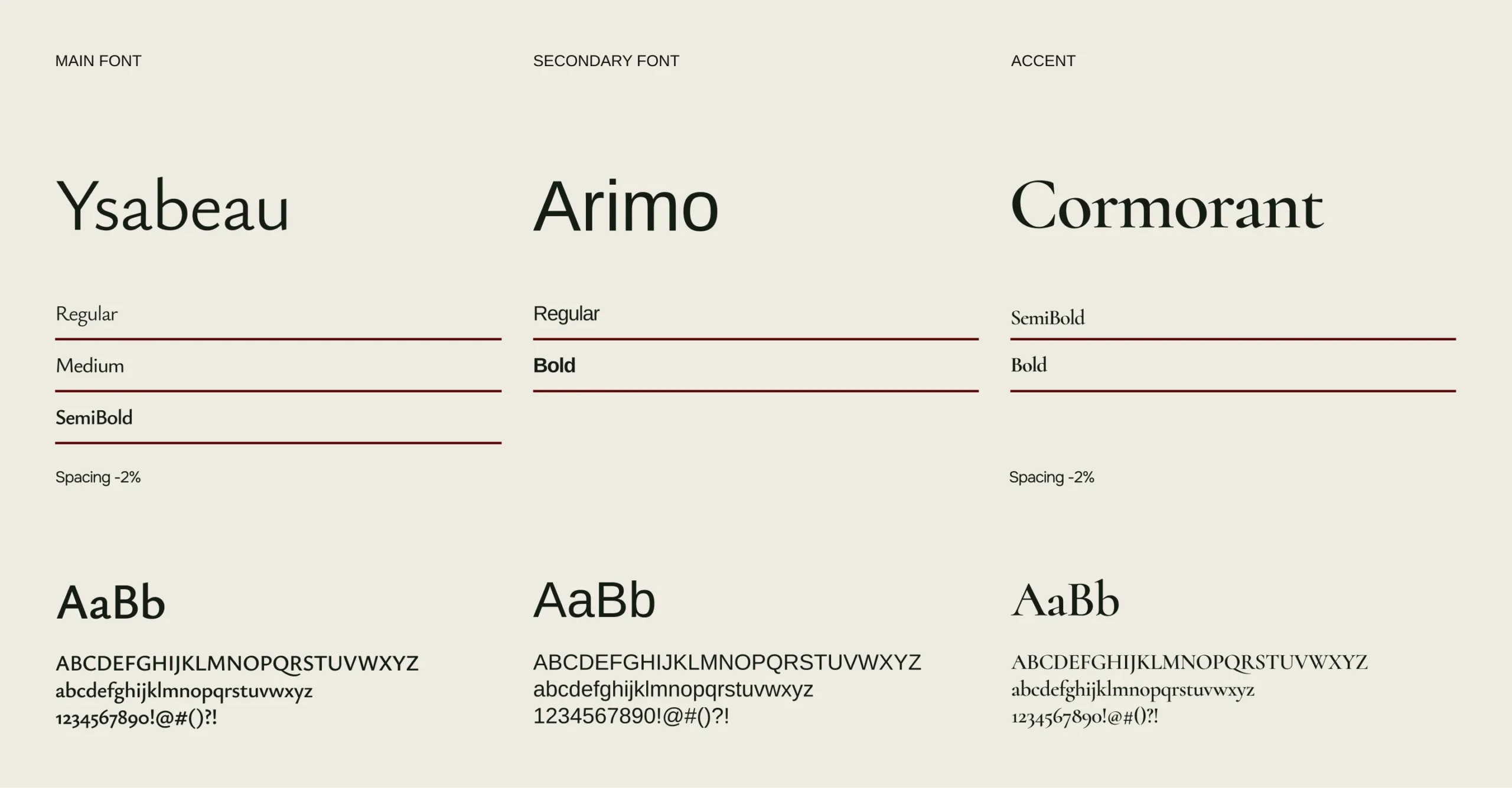
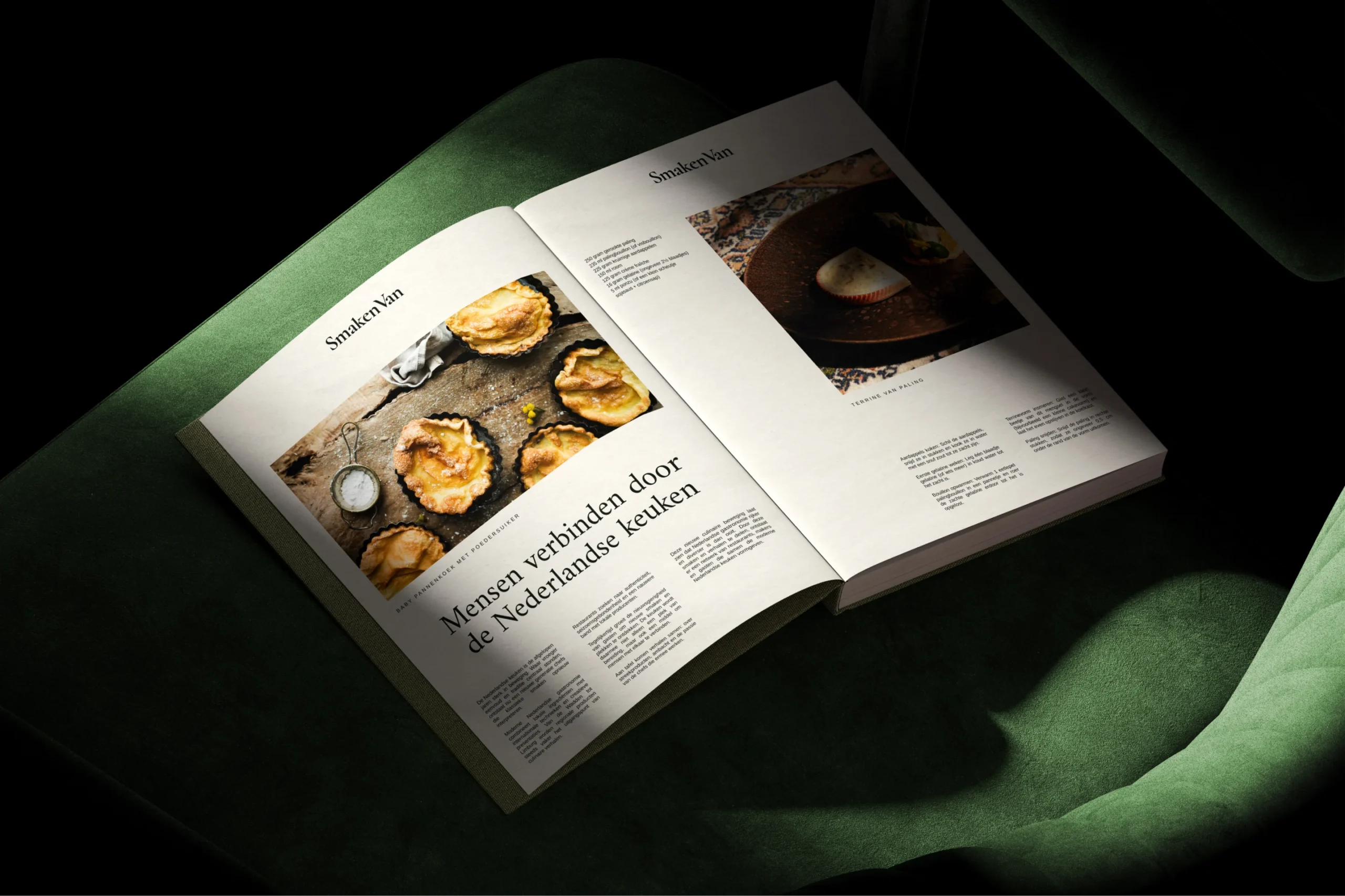
A refined typography system was introduced to bring consistency across all brand touchpoints. Elegant serif typefaces form the foundation of the identity, reflecting the editorial and culinary nature of the platform. The typography balances sophistication with readability, making it suitable for both printed books and digital interfaces. The hierarchy allows the brand to communicate clearly across different formats — from editorial articles and restaurant descriptions to social media captions and website content.
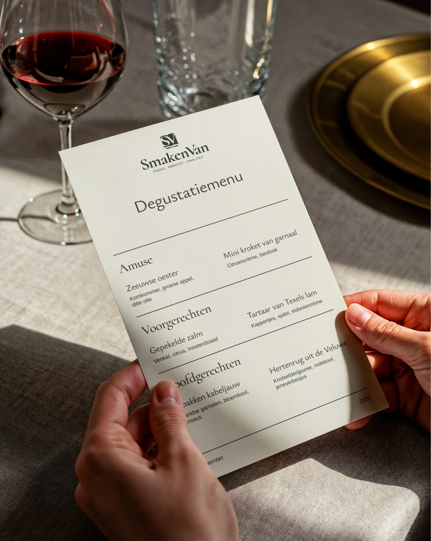
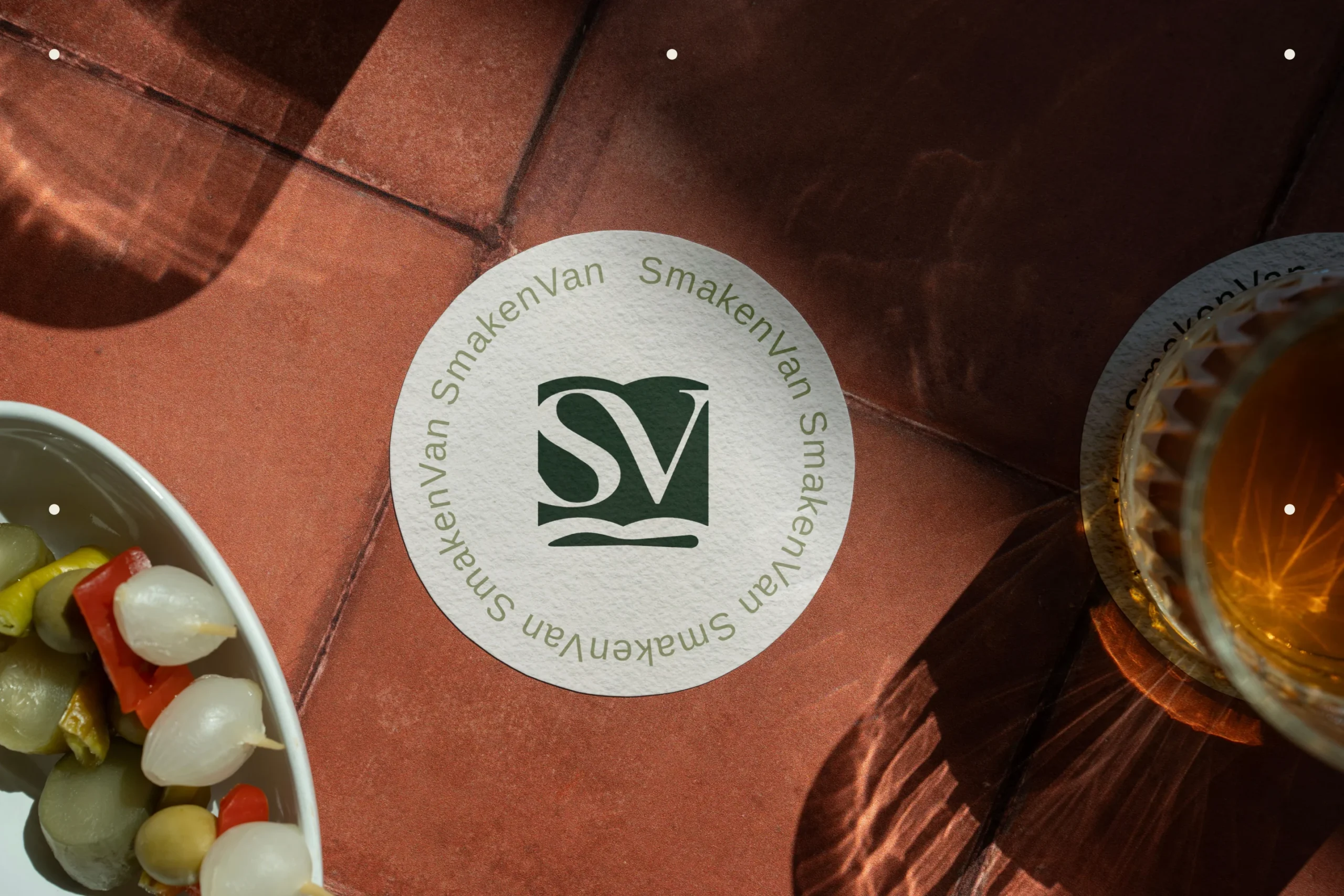
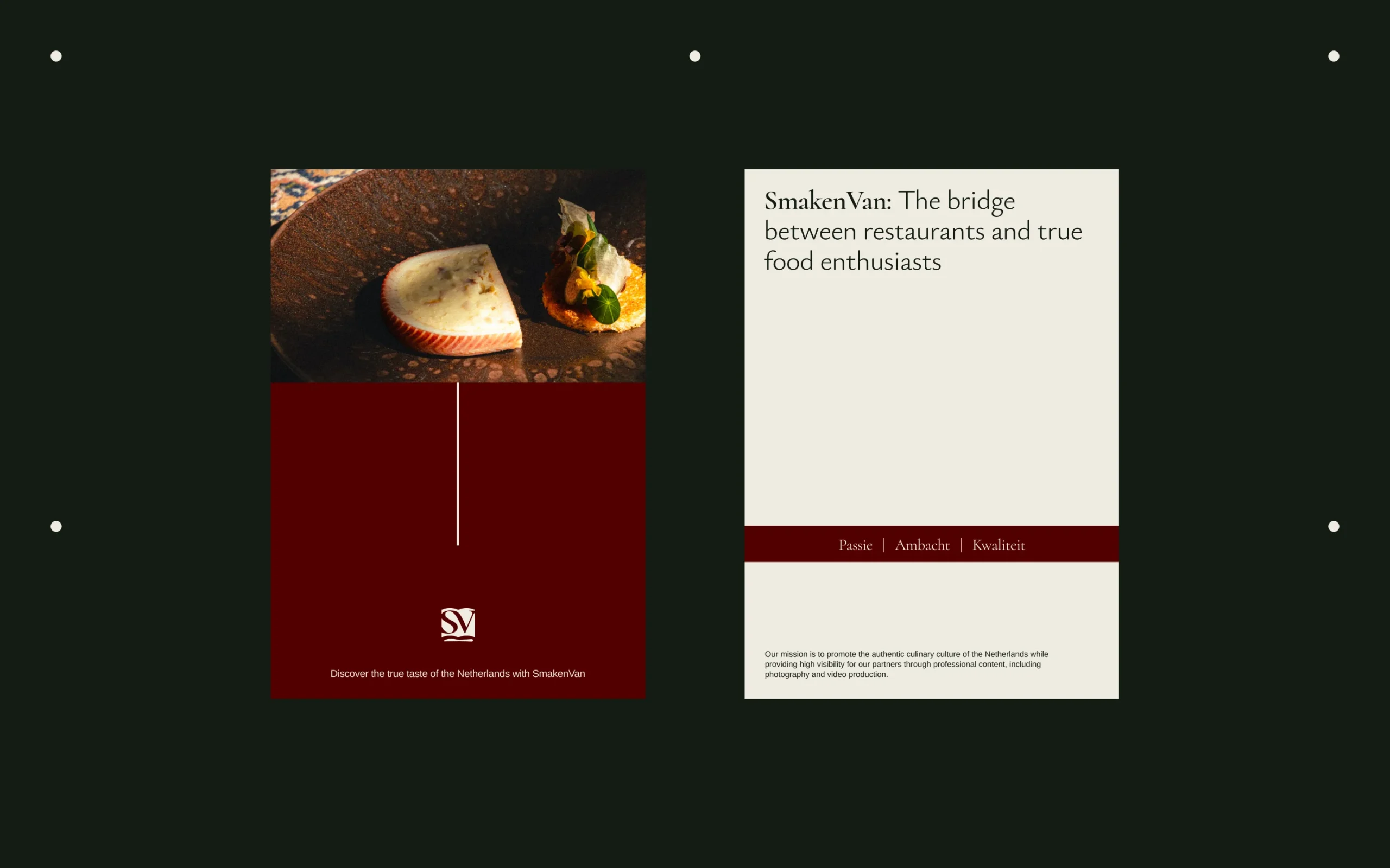
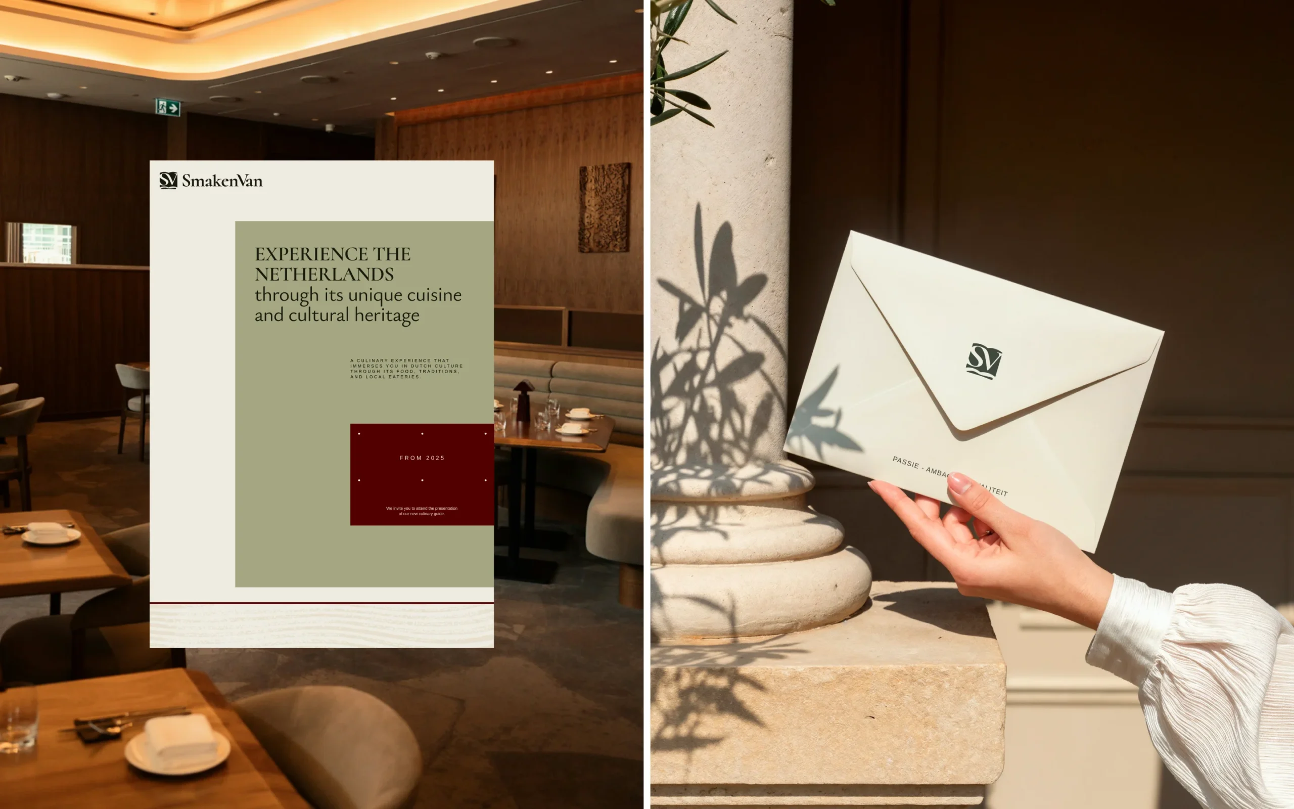
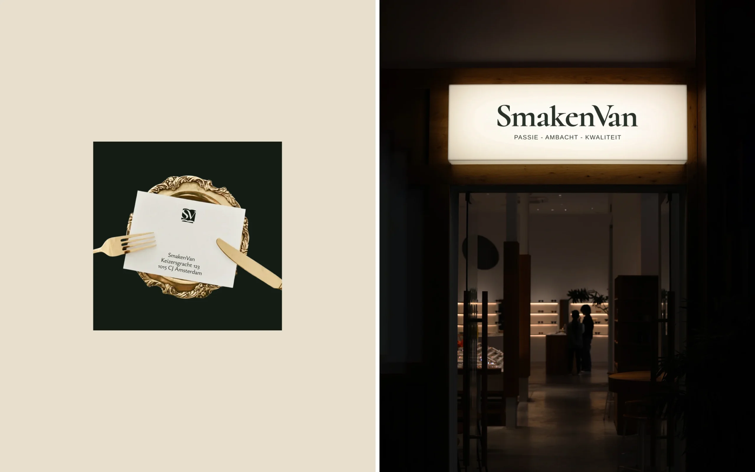
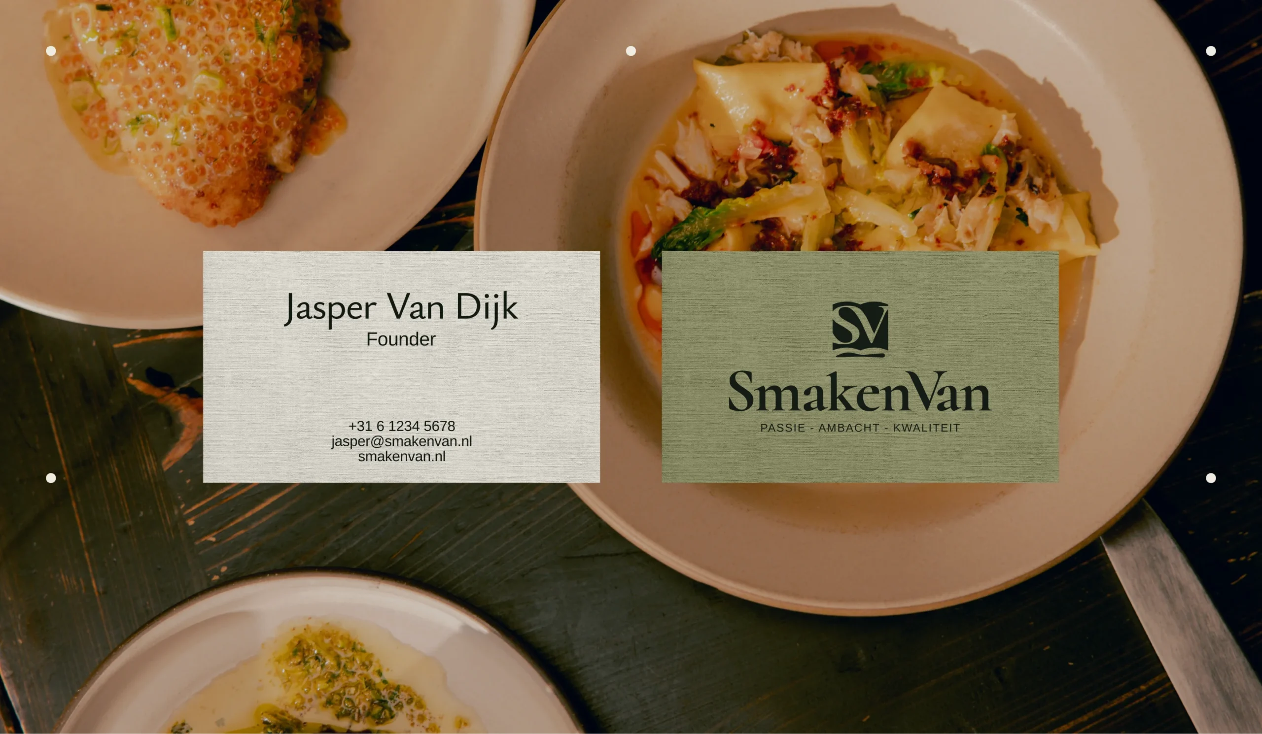
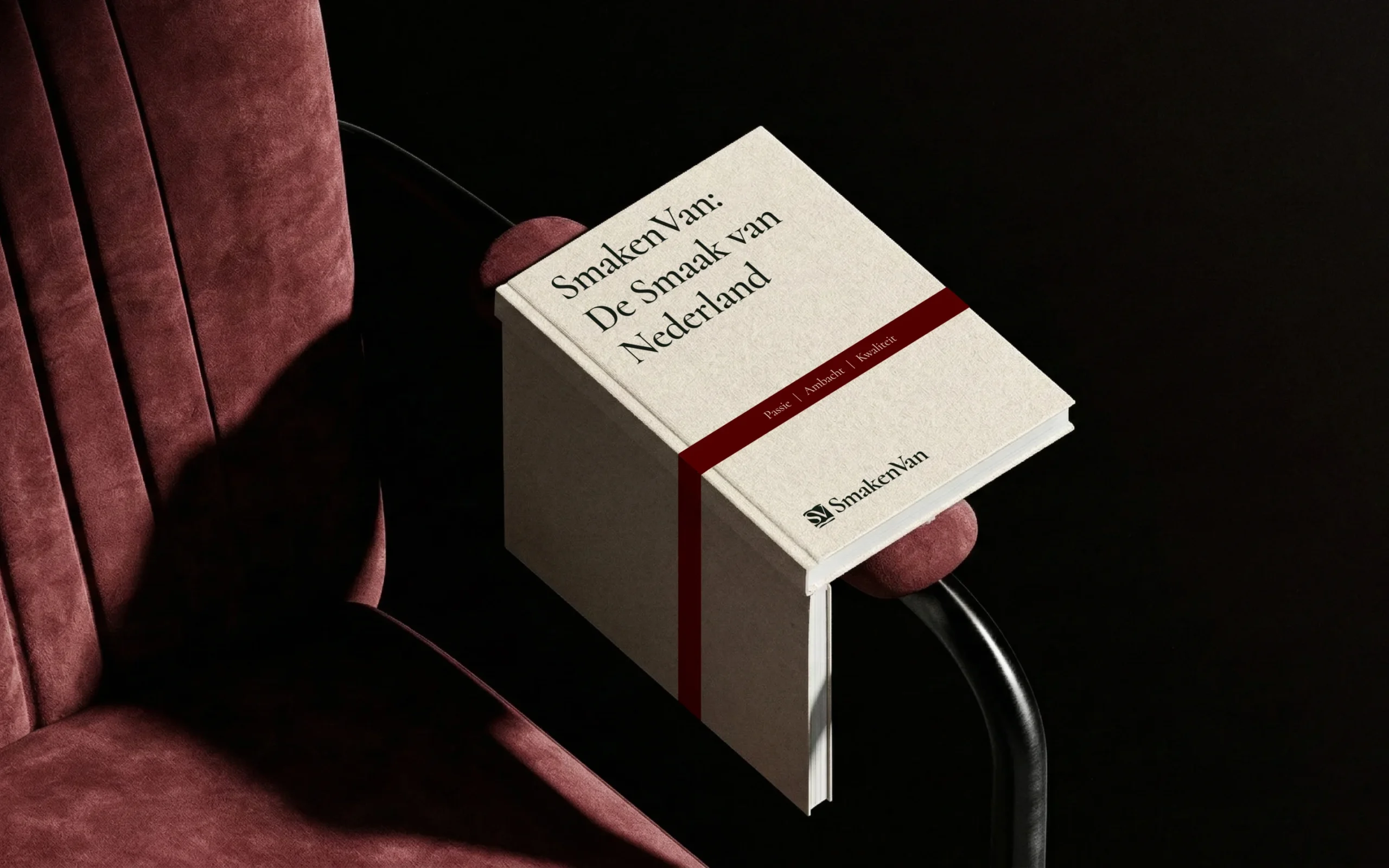
The brand identity was also applied to a range of physical materials, demonstrating how the visual system translates into real-world environments. Minimalist printed pieces such as cards and promotional inserts use the refined typography, soft neutral backgrounds, and subtle color accents from the brand palette.
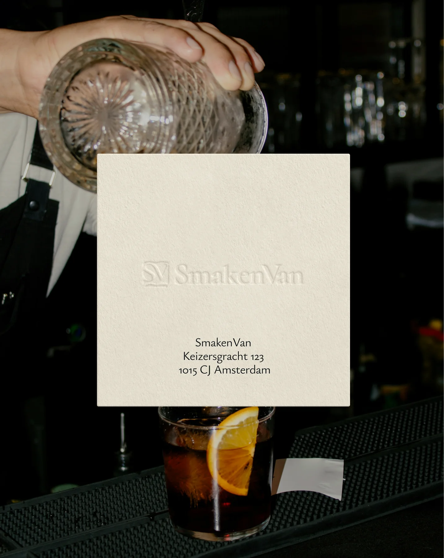
The layouts emphasize simplicity and elegance, allowing the SmakenVan logo and messaging to remain the focal point. Warm restaurant photography in the background helps connect the printed materials with the culinary atmosphere the platform represents.
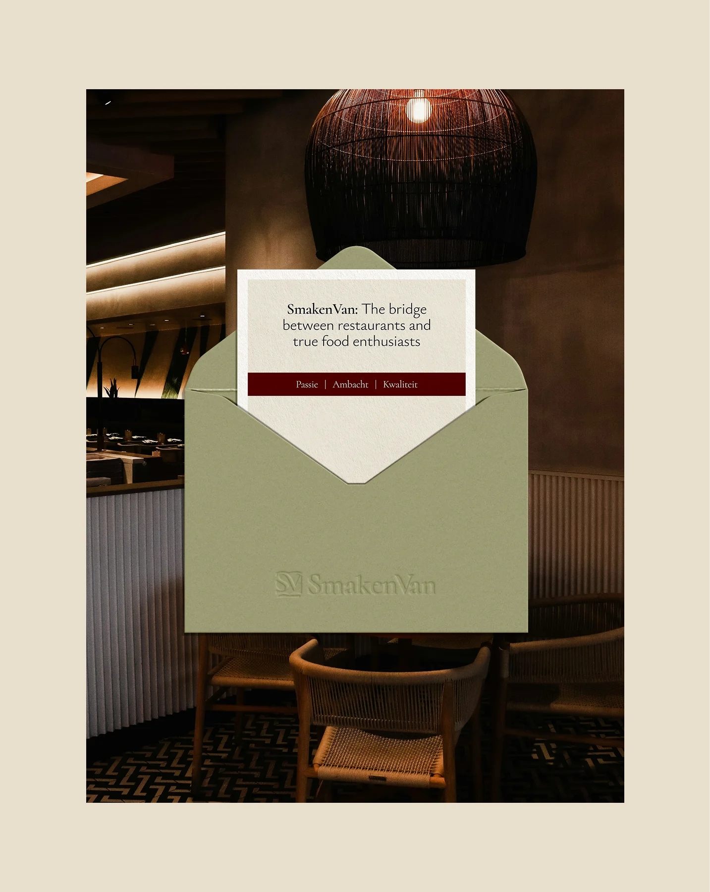
These physical applications reinforce the premium and editorial character of the brand while ensuring that the identity remains consistent across both digital and offline experiences.
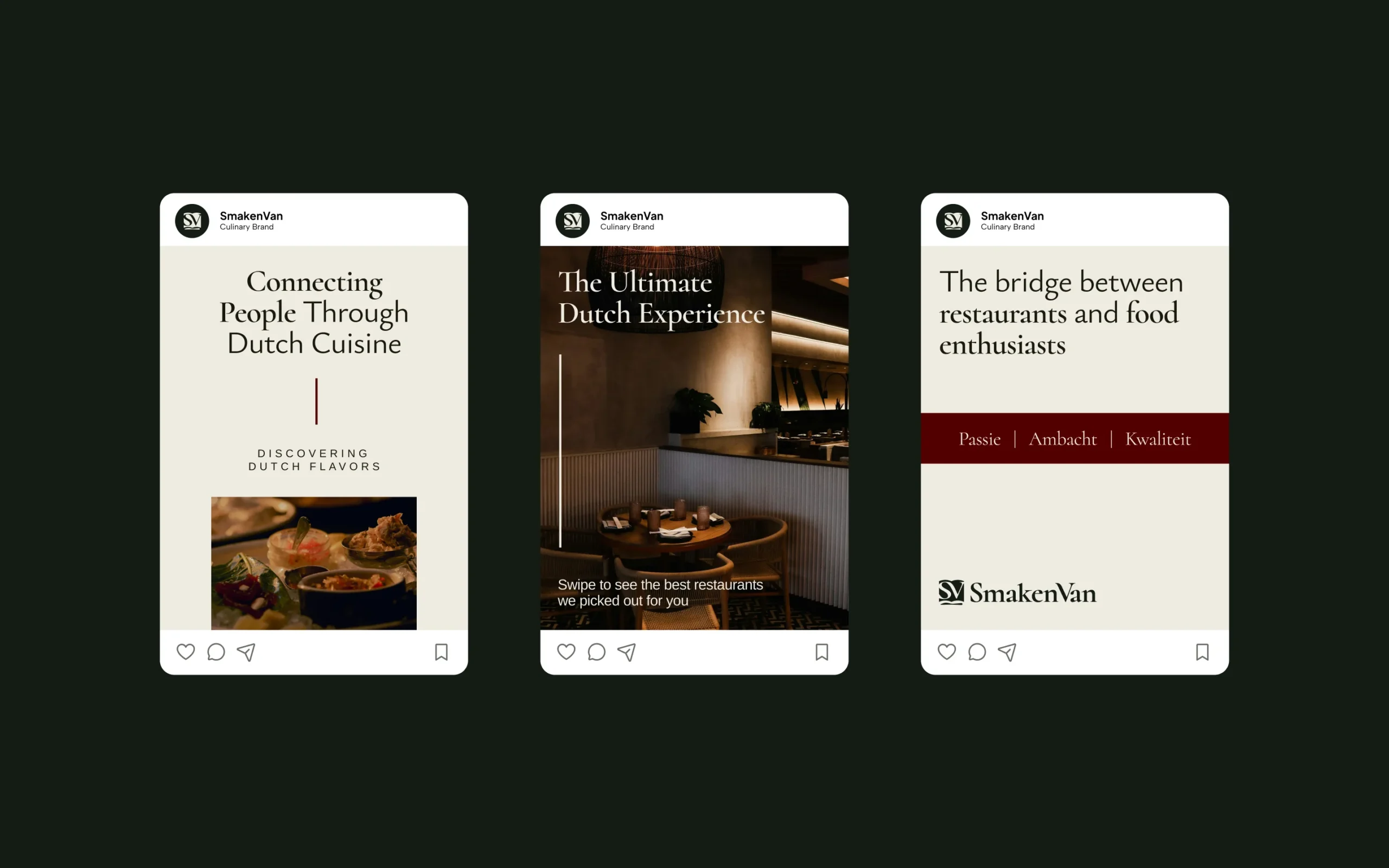
Social media extends the SmakenVan brand beyond the platform, bringing restaurant stories and culinary experiences closer to the community. The visual direction focuses on elegant typography, structured layouts, and rich food photography to create a consistent and recognizable presence.
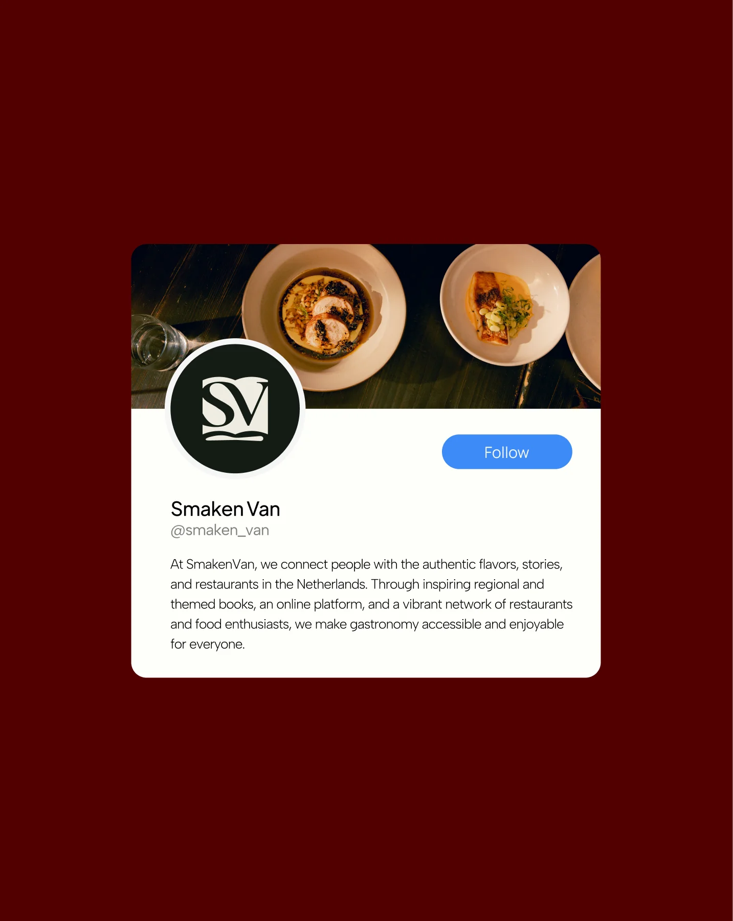
The brand’s deep green and burgundy tones help frame the content while maintaining a warm, editorial feel. This flexible system allows the brand to highlight restaurants, share culinary stories, and present updates while keeping the overall feed visually cohesive.
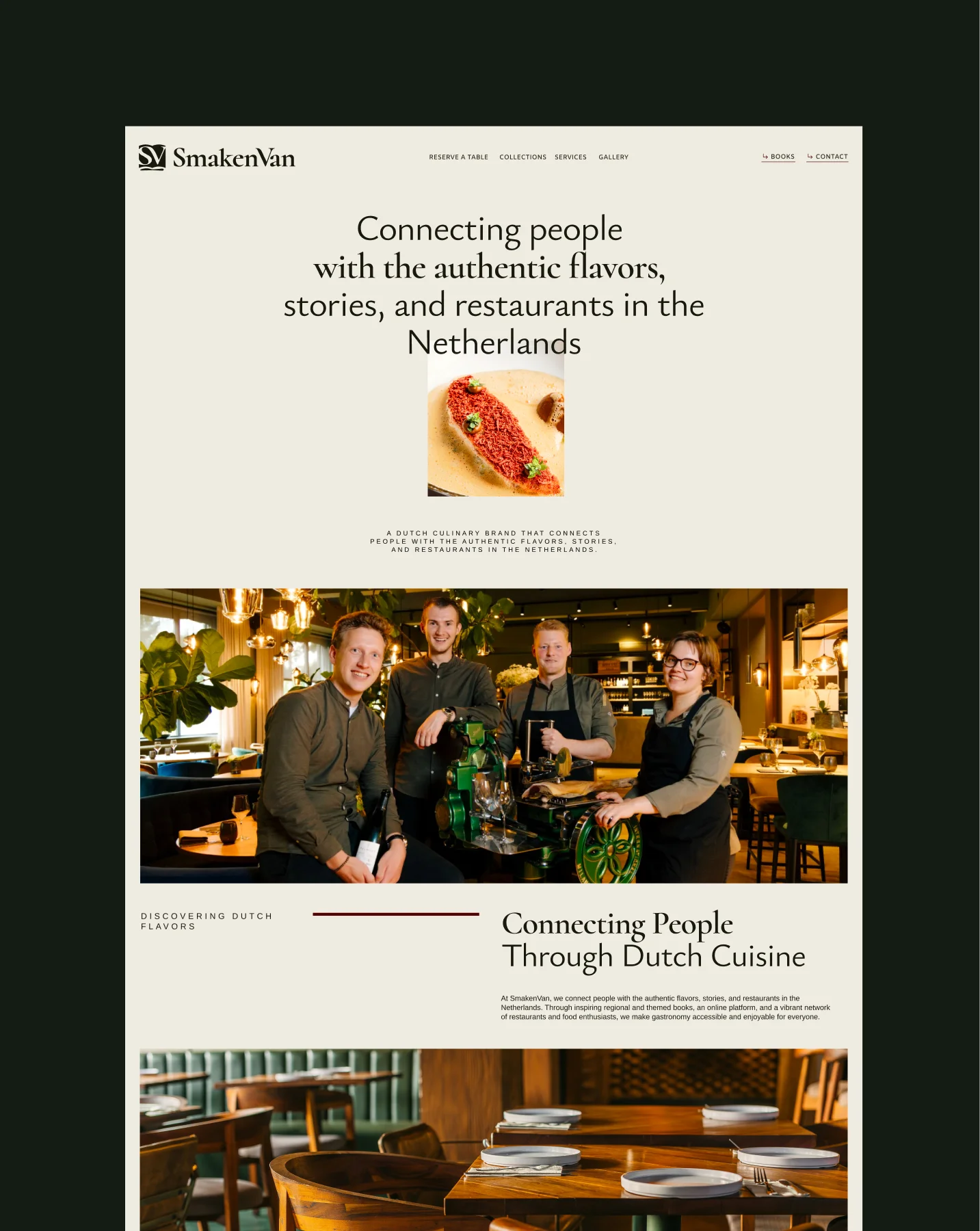
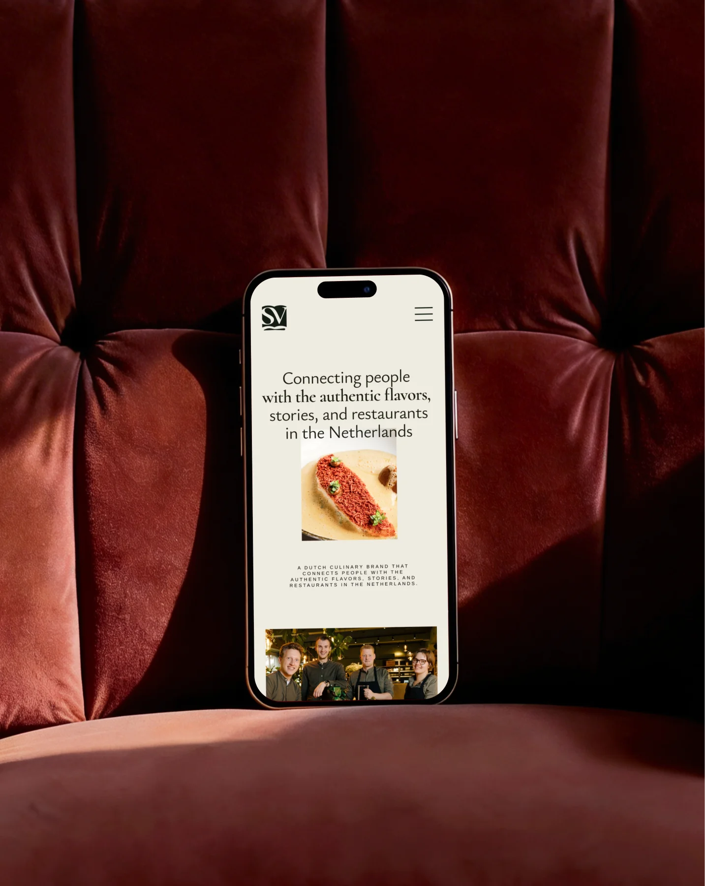
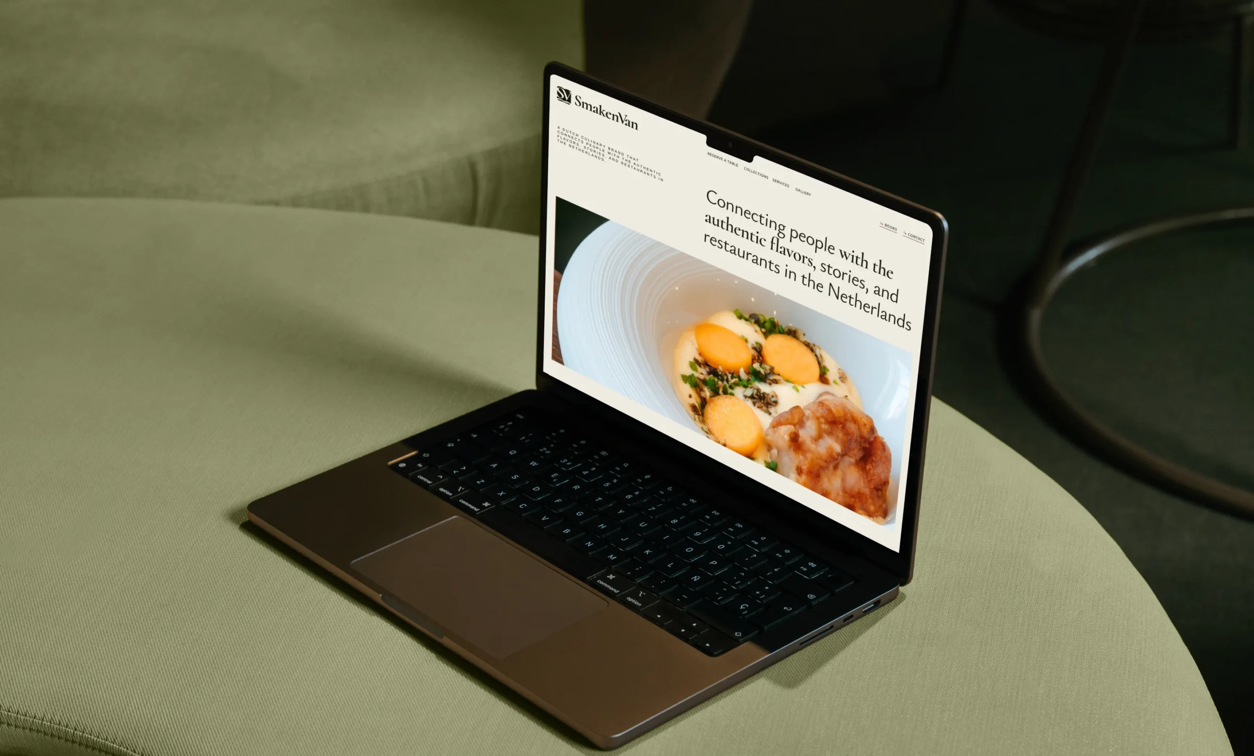
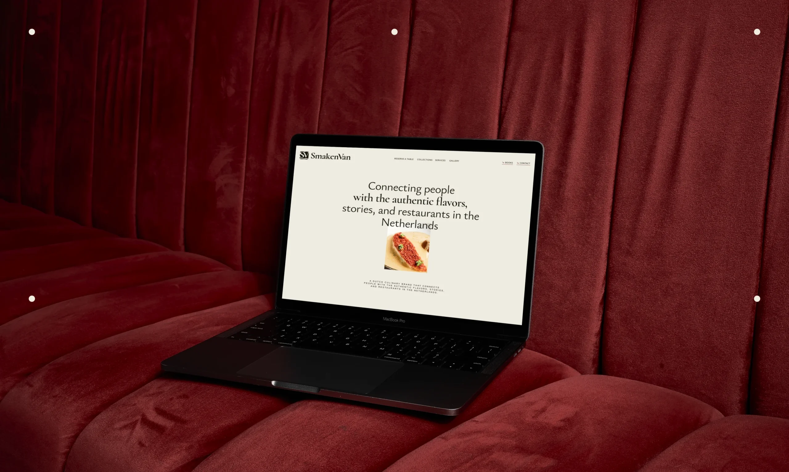
The brand identity also provides a clear visual direction for the redesigned SmakenVan website. The interface emphasizes readability, elegant typography, and strong food photography. The design system supports both light and dark environments, ensuring the platform remains visually distinctive while staying accessible and easy to navigate.
The refined brand identity gives SmakenVan a more structured and professional visual system while preserving the elements that make the brand recognizable. By aligning typography, color usage, and visual style across books, digital platforms, and social media, the new identity creates a cohesive brand experience. The result is a brand that better reflects SmakenVan’s role as a curated culinary platform — connecting people with authentic restaurant stories, regional flavours, and memorable dining experiences across the Netherlands.
 BOOK A CALL
 has been sent successfully!
Our managers will contact you as soon as possible.