Laminar Instruments is a research-grade, systems-level innovation company developing scientific instruments for computational environments. The company focuses on enabling reliable data movement, transformation, and persistence across modern infrastructure.
Its work bridges engineering precision and scientific rigor, supporting advanced research and technology-driven organizations.
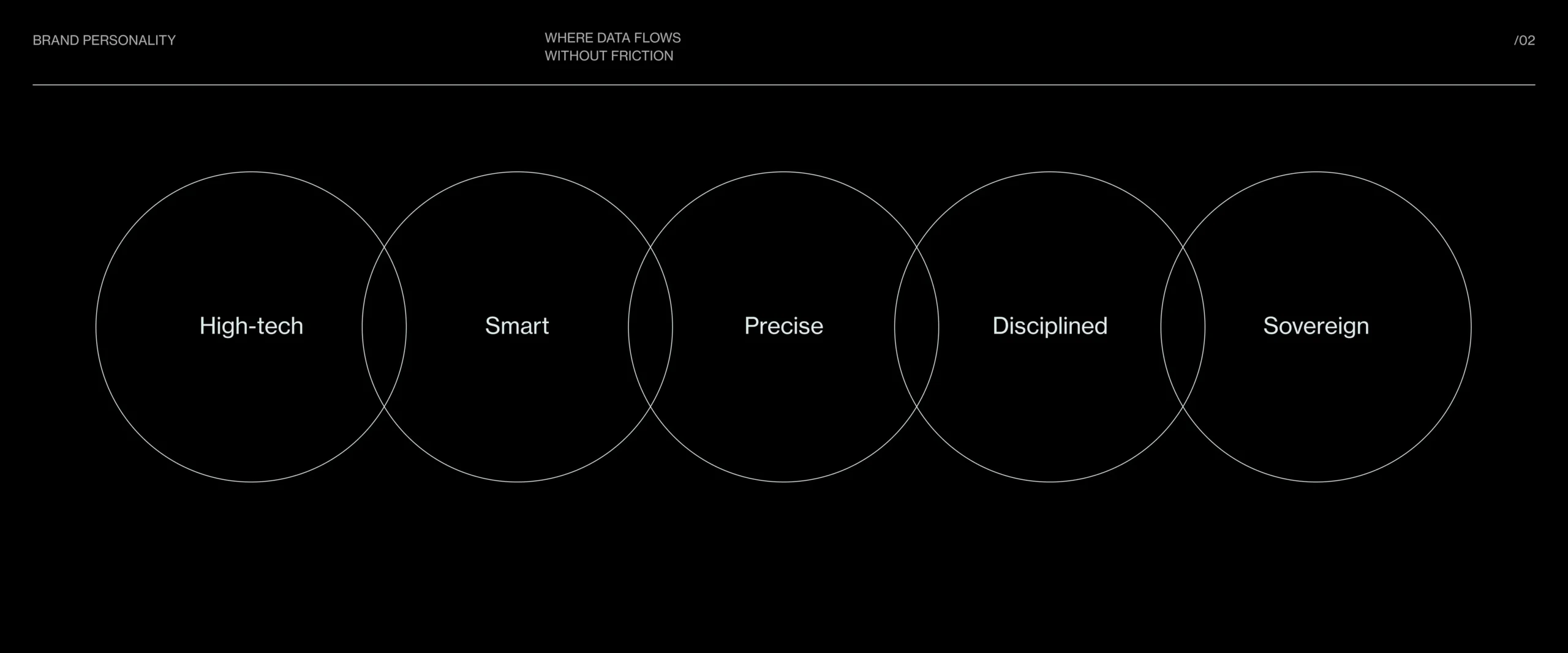
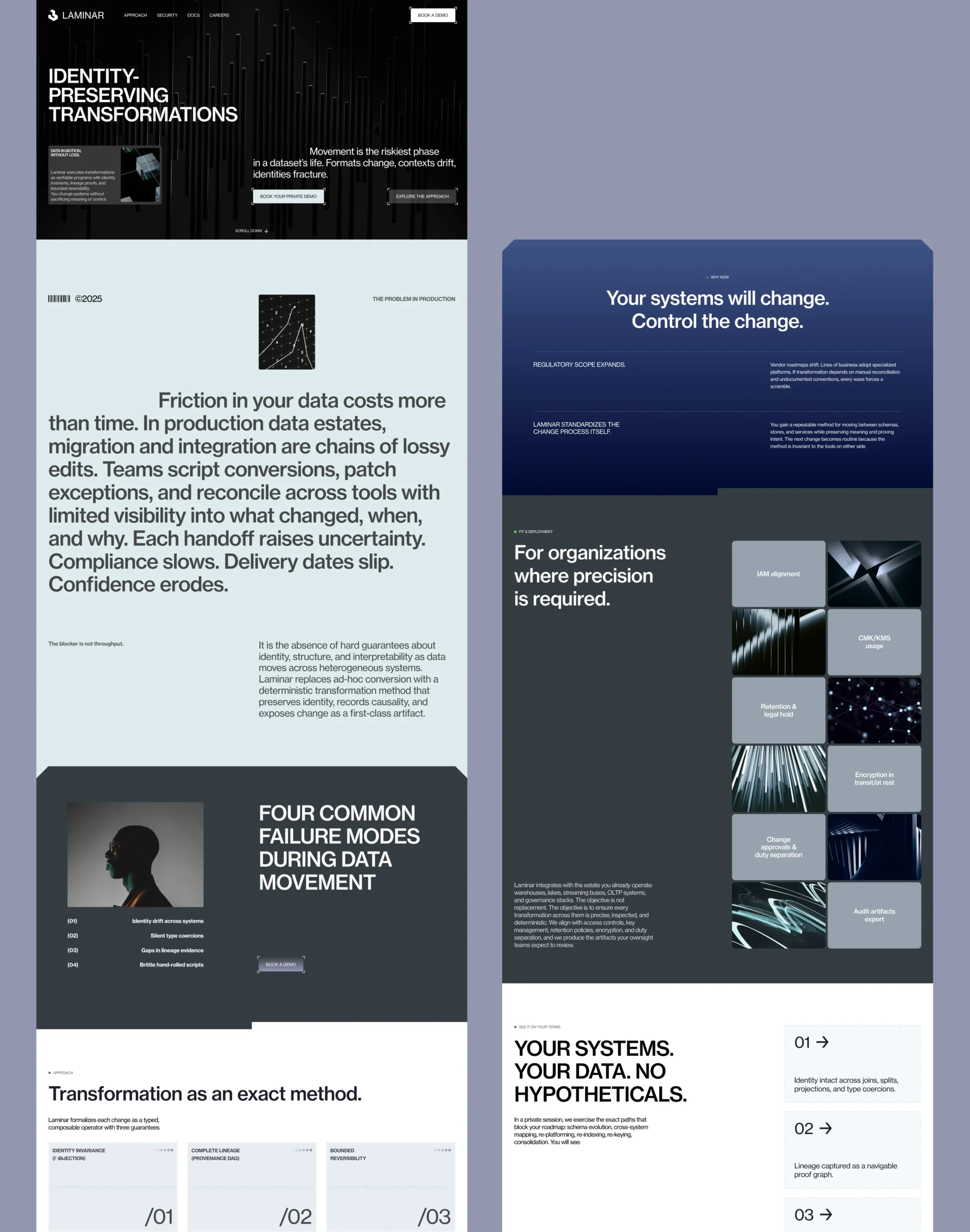
The core challenge was positioning a highly technical product for enterprise buyers in a way that felt credible, modern, and immediately understandable. The brand needed to signal deep systems thinking, but avoid the usual enterprise-tech clichés. From the brief, the emphasis was on making complex transformation work feel controlled and trustworthy: smooth movement instead of turbulence, proof instead of promises, and clarity instead of overload. That same principle had to carry across the logo, web design, pitch materials, and technical document.

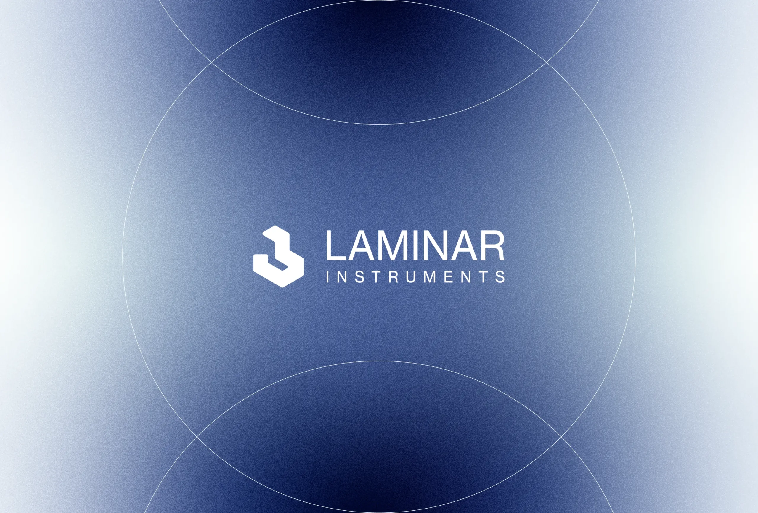
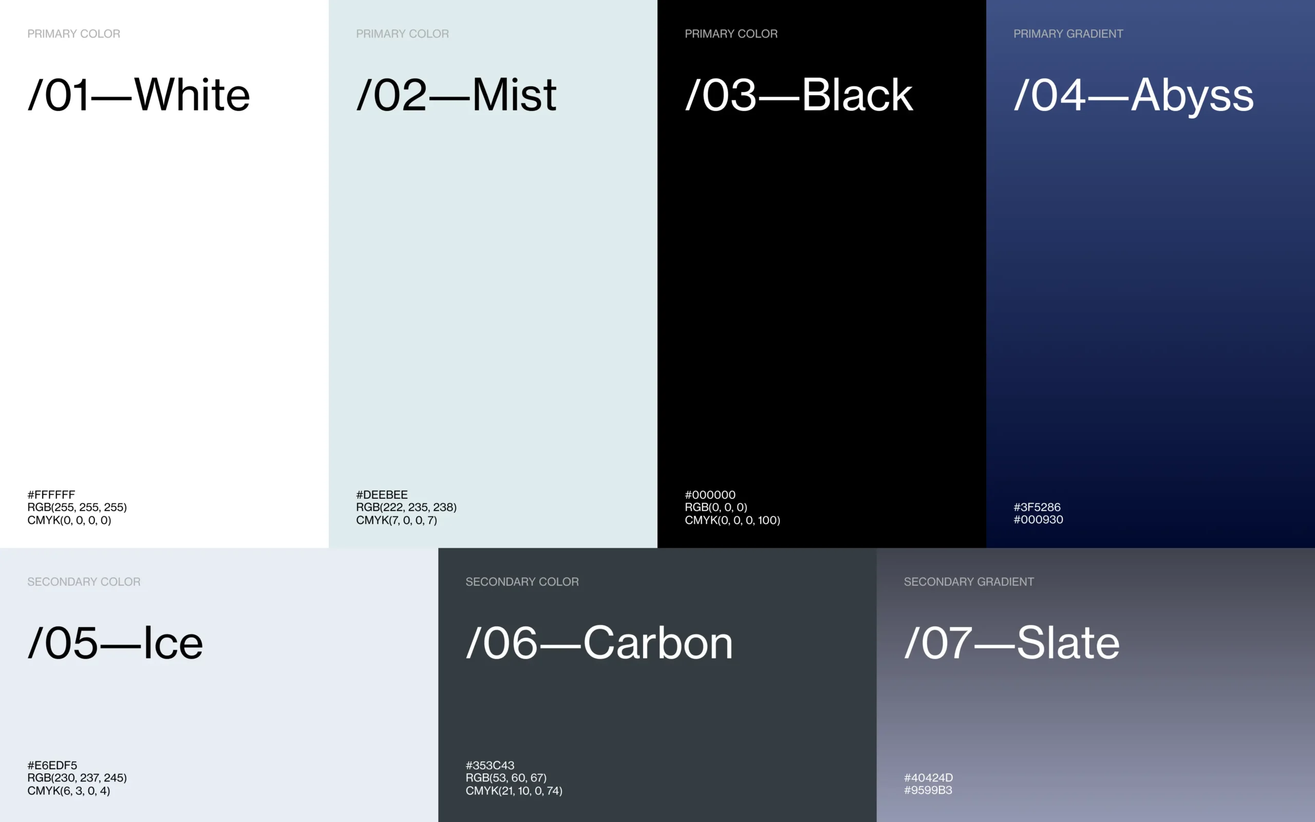
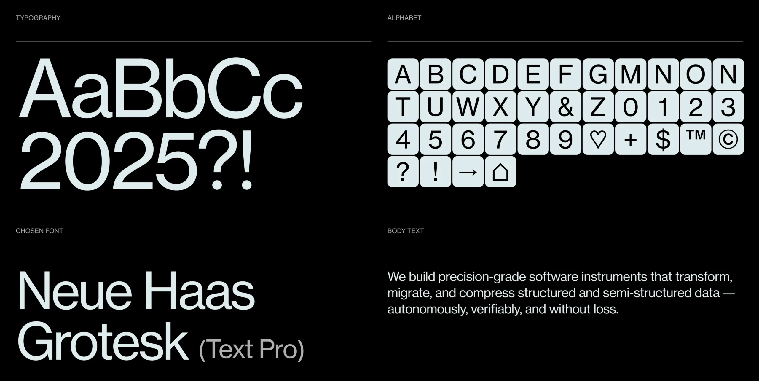
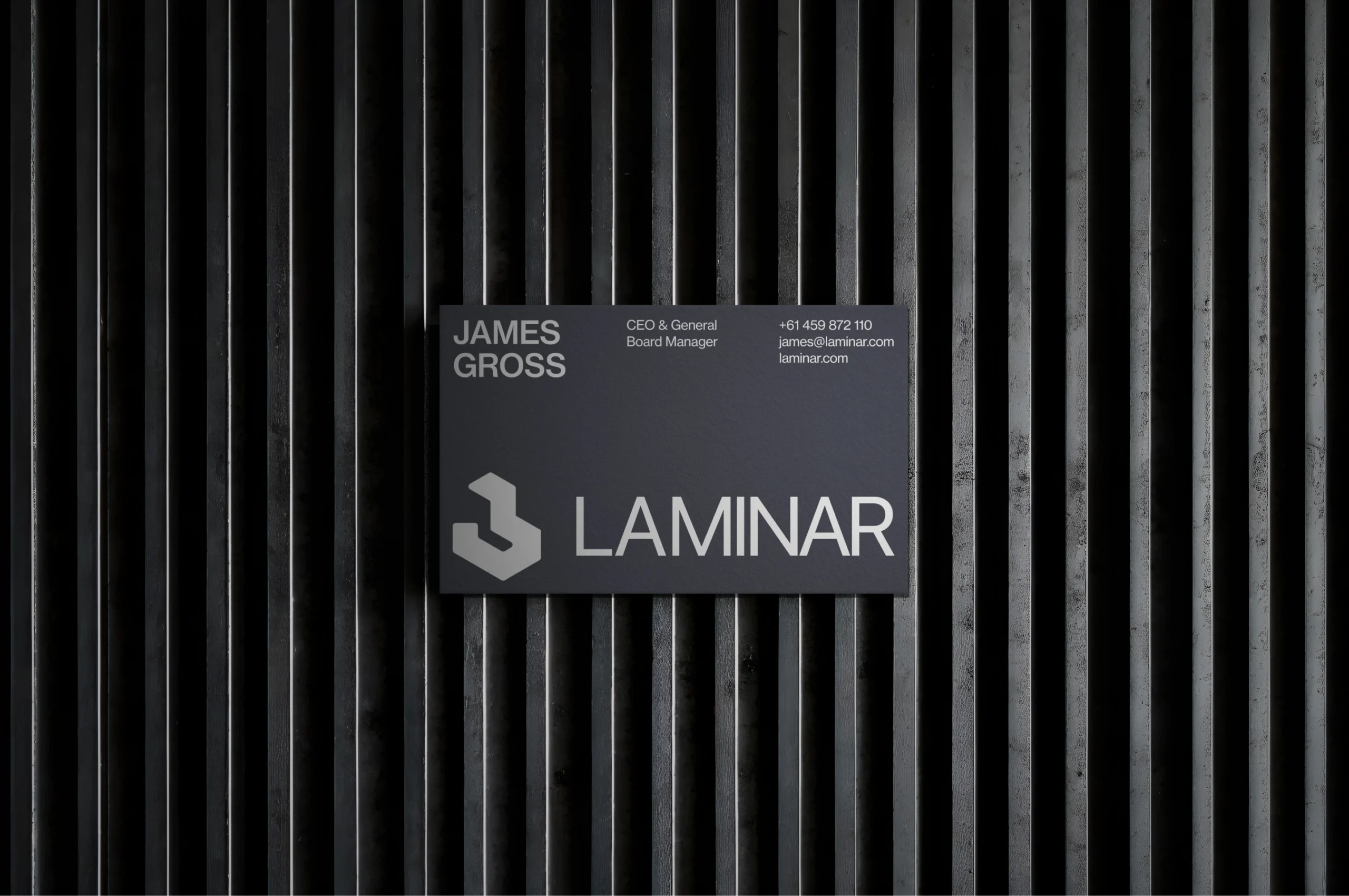
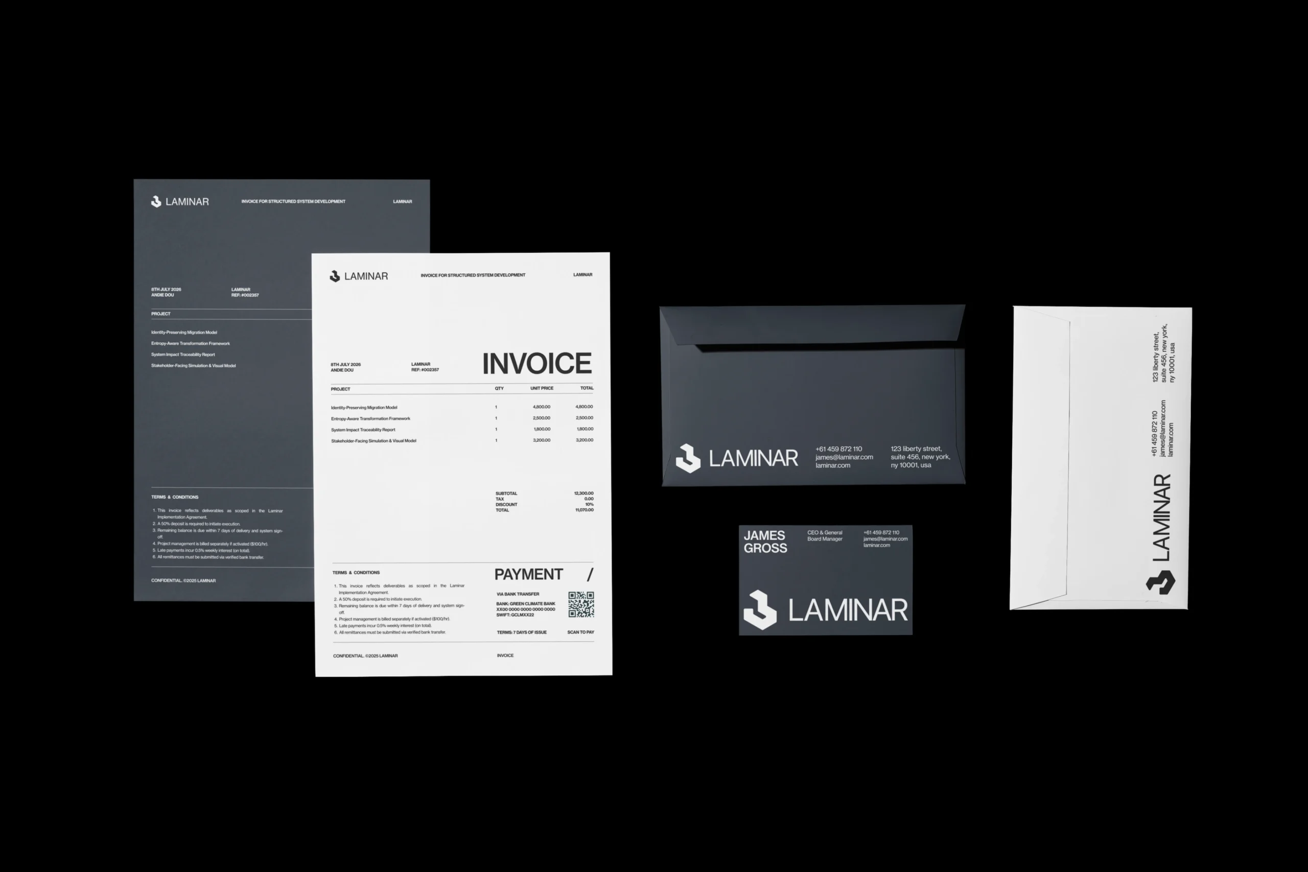
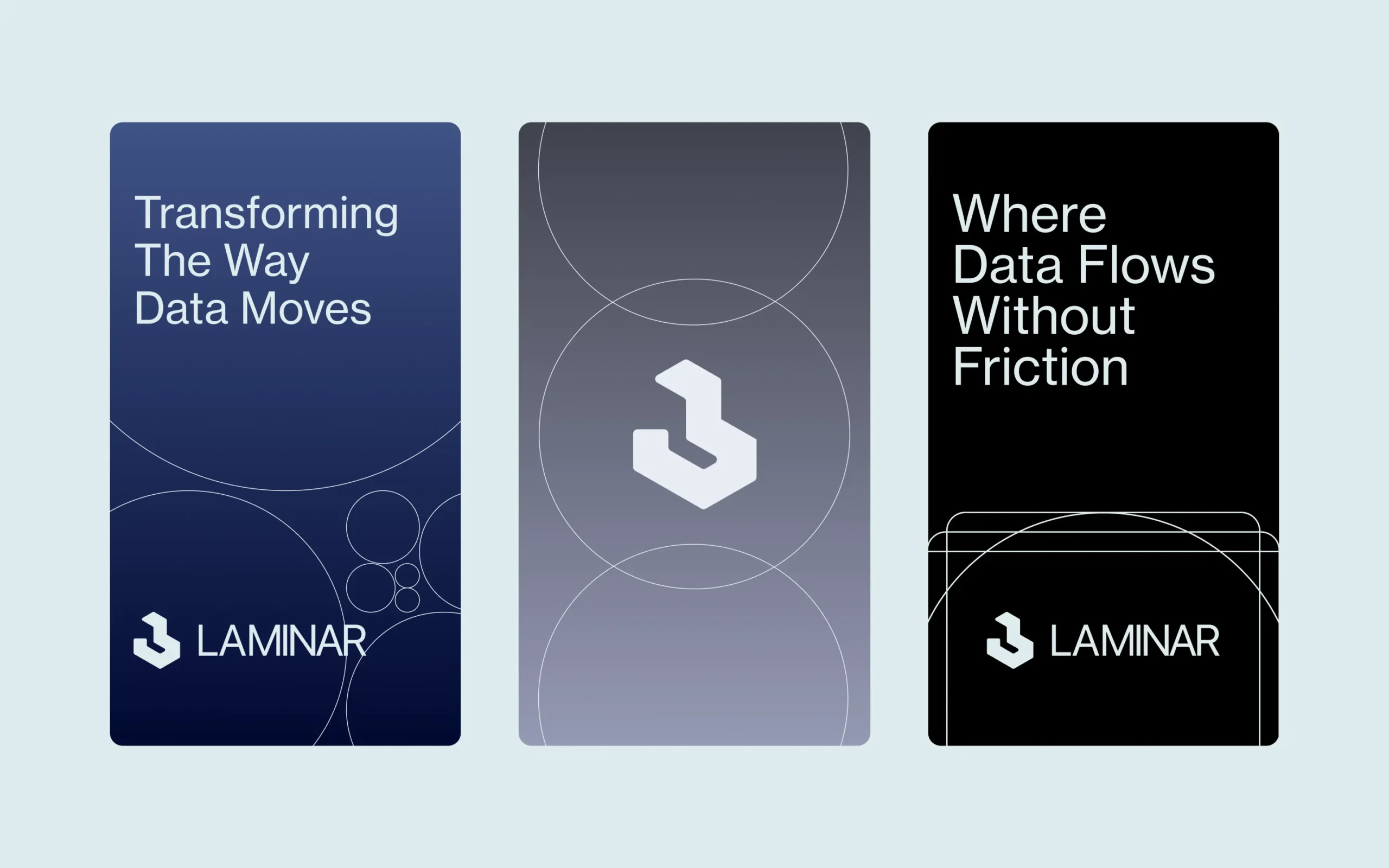
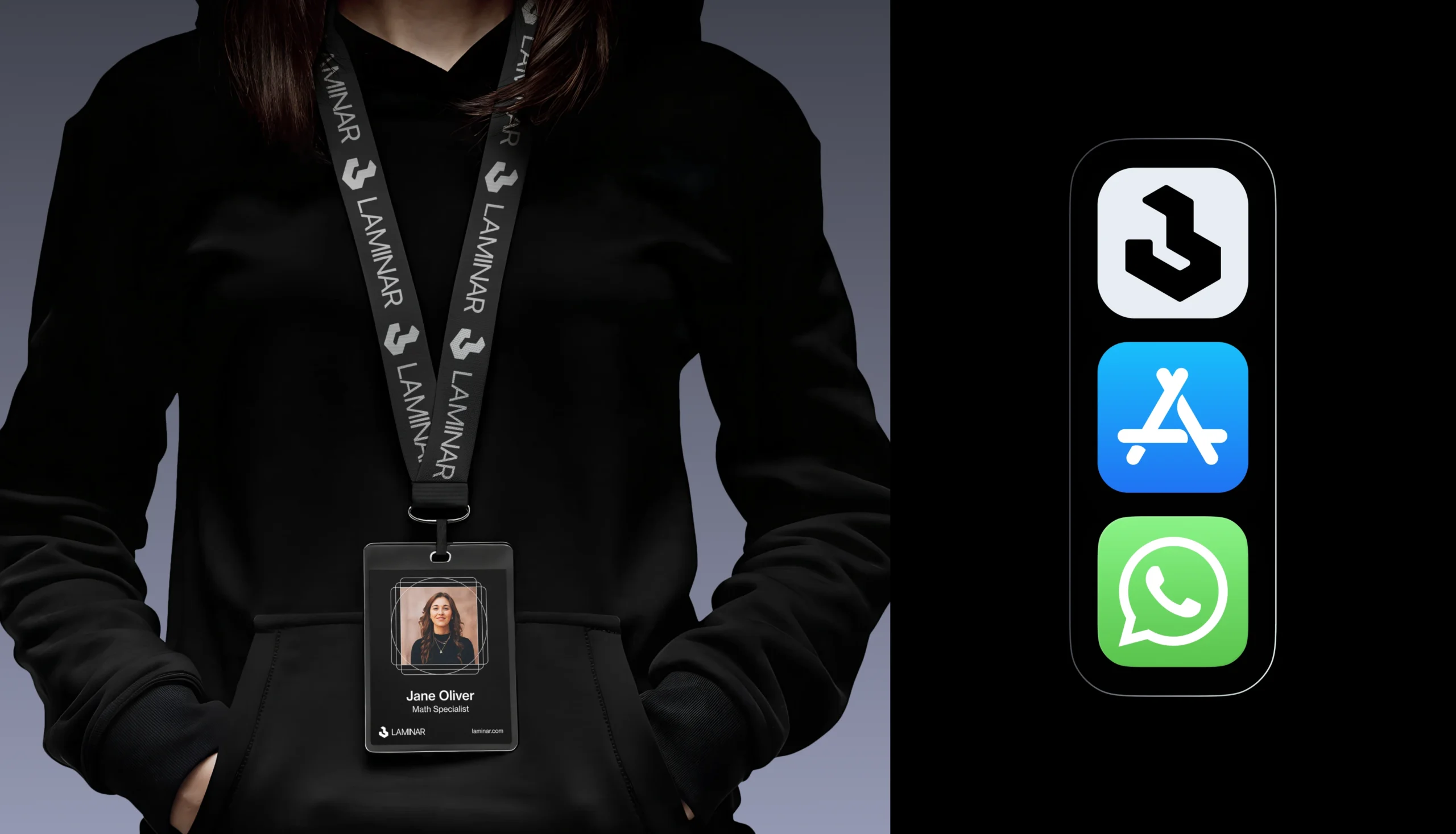
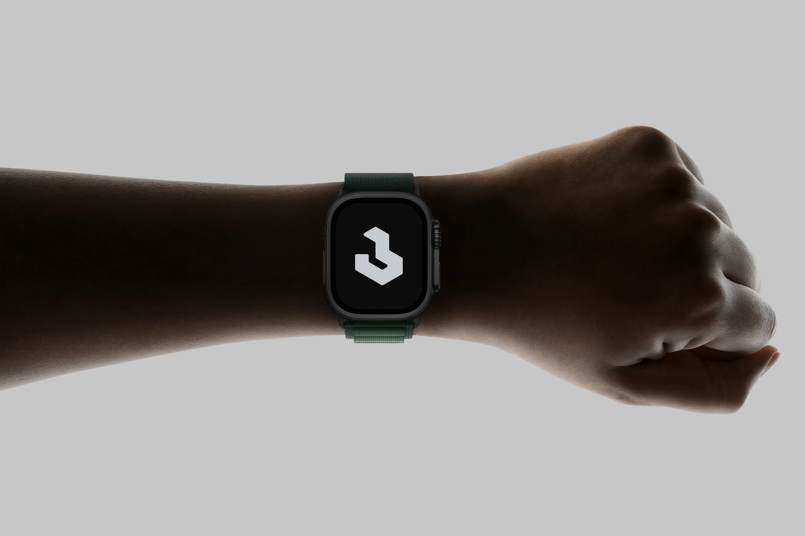
The identity system is built around a minimal, structured visual language. The logo combines a compact geometric symbol with a precise sans-serif wordmark, giving Laminar a mark that feels both technical and stable. Across the supplied visuals, the symbol appears modular and engineered rather than decorative, which supports the idea of controlled flow and exact transformation. The color system stays disciplined: white, black, pale mist, icy gray, carbon, and deep blue gradients labeled “Abyss” and “Slate” in the palette board. The result is a restrained brand environment that feels enterprise-ready while still distinct. The palette shown in the project includes /01 White, /02 Mist, /03 Black, /04 Abyss, /05 Ice, /06 Carbon, and /07 Slate. Typography is clean and high-contrast, with large headlines, tight spacing, and simple hierarchy. This supports the product positioning well: technical, but readable; modern, but not trendy.
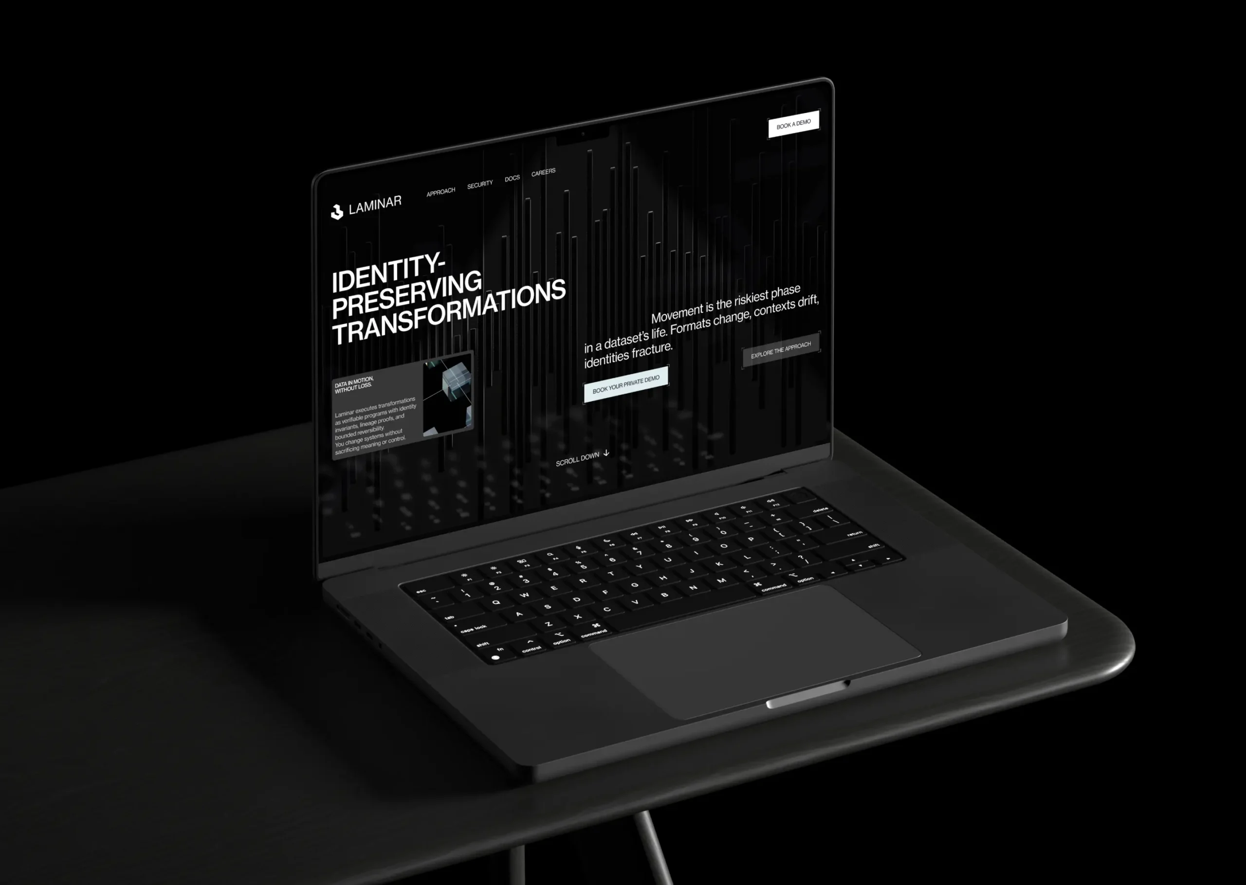
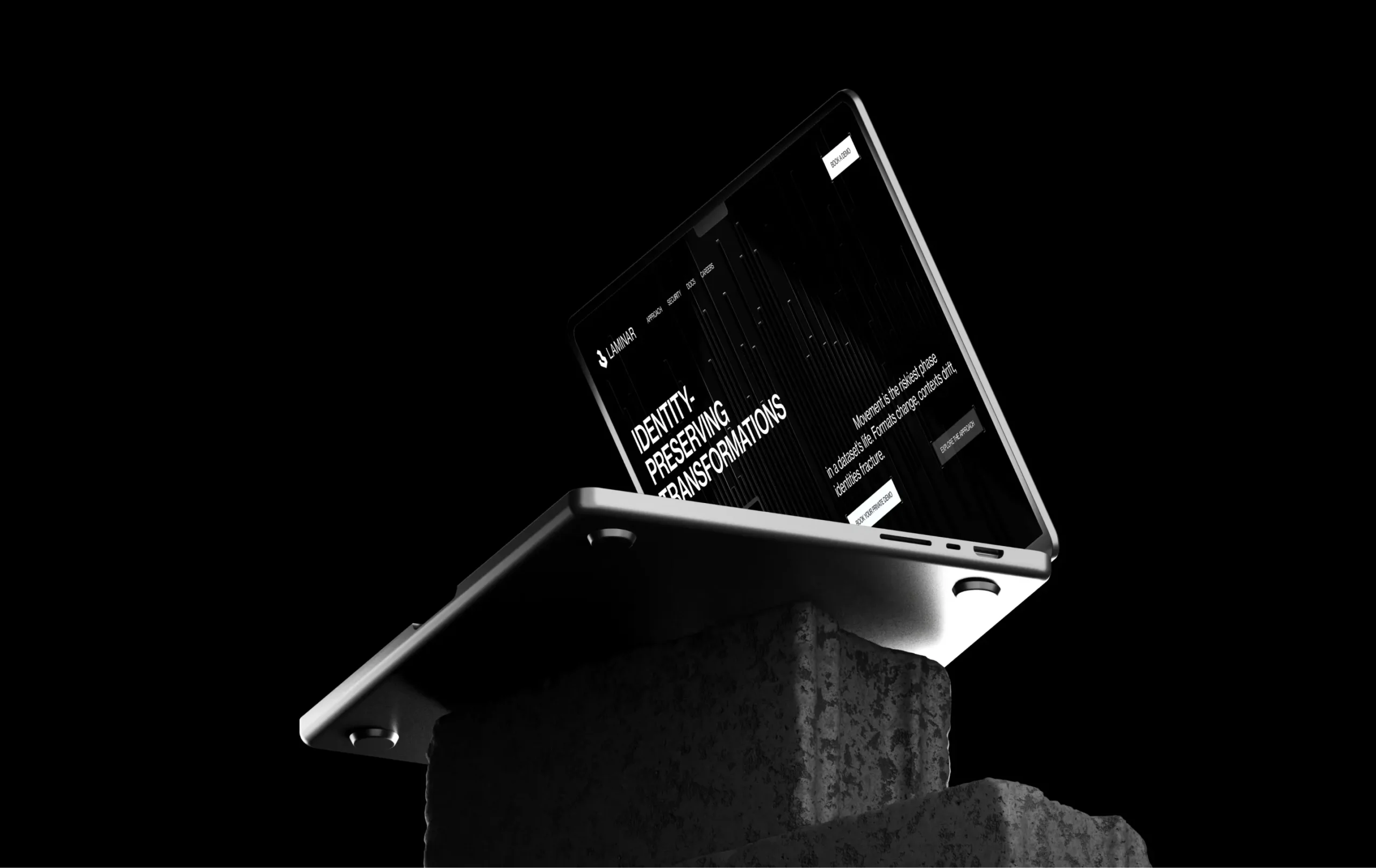
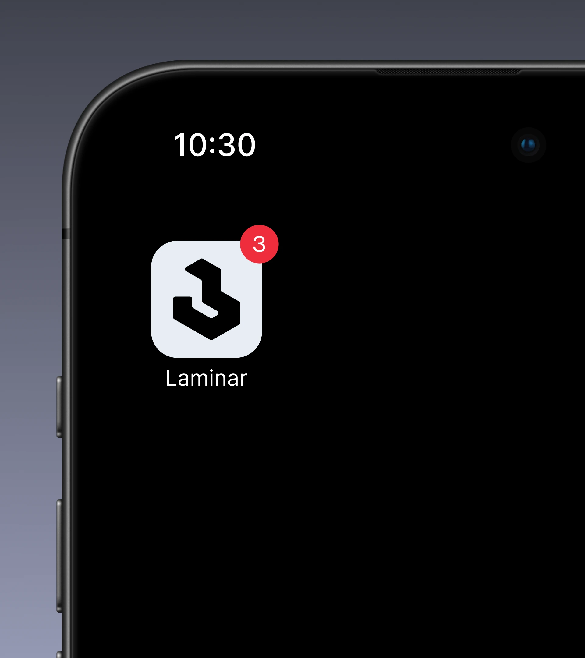
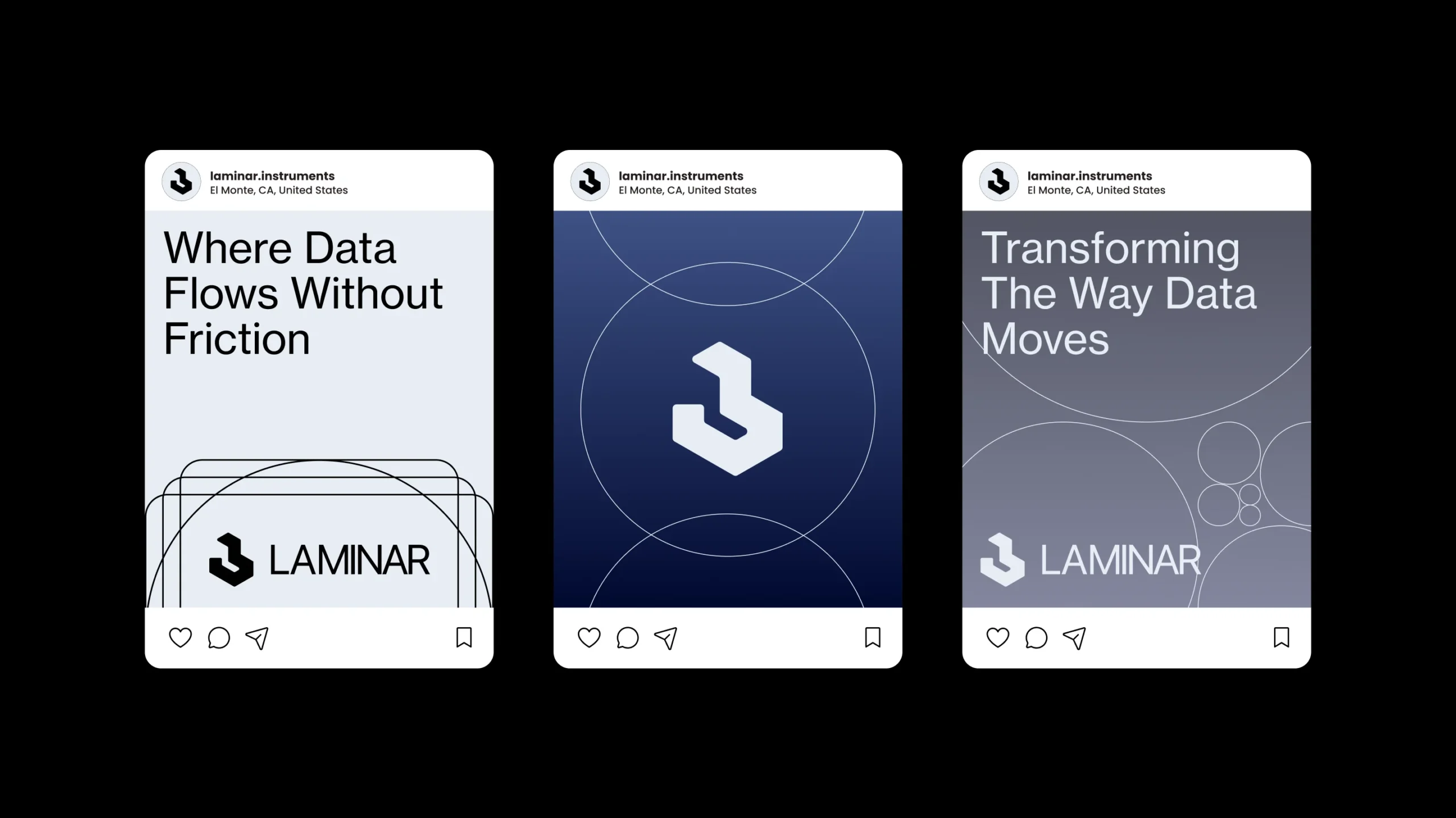
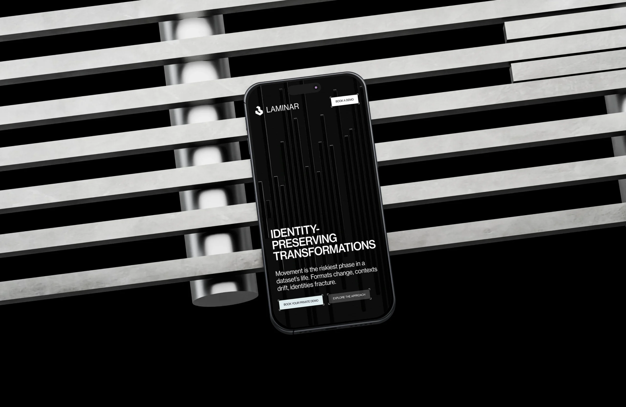
A key part of the system is the use of thin circular linework and controlled gradients. Rather than relying on generic “data” imagery, the visuals suggest motion, transformation, and continuity through subtle geometric overlays. In the supplied applications, these circular arcs and soft transitions create a sense of measured flow, which aligns directly with the laminar-flow metaphor in the brief. The visual system also works well in dark interfaces. The mobile landing mockup uses a near-black base with crisp white type and vertical graphic elements, making the experience feel focused and developer-friendly rather than overly polished or marketing-heavy. That supports the project goal of appealing to technical decision-makers and enterprise buyers at the same time.
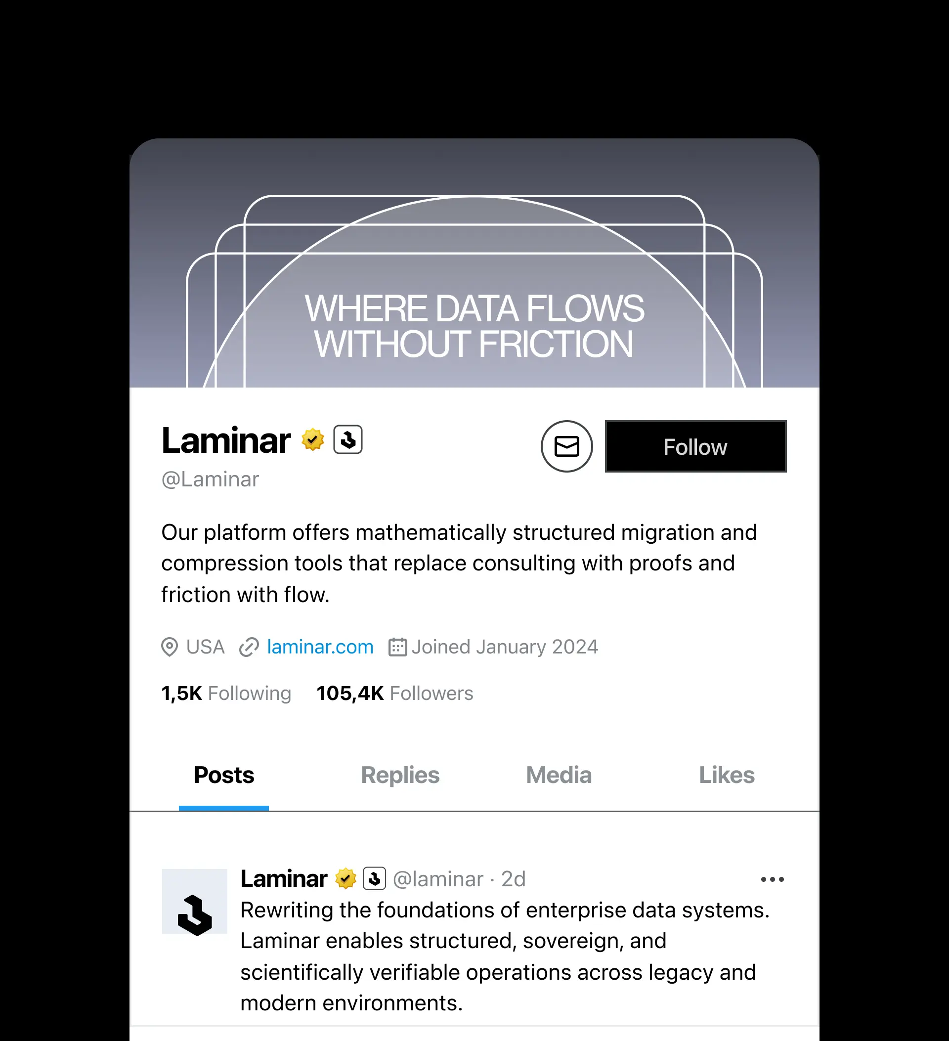
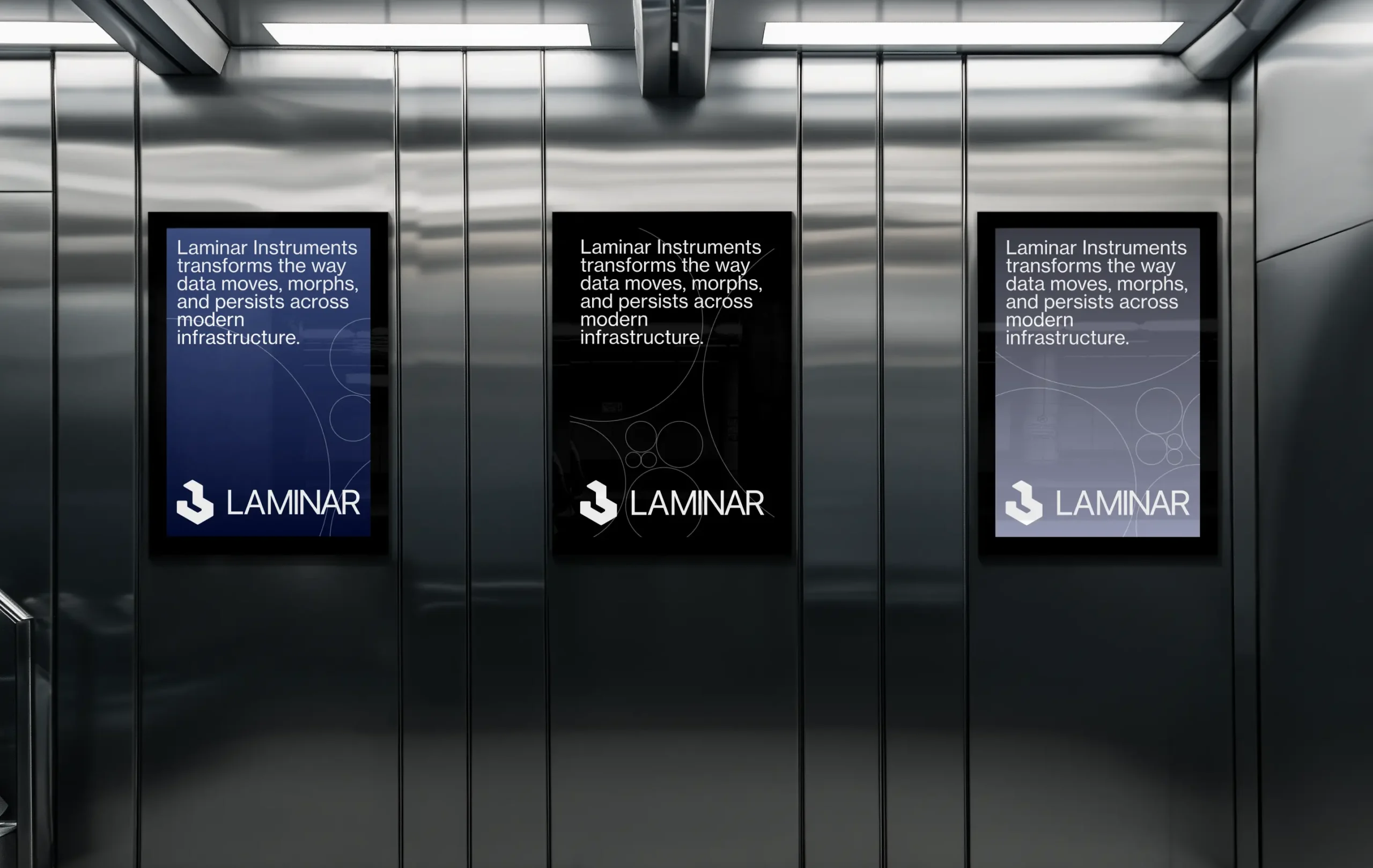
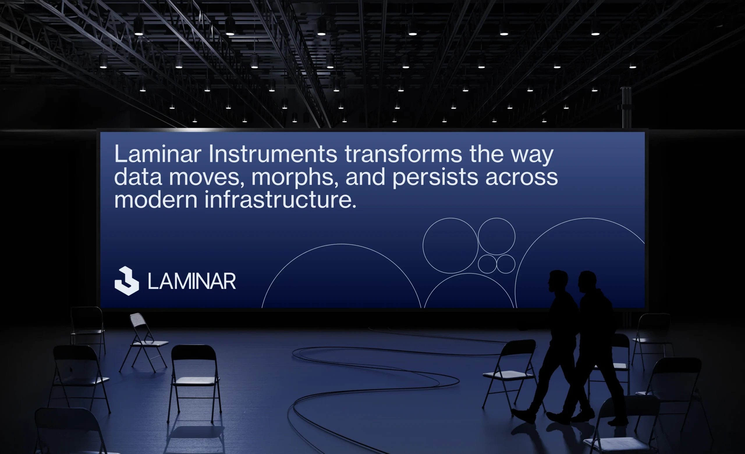
The landing page direction is built around one clear objective: booking demos. The provided copy structure supports that with a direct narrative arc — problem, method, operating value, deployment fit, and private demo CTA. Visually, the system is well suited for that format because it keeps attention on the message instead of competing with it. The identity also extends naturally into launch materials. In the elevator poster mockups, the brand holds up in large-format environments through bold typography, sharp contrast, and minimal composition. The same is true for the mobile screen and presentation-style applications: the system remains recognizable without needing extra decorative assets.
The final direction positions Laminar Instruments as a modern infrastructure brand with real technical weight. The identity feels controlled, exact, and scalable — appropriate for a company selling transformation services where trust and precision matter more than visual spectacle. Based on the brief and the visible applications, the system succeeds by making Laminar look enterprise-grade, but still sharp and contemporary enough to stand apart in a conservative category. The published Behance project presents the work as a brand identity for Laminar Instruments, focused on scientific clarity and structured performance across computational systems.
 BOOK A CALL
 has been sent successfully!
Our managers will contact you as soon as possible.