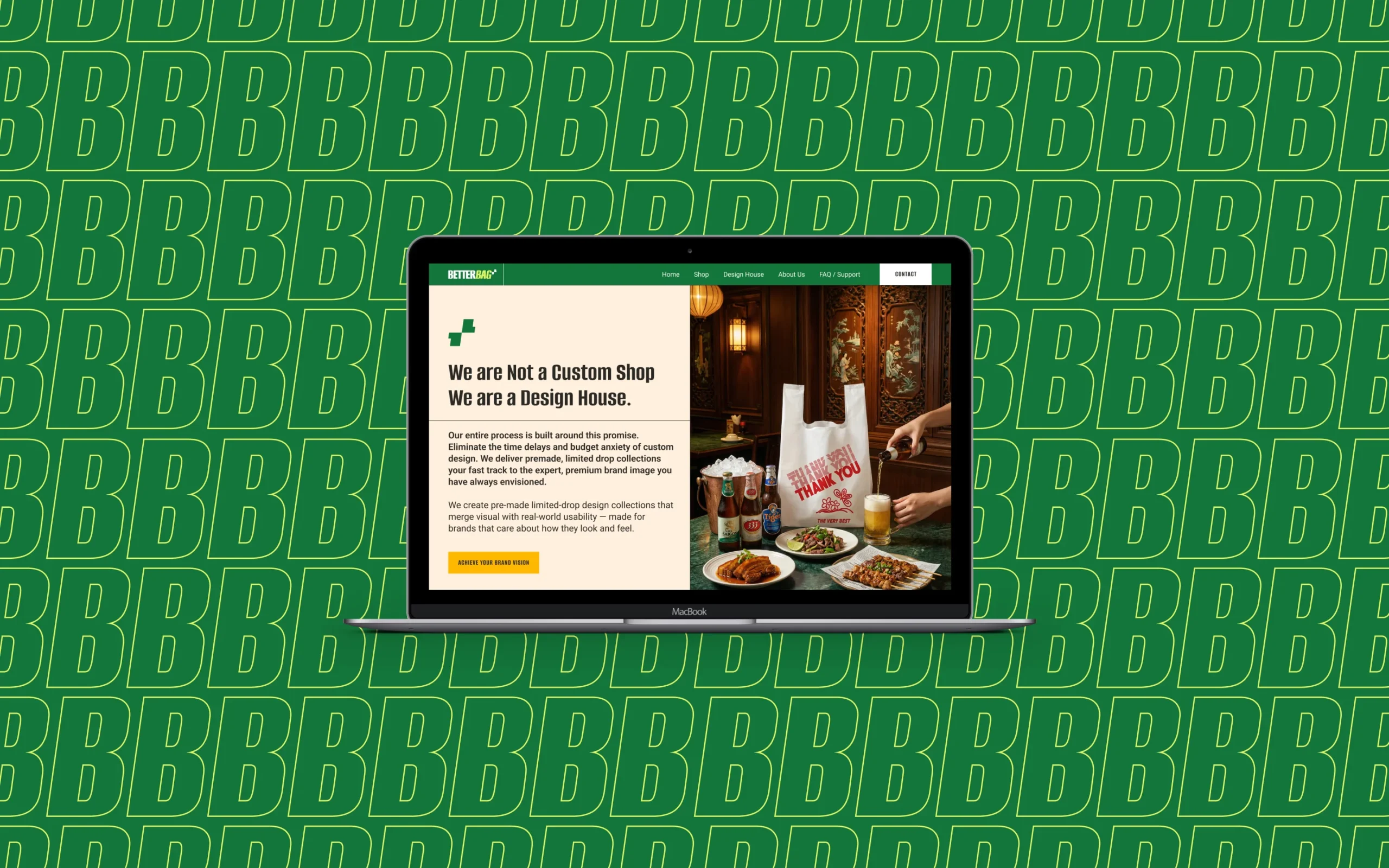
BetterBag+ is a B2B e-commerce company that provides premium, pre-designed take-out bags for small and medium-sized businesses in the food service industry. Instead of offering fully customized packaging, the brand introduces ready-made designer collections that allow businesses to instantly elevate their packaging without the cost and complexity of custom production.
The company operates at the intersection of packaging, design, and retail culture, releasing curated design drops that refresh the visual identity of everyday takeaway bags. By combining accessibility with a studio-driven creative approach, BetterBag+ helps cafés, restaurants, food trucks, and local businesses present their products in a more distinctive and memorable way.
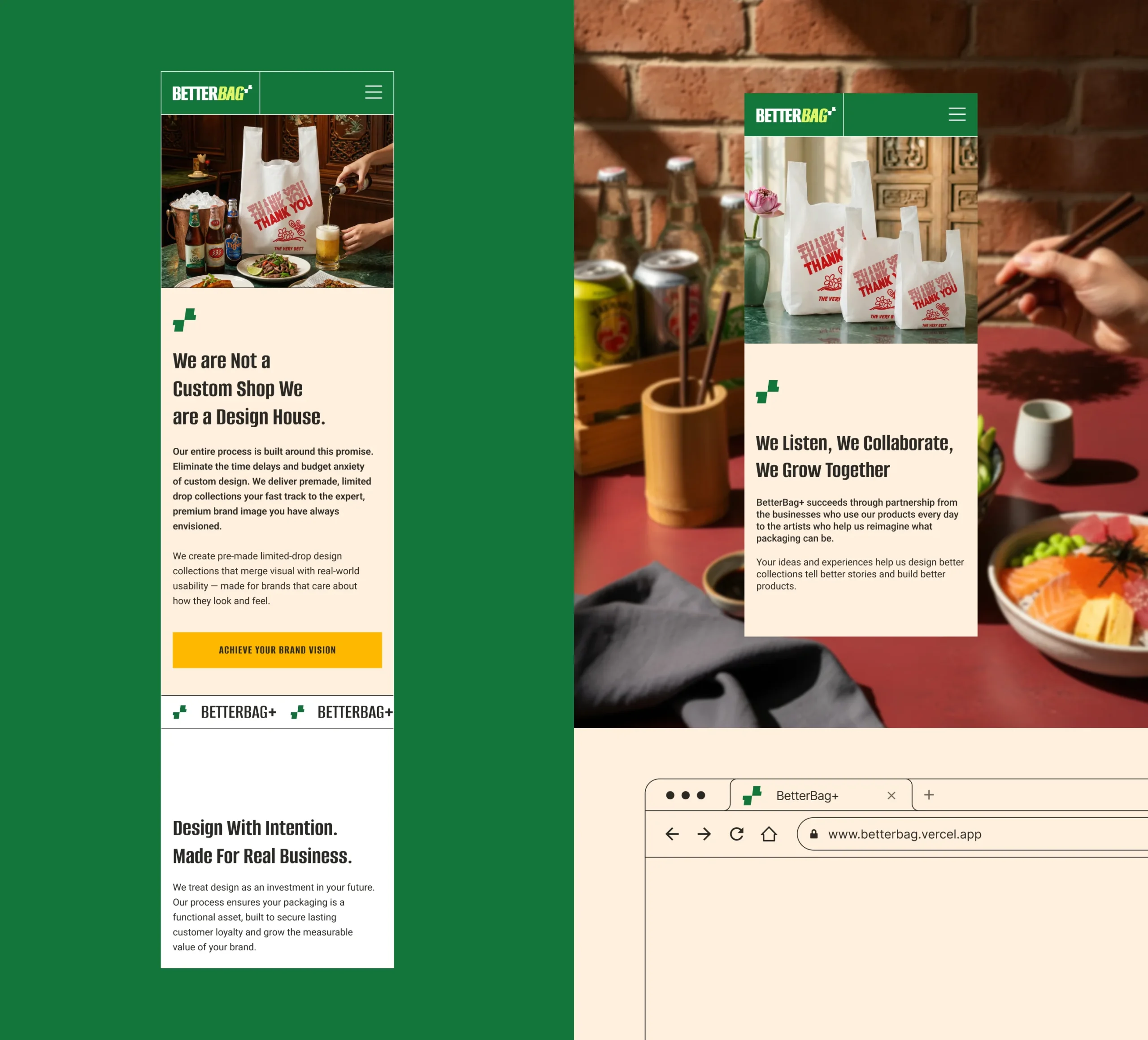
The client initially worked with another supplier, but the results were disappointing. The final bags suffered from several issues: Poor print quality and inconsistent ink application, Low-quality materials that did not feel premium, Incorrect sizing and production inaccuracies. These problems affected both the visual perception of the brand and the usability of the product. At the same time, the packaging needed to meet a unique challenge: the design could not represent a specific type of restaurant or cuisine. Instead, it had to communicate a universal message of appreciation that would work equally well for a café, restaurant, food truck, or takeaway shop. The goal was to create a system of packaging designs that feel stylish, modern, and inclusive across the entire F&B industry.
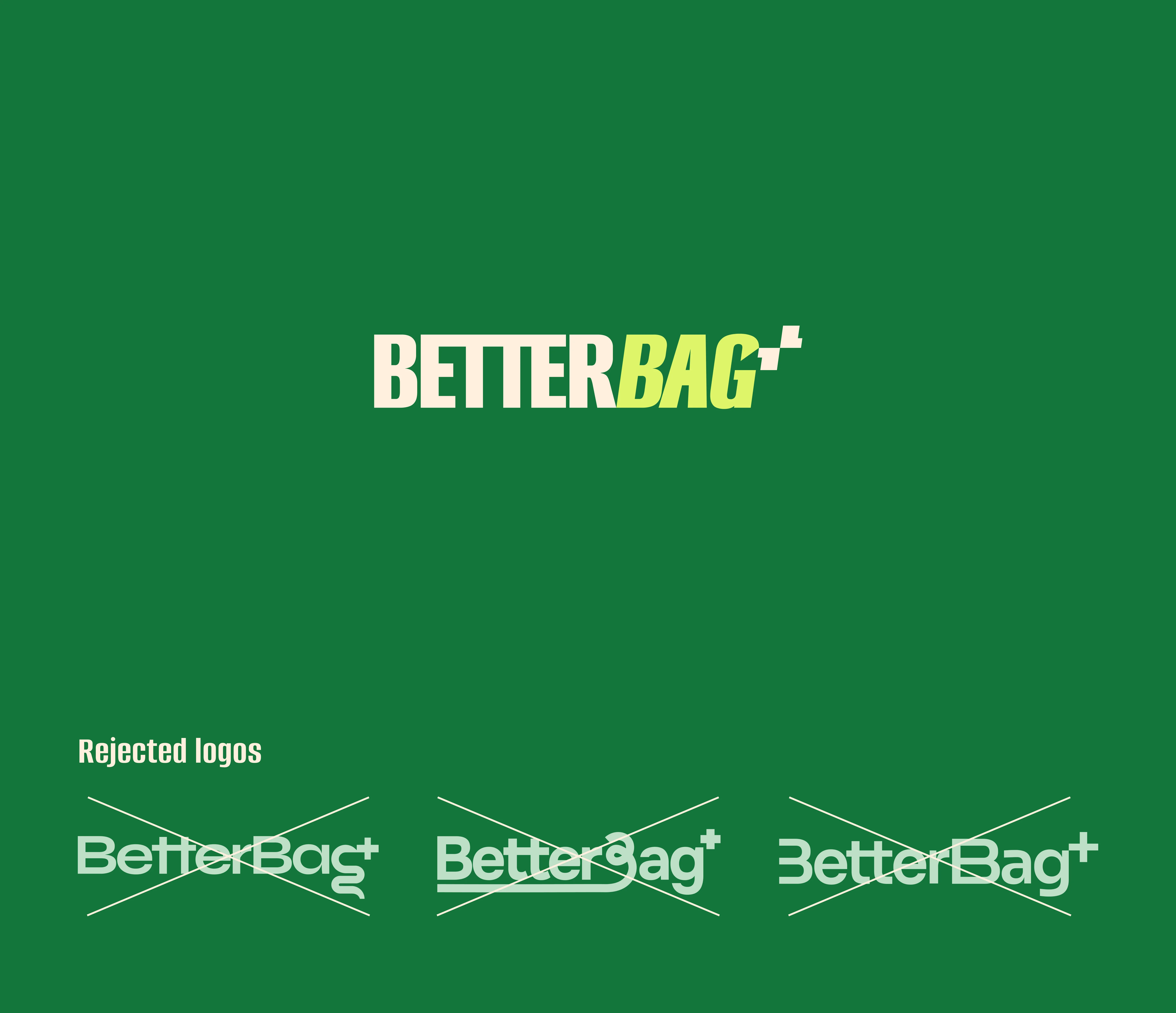
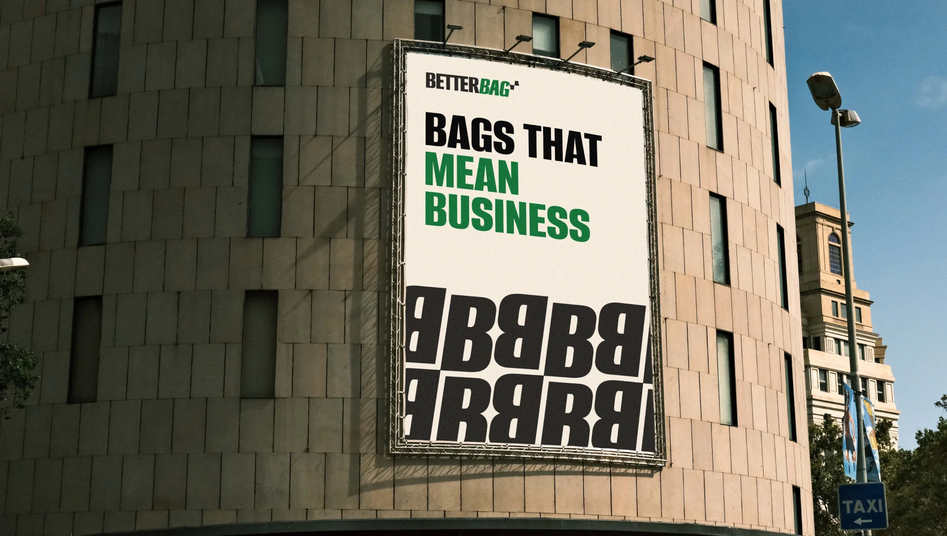
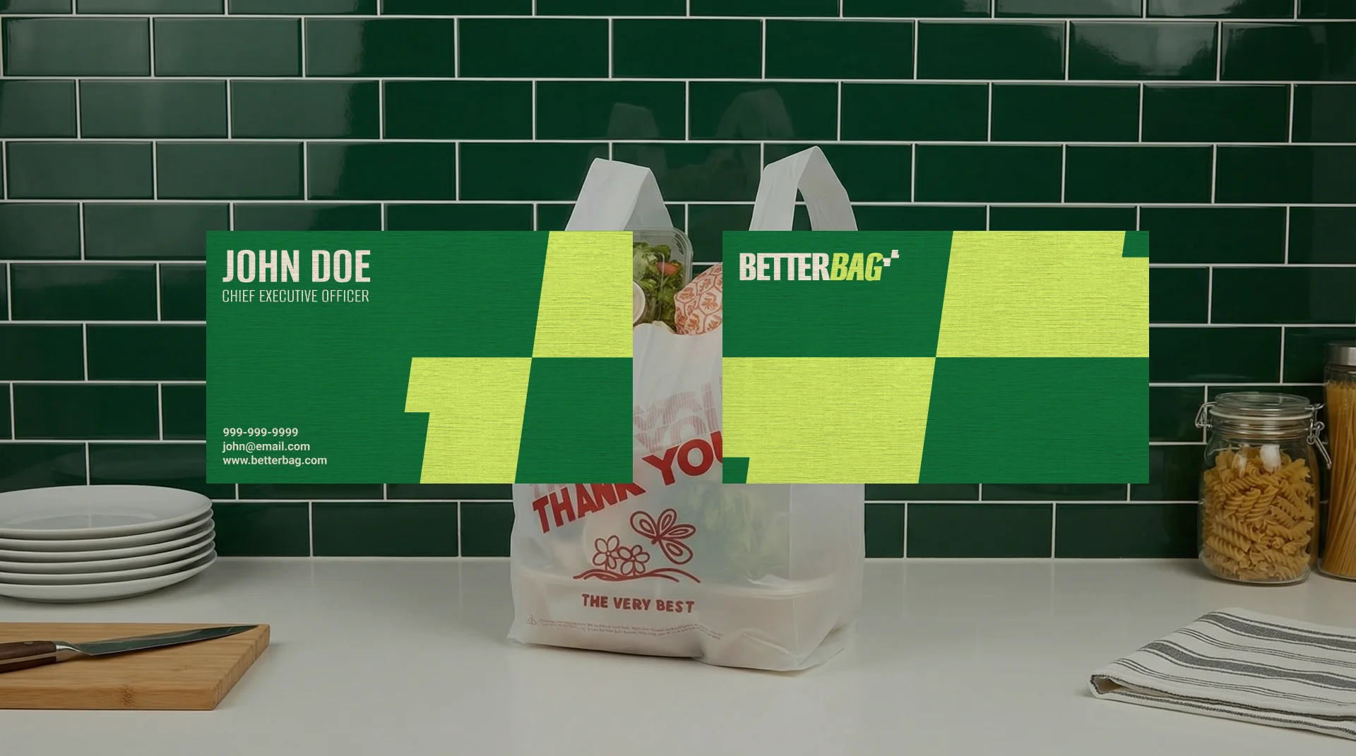
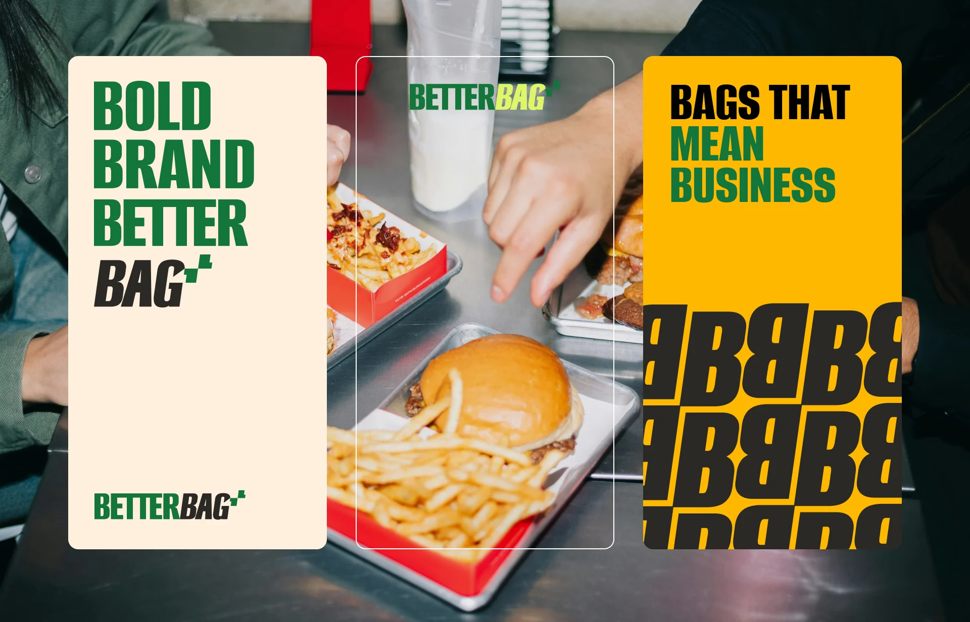
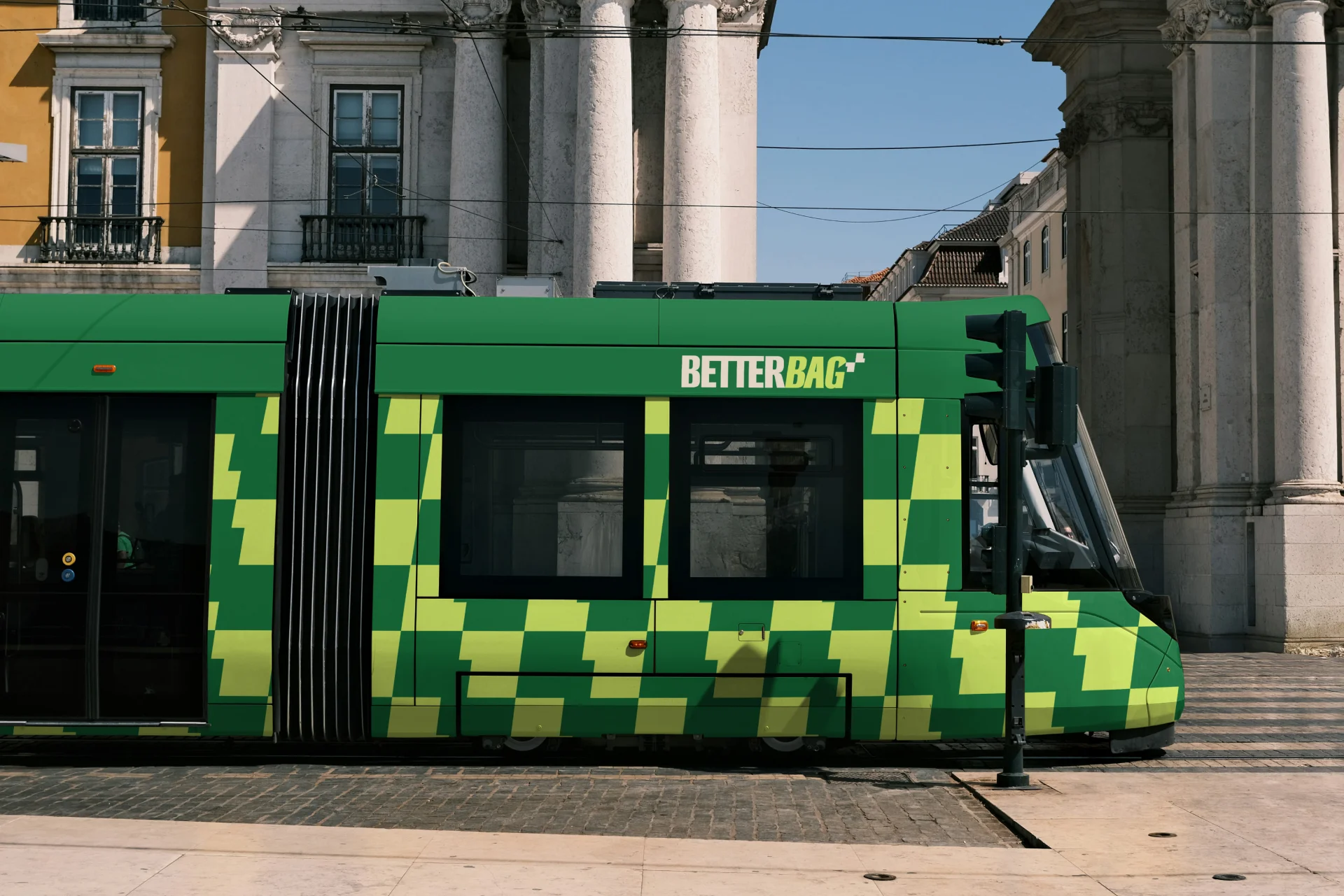
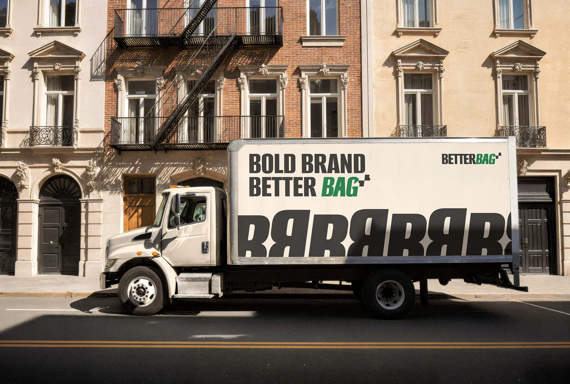
The design direction positions BetterBag closer to a design studio releasing packaging collections, rather than a traditional packaging manufacturer. The identity combines bold typography, expressive color contrasts, and simple graphic systems that make the bags visually striking while remaining easy to recognize.
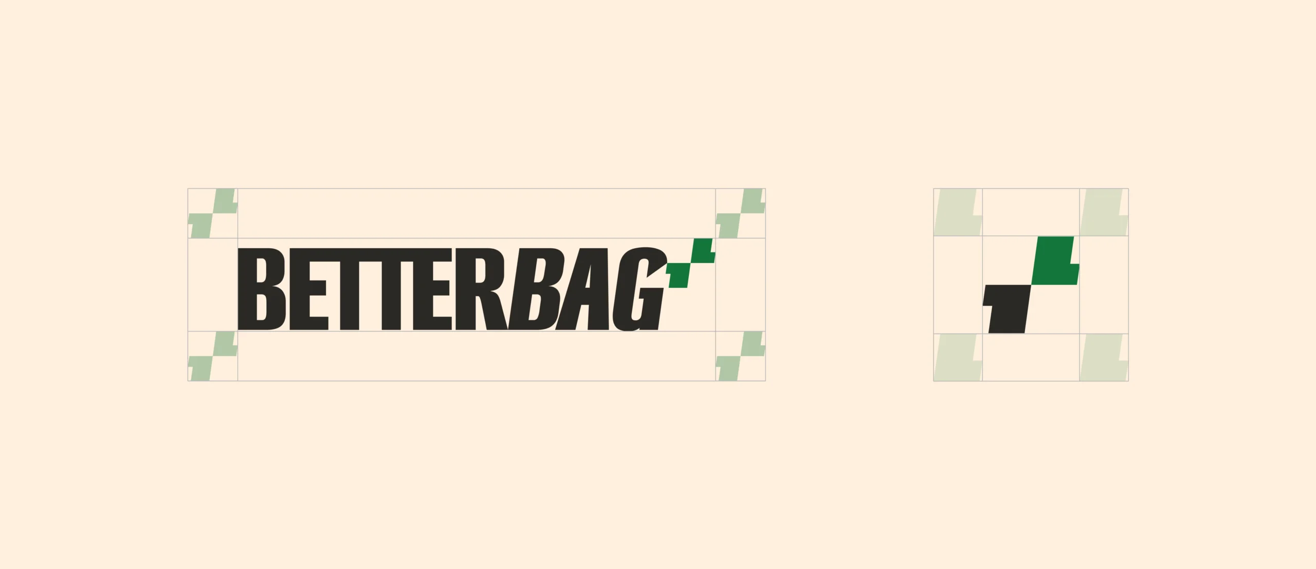
The BetterBag logo uses a bold condensed sans-serif style, giving the brand a confident and modern appearance. The visual hierarchy highlights the word “BAG” with a bright accent color, creating a strong focal point while reinforcing the product itself. This typographic approach makes the brand highly visible on packaging, posters, and storefront displays.
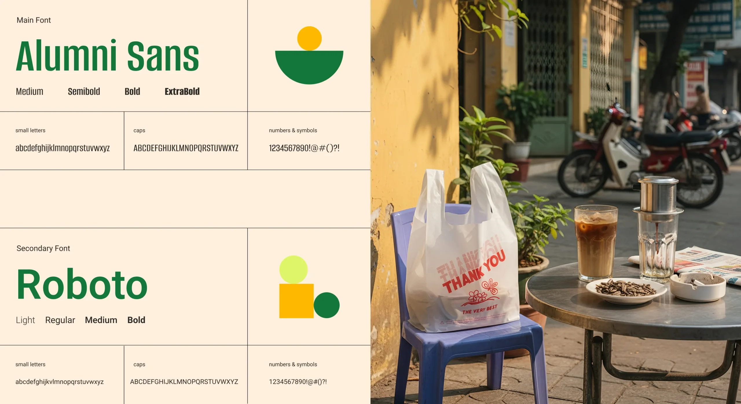
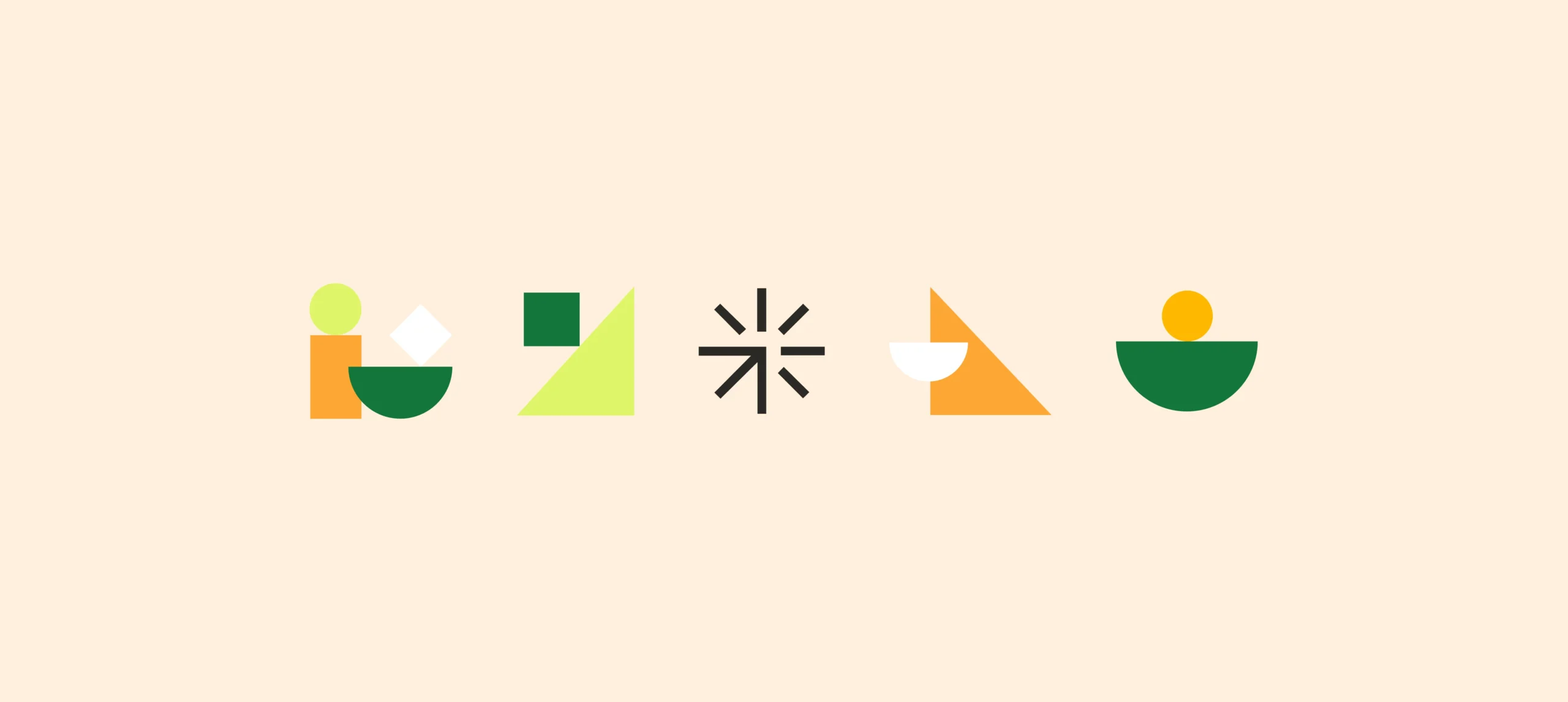
The color palette is energetic but grounded, balancing bold tones with neutral surfaces. Primary colors include: Dark Spring Green (#13753A) — the main brand color representing freshness and reliability, Antique White (#FFF0DD) — a warm neutral that softens the overall look, Mindaro (#DDF568) — a vibrant lime accent used to highlight key elements, Selective Yellow (#FEB800) — a strong highlight color for energetic applications, Jet (#2B2925) — a deep neutral used for contrast and typography. This palette allows the brand to feel fresh, modern, and highly visible in busy urban environments.
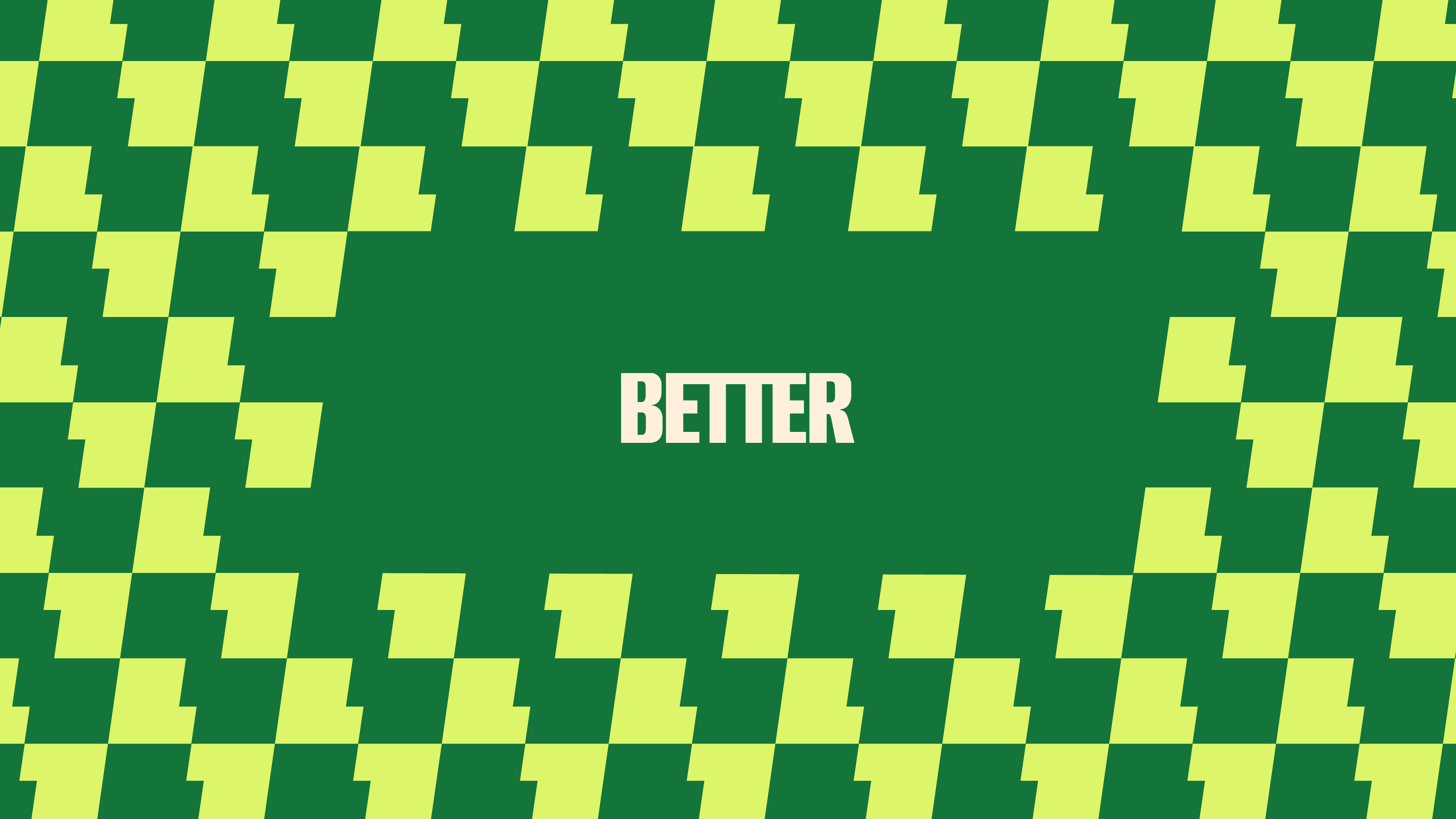
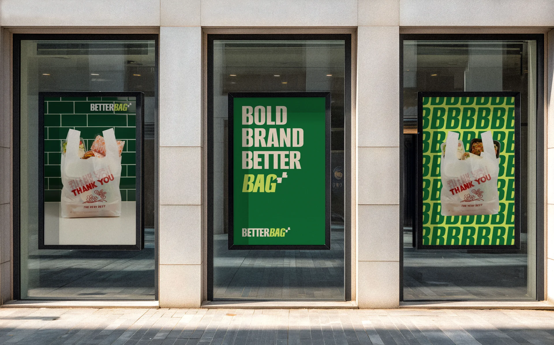
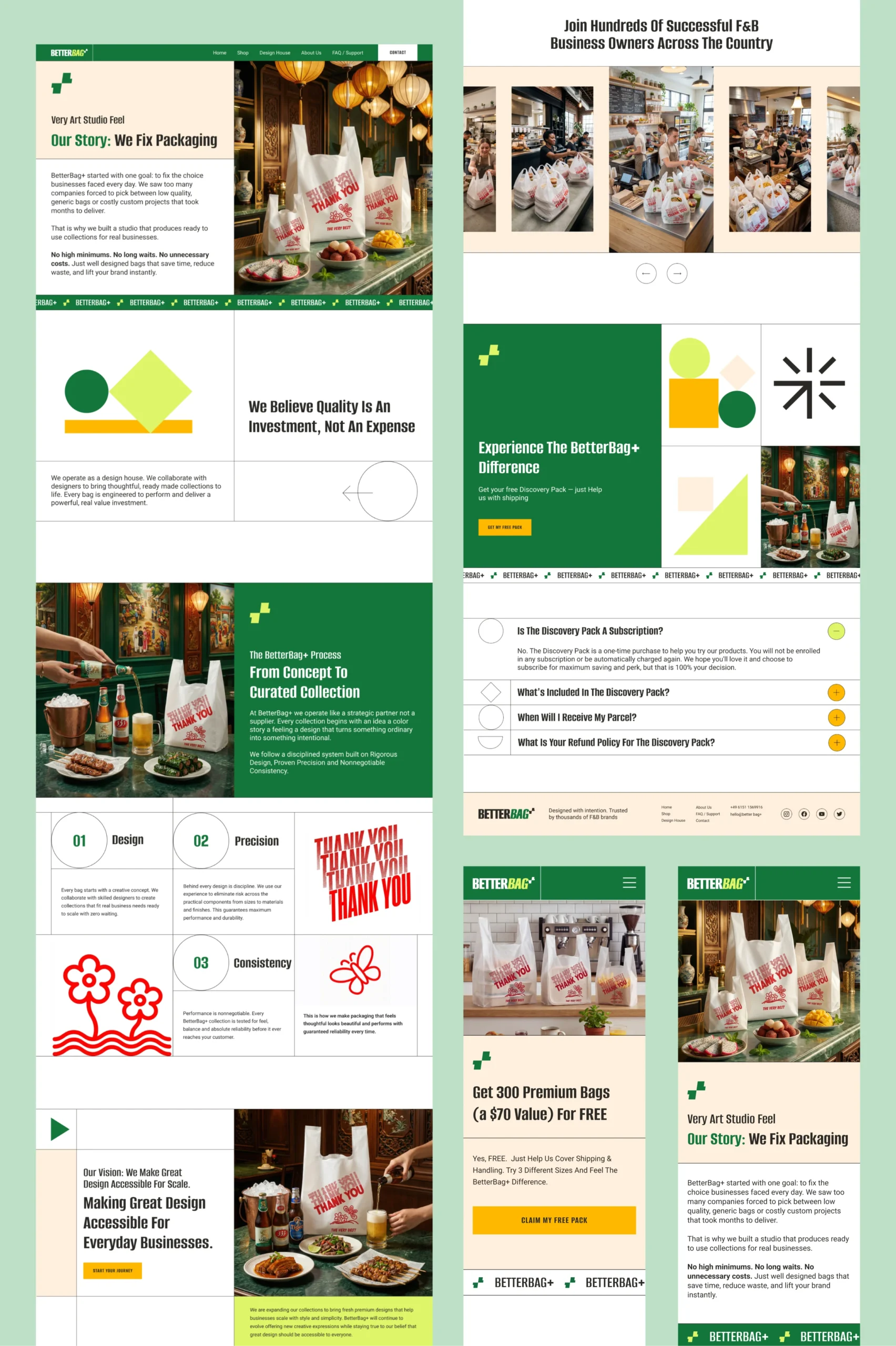
The visual language relies heavily on bold type compositions and repeating patterns. These elements create a dynamic look across posters, storefront displays, and packaging. The repeating typography patterns reinforce brand recognition while also reflecting the concept of design drops — collections that evolve over time. The system is intentionally simple so it can be easily adapted to future packaging collections and monthly design releases.
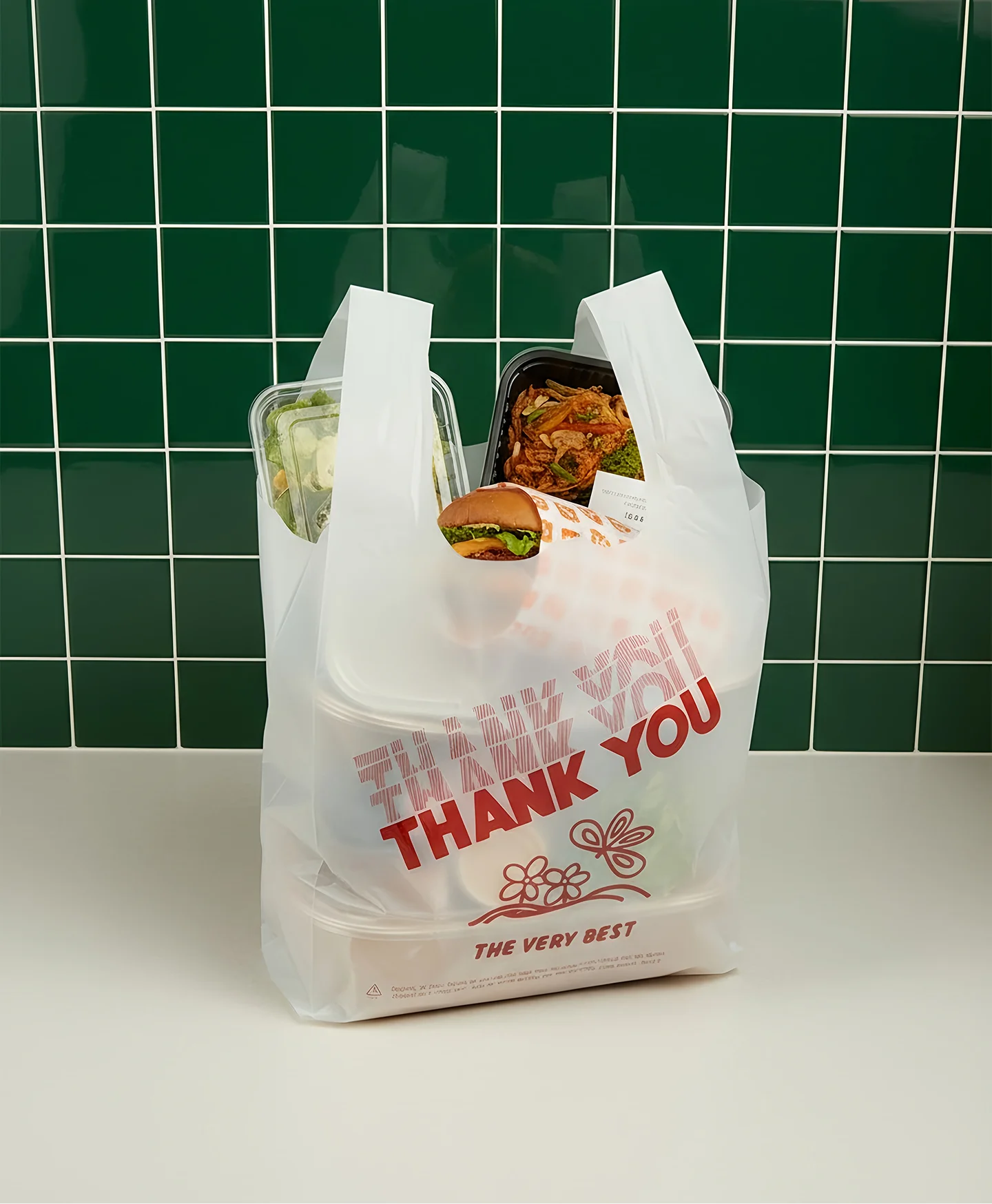
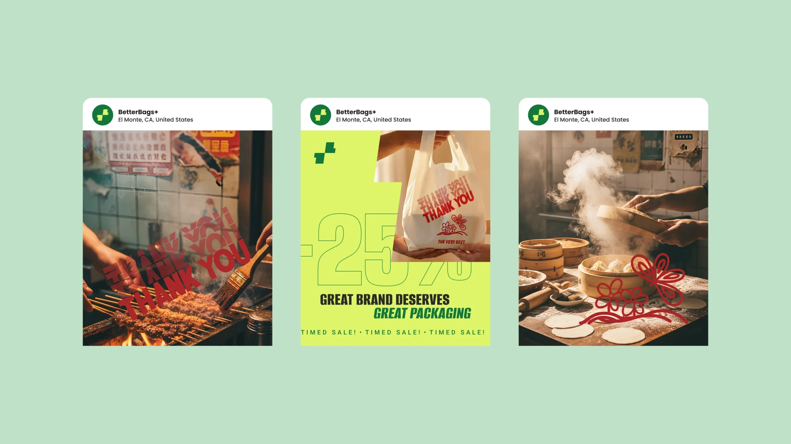
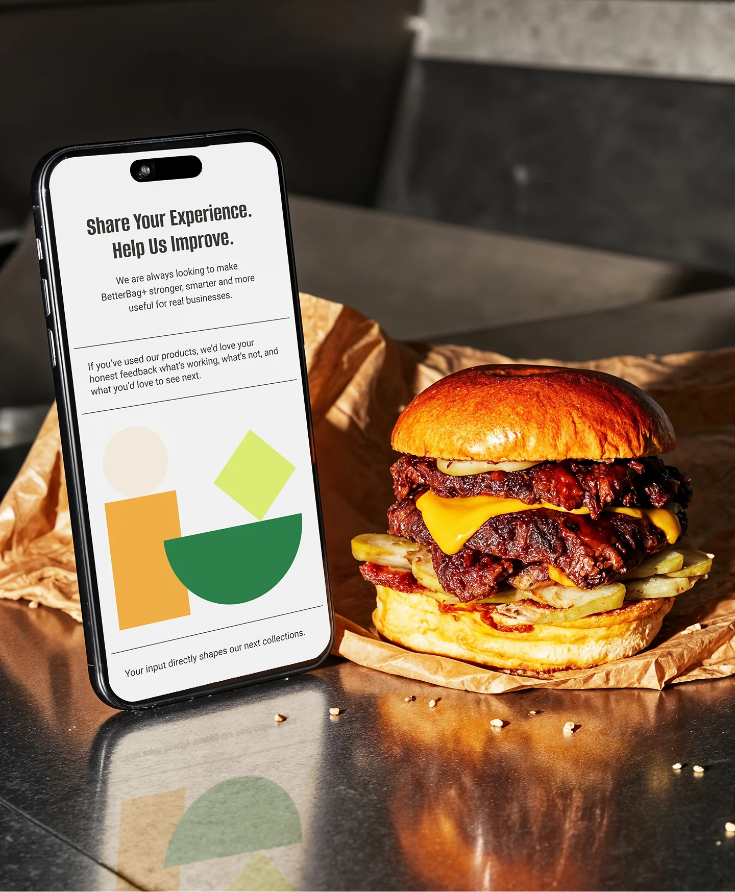
The packaging itself becomes the main storytelling medium of the brand. Each design communicates a universal message of gratitude and appreciation to customers. This approach allows the bags to feel appropriate for any food business without referencing a specific cuisine or brand. Key design principles include: Clear, expressive typography, High-contrast color combinations, Friendly, universal messaging, Strong shelf and street visibility. The designs were also developed with real-world printing limitations in mind to ensure the final product maintains high visual quality and production accuracy.
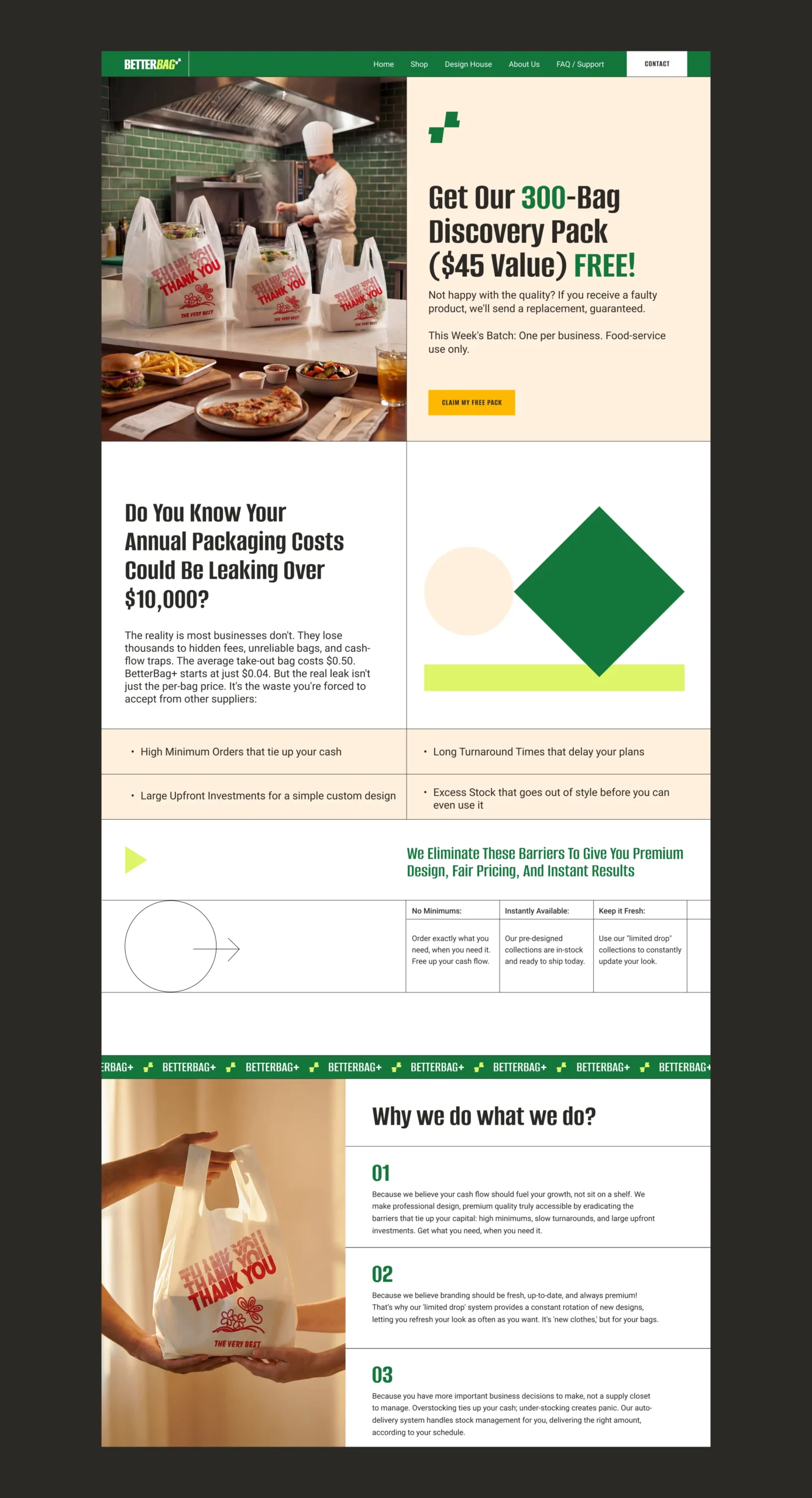
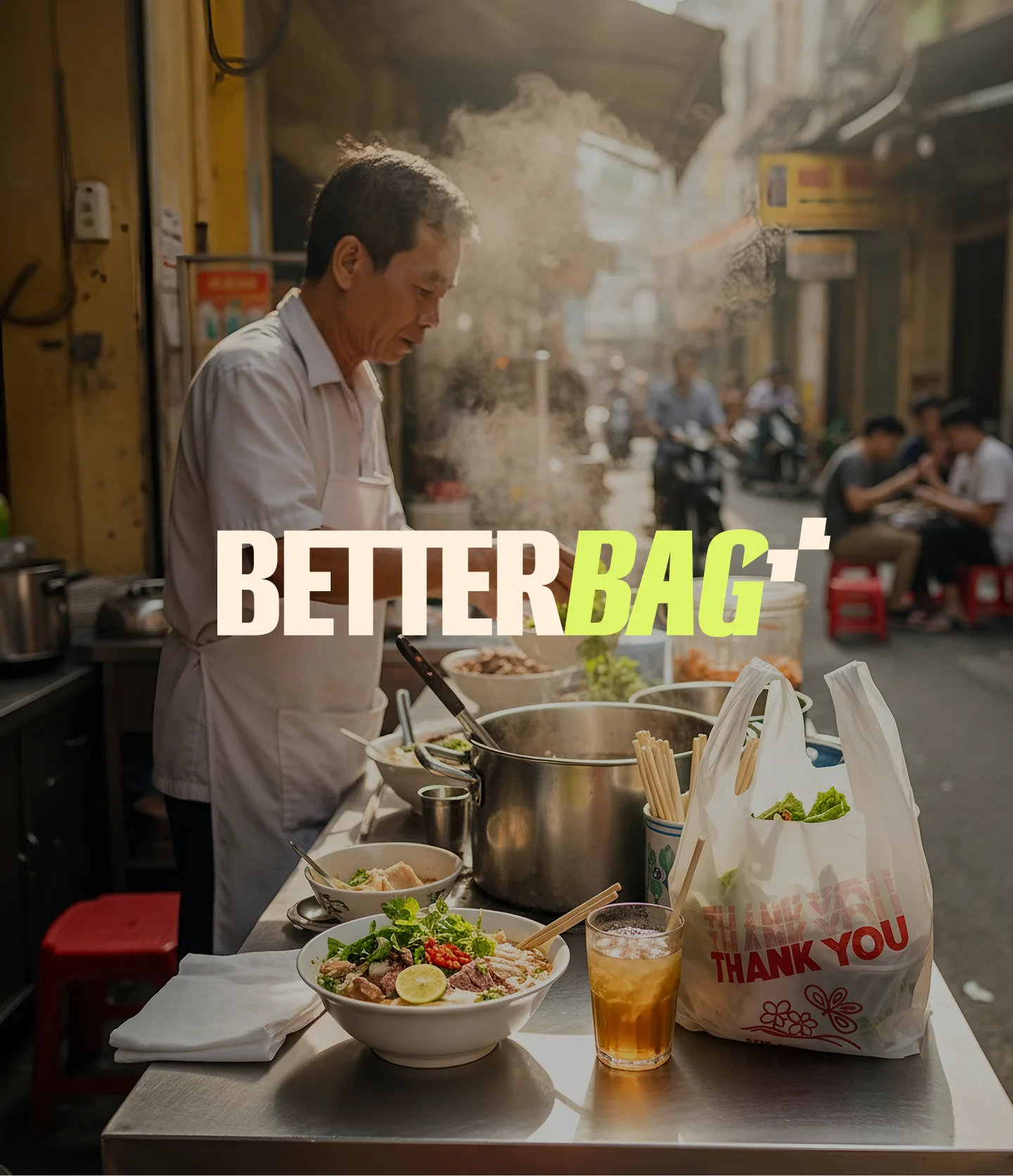
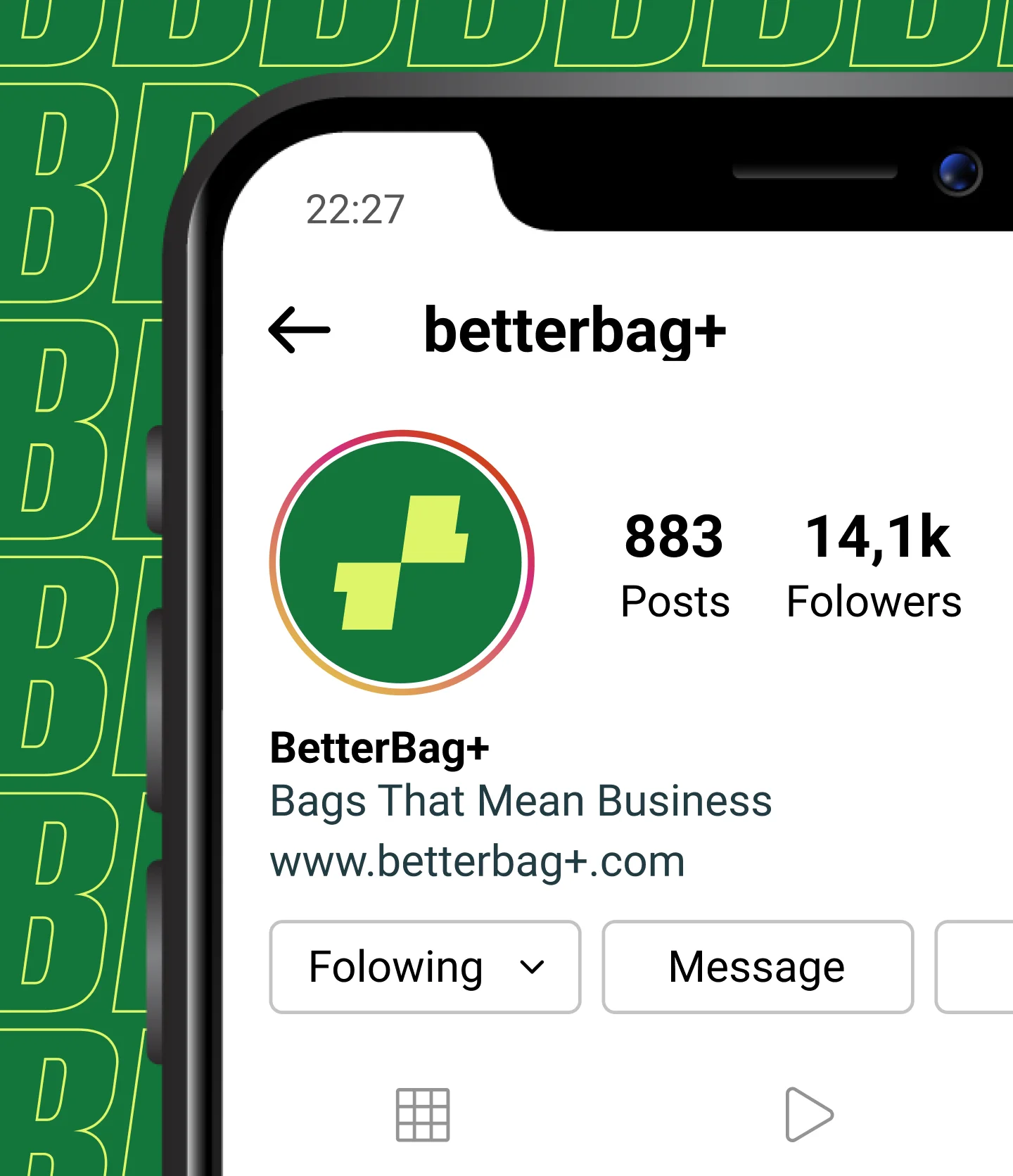
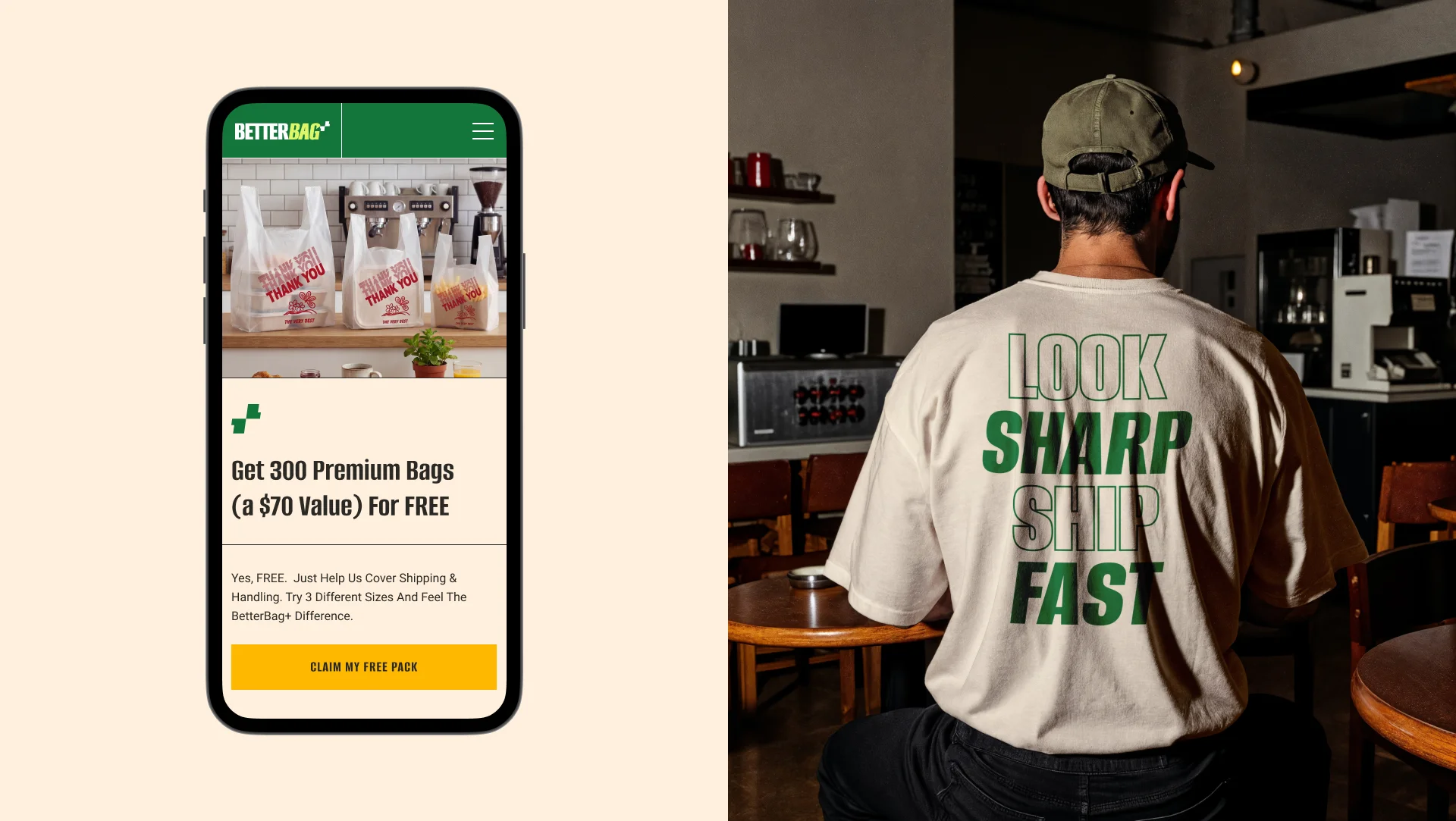
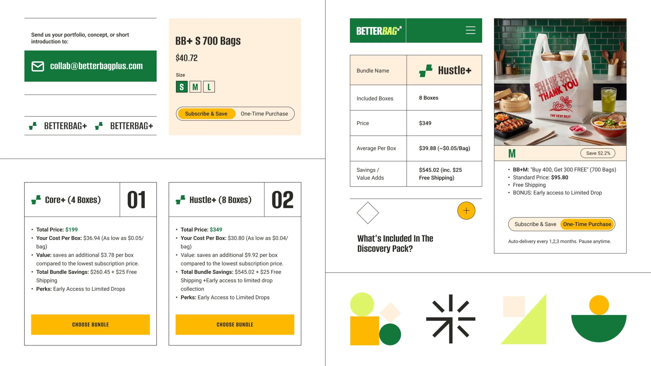
The identity extends naturally into various brand touchpoints. Applications include: Storefront posters and window graphics, Packaging mockups and product visuals, Lifestyle imagery showing real usage scenarios, Digital assets for the e-commerce platform. The system works equally well in physical environments and online storefronts, supporting the brand’s Shopify-based e-commerce platform.
The final identity transforms BetterBag from a simple packaging supplier into a design-driven packaging brand. The new visual system communicates: Confidence through bold typography, Freshness and energy through vibrant colors, Accessibility for small businesses, A scalable system for future design drops. Most importantly, the packaging now feels like a designed product rather than a generic supply item, helping food businesses present their takeaway orders with style and personality. The result is a brand that supports BetterBag’s long-term vision — a rotating system of packaging collections that keeps small business packaging fresh, modern, and visually distinctive.
 BOOK A CALL
 has been sent successfully!
Our managers will contact you as soon as possible.