IC Labs is a next-generation AI automation company that develops intelligent systems designed to help small and medium-sized businesses operate more efficiently and scale without expanding their teams. The platform focuses on replacing repetitive operational work with automated processes that handle lead generation, customer follow-up, payment recovery, onboarding, invoicing, and reporting.
The brand needed to strike a careful balance between innovation and trust. AI products often fall into visual clichés — robotic imagery, circuit graphics, or overly futuristic aesthetics. For IC Labs, the objective was different. The identity had to feel calm, intelligent, and system-driven, reflecting software that quietly runs complex business processes in the background. The visual language needed to: Communicate automation and intelligent systems, Feel enterprise-level and trustworthy, Maintain simplicity and clarity for SME audiences, Work seamlessly across SaaS interfaces, marketing, and product visuals.
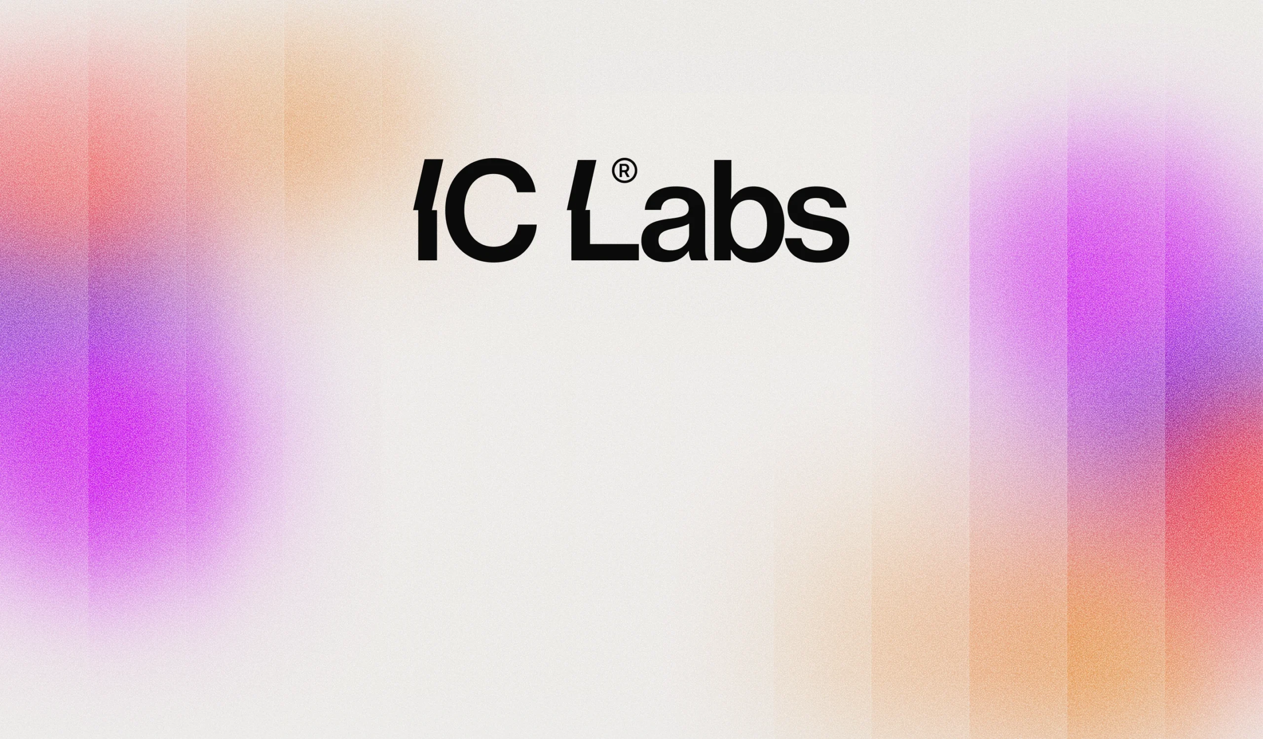
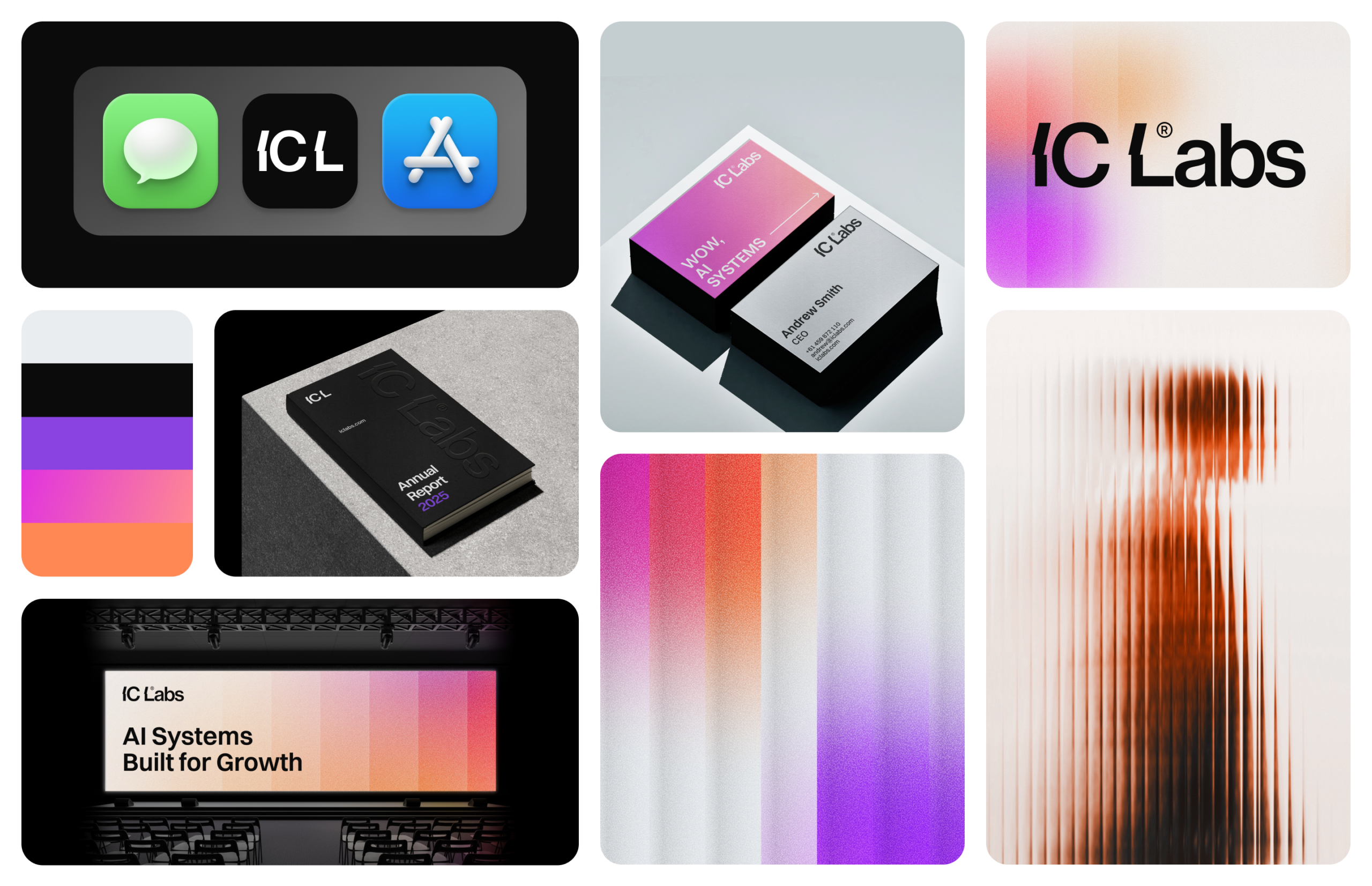
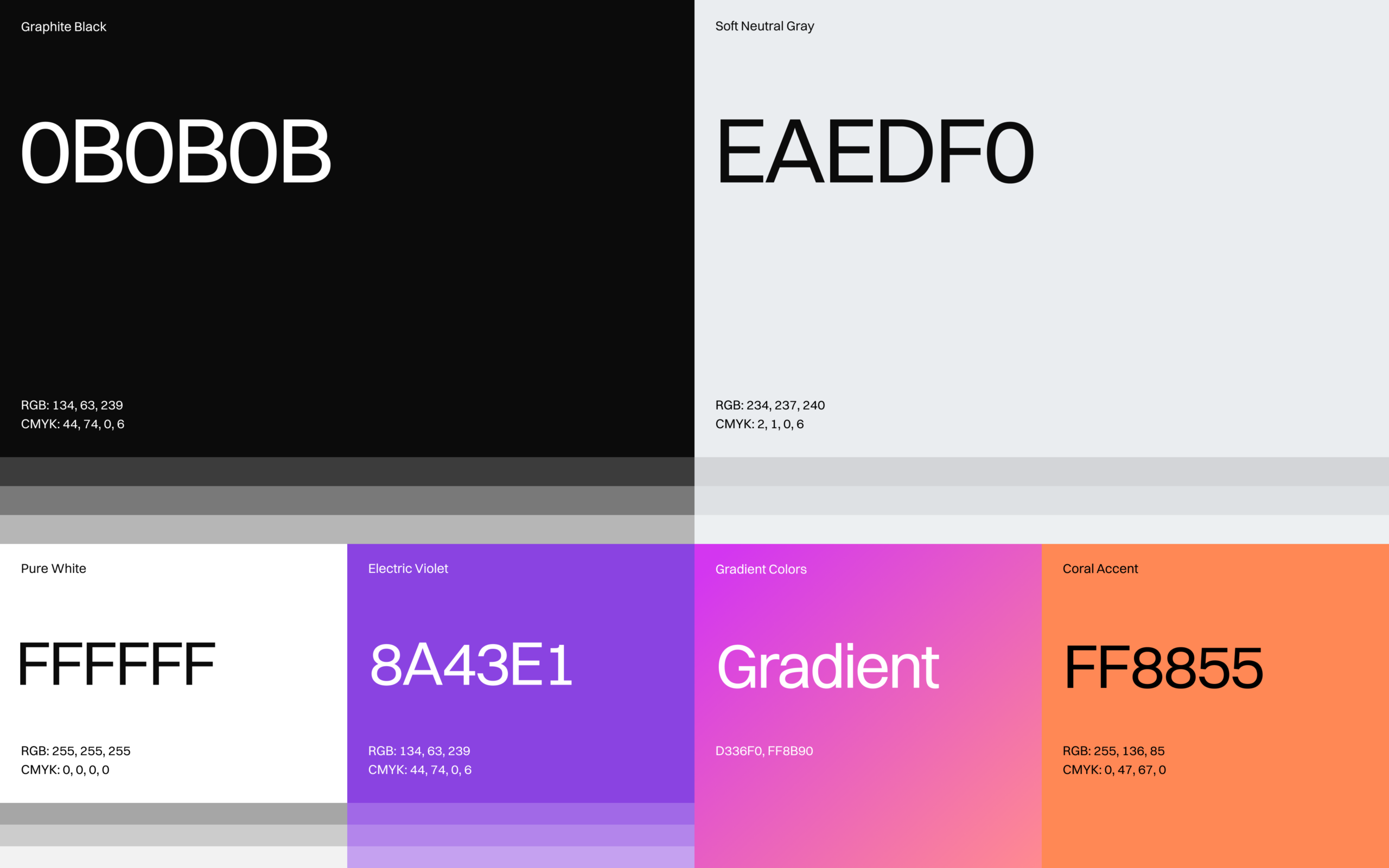
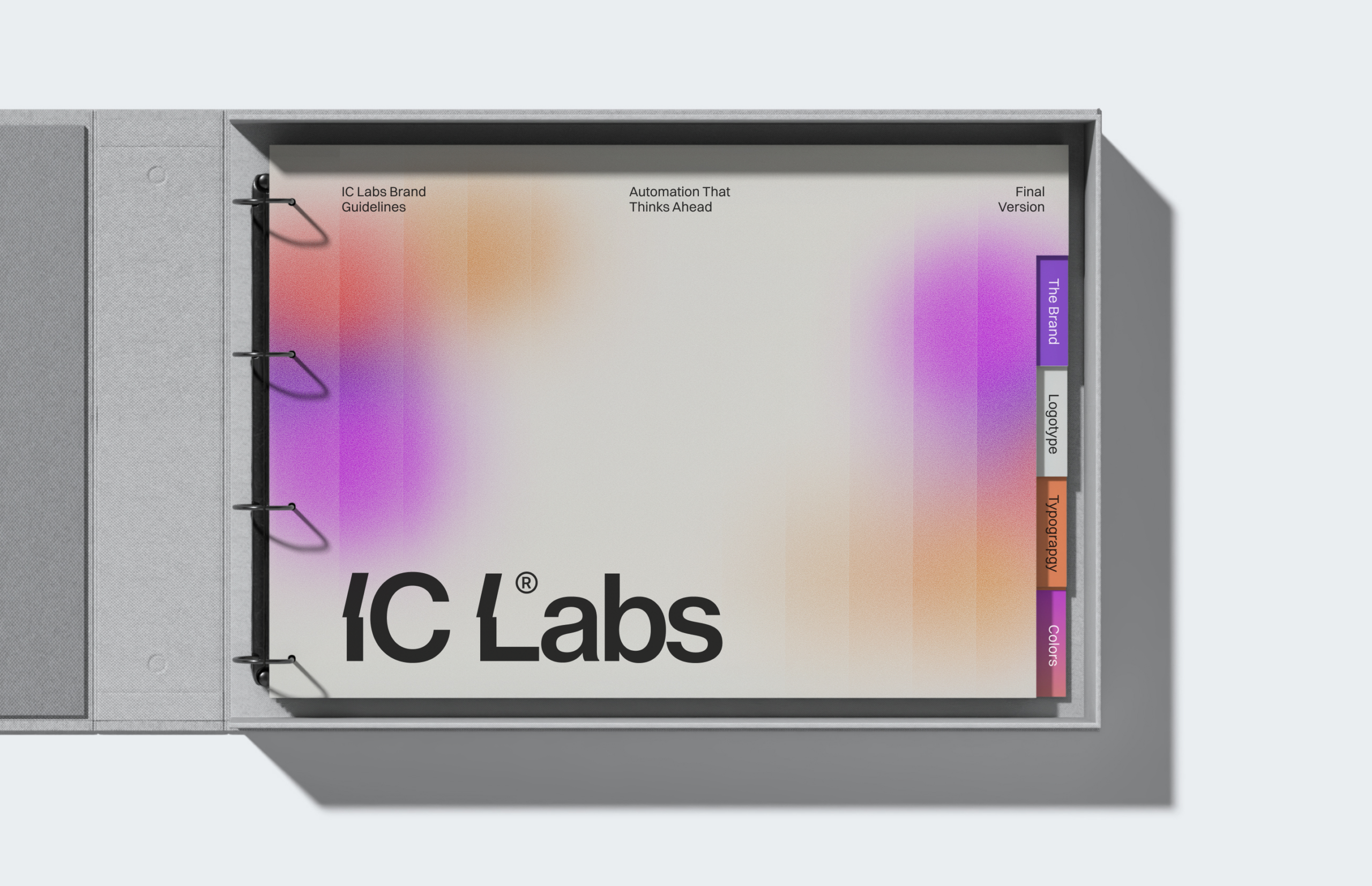
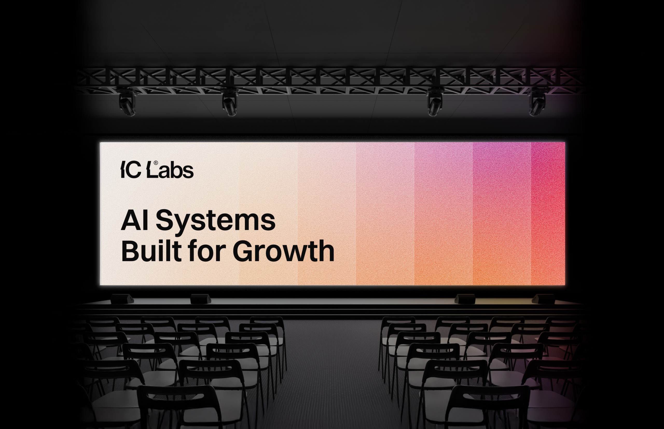
The color system combines calm neutrals with energetic gradient accents. Core colors include: Graphite Black for strong contrast and product UI environments, Soft Neutral Gray and Pure White for clean layouts and readability, Electric Violet as a primary tech accent, Coral as a warm highlight color. The gradients move between violet, magenta, coral, and warm orange, creating a dynamic visual flow that reflects data movement, automation, and system intelligence. This gradient system becomes one of the defining visual elements of the brand, appearing across backgrounds, presentations, and digital interfaces.
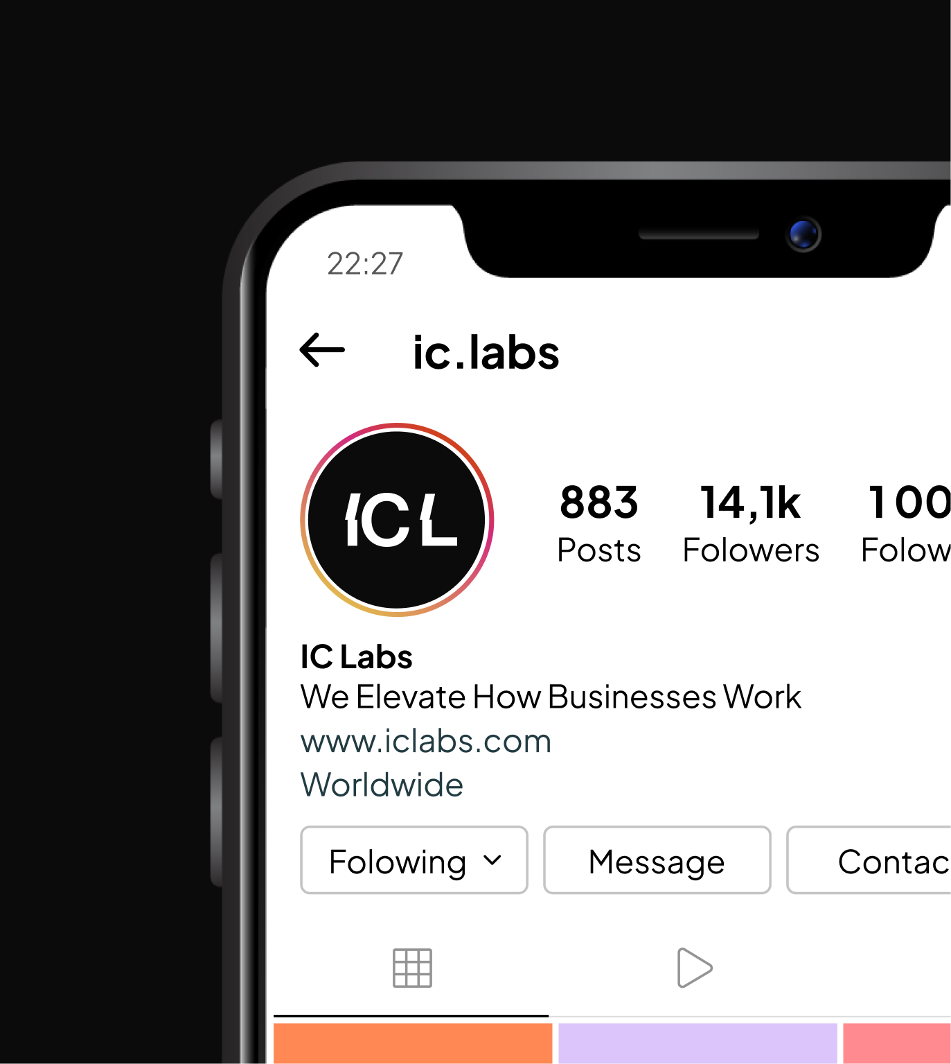
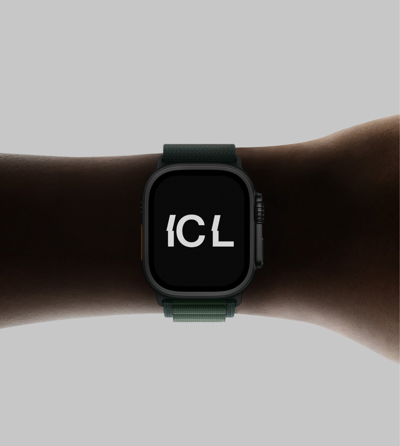
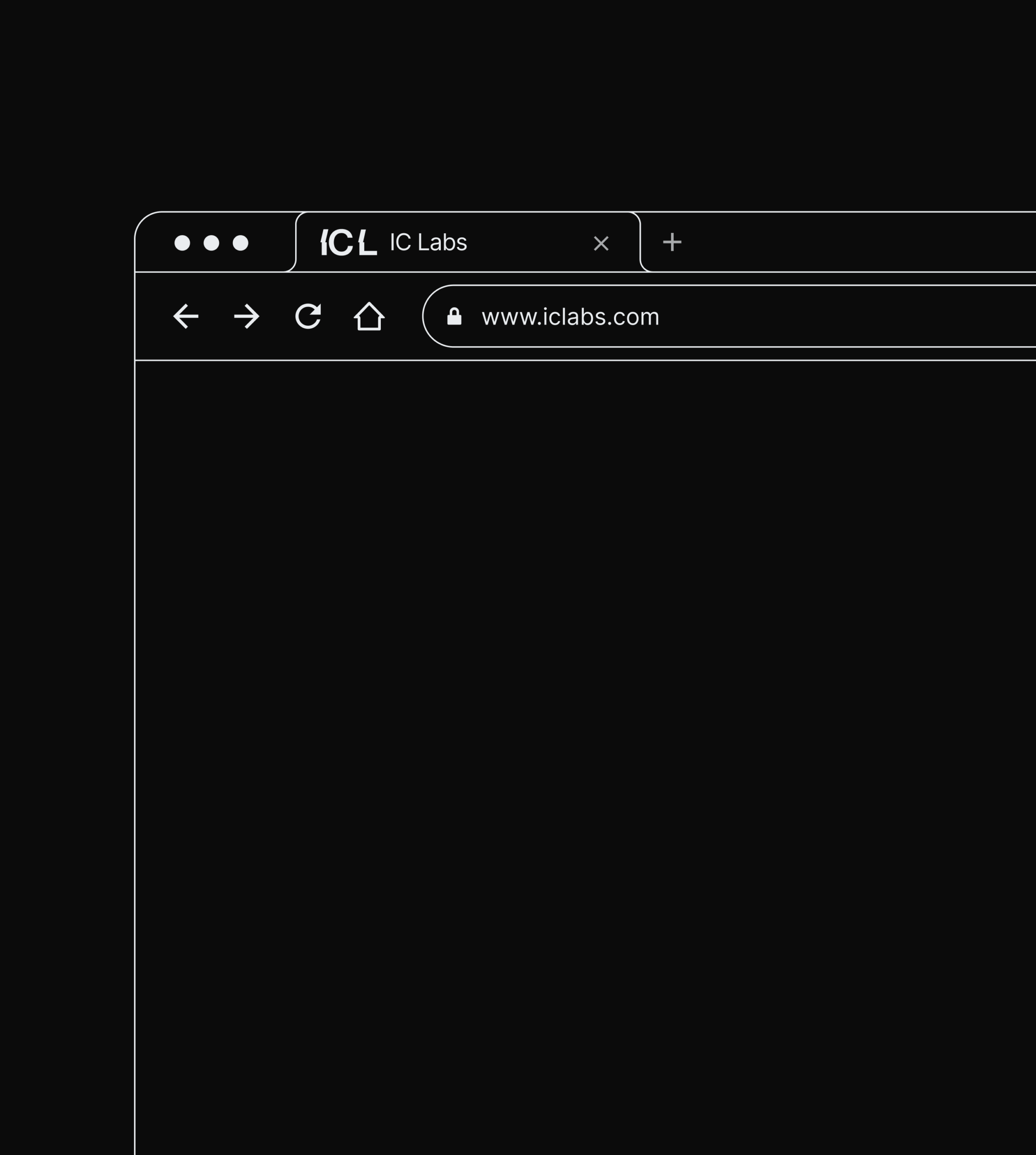
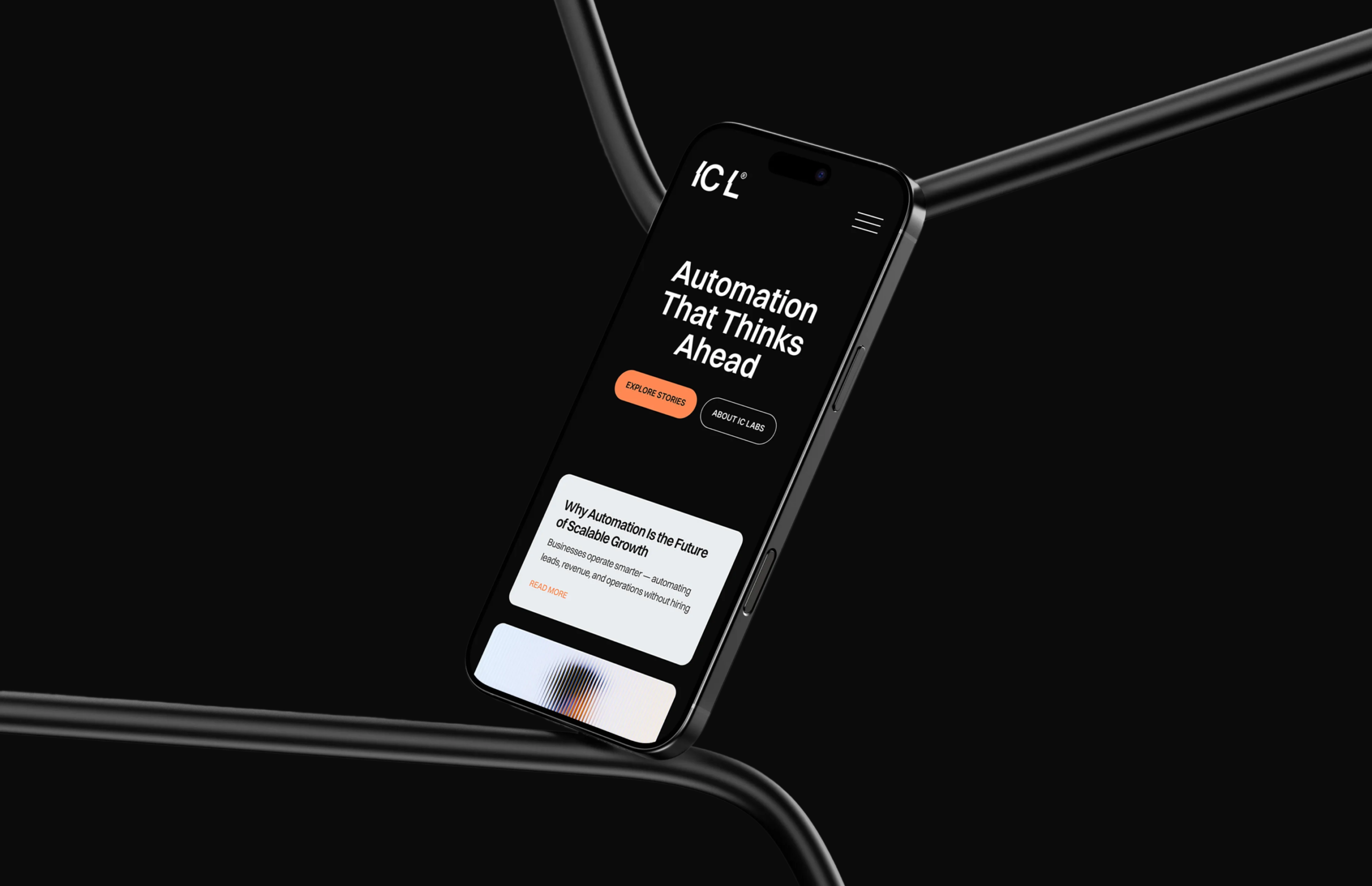
The IC Labs logo uses clean geometric typography with subtle structural modifications. The IC monogram acts as a compact brand symbol suitable for app icons, favicons, and digital interfaces, while the full IC Labs wordmark provides a strong corporate presence in marketing and product environments. The visual balance between the monogram and the wordmark allows the brand to function both as a product icon and a company identity, which is essential for SaaS ecosystems.
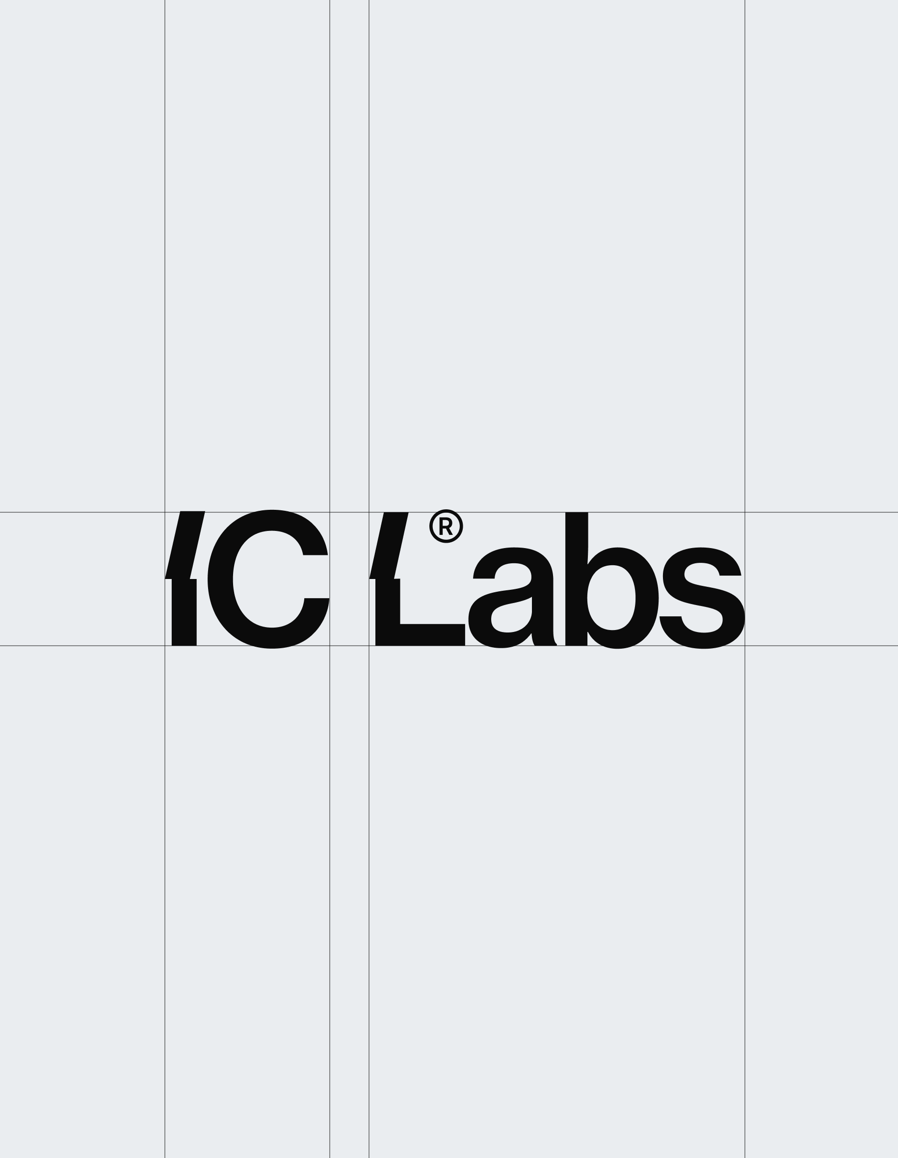
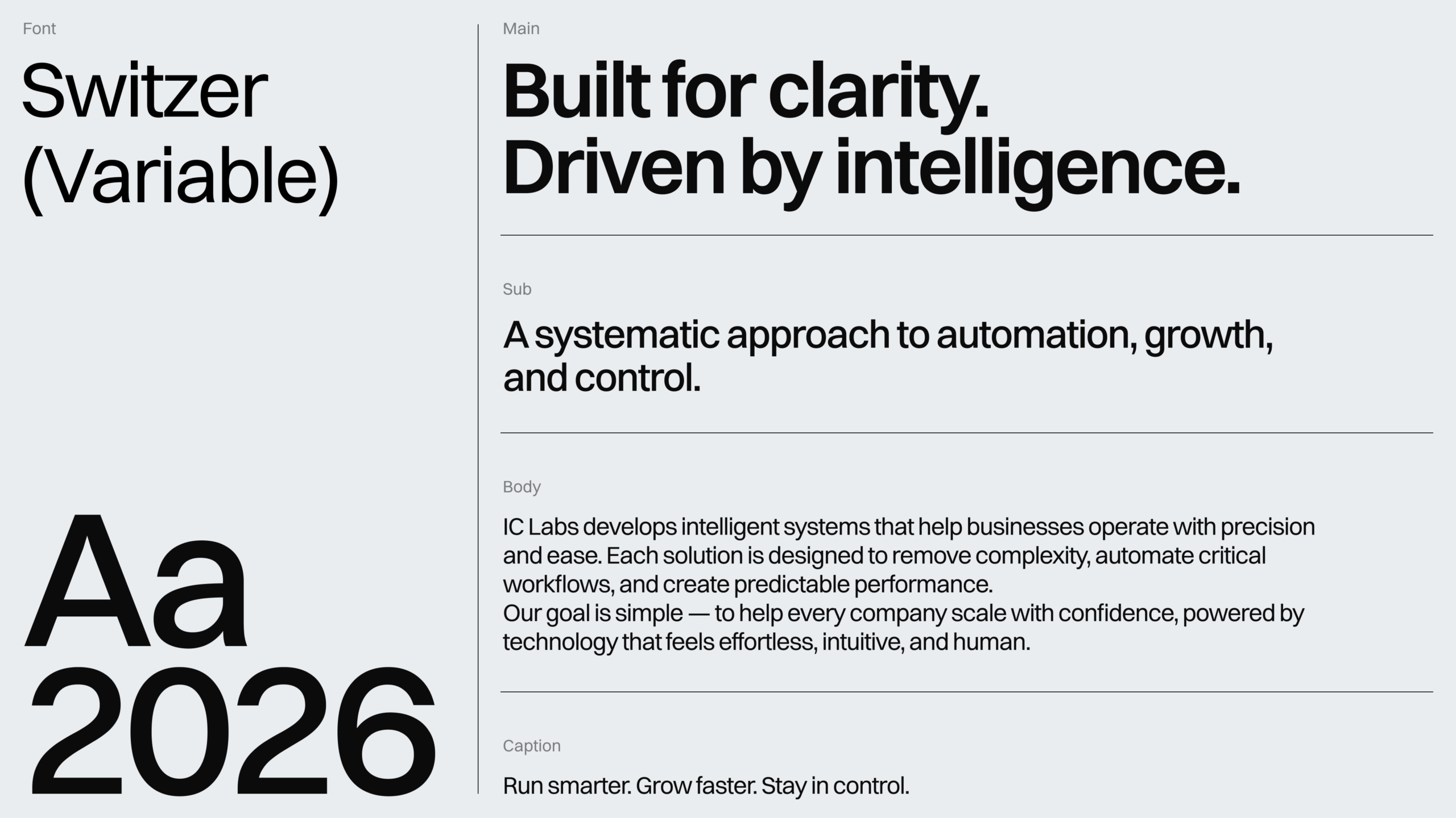
All visual elements were organized into a structured brand system that defines how the identity is used across platforms. The guidelines cover: Logo usage and clear space rules, Color system and gradient applications, Typography hierarchy, Background graphics and texture usage, Digital UI applications and layout balance. This ensures the IC Labs brand remains consistent whether used in marketing materials, product interfaces, or presentations.
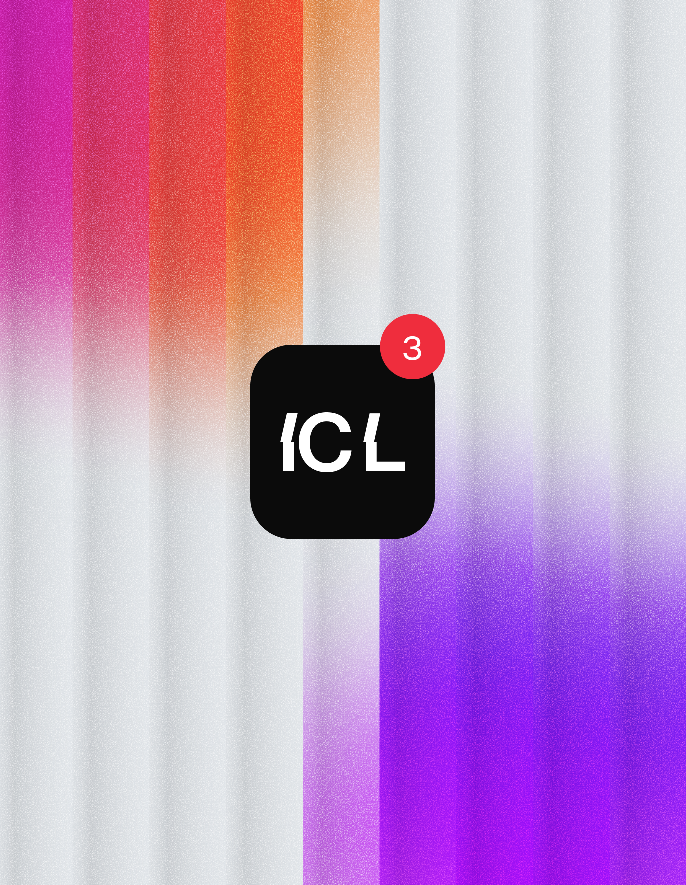
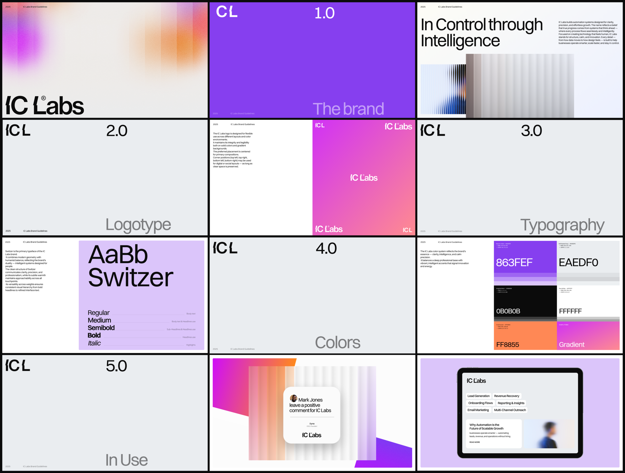
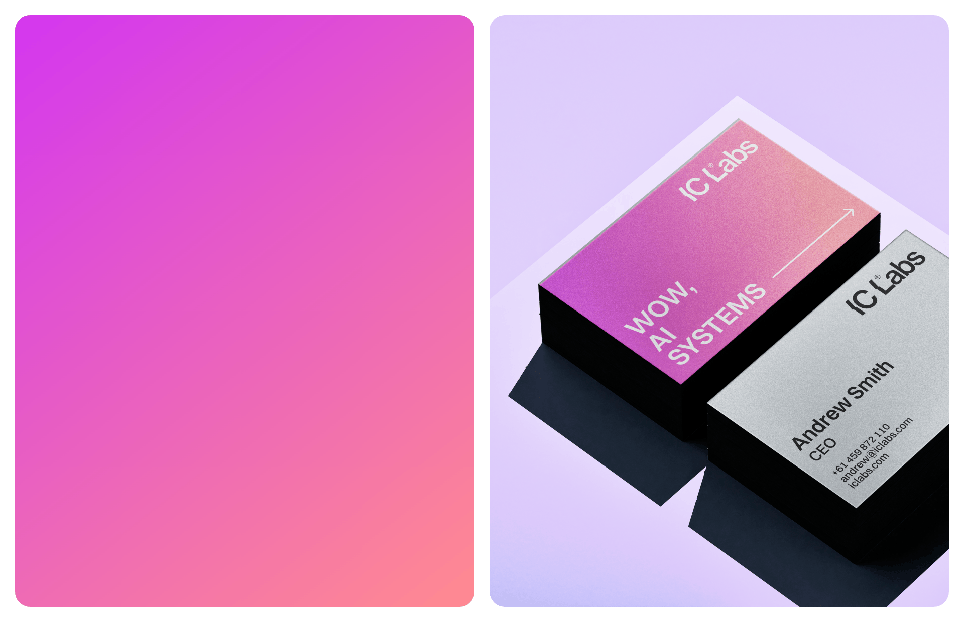
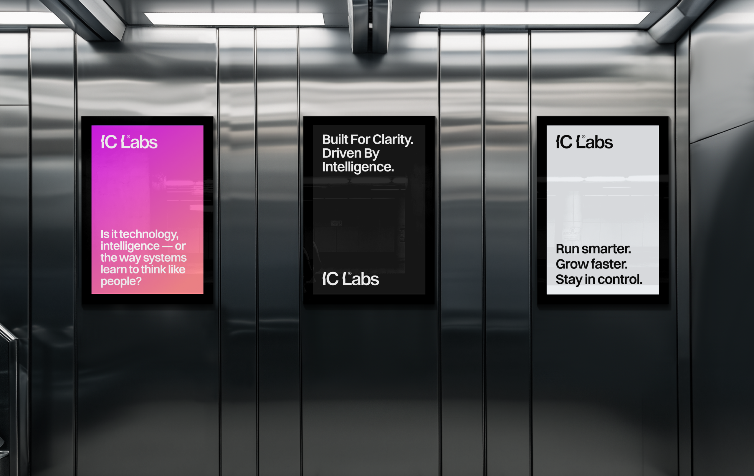
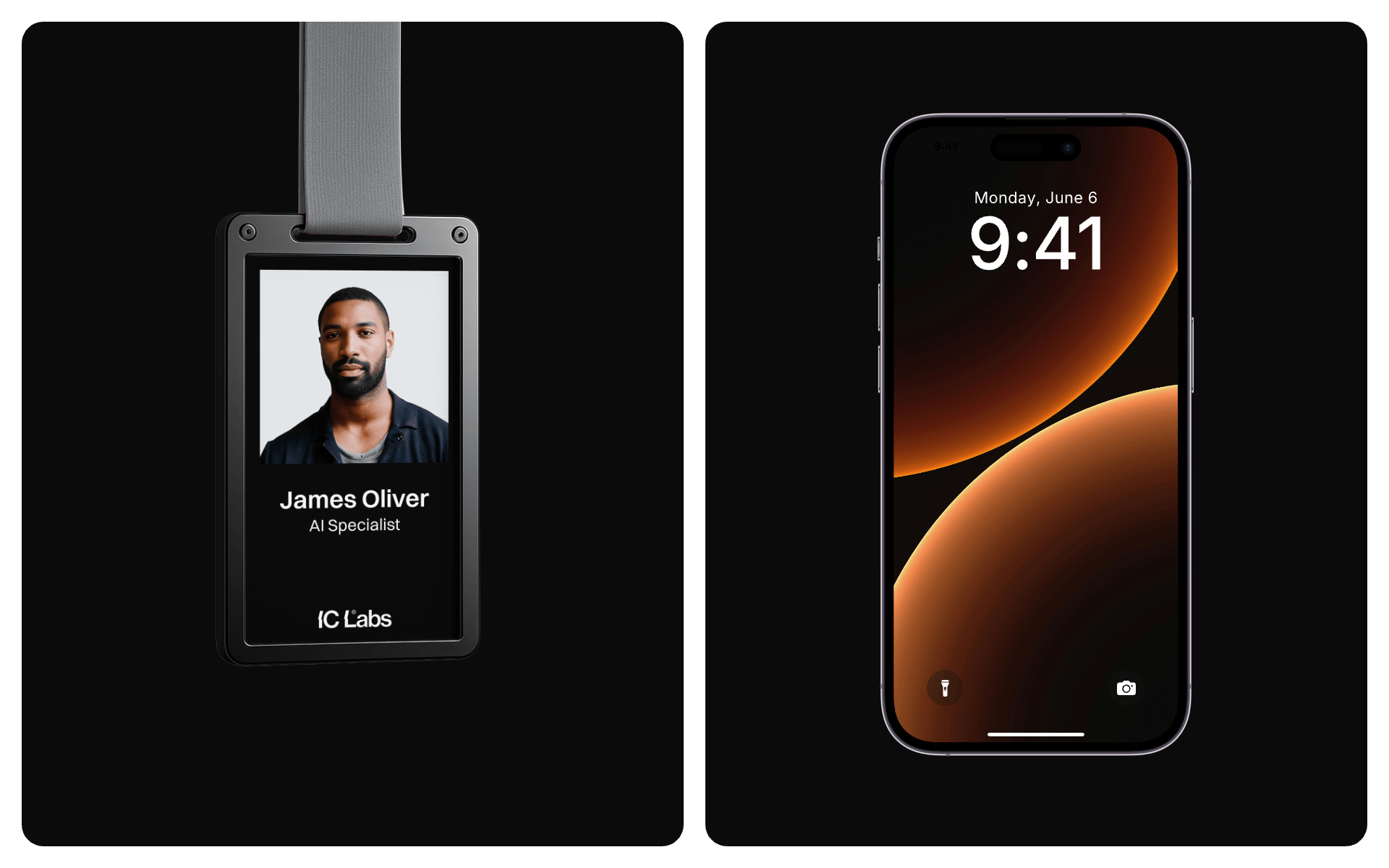

The identity system was designed to extend naturally into real-world applications. Examples include: Mobile app icon and interface usage, Business cards and corporate stationery, Presentation environments and conference screens, Annual reports and company documents. The gradient system plays a key role in these applications, allowing the brand to remain visually recognizable even when the logo is not the central element.
The IC Labs identity establishes a strong foundation for a modern AI automation platform. The final system communicates: Precision and intelligence through minimal typography, Innovation and motion through gradient-driven graphics, Trust and professionalism through a restrained, structured layout. The brand now presents IC Labs as a serious SaaS product built for growth-focused businesses, with a visual language that supports both marketing and product experiences. The result is a flexible identity system that can scale with the company as its automation platform and product ecosystem expand.
 BOOK A CALL
 has been sent successfully!
Our managers will contact you as soon as possible.