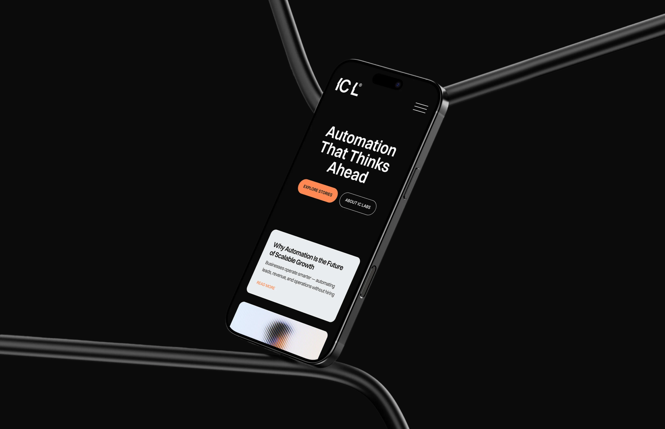
IC Labs is a next-generation AI automation company that develops intelligent systems designed to help small and medium-sized businesses operate more efficiently and scale without expanding their teams. The platform focuses on replacing repetitive operational work with automated processes that handle lead generation, customer follow-up, payment recovery, onboarding, invoicing, and reporting.
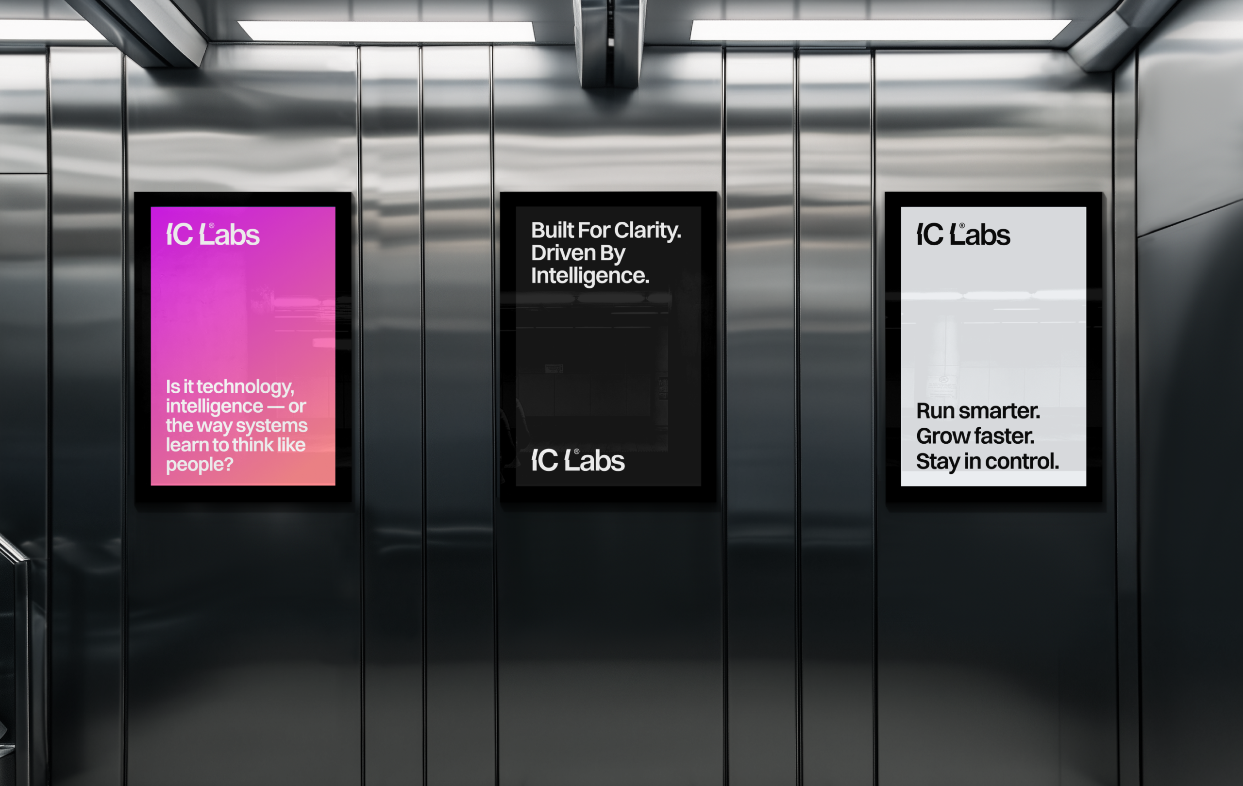
IC Labs is entering a competitive SaaS landscape where many AI and automation products appear visually similar, often relying on generic “tech” aesthetics or overly complex visual systems. To position the company as a serious and trustworthy platform, the brand needed to communicate intelligence, clarity, and operational confidence from the first interaction. The challenge was to create a visual identity that reflects advanced automation and data-driven systems while remaining calm, minimal, and professional. The brand had to feel sophisticated enough to stand alongside established SaaS companies, yet approachable for small and medium-sized businesses that rely on clarity and reliability when choosing operational tools.
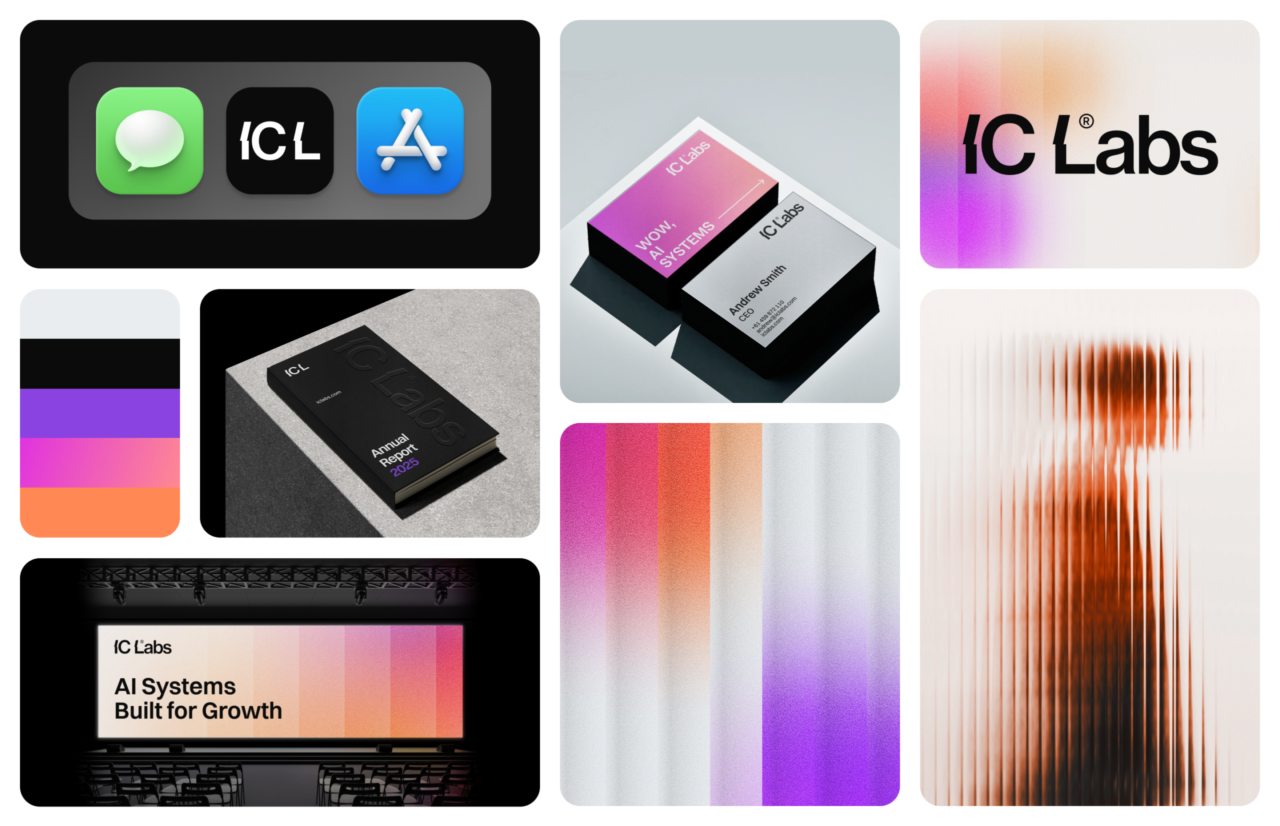
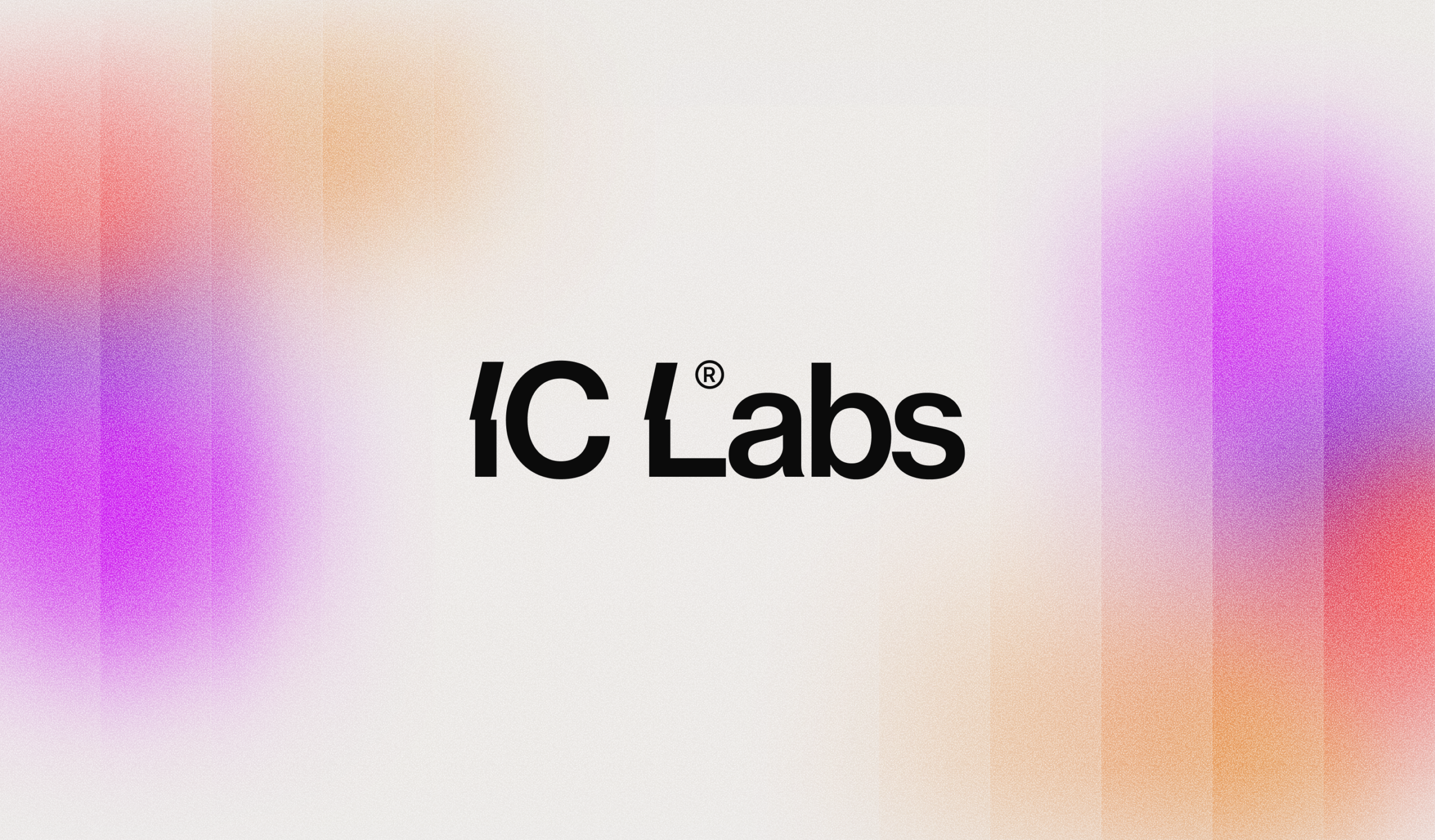
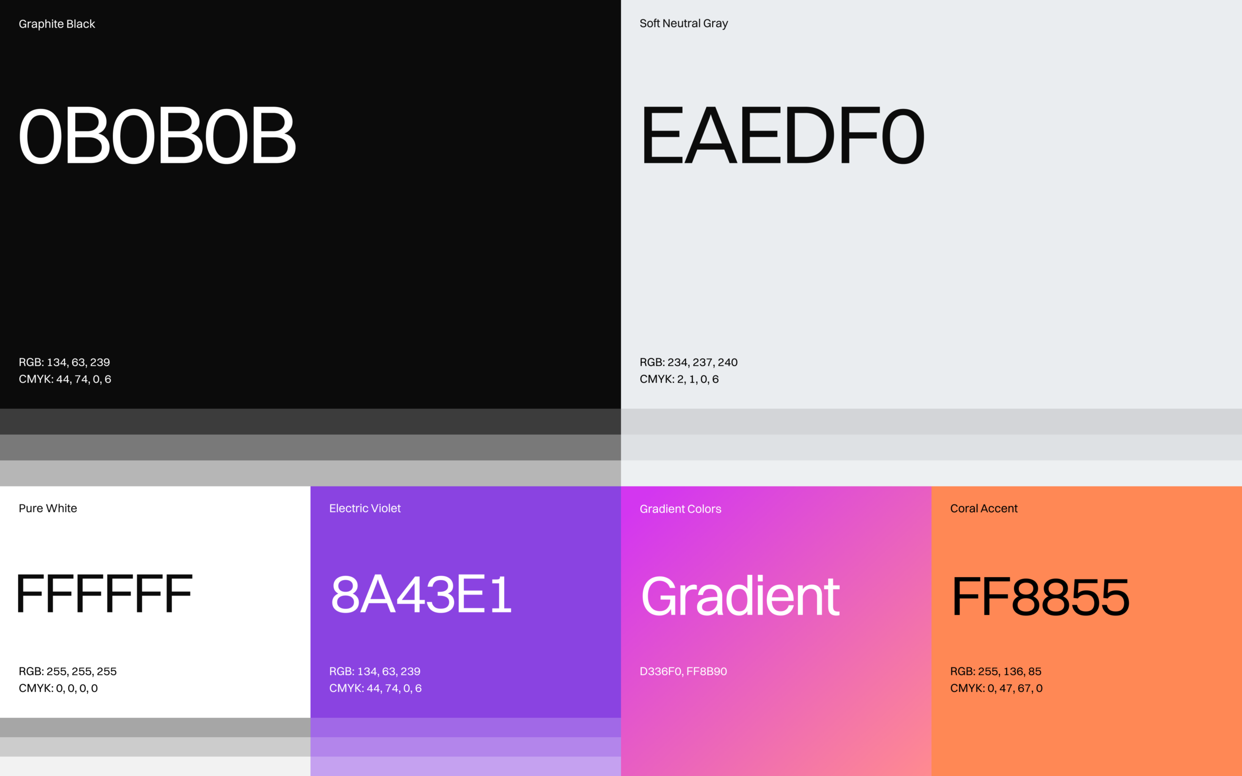
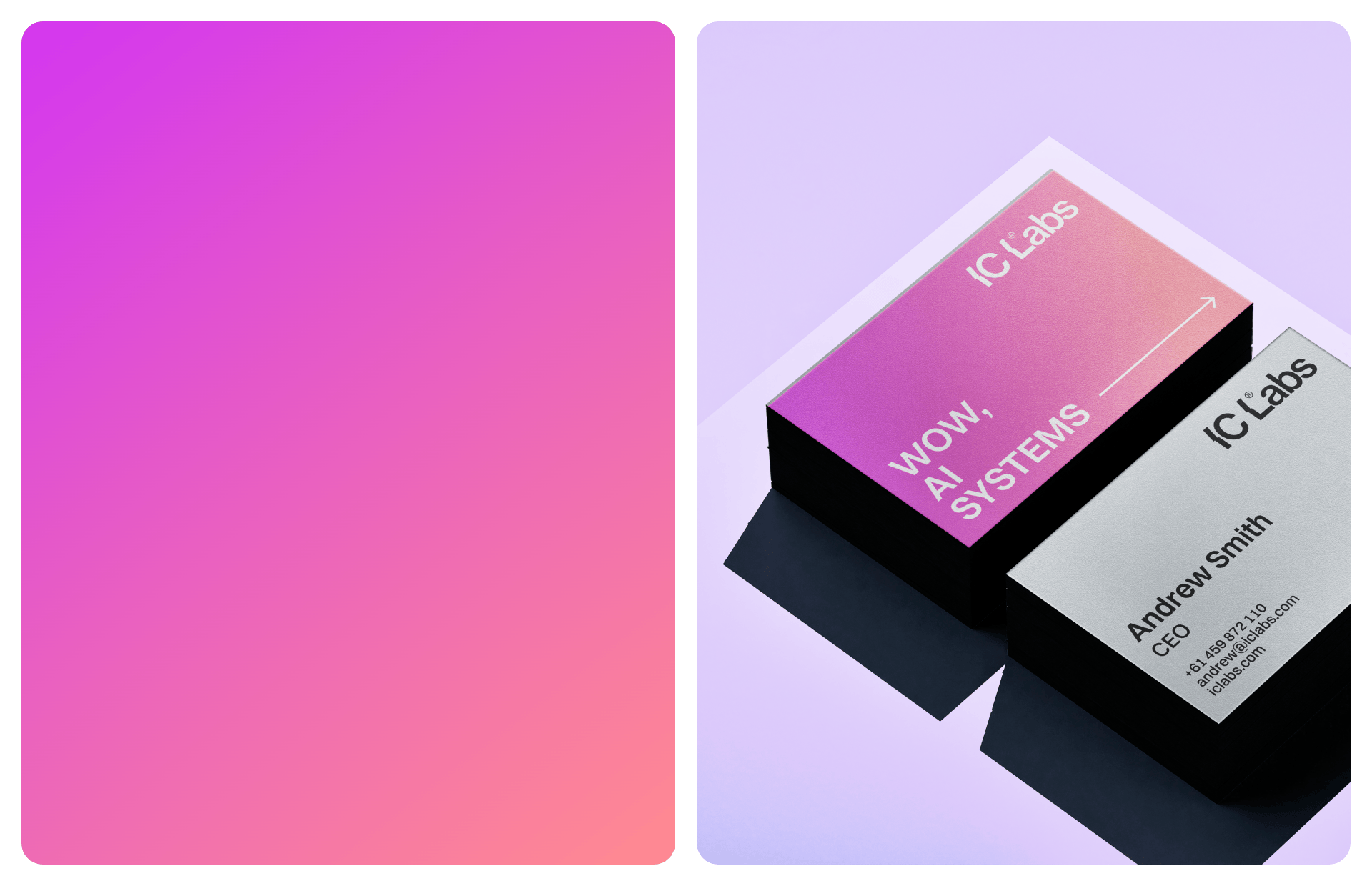
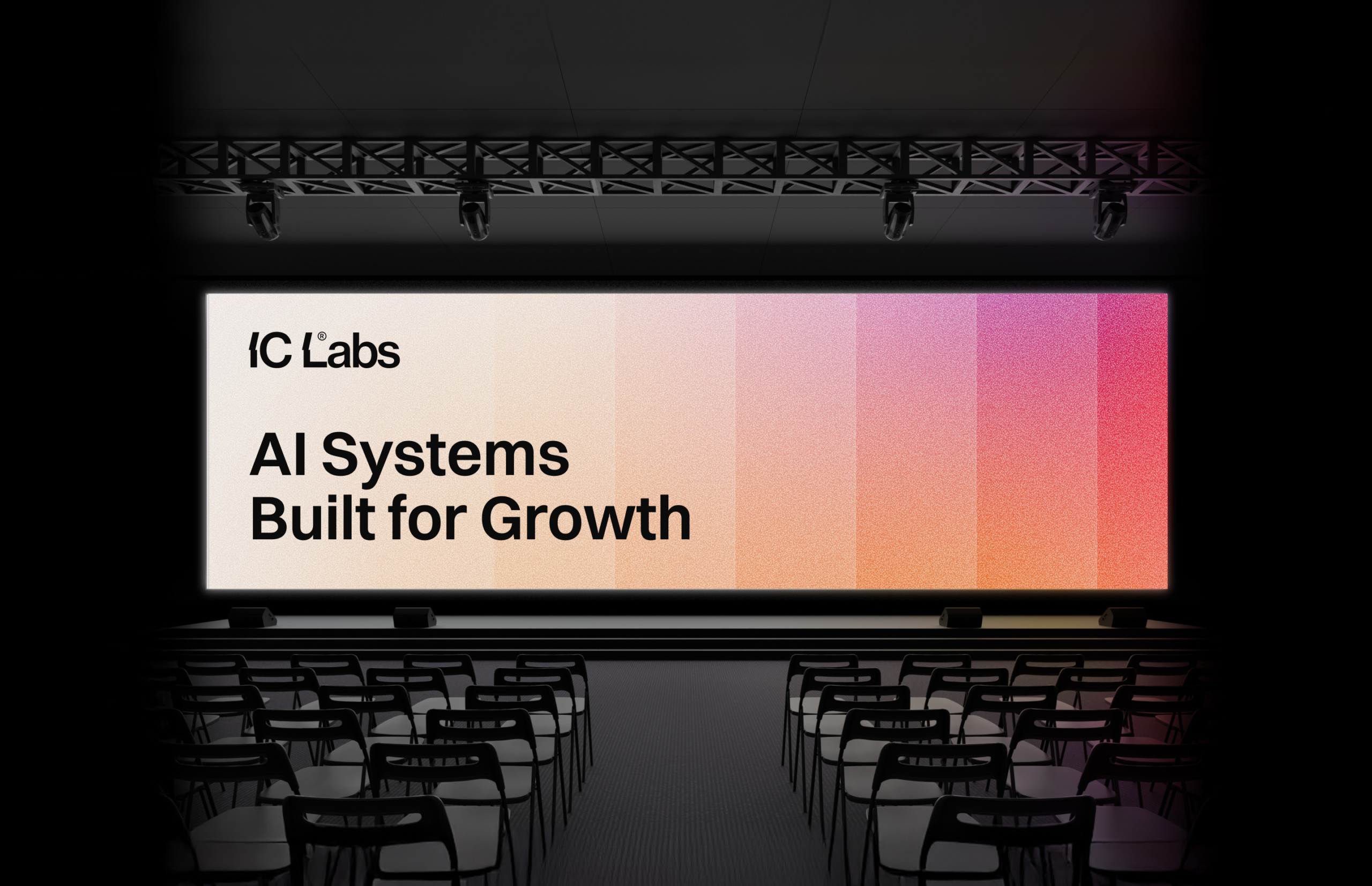
The color palette was designed to reflect the balance between precision, intelligence, and clarity that defines IC Labs. A foundation of deep Graphite Black and soft Neutral Gray establishes a calm and professional base, creating a visual environment that feels stable, reliable, and enterprise-ready. To introduce energy and technological character, Electric Violet is used as a primary accent color. This tone represents innovation, automation, and the advanced intelligence behind the platform’s systems. The gradient spectrum extending from violet to magenta adds depth and movement, visually referencing the flow of data, automation processes, and interconnected systems.
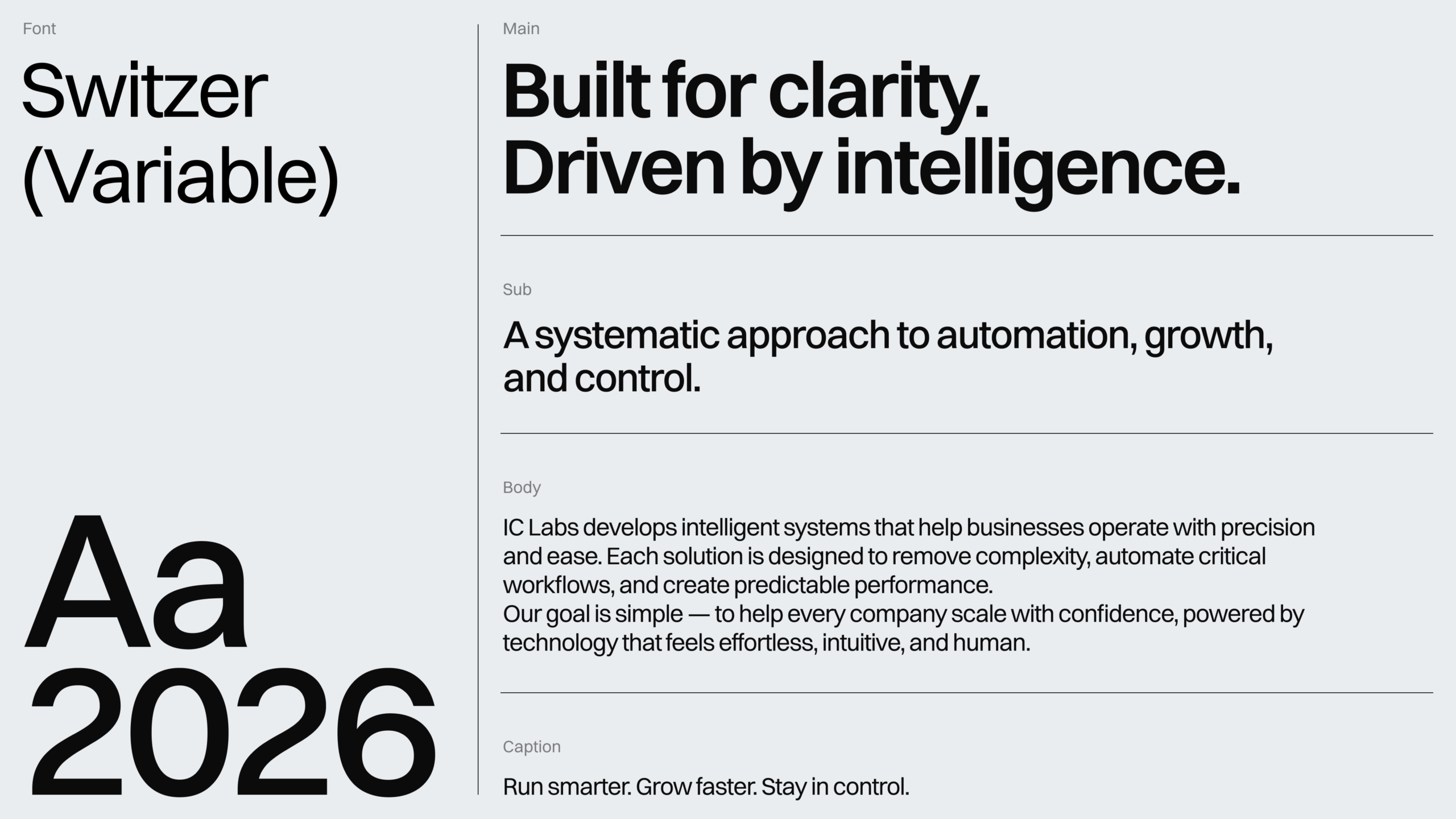
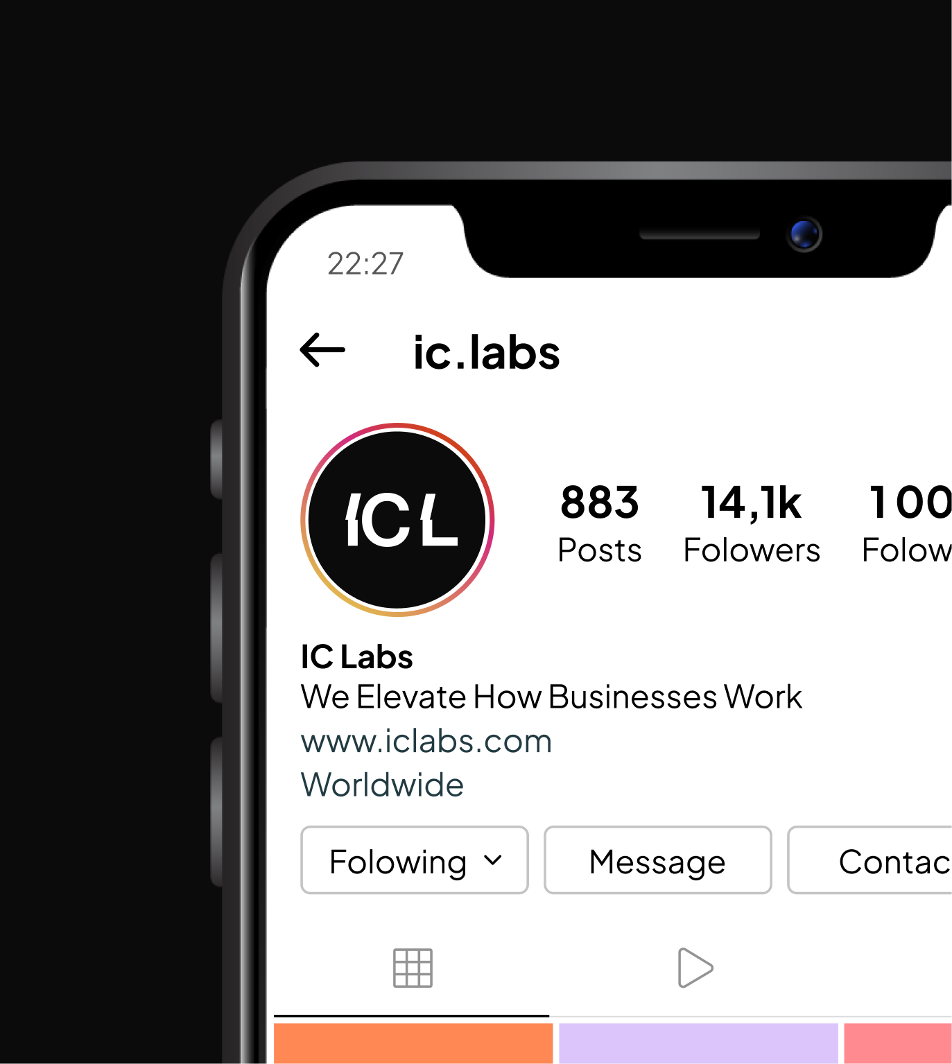
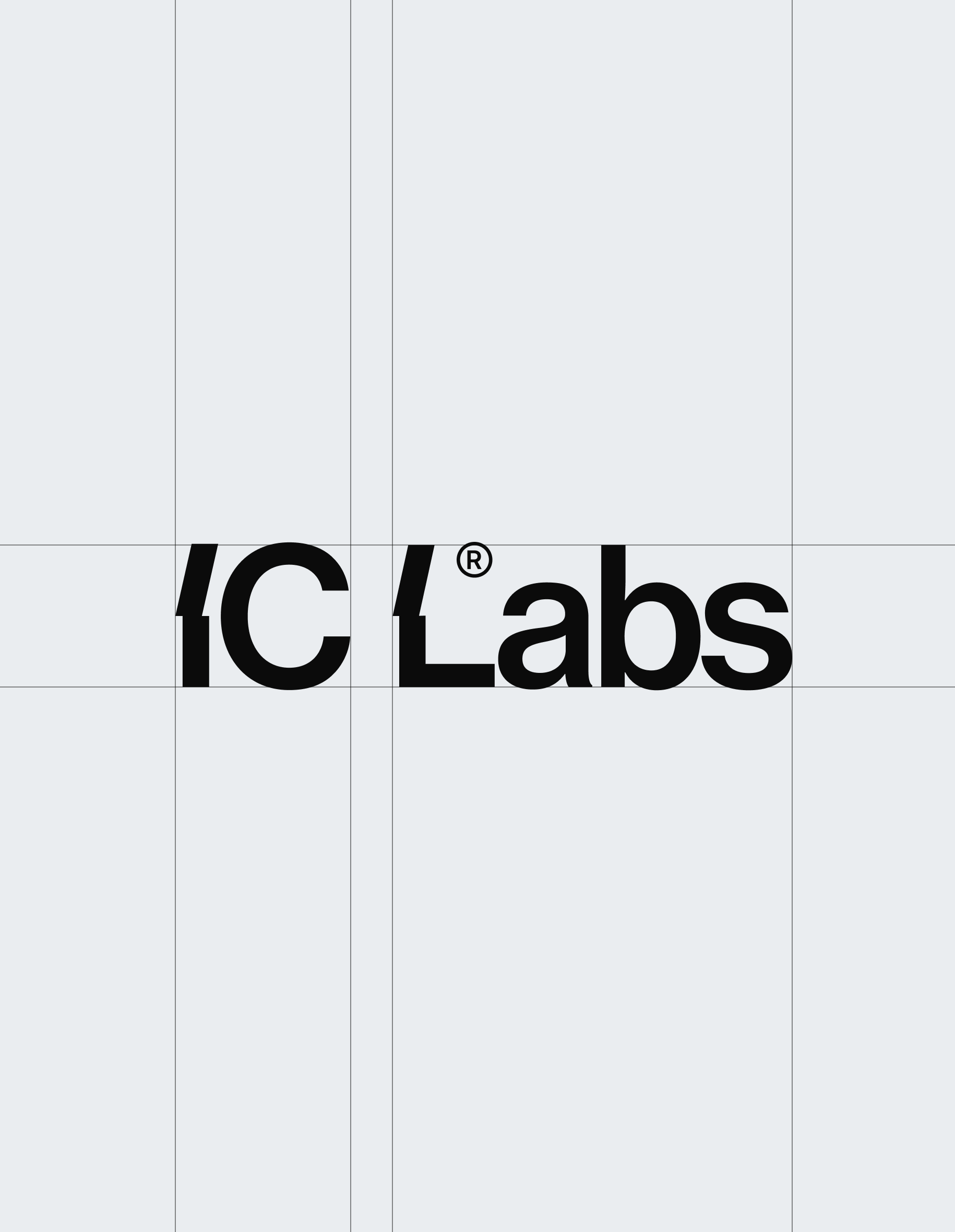
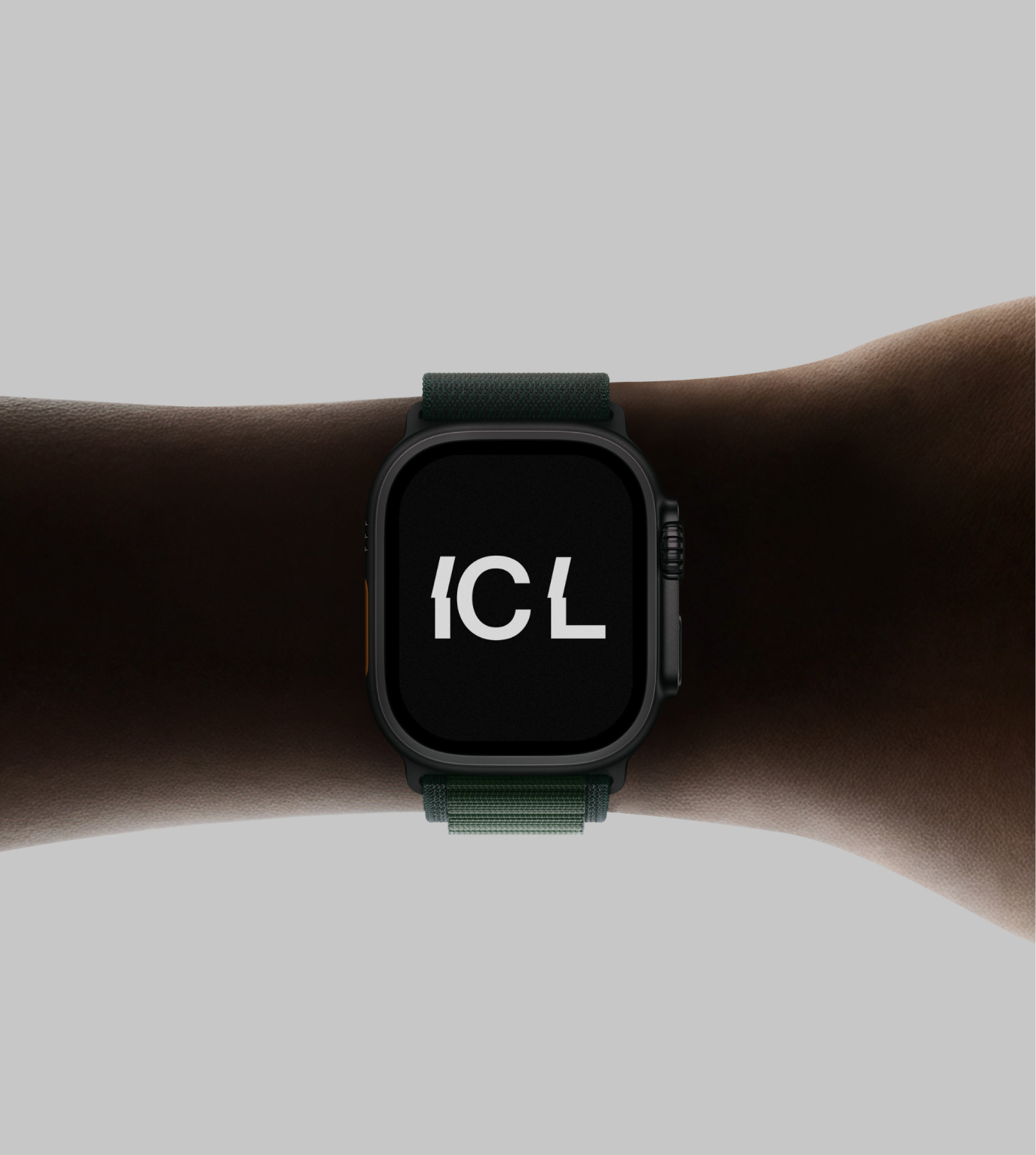
The IC Labs logo was designed with a focus on clarity, balance, and modern SaaS precision. The wordmark uses a clean geometric structure that reflects the company’s system-driven approach and emphasis on intelligent automation. Careful attention was given to spacing and proportions to ensure the logo feels stable, minimal, and highly legible across digital environments. Its restrained form allows the brand to appear confident and professional while remaining flexible for use across product interfaces, dashboards, and marketing materials.
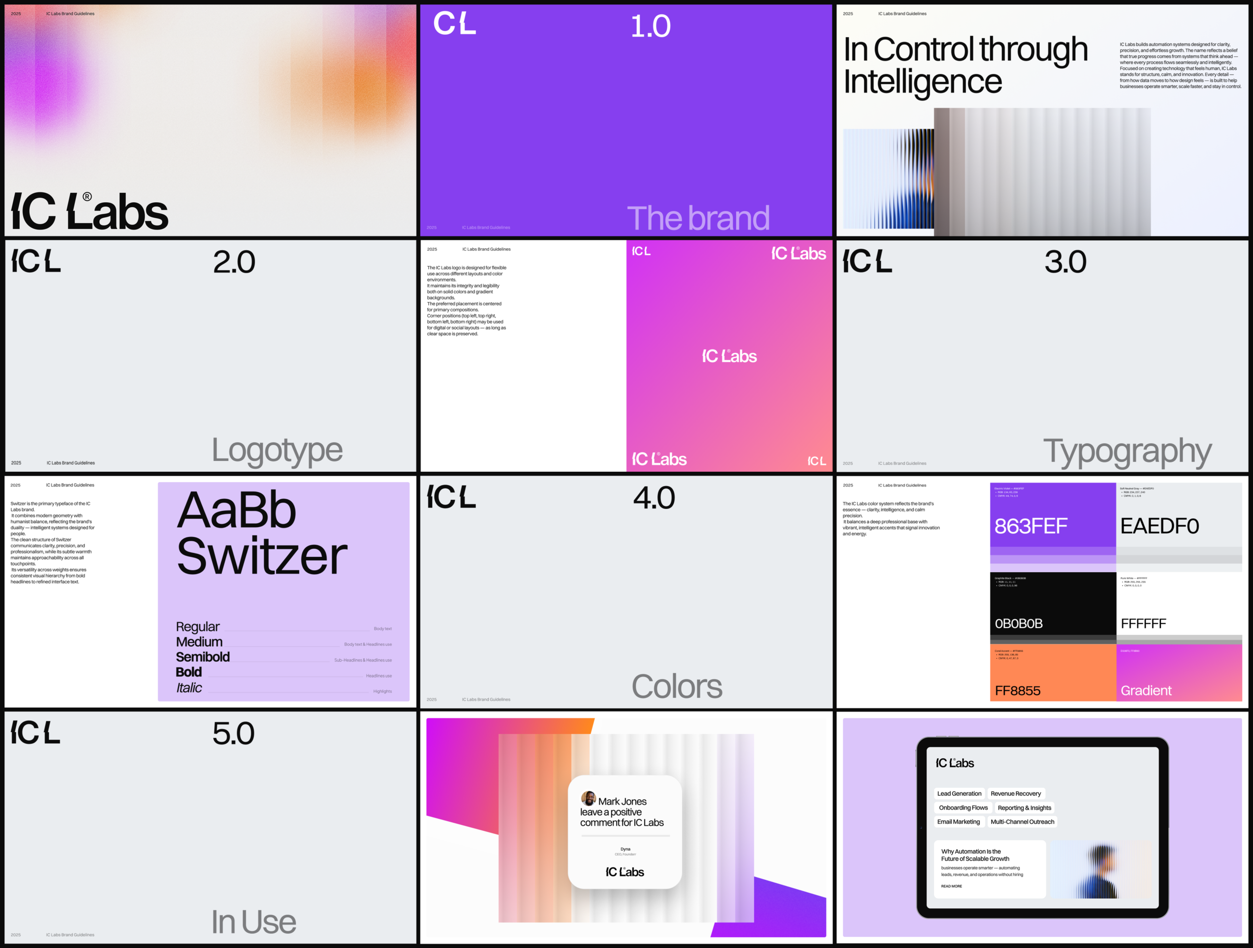

The IC Labs design system was developed to create a cohesive visual framework that supports the brand across digital products, marketing materials, and future platform expansion. Built around principles of clarity, modularity, and precision, the system ensures that every element — from typography and color usage to layout structure and interface components — works together in a consistent and scalable way.
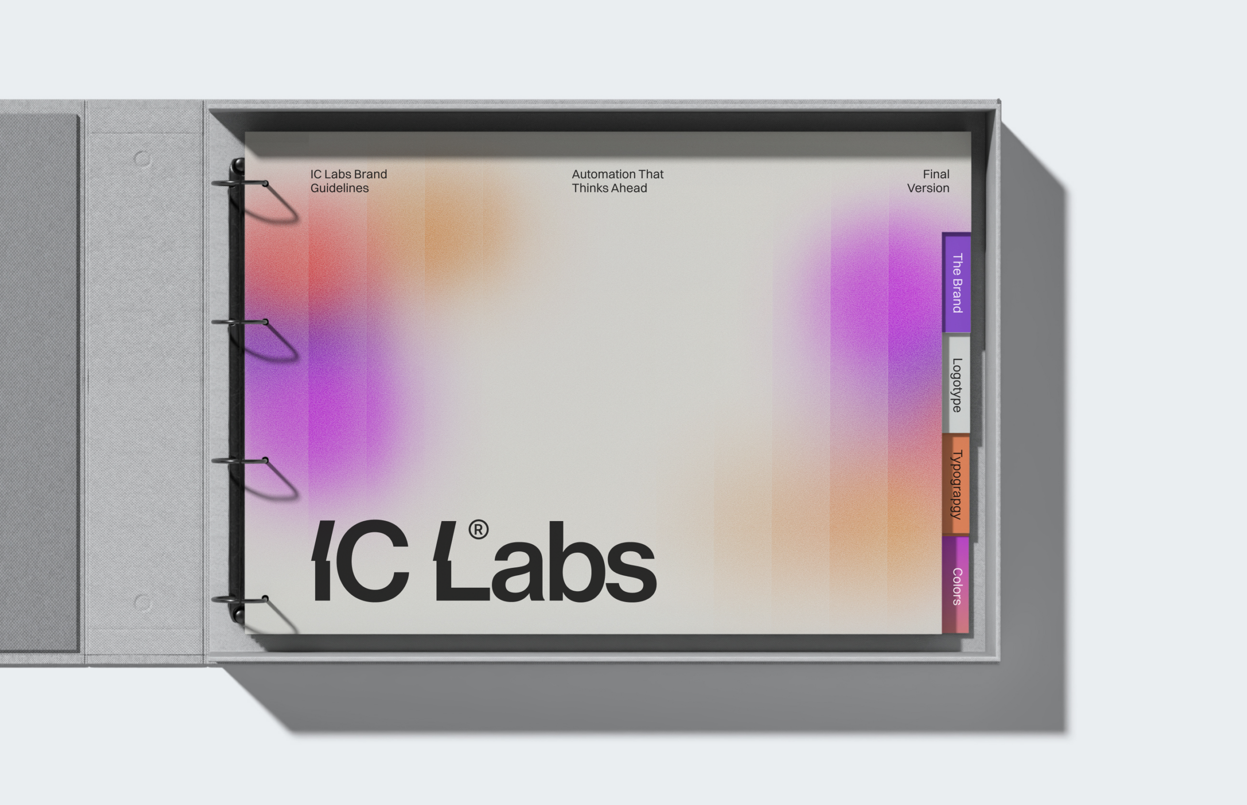
The system introduces a structured visual language where gradients, spacing, and typography interact to create a sense of flow and intelligent simplicity. This approach reflects the core idea behind IC Labs: automation systems that operate smoothly in the background while maintaining clarity and control for the user. By establishing clear visual rules and component guidelines, the design system enables the brand to remain consistent across website pages, product interfaces, dashboards, and communication materials. The result is a flexible yet disciplined framework that allows IC Labs to grow its product ecosystem while maintaining a recognizable and professional visual identit
 BOOK A CALL
 has been sent successfully!
Our managers will contact you as soon as possible.