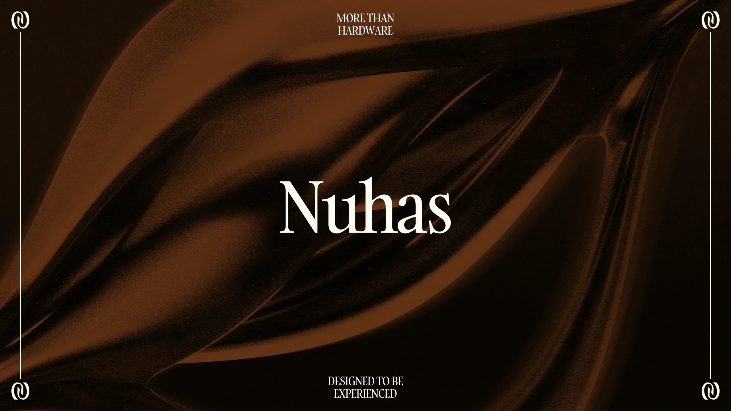
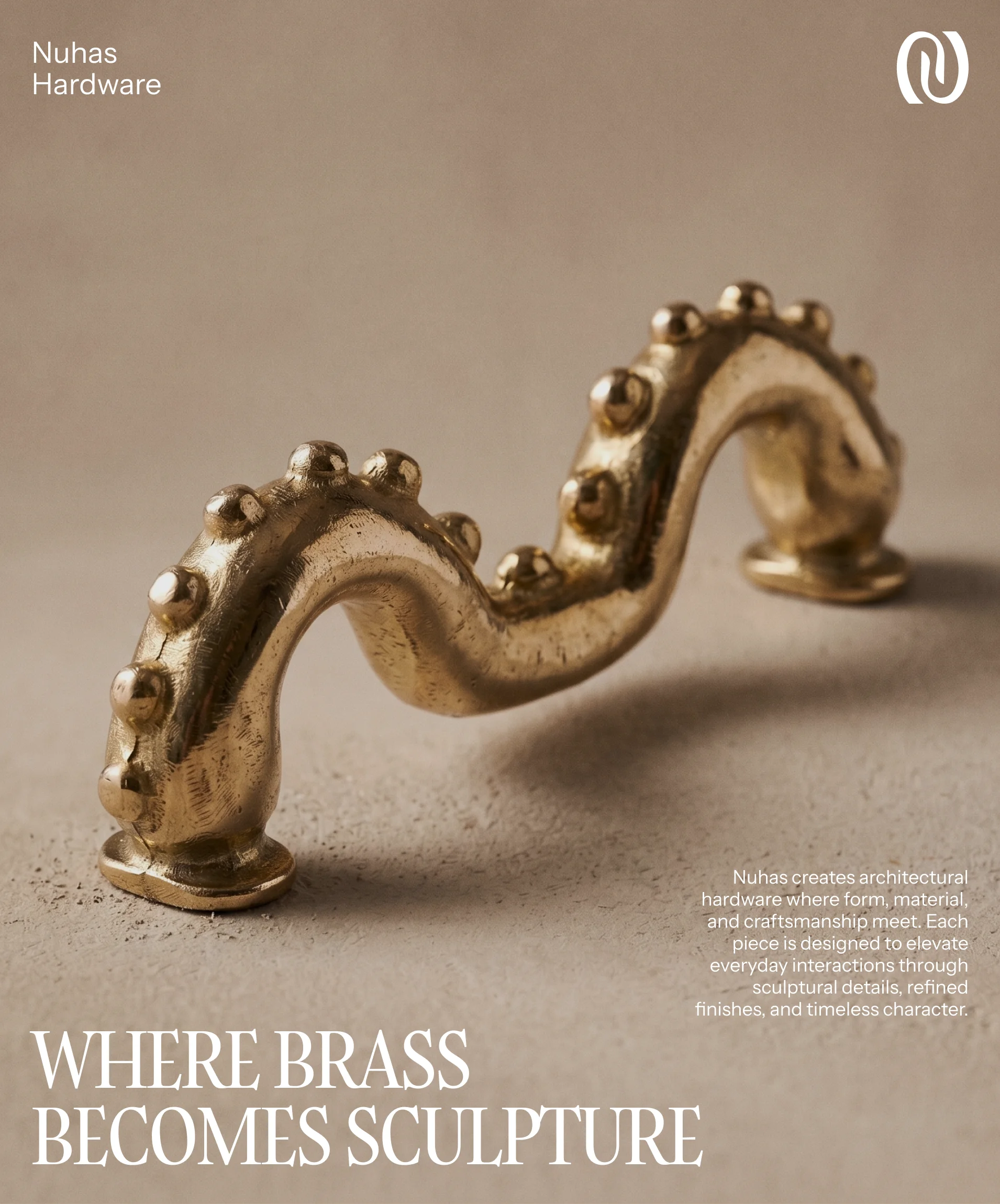
Nuhas is a contemporary design house that transforms architectural hardware into collectible design objects. Defined by strong forms, honest materials, and precise craftsmanship, the brand treats every piece as a lasting visual and tactile experience rather than a purely functional item. Operating in the luxury architectural space, Nuhas offers curated brass collections while expanding into furniture, lighting, and creative collaborations.
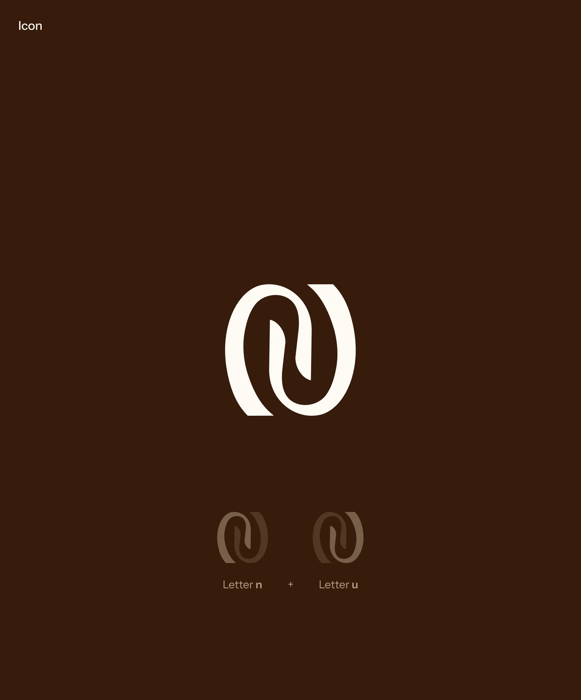
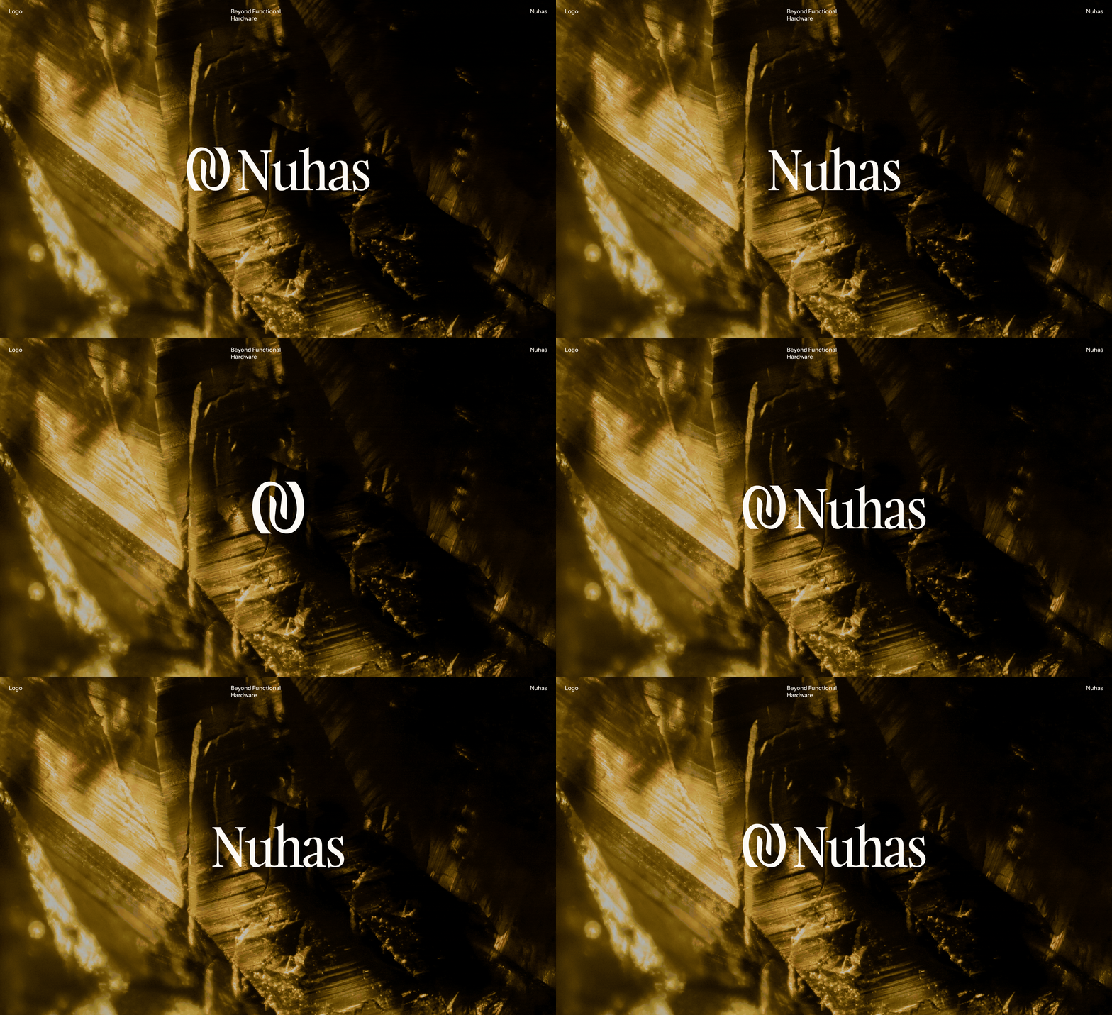
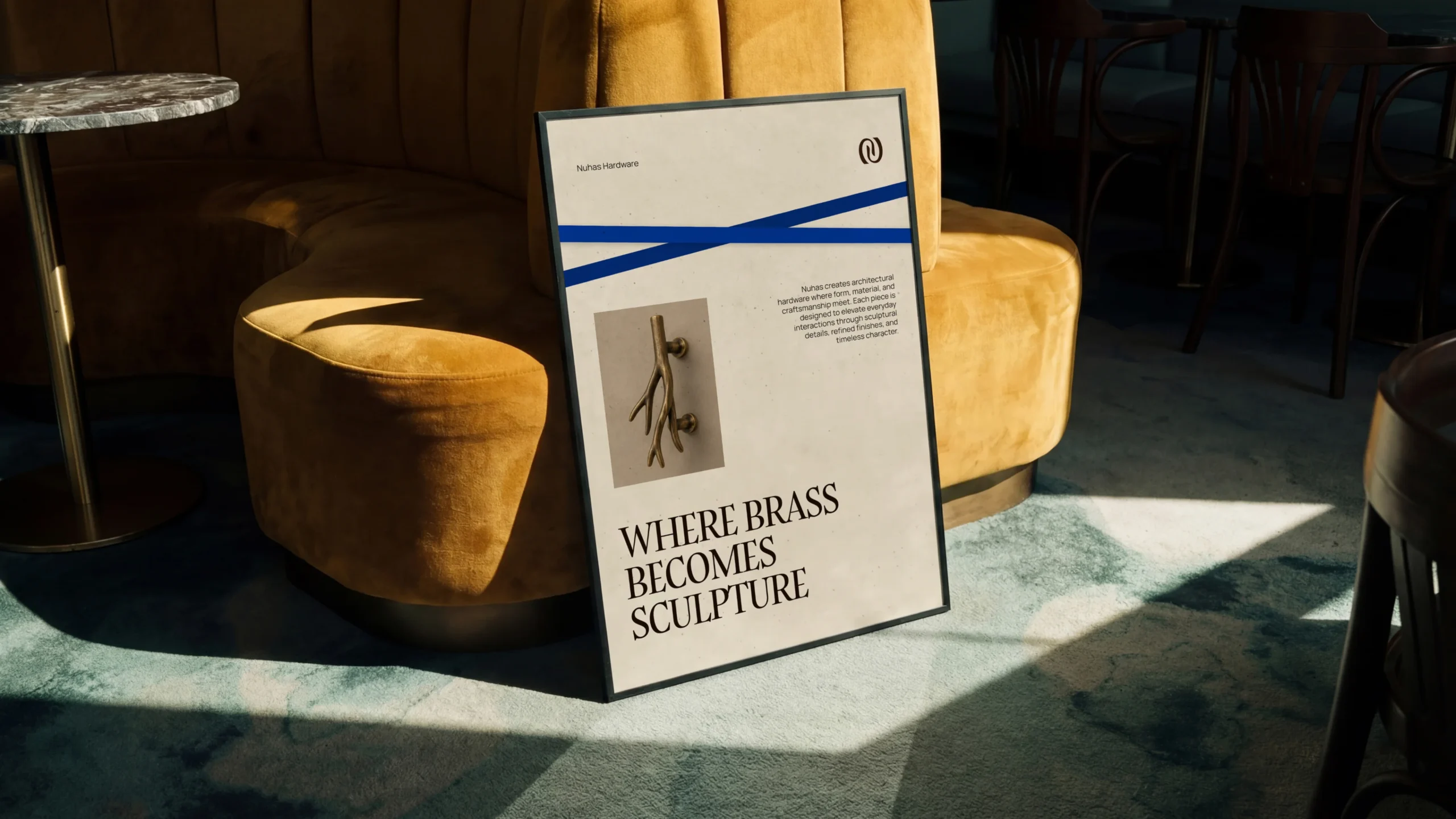
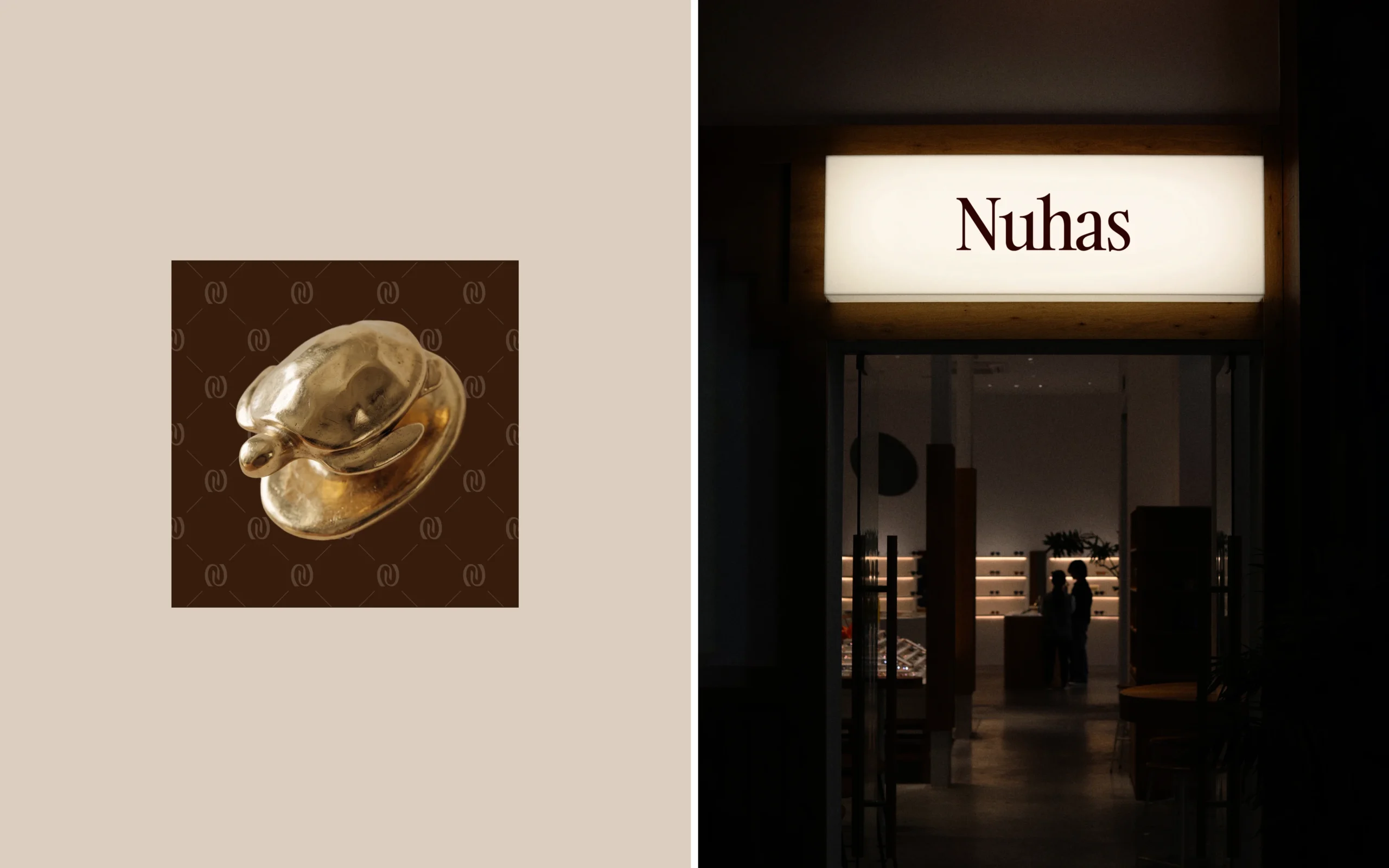
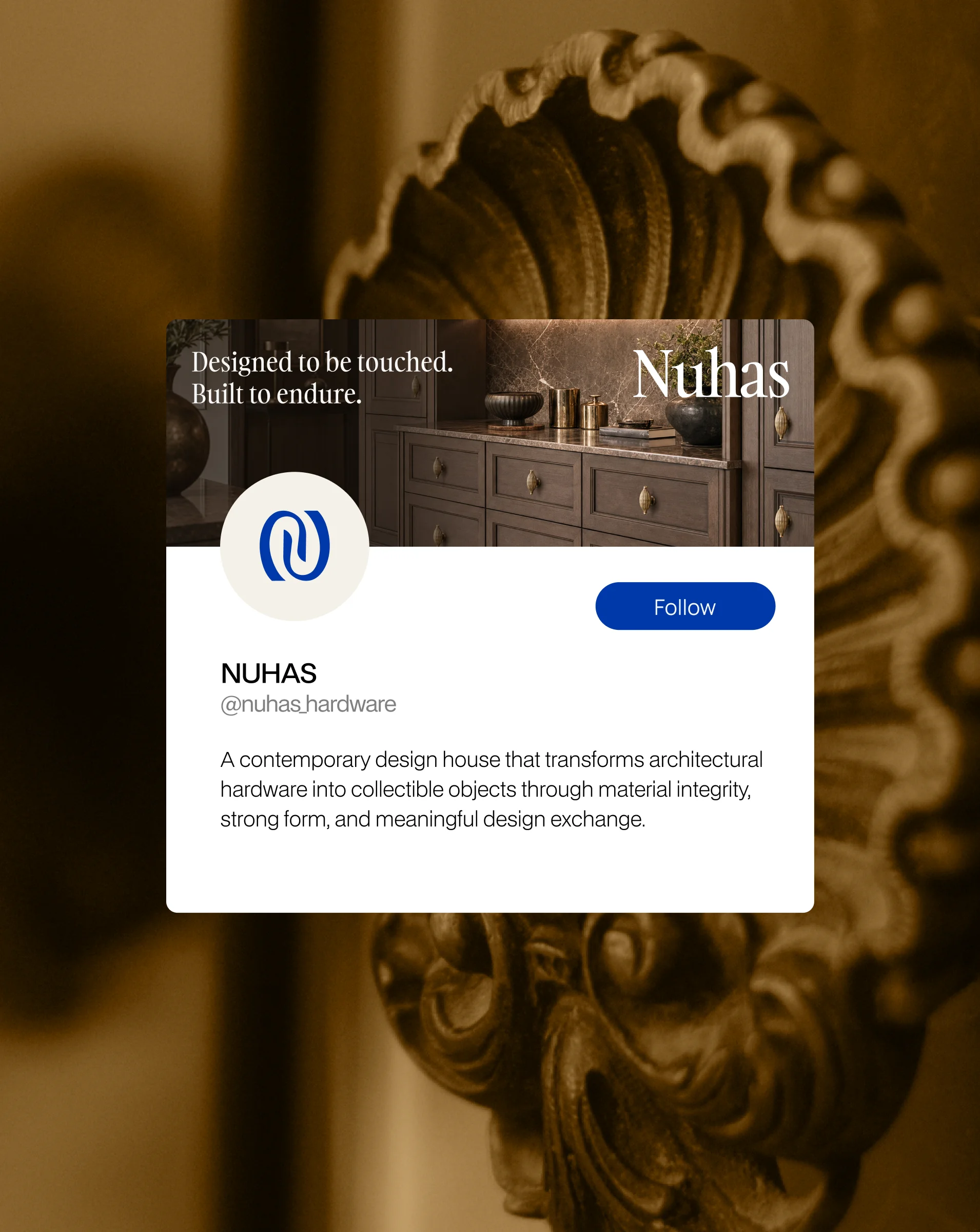
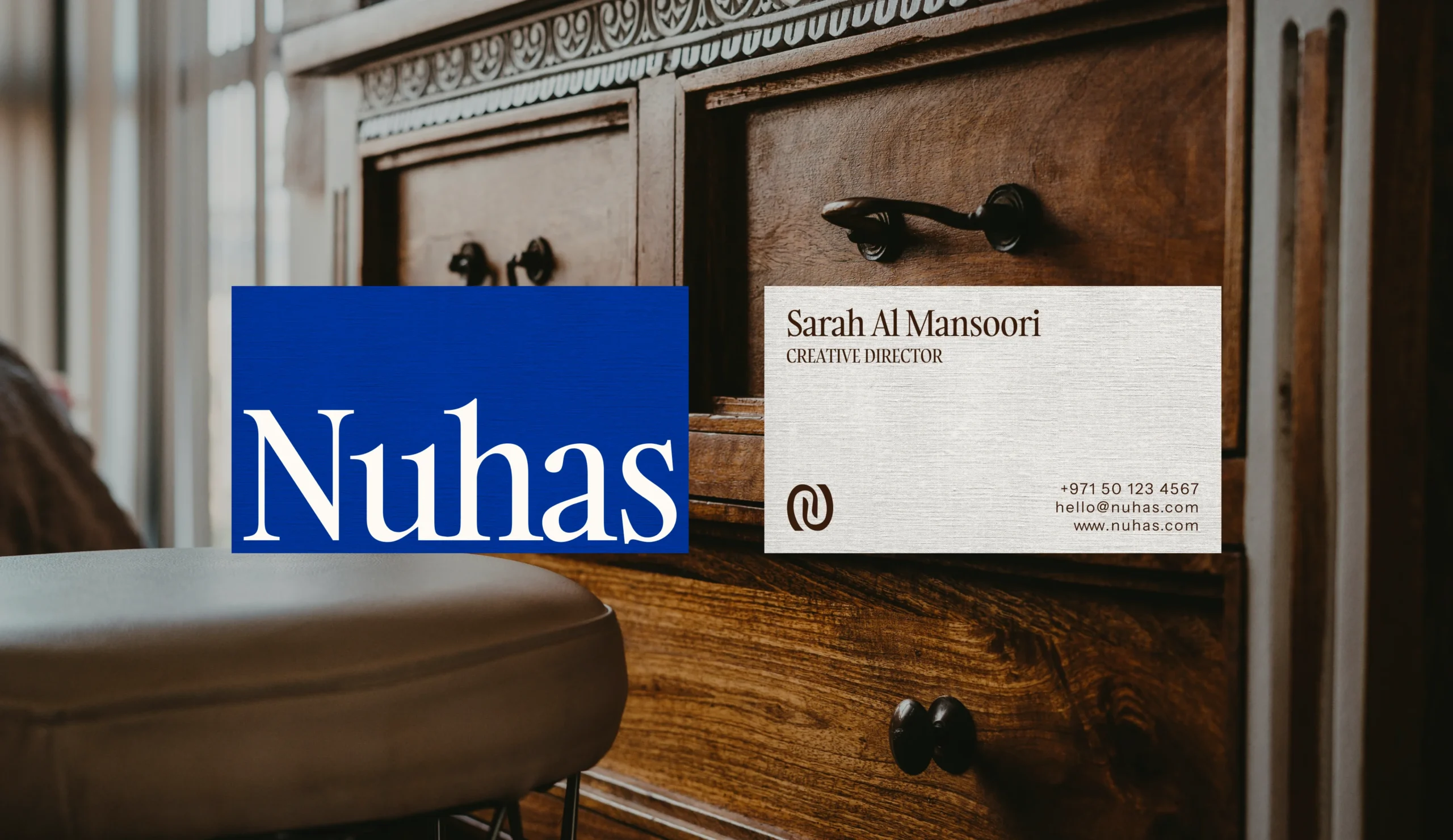
The logo and visual system are built around high aesthetic contrast, spatial balance, and sculptural elegance. The primary logotype features a high-contrast serif font with sharp, clean letterforms that embody quiet luxury and timeless authority. It is paired with an organic, fluid monogram mark that mimics the smooth curves and tactile silhouettes of physical brass hardware. The mark functions as a standalone icon or alongside the logotype, maintaining strong legibility and visual weight across dark, light, and textured backgrounds. Designed for total visual consistency, the identity scales effortlessly across digital platforms, metal hardware engravings, debossed packaging, and printed visual guidelines.
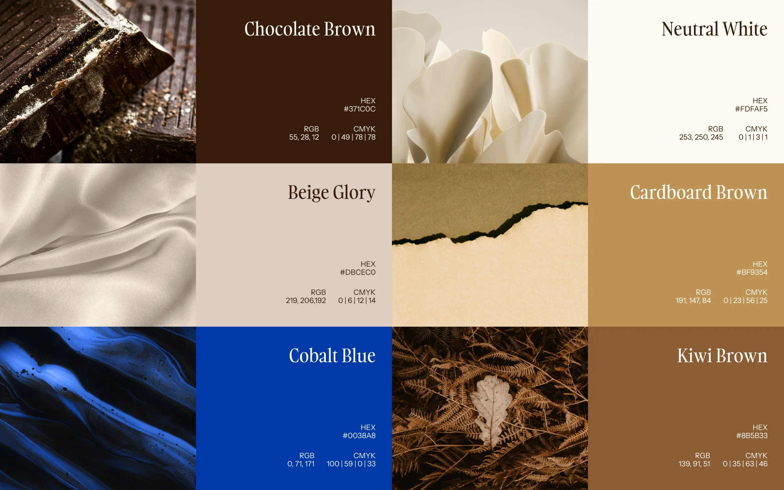
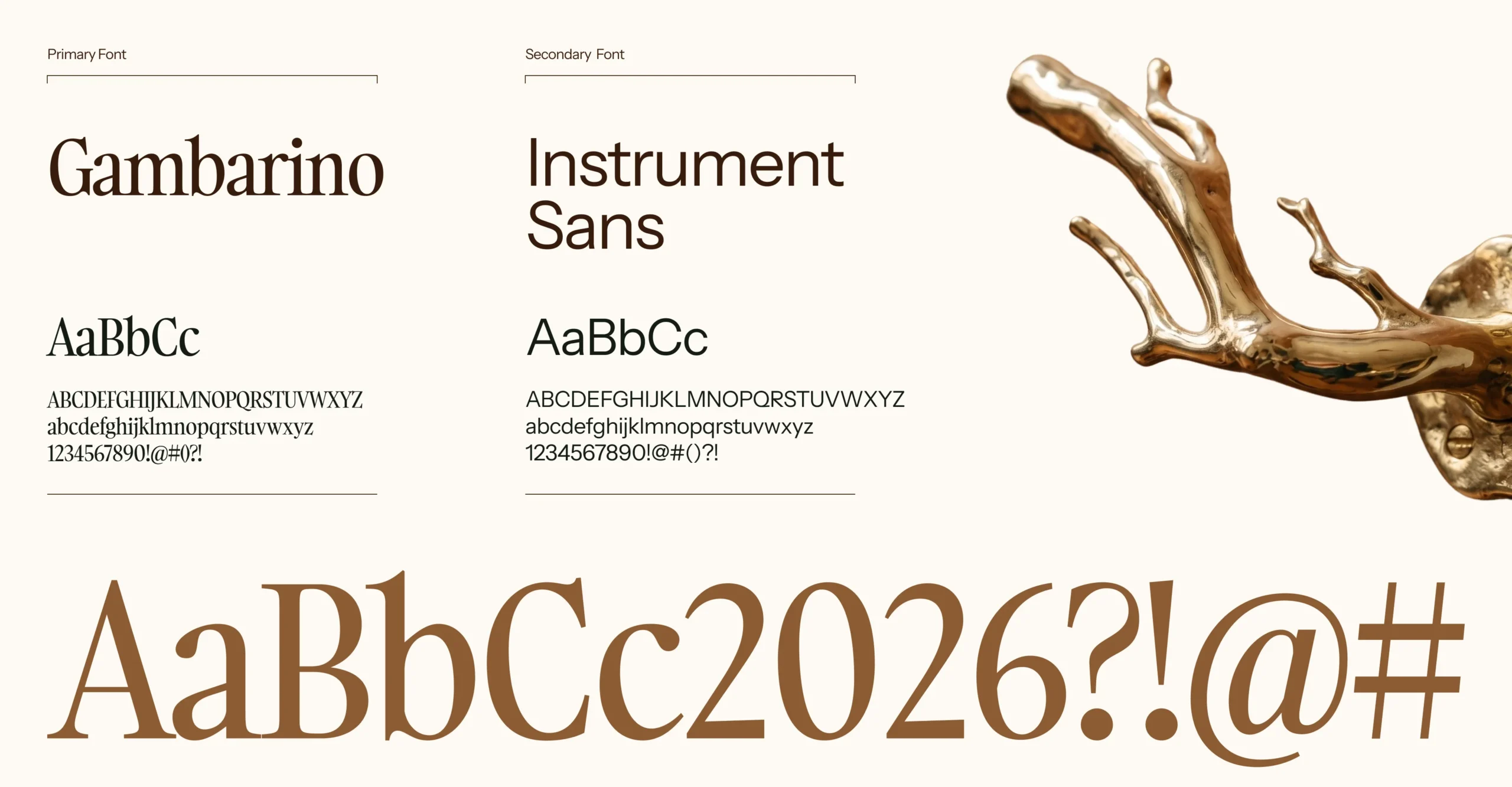
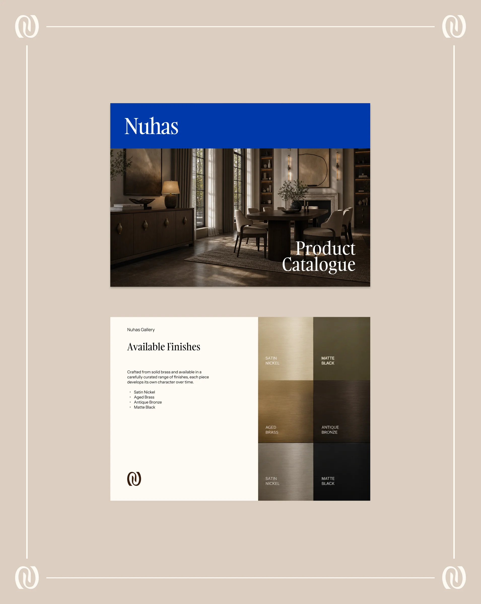
The color system draws from natural patinas, timber, and architectural materiality. Grounded tones of Chocolate Brown, Kiwi Brown, Beige Glory, and Cardboard Brown are balanced with Neutral White, while Cobalt Blue provides a high-contrast contemporary accent across print and digital platforms. The typographic system pairs Gambarino as the primary display serif typeface for headings and editorial statements with Instrument Sans for clean, functional body text, interface elements, and product specifications.
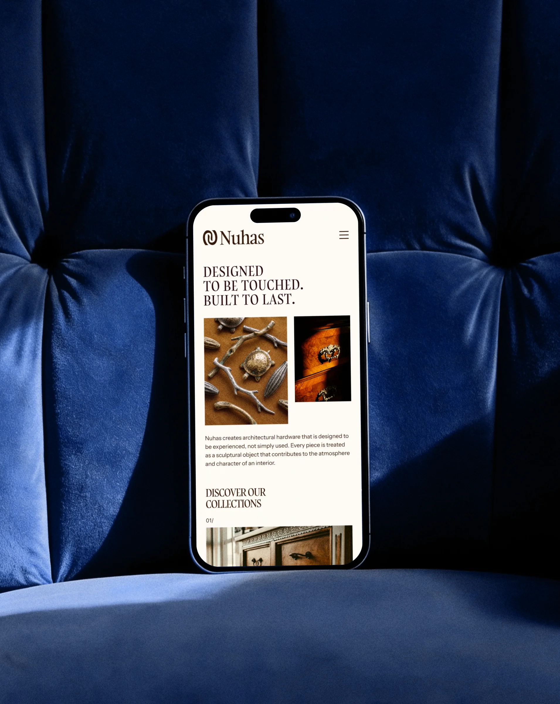
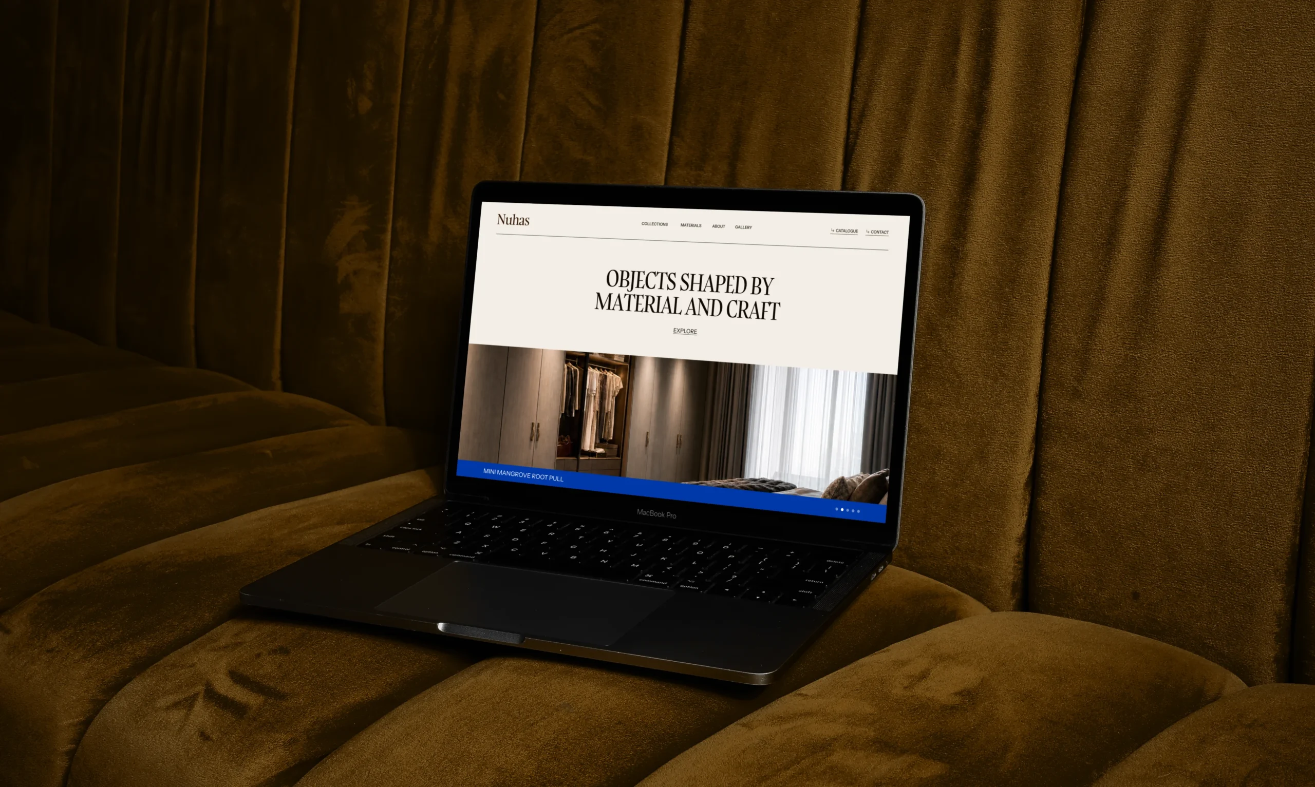
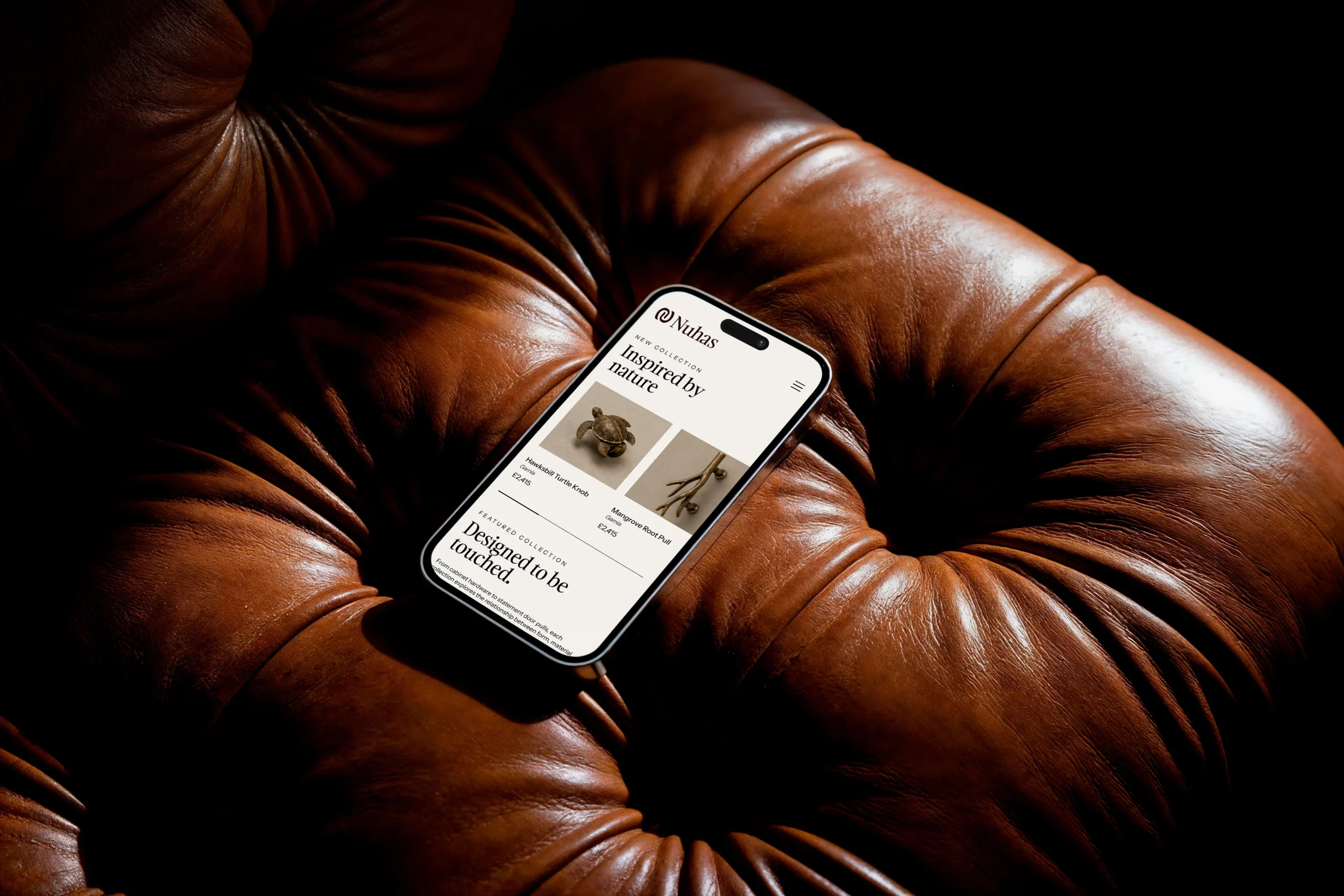
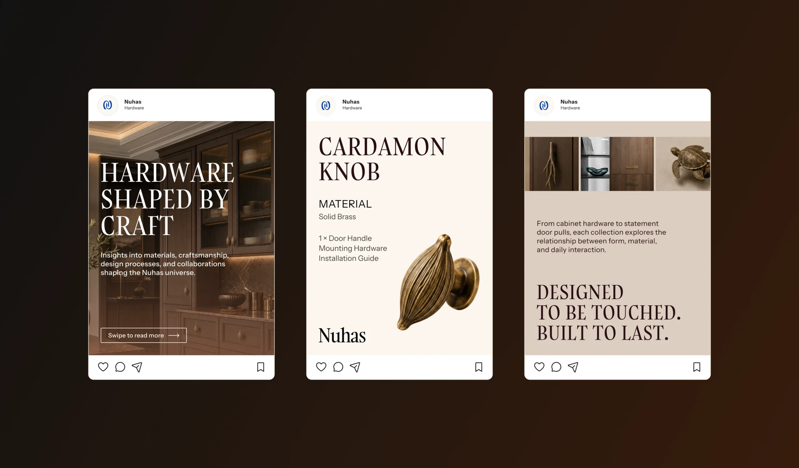
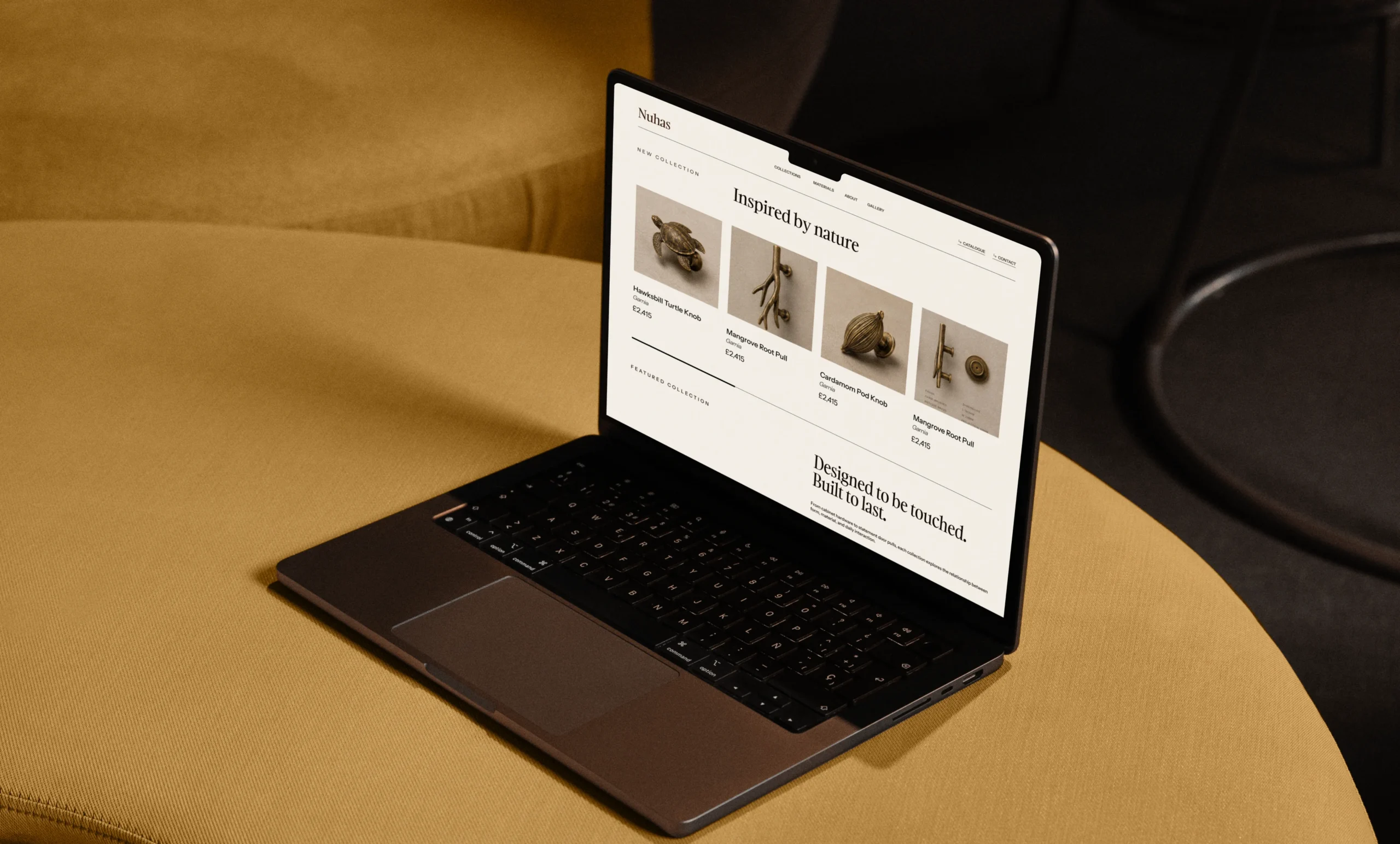
The digital identity translates the brand's tactile aesthetic into responsive web and mobile environments. Layouts feature generous spatial margins, rich imagery, and dark, atmospheric background elements that elevate hardware items into museum-grade art objects. The system maintains consistent grid structures and readable typographic hierarchies across both desktop viewing and mobile interfaces.
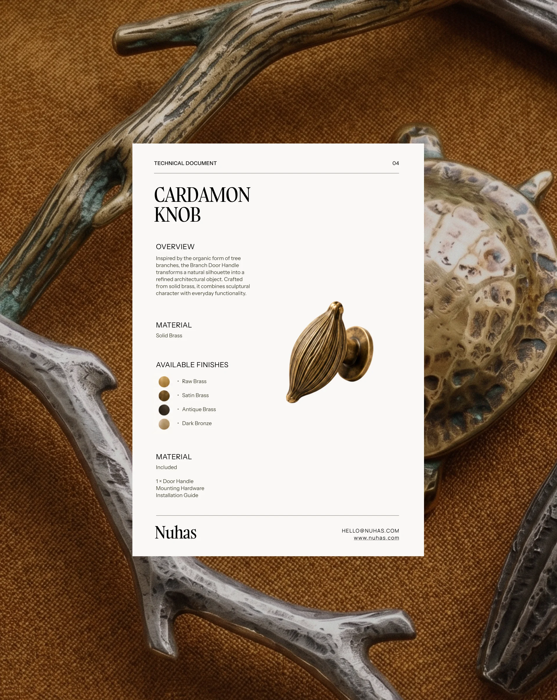
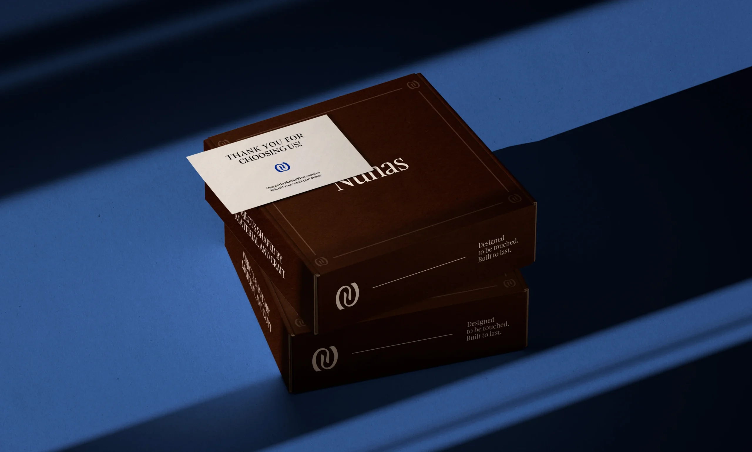
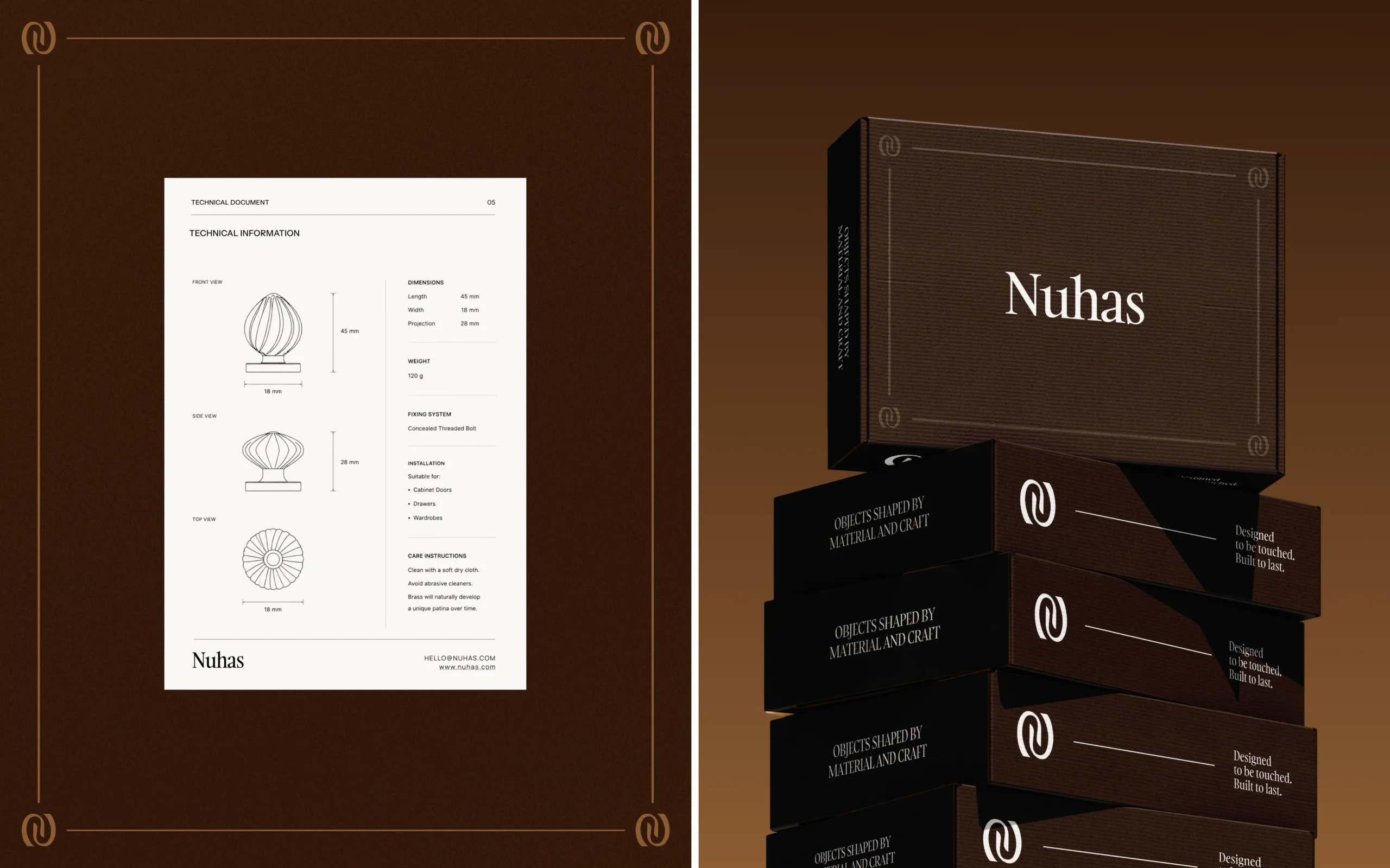
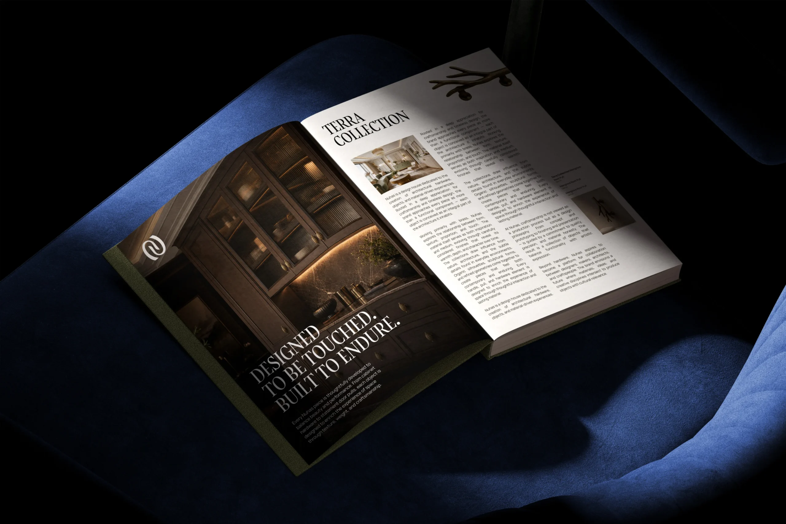
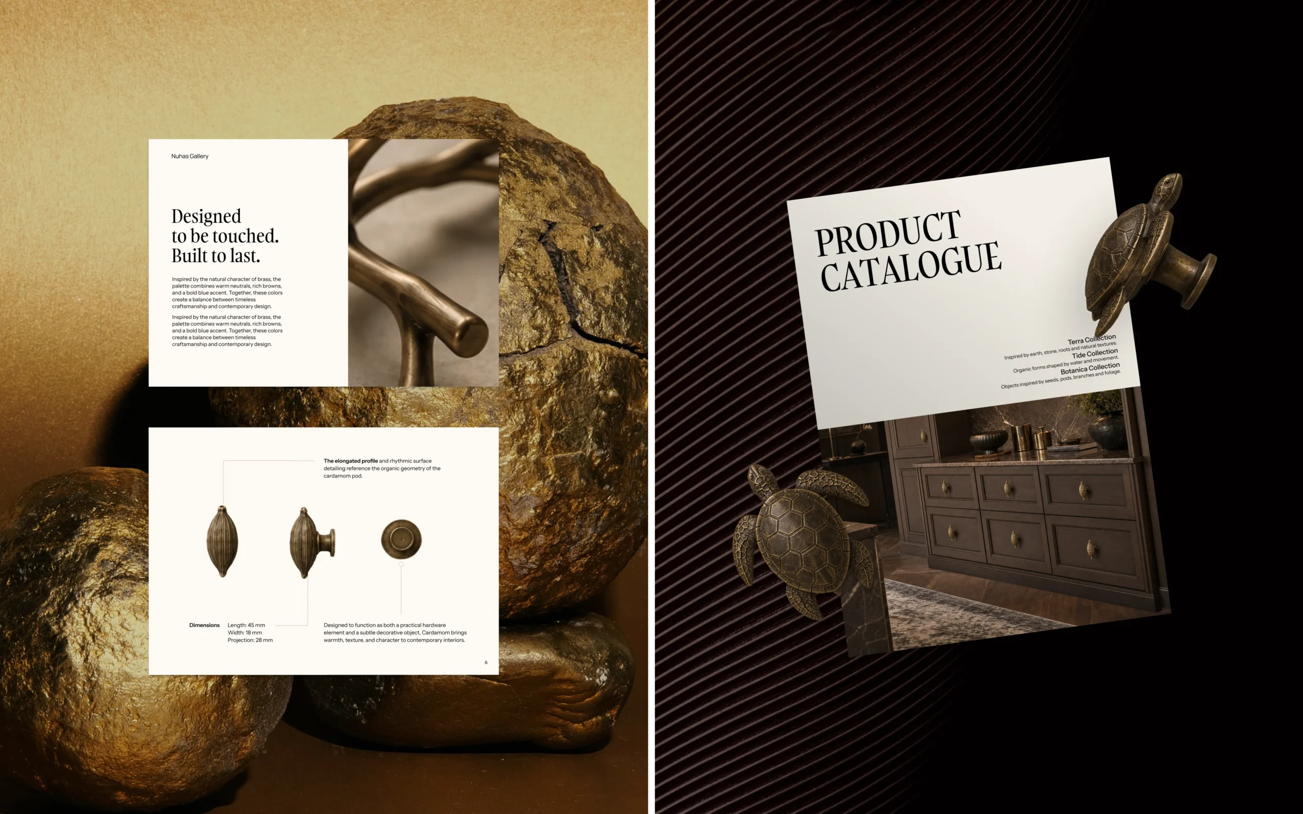
The physical touchpoints extend the brand experience through structured product specification sheets, high-resolution catalog layouts, and editorial visual guideline books. Packaging design utilizes rich Chocolate Brown rigid boxes finished with subtle debossed branding, contrasting with Cobalt Blue print materials to deliver a premium, tactile unboxing experience.
 BOOK A CALL
 has been sent successfully!
Our managers will contact you as soon as possible.