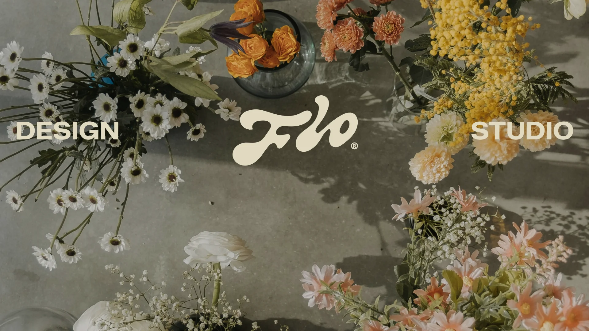
Design Flo Studio is a floral design platform created for florists and their clients, combining curated flower libraries, intuitive design tools, and visual mockup creation into one seamless ecosystem.
For this identity system, we developed a visual language that balances organic expression with digital structure. Soft botanical imagery, tactile textures, and warm natural tones are paired with structured layouts, bold typography, and grid-based compositions to reflect the connection between creativity and precision.
The custom symbol draws inspiration from floral forms and handcrafted arrangements, while the overall system was designed to remain flexible across digital platforms, social media, and brand communications.
Logo, Color Palette, Typography, Digital & Social Media, Printed Media & Merch, Brand Guidelines
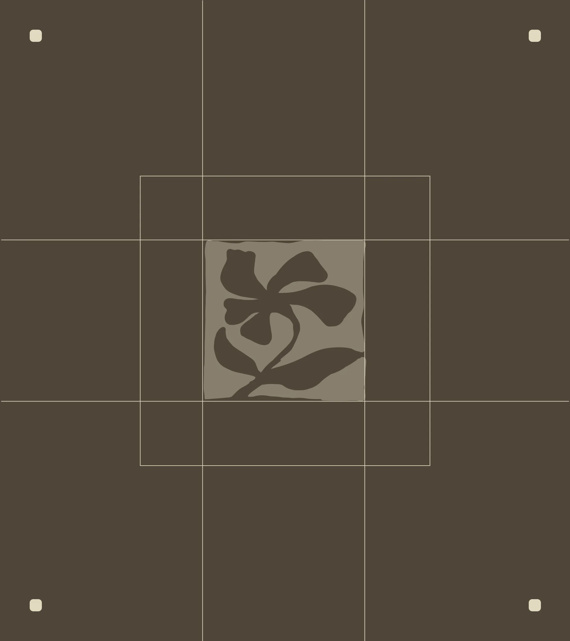
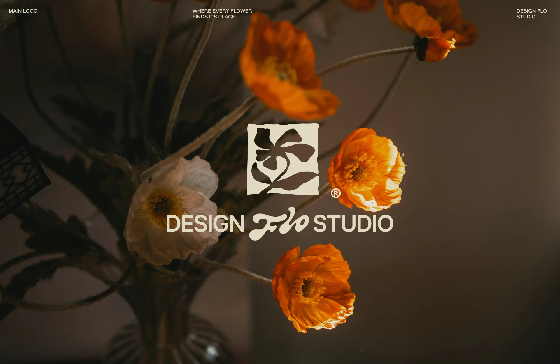
The logo balances artistic expression with the clarity of a structured digital product. The stylized flower, rendered in a hand-crafted style, reflects the organic nature of floristry and the brand’s human-centered approach, while the square frame introduces a sense of structure and stability. The custom “Flo” lettering adds softness and flow, contrasting with the more restrained “Design” and “Studio” to create a balance between emotion and precision. Beyond the logo, we developed a complete identity system, including primary and secondary lockups, a standalone icon, and abbreviated versions. Each variation is designed for specific use cases across digital products and brand touchpoints, ensuring flexibility while maintaining consistency across formats and scales.
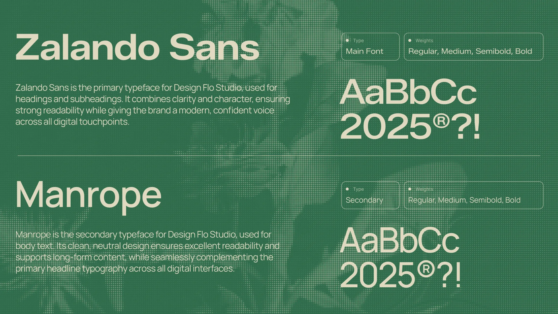
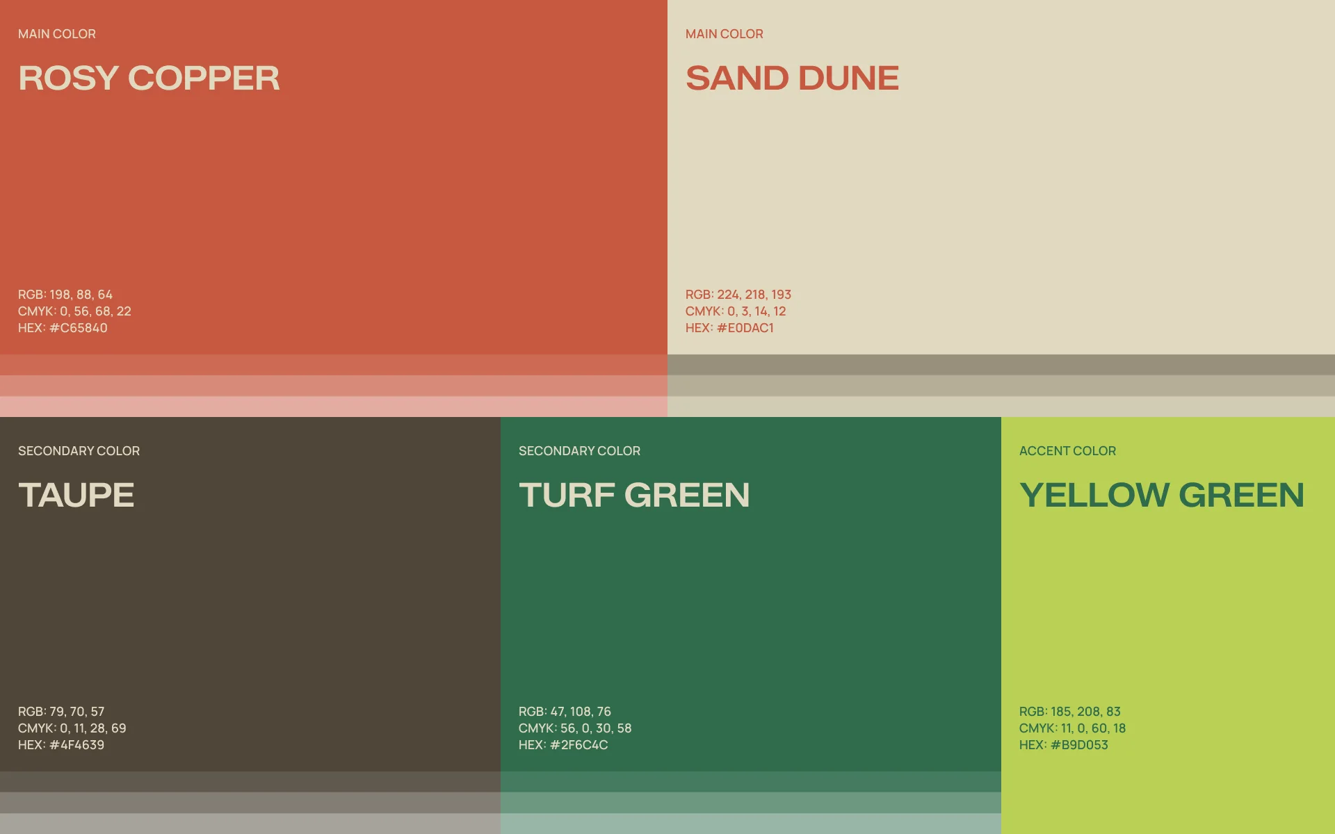
We built a flexible color system around warm, floral-inspired tones — balancing soft neutrals with rich, expressive accents. The palette includes primary and secondary colors, along with a brighter accent used to highlight key actions and elements, bringing clarity and visual hierarchy across the interface. For typography, we paired Zalando Sans for headings and brand moments with Manrope for body text and UI. Together, they create a clear, modern voice that feels both confident and approachable, ensuring strong readability across all digital touchpoints.
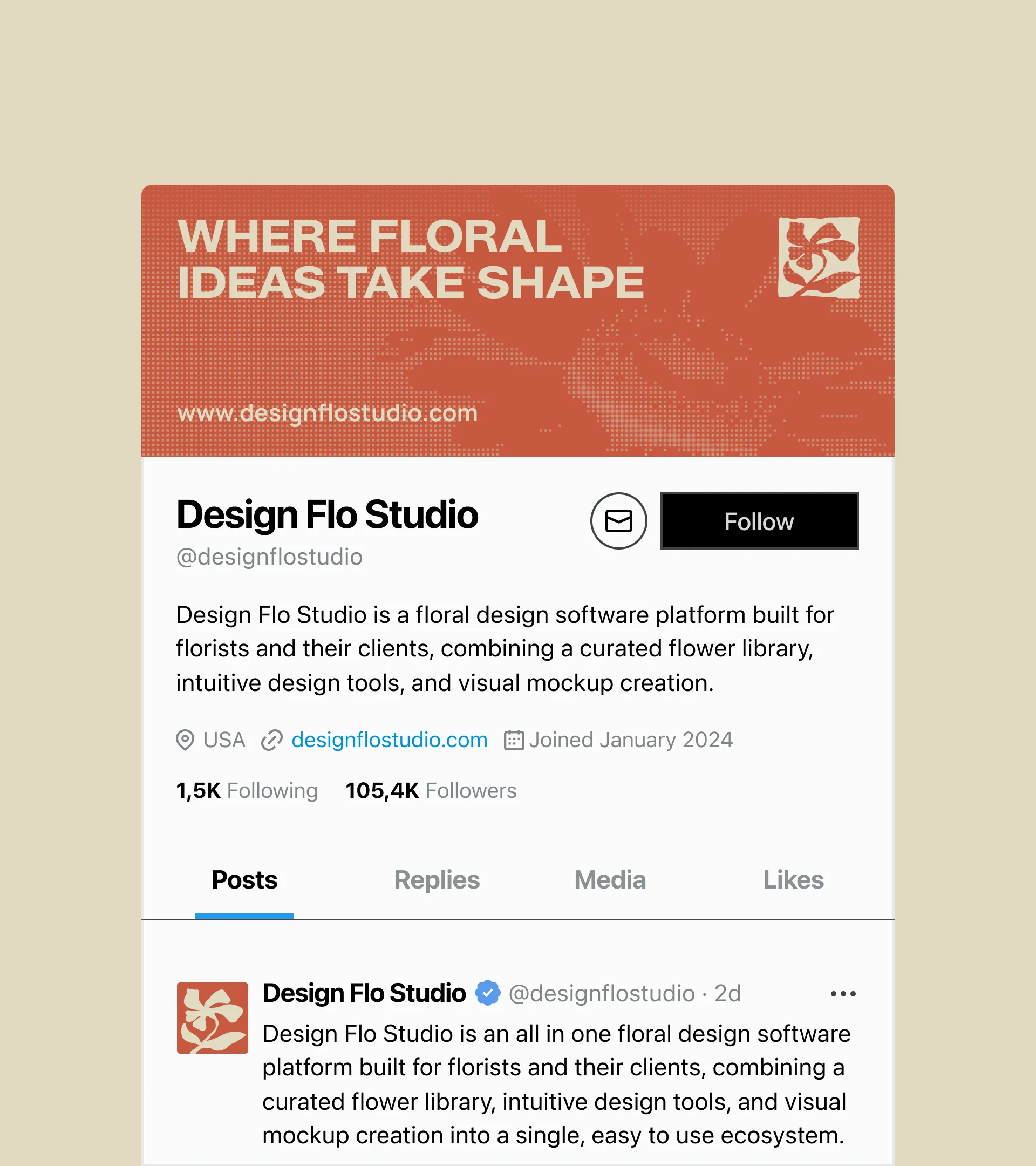
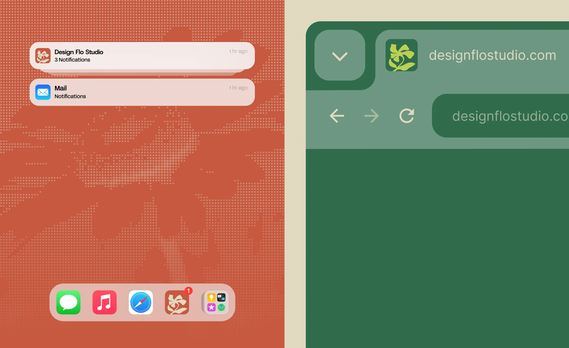
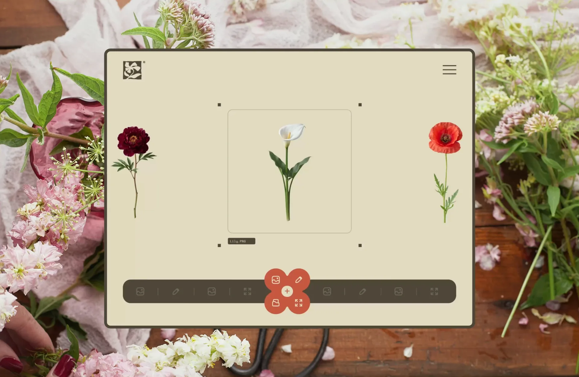
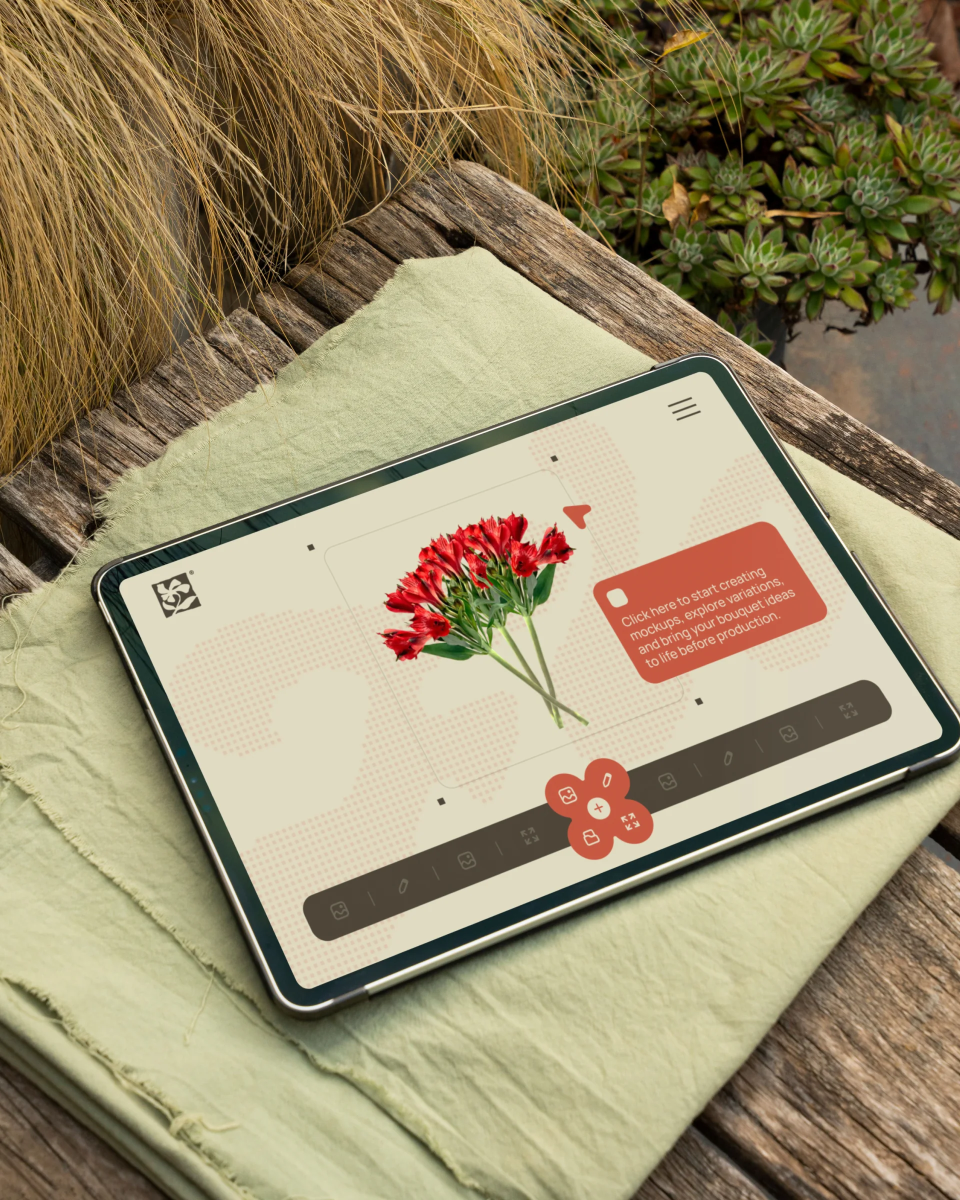
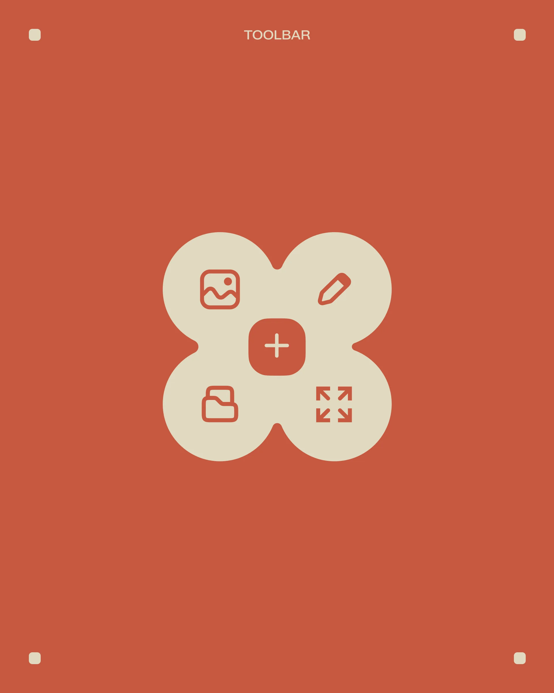
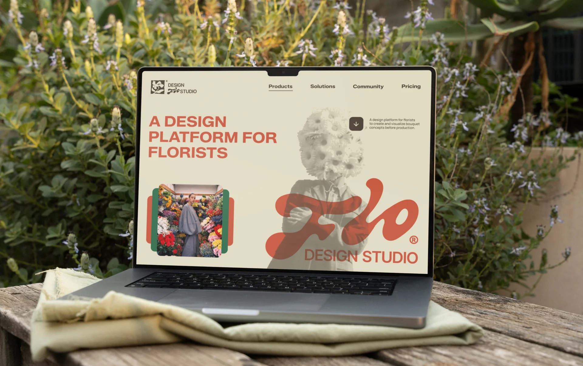
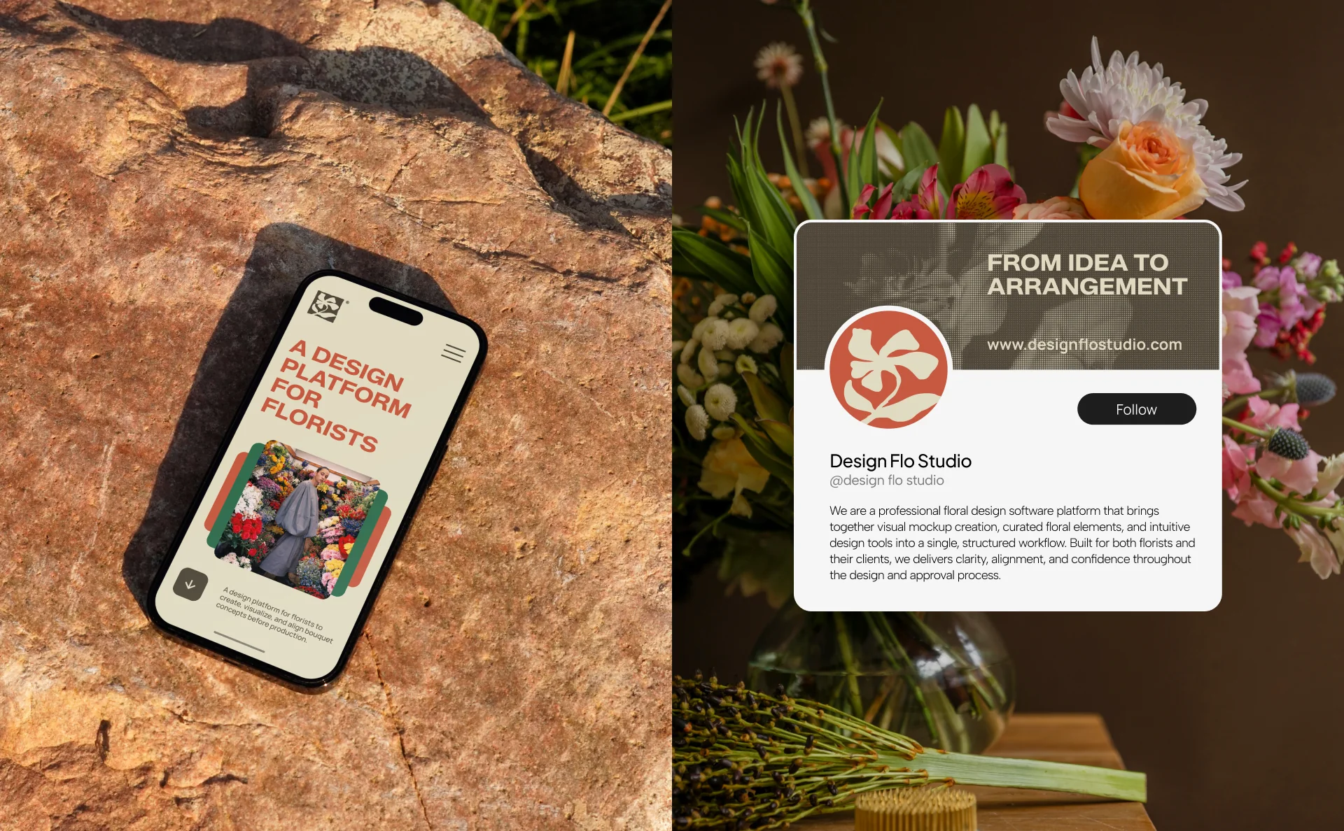
We built a comprehensive set of digital assets to establish a consistent and recognizable presence across all platforms — including profile images, cover banners, and a flexible system of Instagram post and story templates designed for ongoing content creation. Beyond social, we developed the core digital experience, designing responsive website layouts and app interfaces for both mobile and desktop. Each screen was crafted to maintain clarity, usability, and visual consistency, ensuring the brand translates seamlessly across every touchpoint.
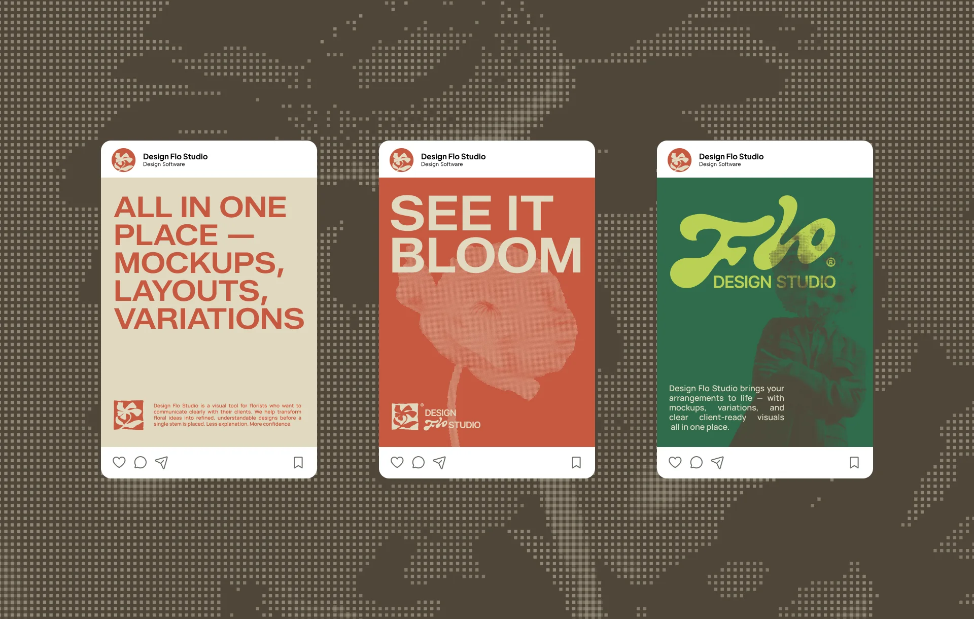
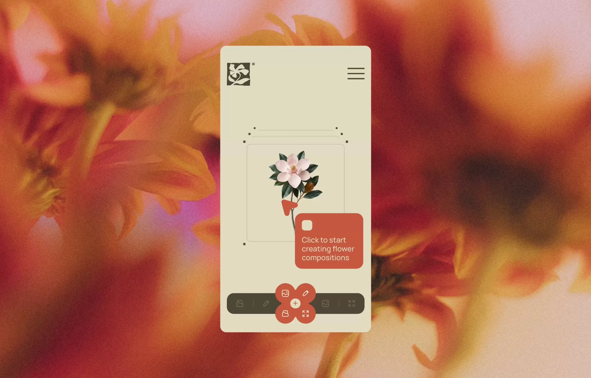
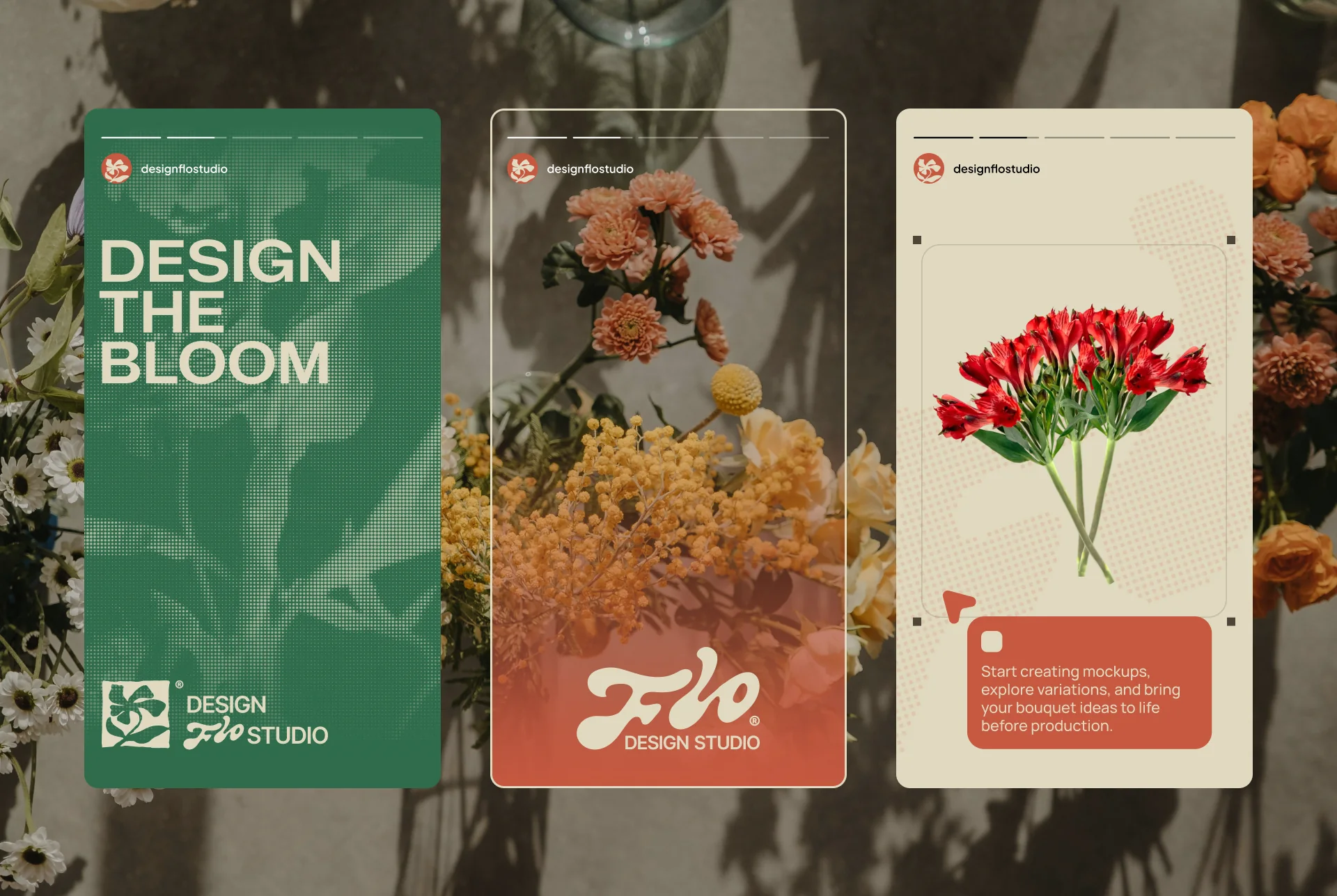
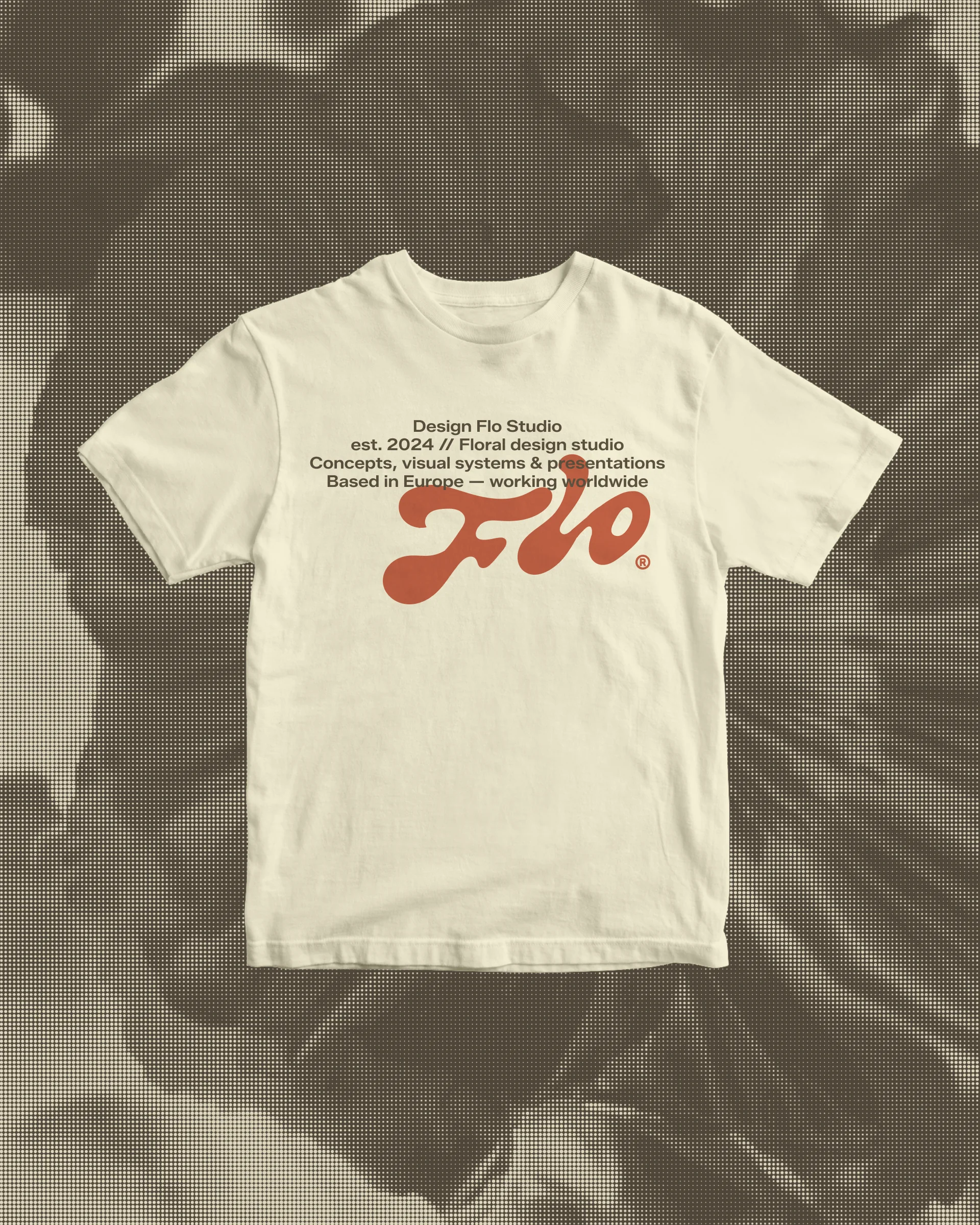
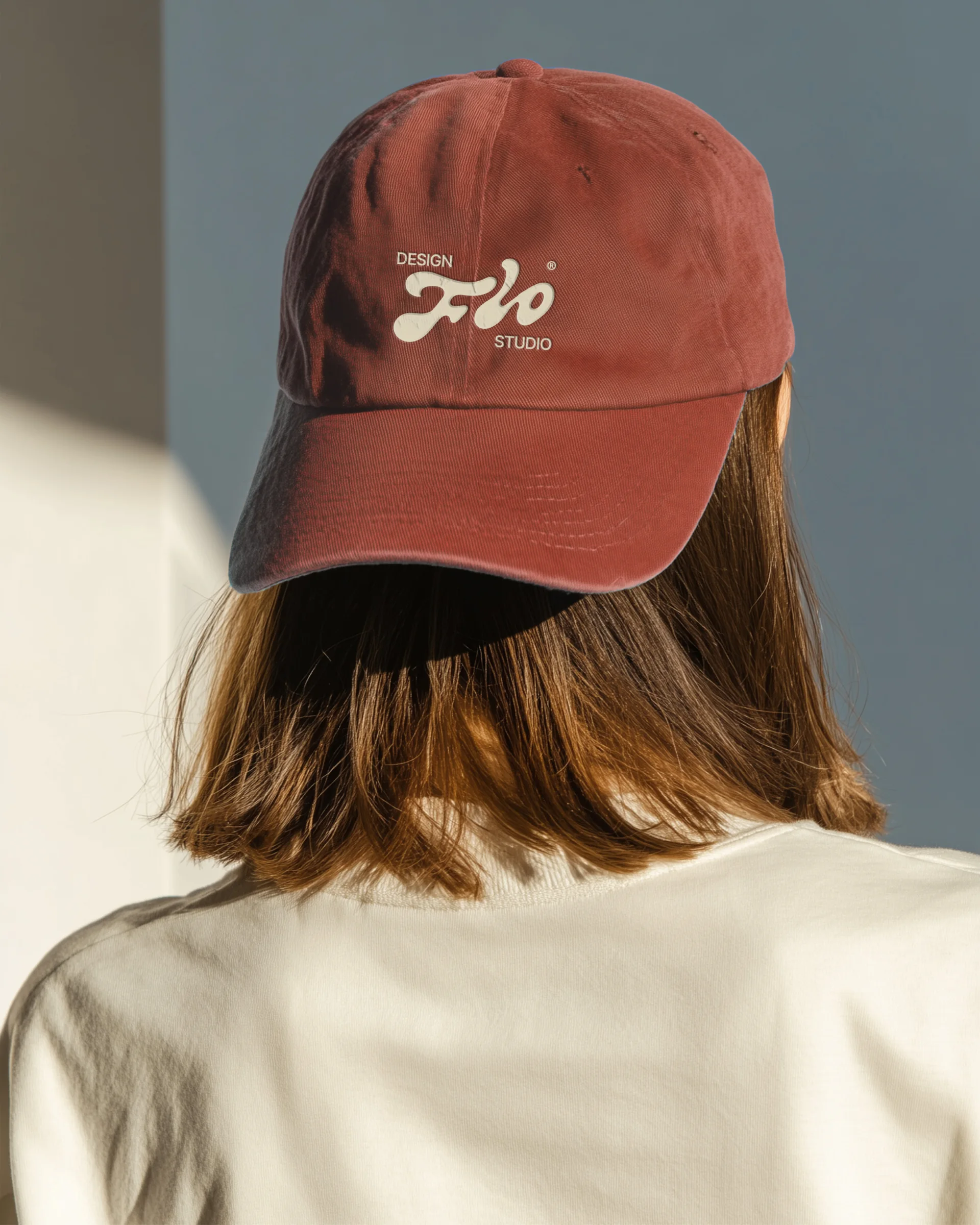
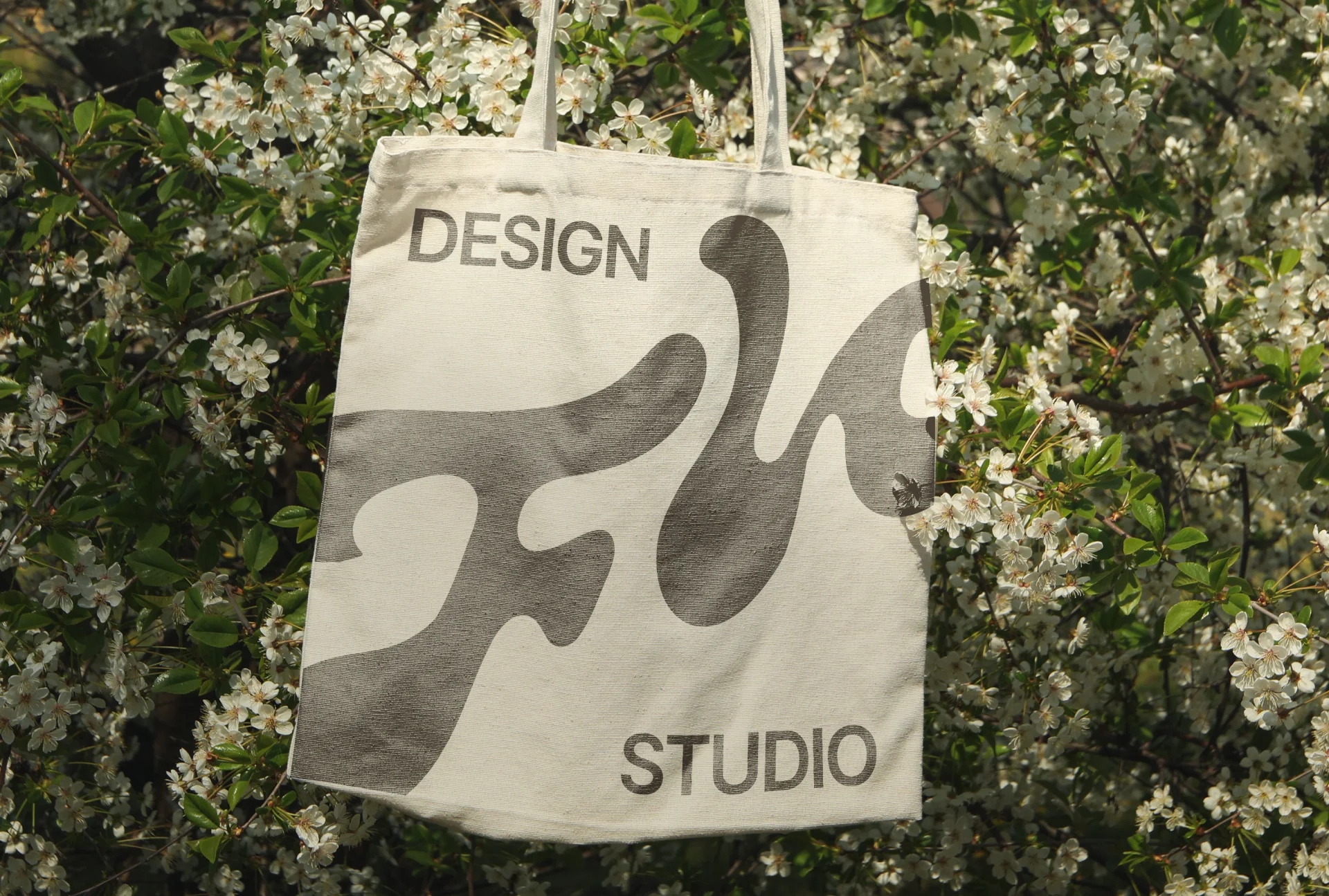
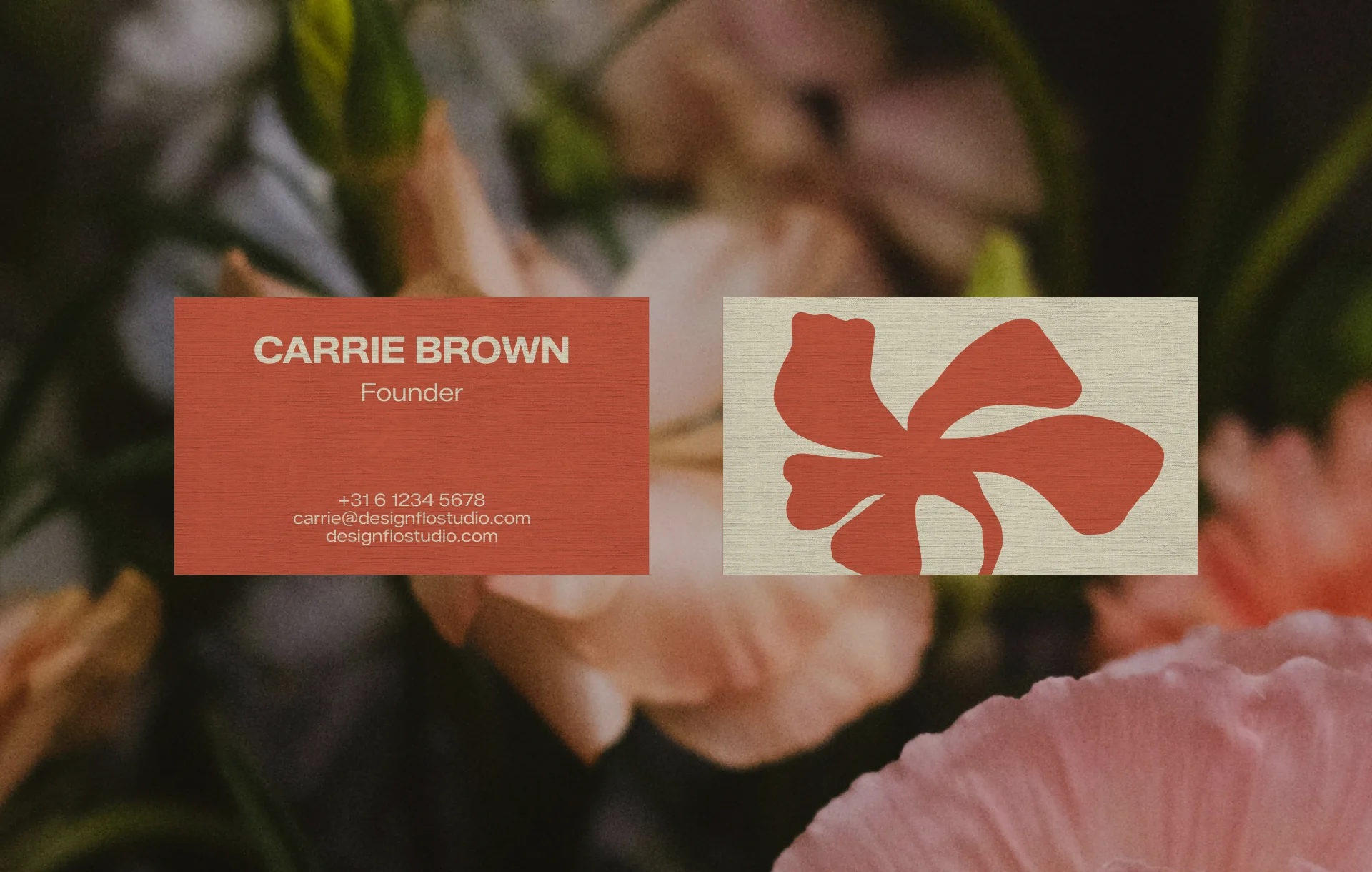
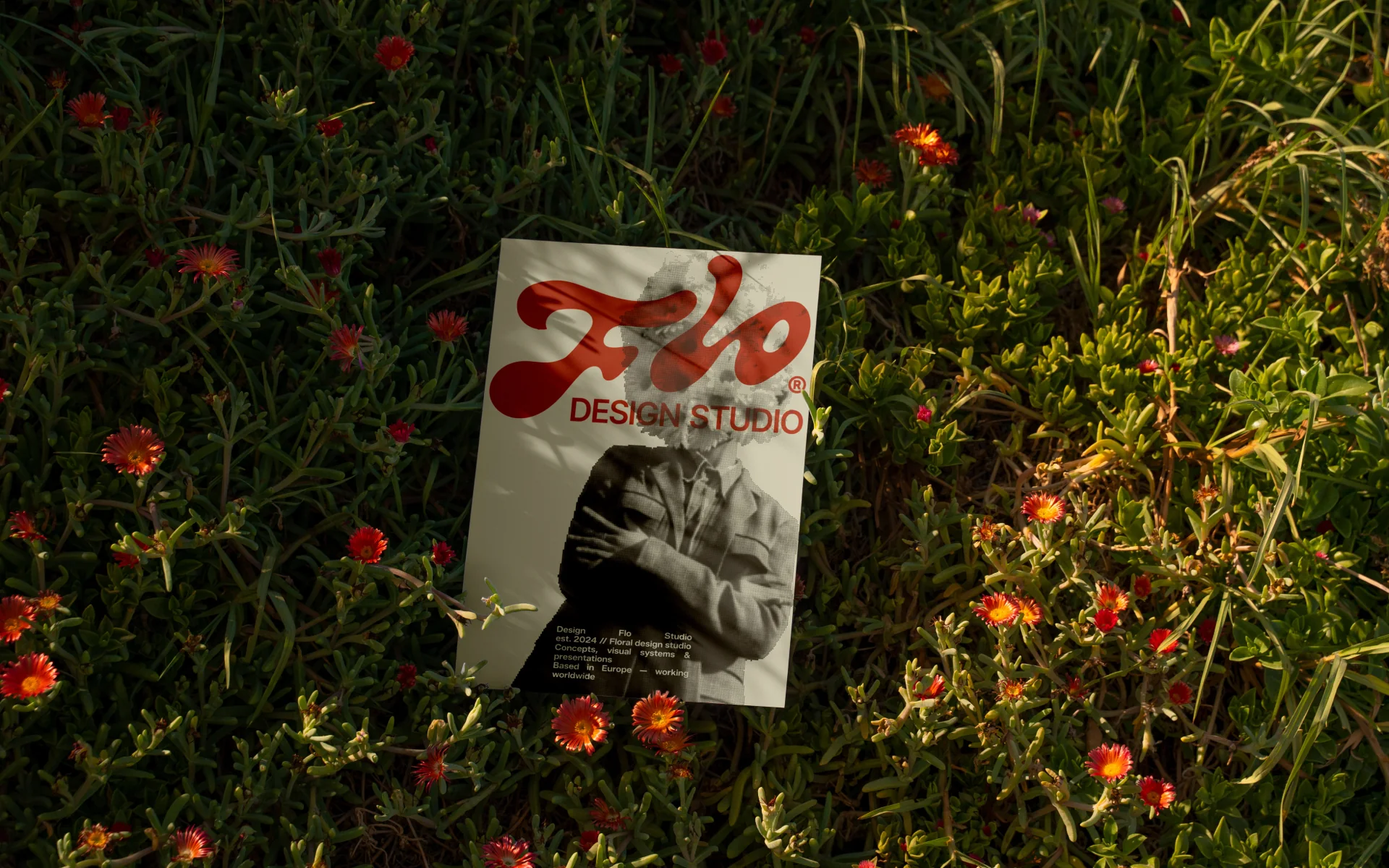
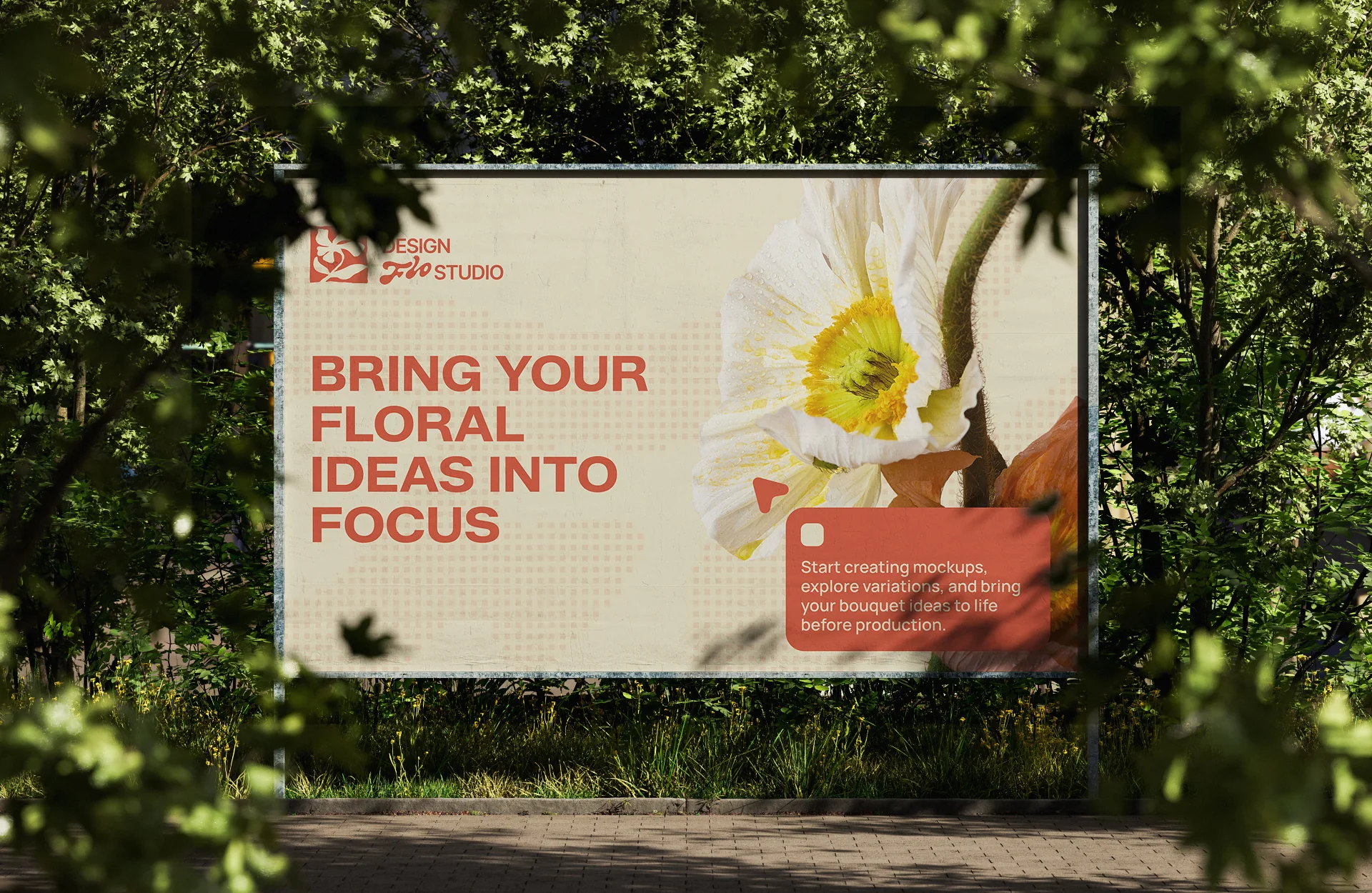
We extended the identity into a range of printed materials and branded merchandise, including business cards, flyers, and large-scale formats such as billboards — ensuring the brand remains clear and impactful across both small and high-visibility applications. In parallel, we developed a selection of merchandise, including hats, t-shirts, and tote bags, designed to carry the brand into everyday use while maintaining consistency and recognizability across all physical touchpoints.
Our managers will contact you as soon as possible.
 has been sent successfully!