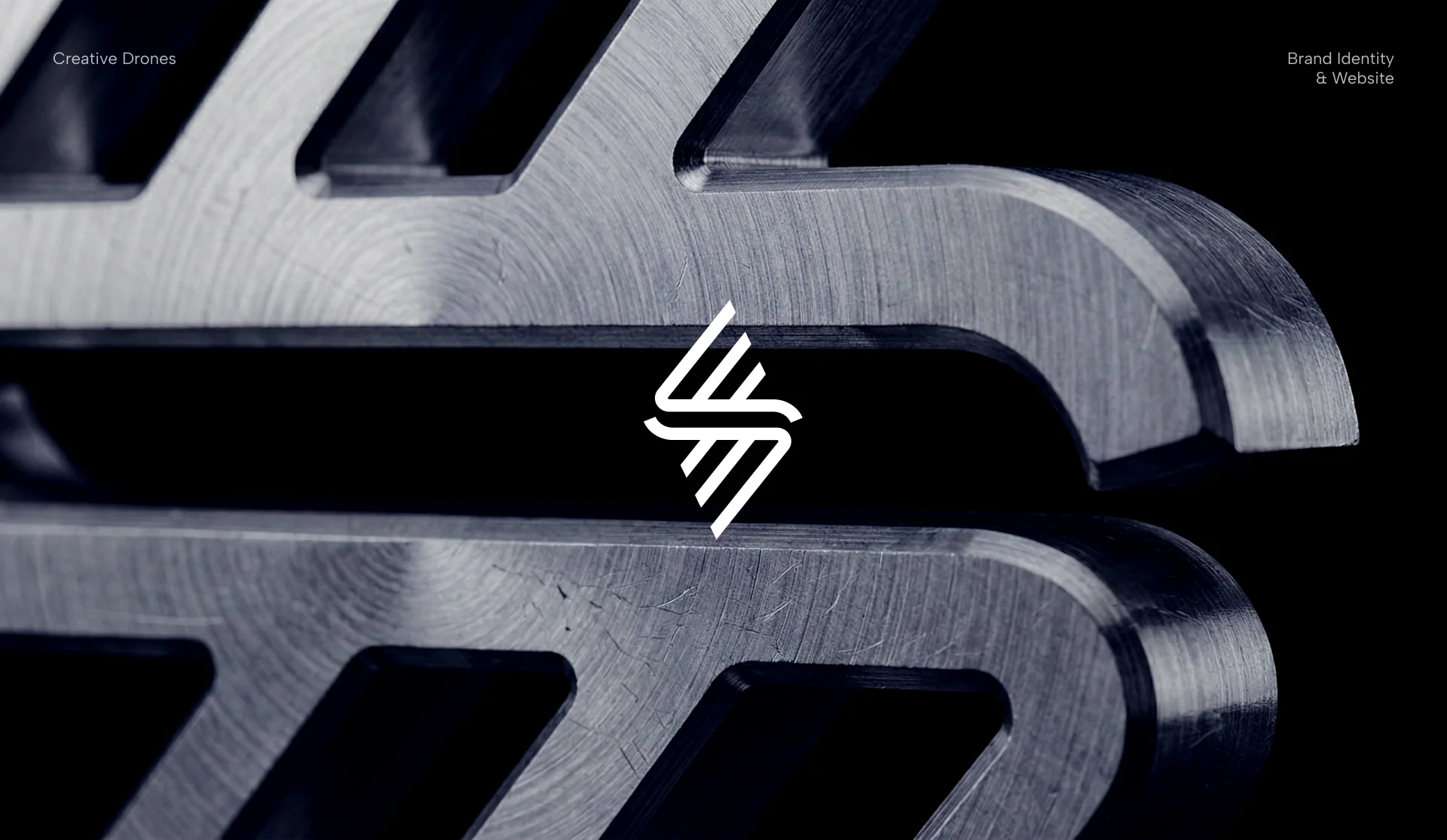
Creative Drones is an innovation-driven technology company redefining the way people interact with FPV drones. By combining accessibility, precision, and performance, the brand bridges the gap between gaming culture and advanced drone piloting — making high-performance FPV flight more intuitive and immersive.
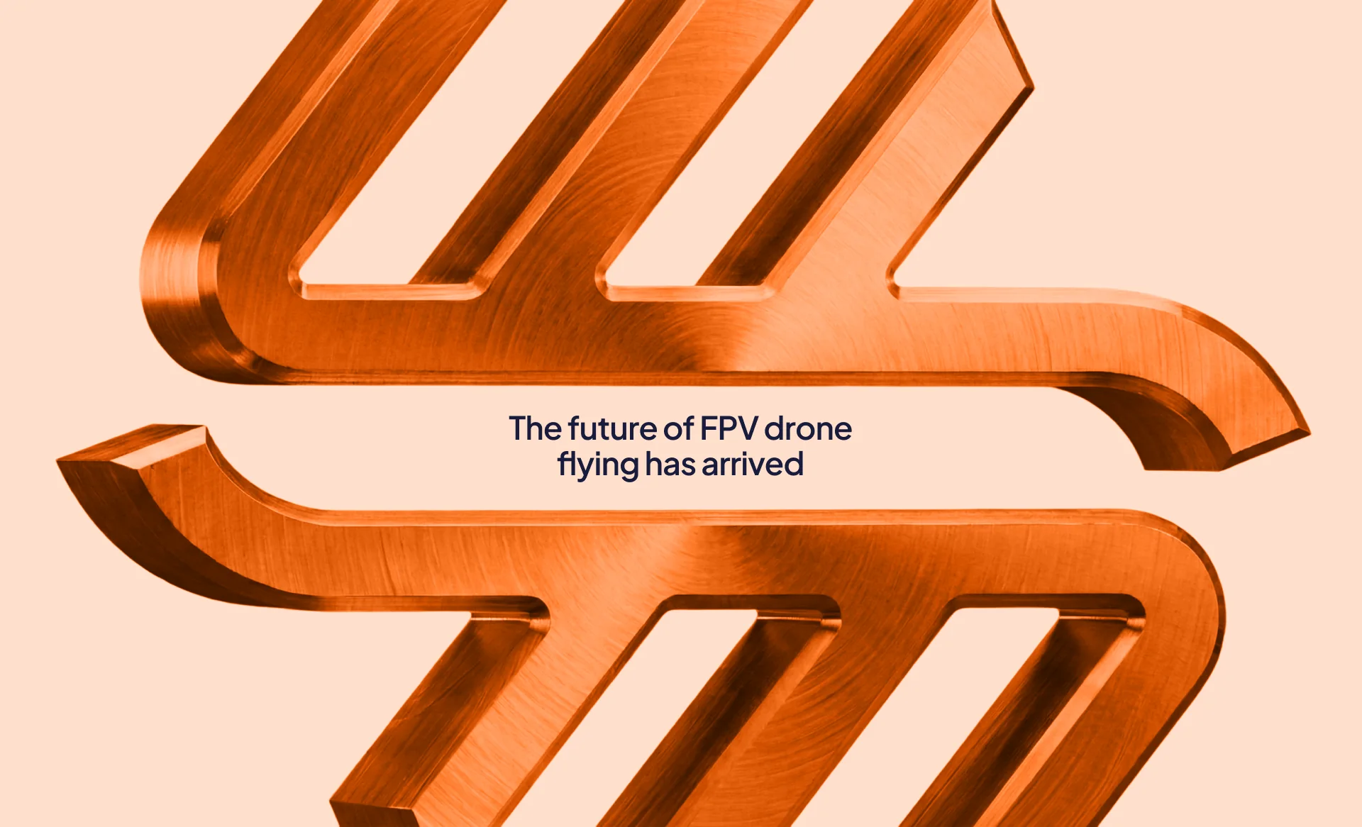
The visual identity is built around a dynamic symbol that reflects motion, direction, and airflow. Constructed from parallel lines that converge and expand, the mark conveys acceleration, control, and the aerodynamic nature of drone flight.
The system extends across digital interfaces and web environments, creating a cohesive brand experience that feels technological, energetic, and future-focused.
Logo, Color Palette, Typography, Website Design, Digital Media, Brand Guidelines
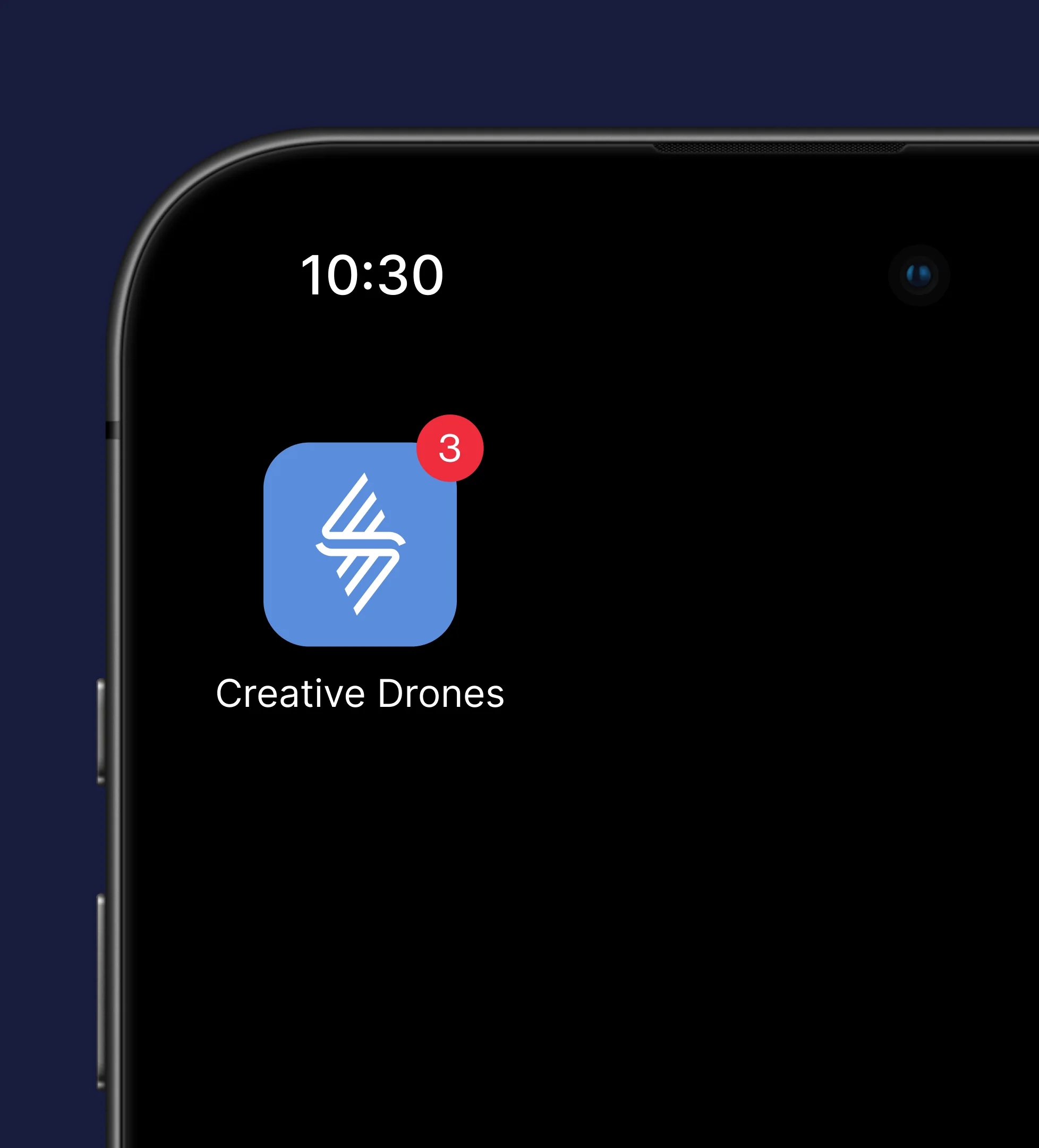
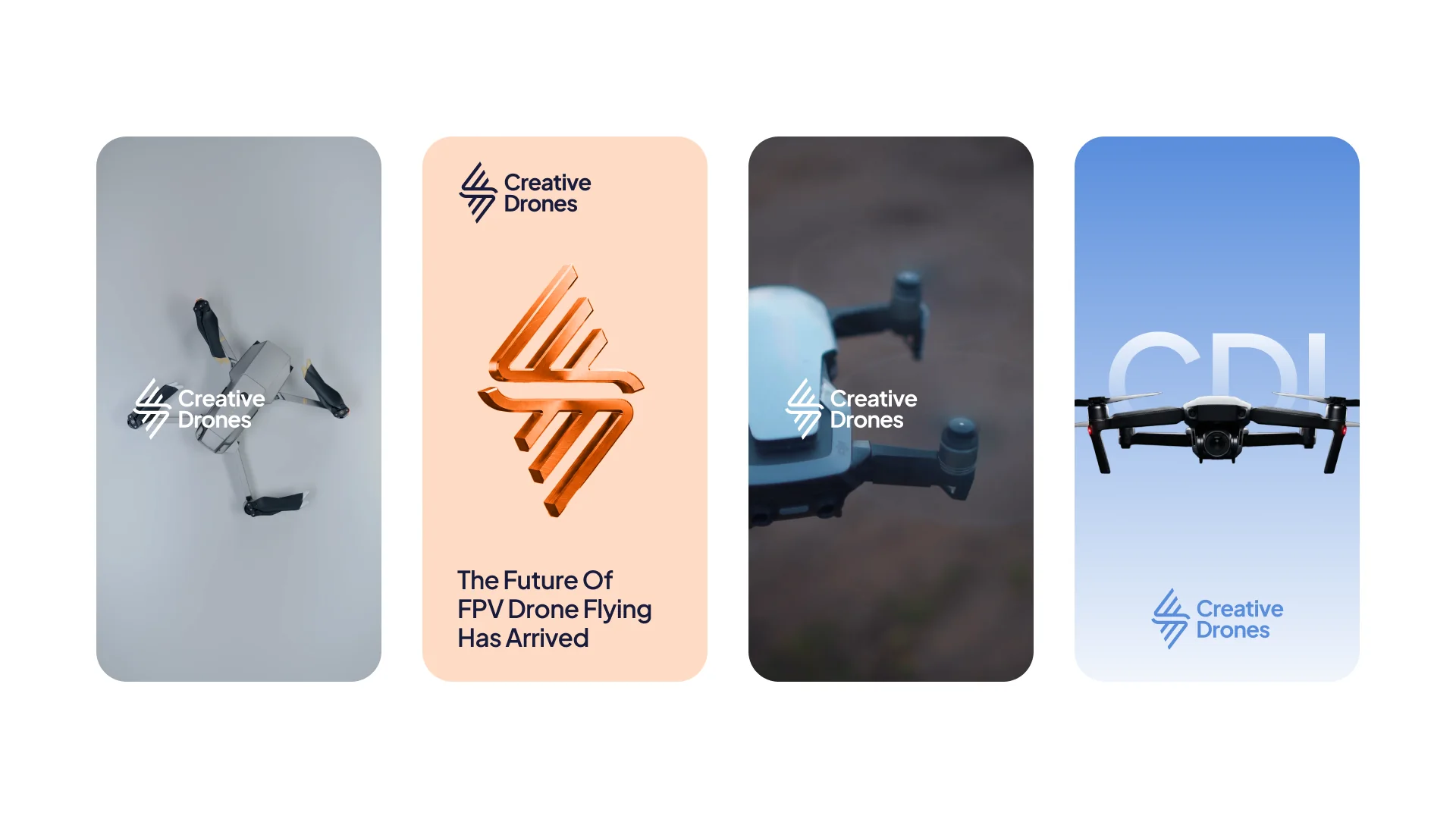
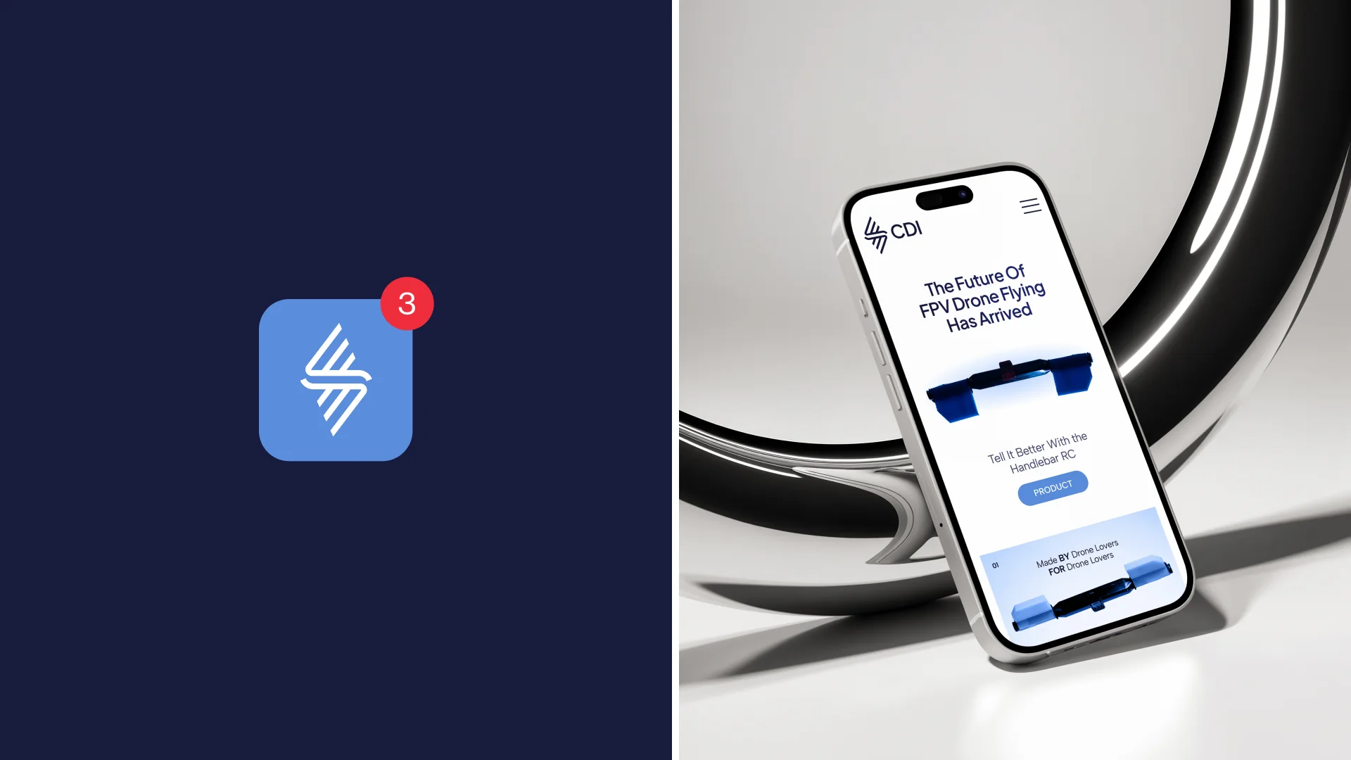
The symbol is built from parallel lines that converge and expand — a compact mark that reads as motion, direction and airflow. It works on its own as an app icon or avatar, and pairs with the Creative Drones wordmark or the short CDI lockup when space is tight. The same angled rhythm scales up into bold 3D renders for key visuals and campaigns, so the brand feels engineered and in motion at every size.
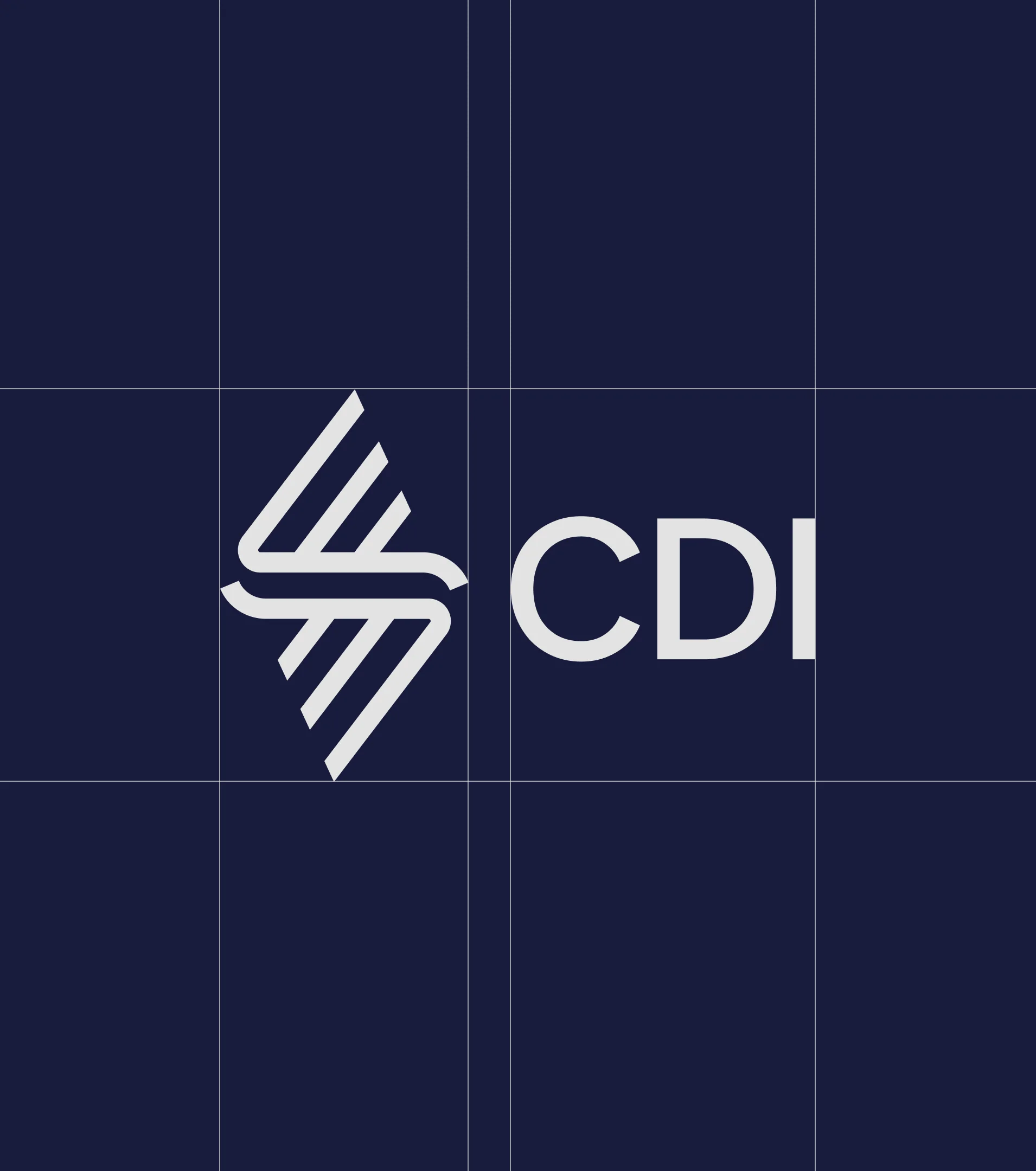
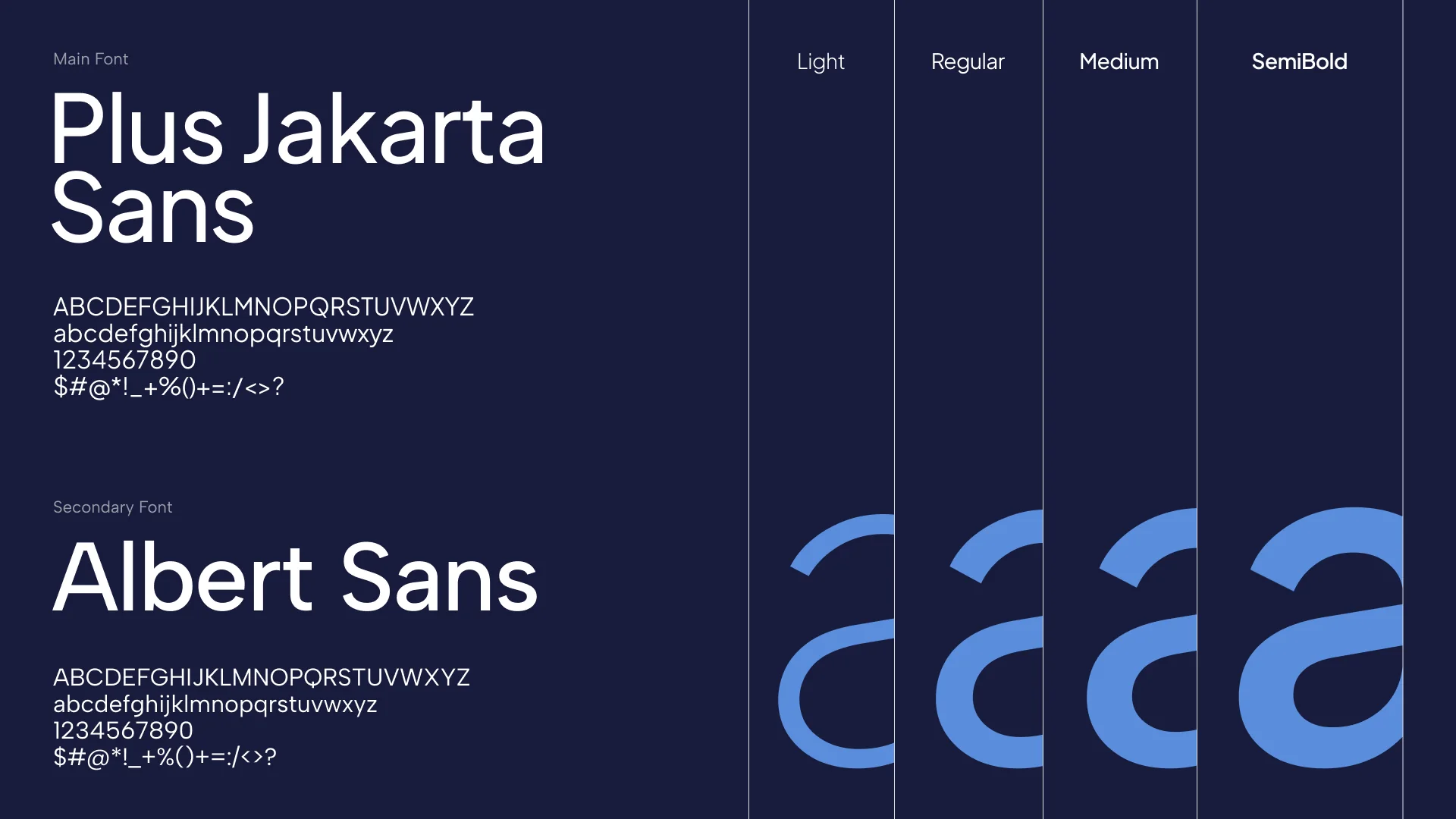
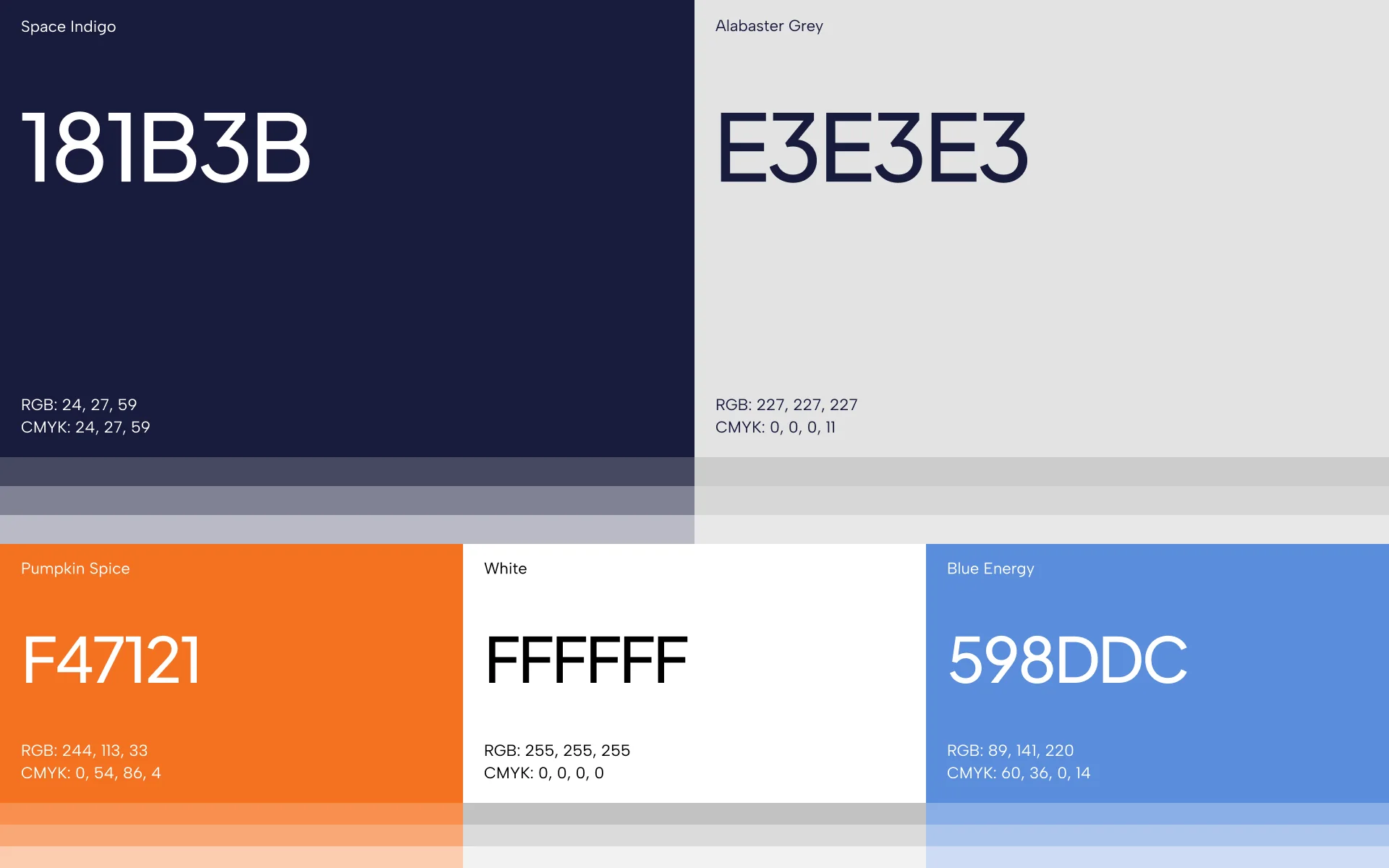
The palette is anchored in a deep indigo (#181B3B) and a clean light grey (#E3E3E3), with white for breathing room. A vivid orange (#F47121) brings energy and highlights key messages, while a sky blue (#598DDC) connects the brand to flight and open air. For typography, we paired Plus Jakarta Sans as the main typeface with Albert Sans as the secondary one — geometric, technical and highly readable across interfaces and marketing materials.
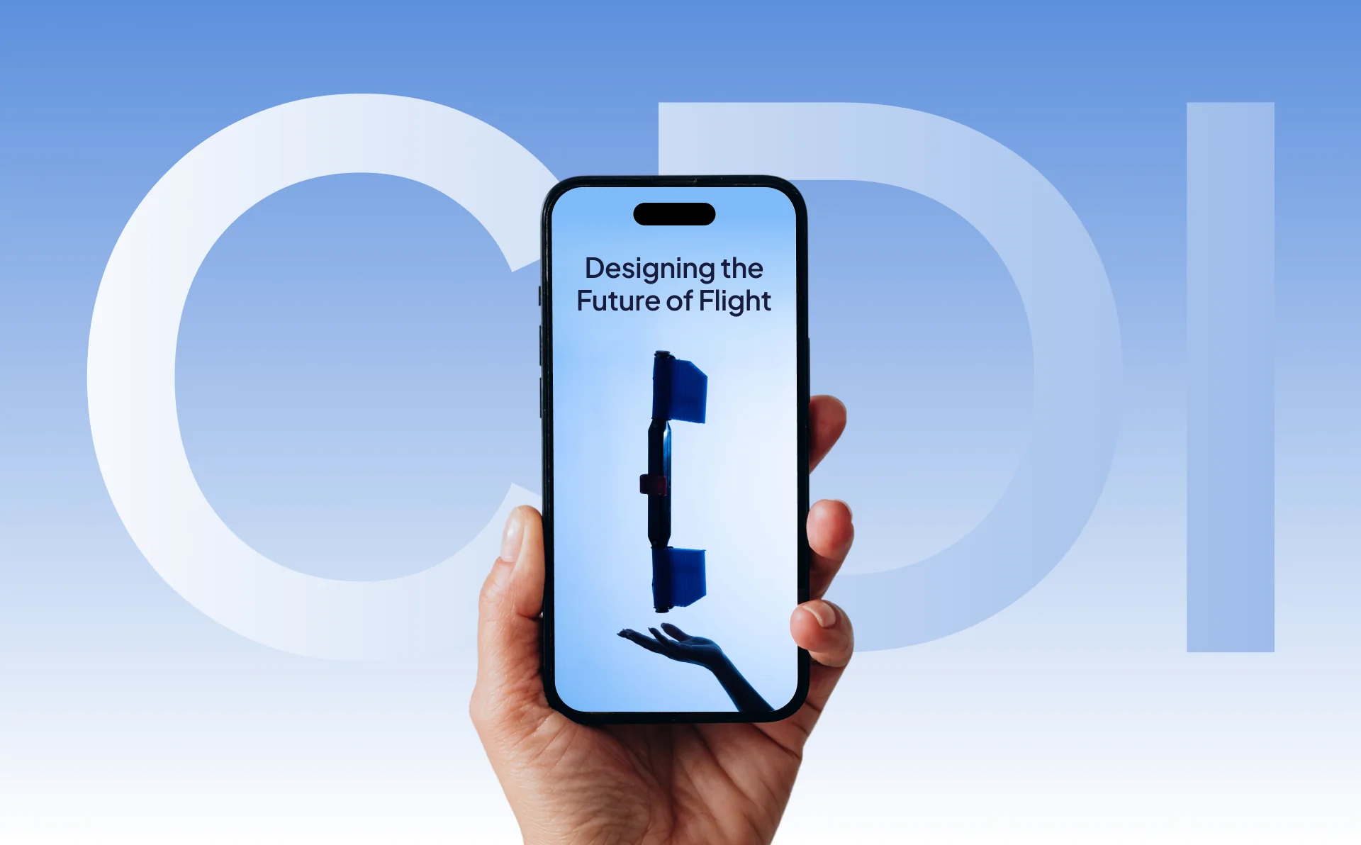
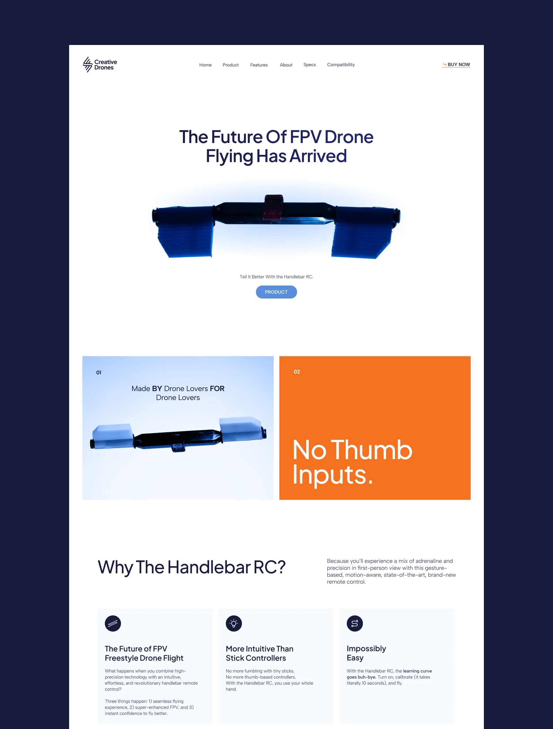
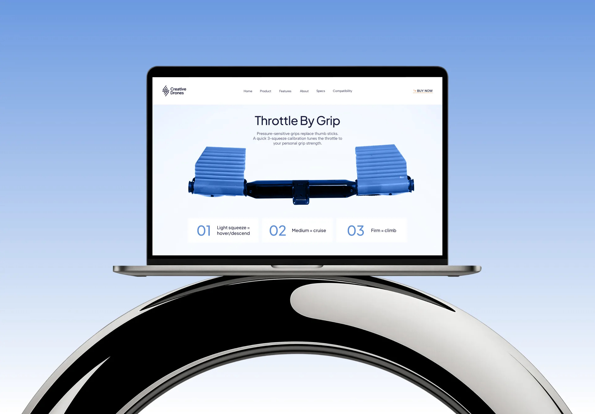
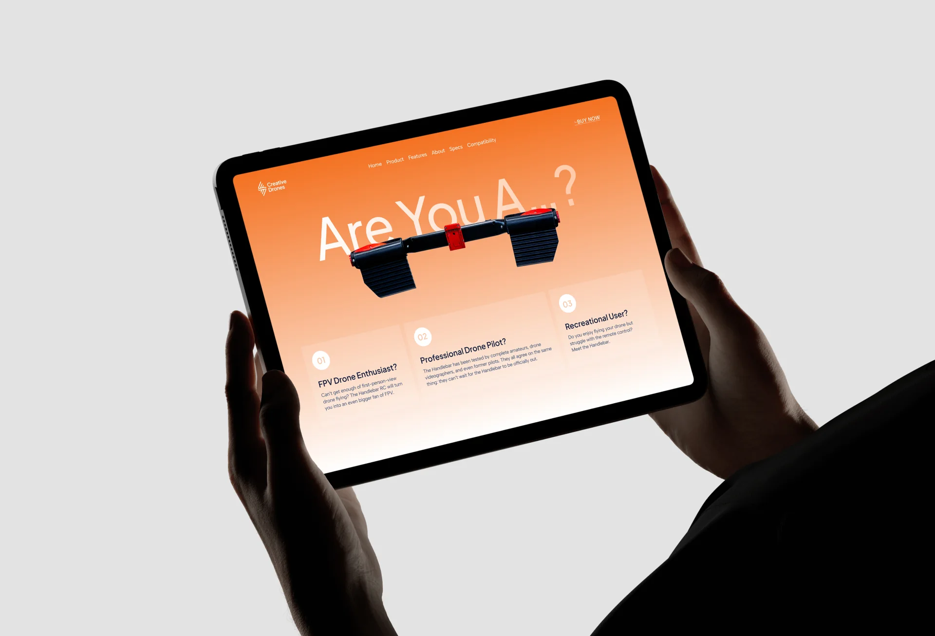
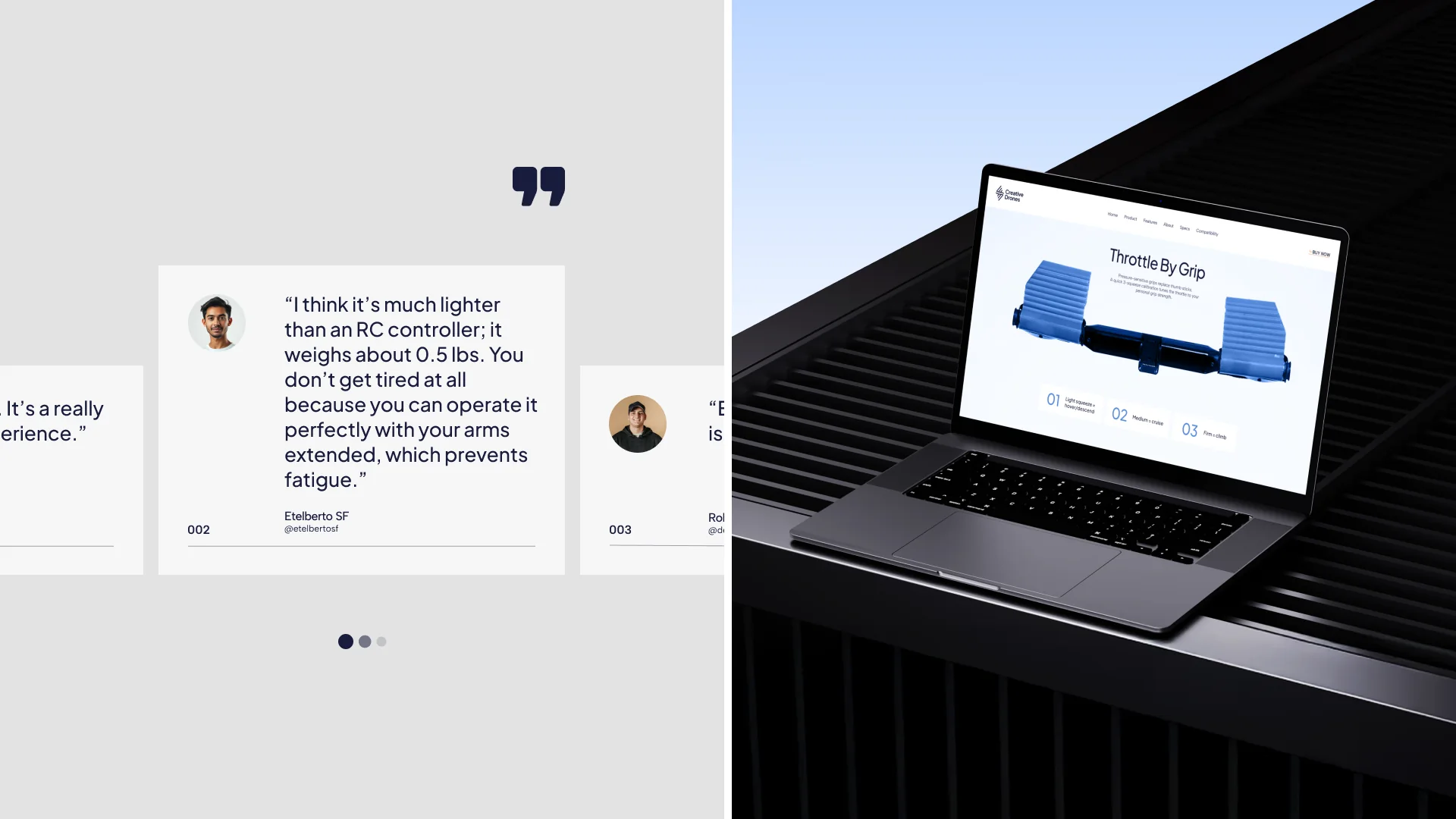
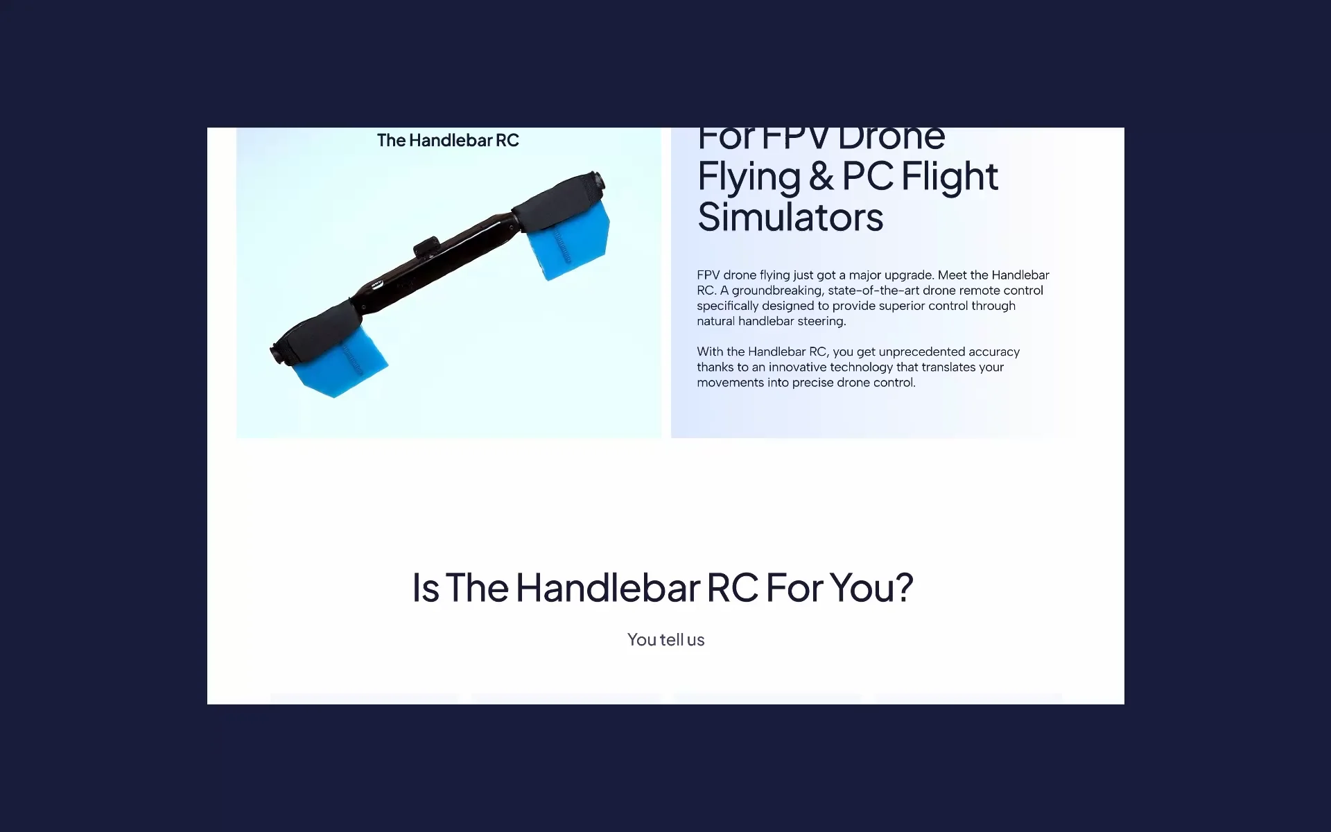
The website introduces the Handlebar RC — the brand's flagship hybrid controller for games and FPV drones. We designed a product-led landing page with a bold hero, clear feature blocks explaining what makes the controller different, customer reviews and a direct answer to “Is the Handlebar RC for you?”. Calm layouts on a deep indigo base keep the focus on the product and make the experience feel precise and premium.
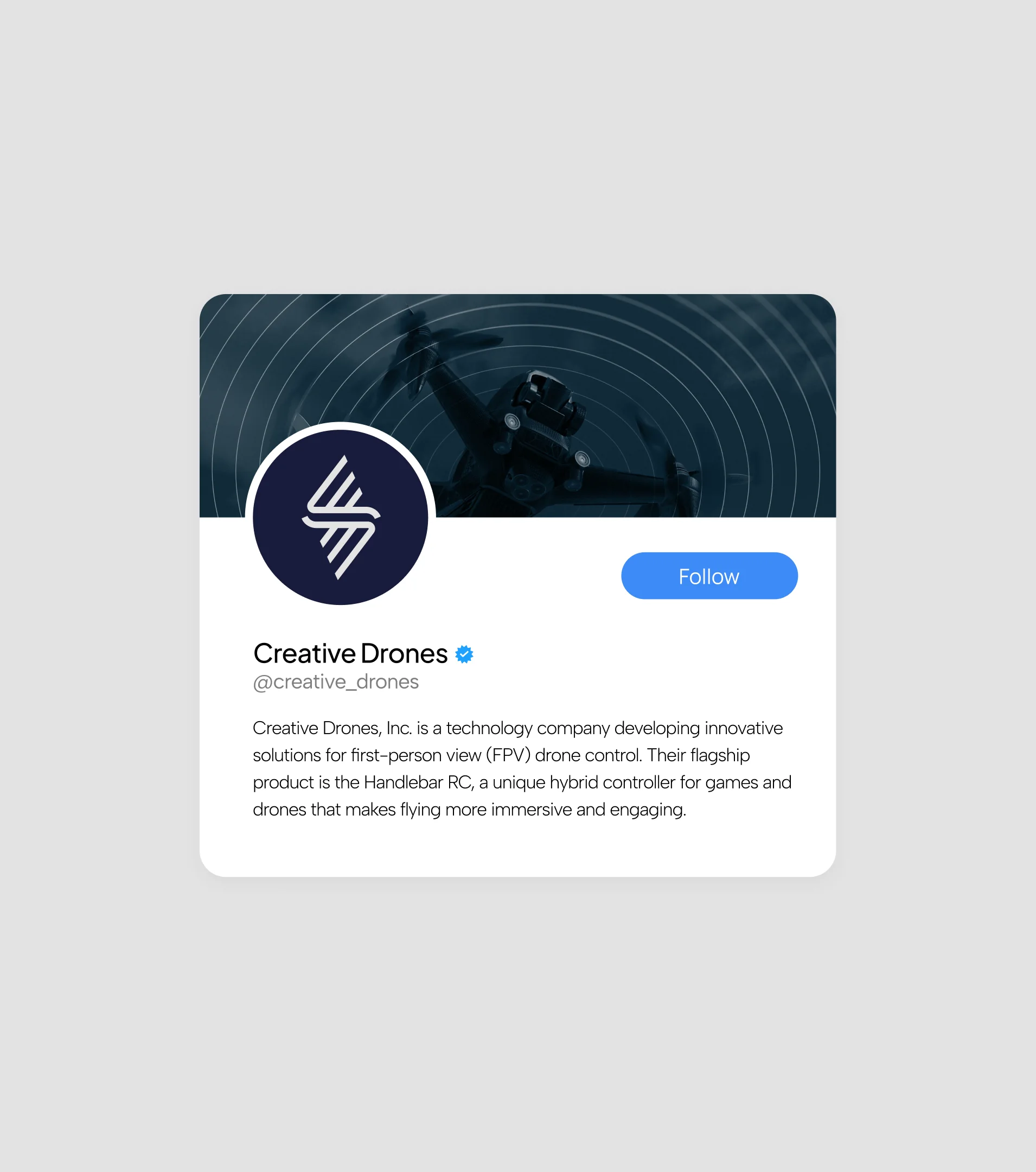
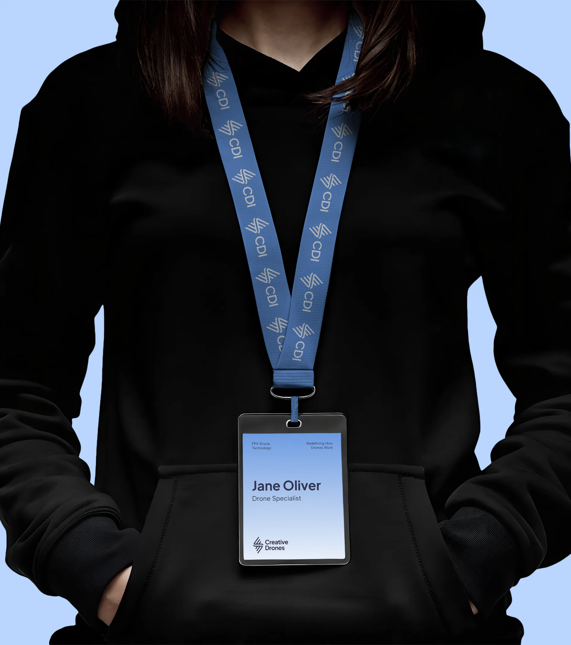
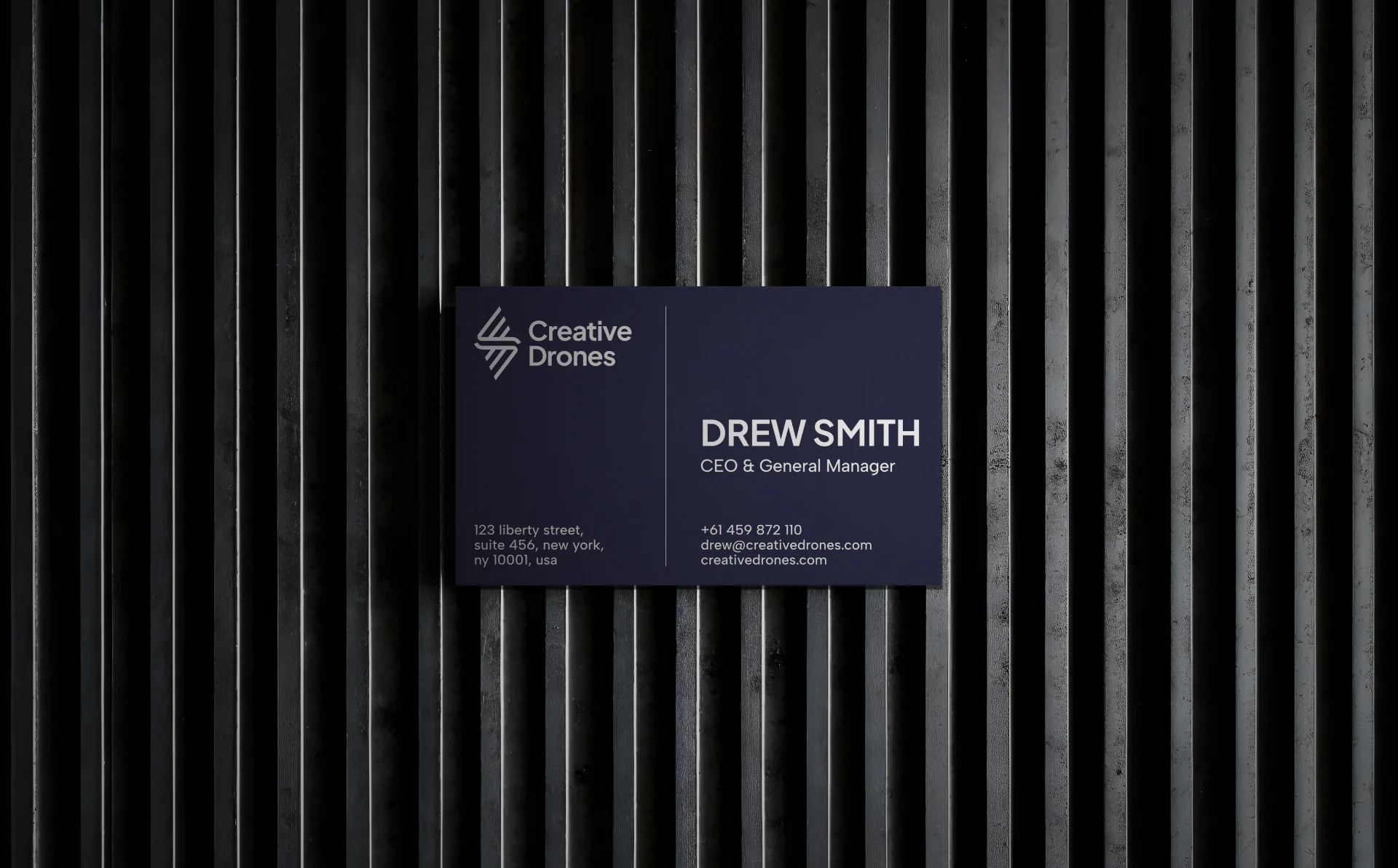
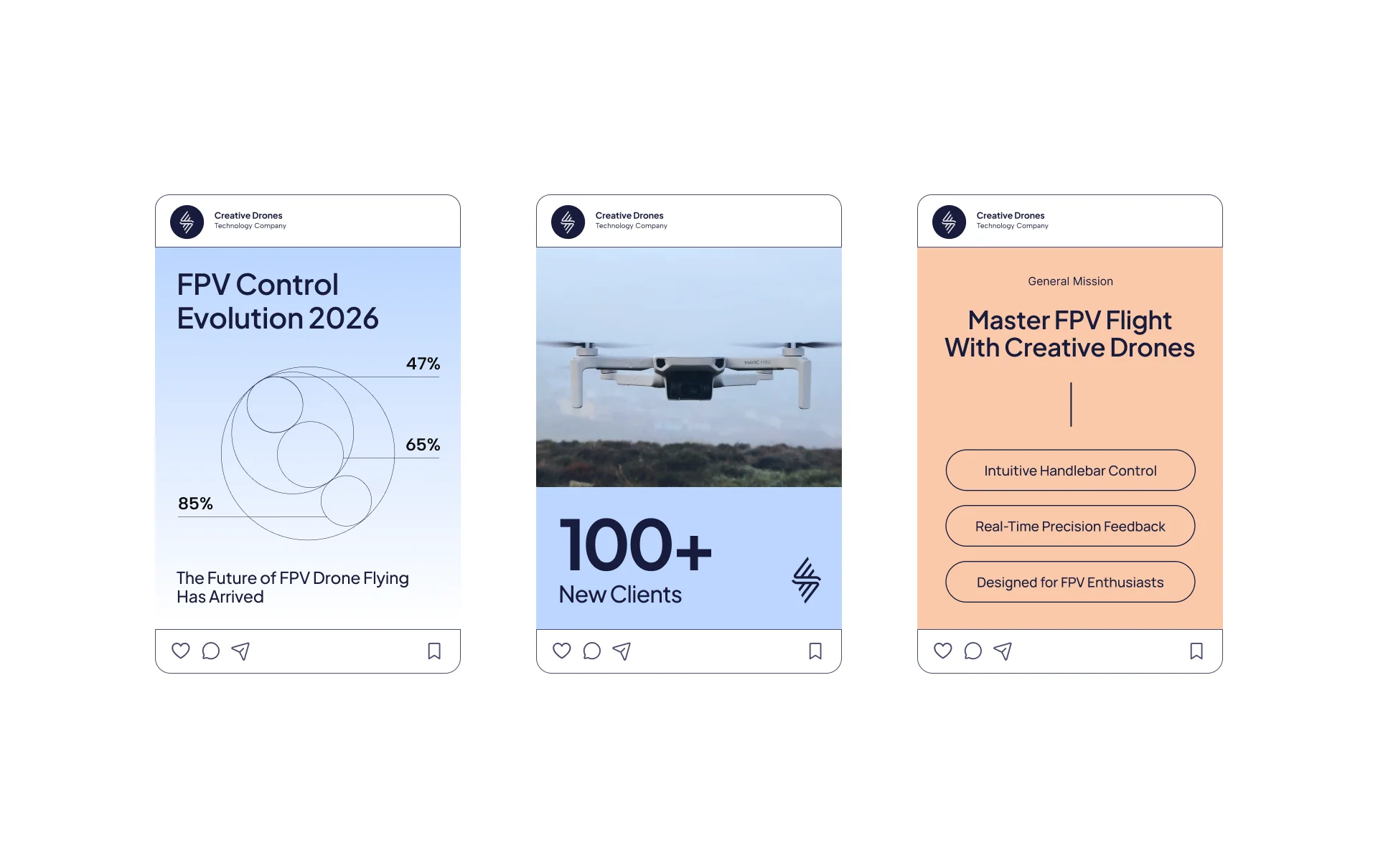
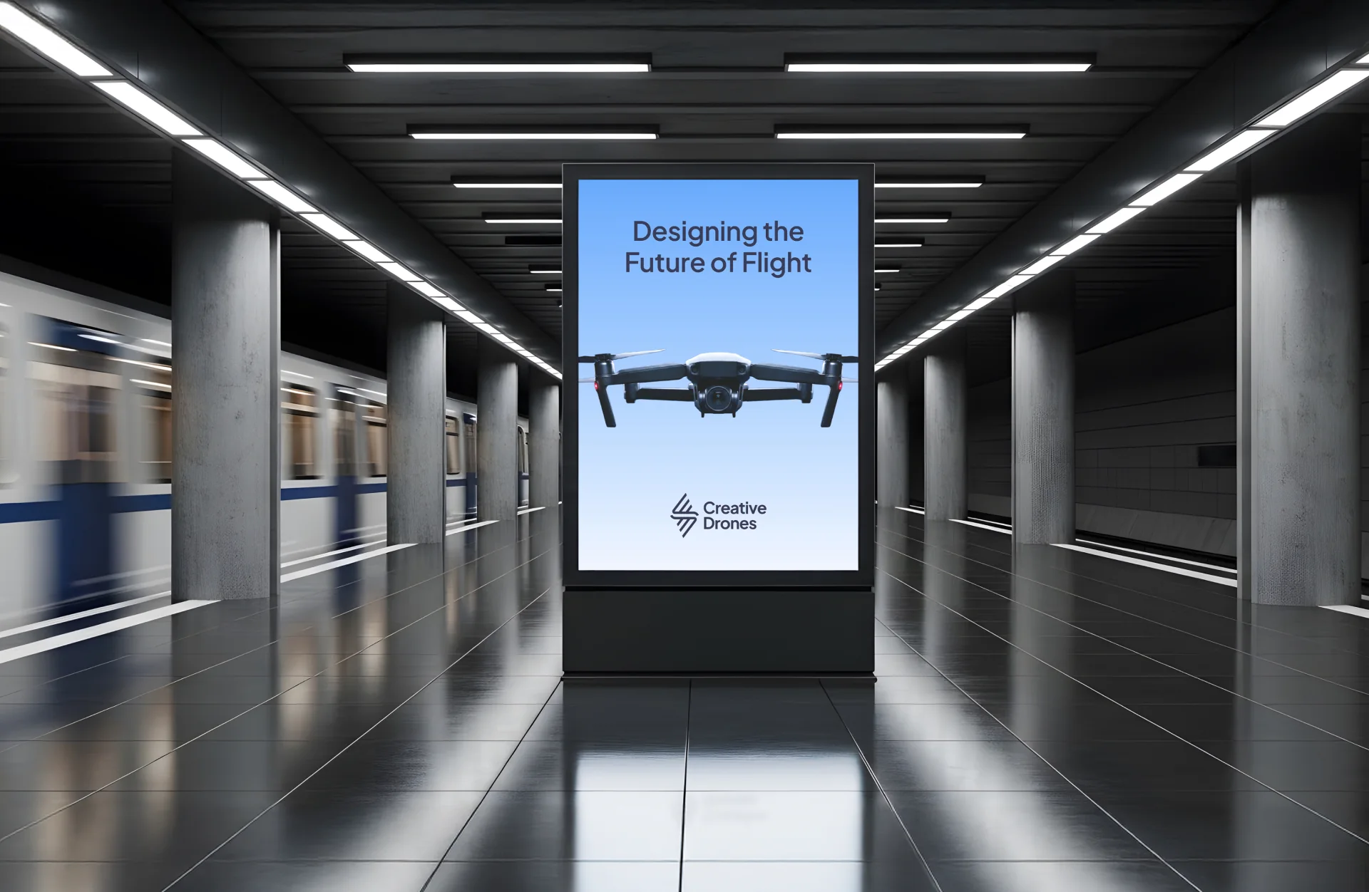
We carried the identity across every touchpoint — social media templates, an app icon, team badges, business cards and large-format outdoor ads. The symbol, the indigo-and-orange palette and a strong typographic hierarchy keep each piece instantly recognizable, whether it's a story on a phone screen or a billboard in a metro station.
Our managers will contact you as soon as possible.
 has been sent successfully!