
Biione is all about simplicity, sustainability, and smart design. They create high-tech products that are not only advanced but also thoughtfully made with the environment in mind. Their focus is to bring together minimalist design and eco-conscious practices in everything they do.
Logo Design, Color Palette, Typography, Packaging Design, Digital Assets for Website & Social Media, Brand Guidelines


Biione needed a brand identity that matched their values сlean, modern, and simple design with a focus on innovation and high-quality tech. The goal was to build a visual identity that would speak to tech lovers while staying true to Biione’s eco-friendly and minimal mindset.


The color palette combines a bold electric blue (for energy and tech) with clean white (for simplicity and space).
We started by designing a sleek, minimalist logo with clean lines and a modern typeface to reflect the brand’s focus on innovation. We chose Century Gothic for the main typography —it's modern, clear, and timeless, just like Biione’s products.


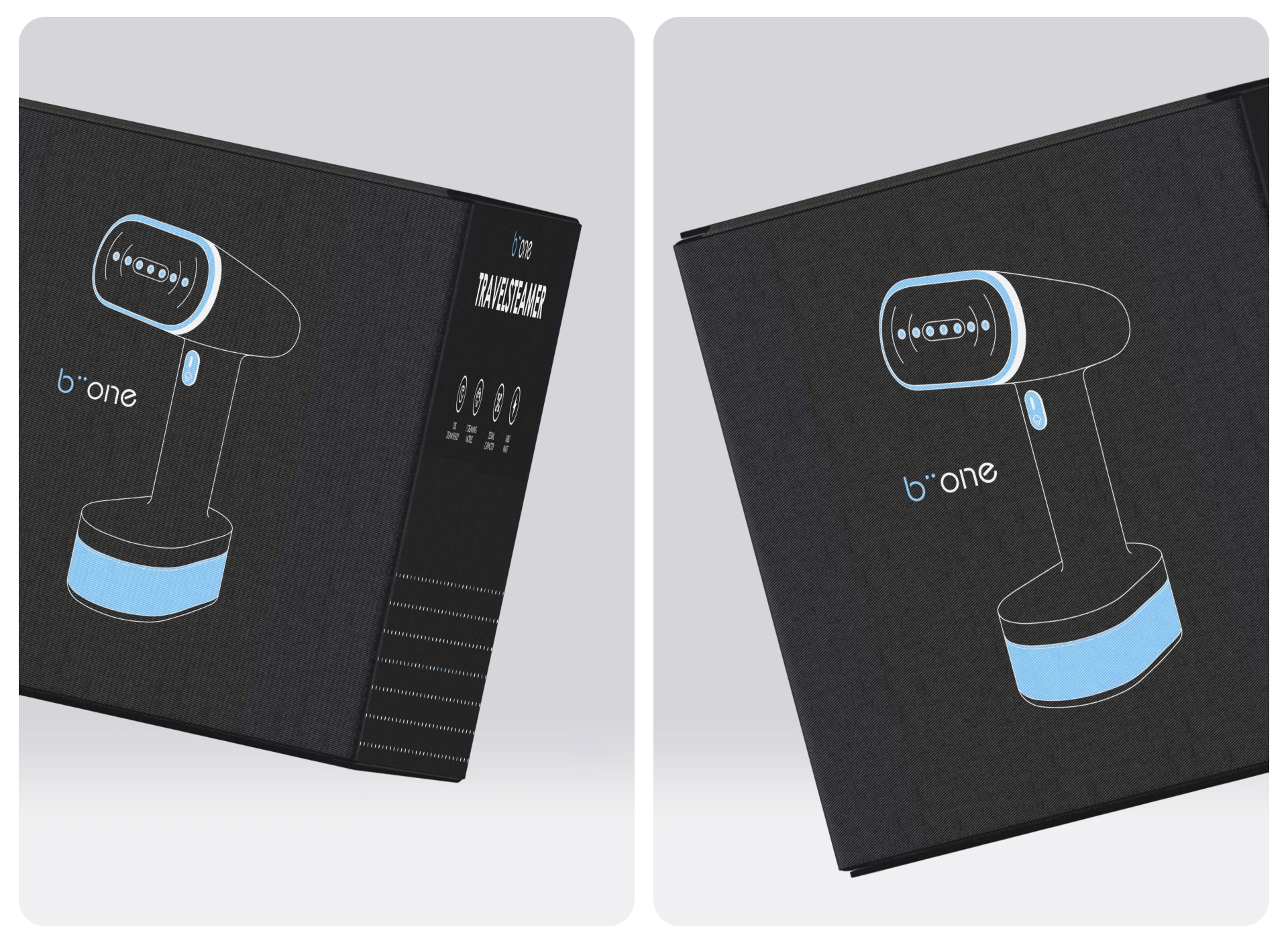
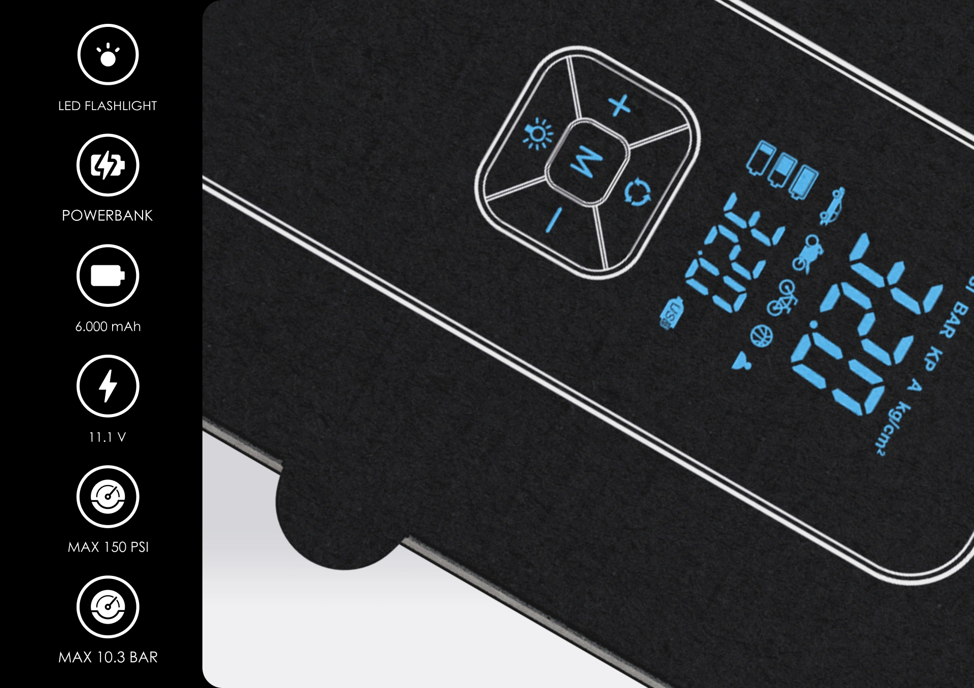
For packaging, we created a range of product designs that are sleek and durable, putting product features front and center while keeping the overall look simple and professional.


We also built out Biione’s digital presence, using consistent colors, fonts, and icons across the website and social media to keep everything cohesive and recognizable.


 BOOK A CALL
 has been sent successfully!
Our managers will contact you as soon as possible.