
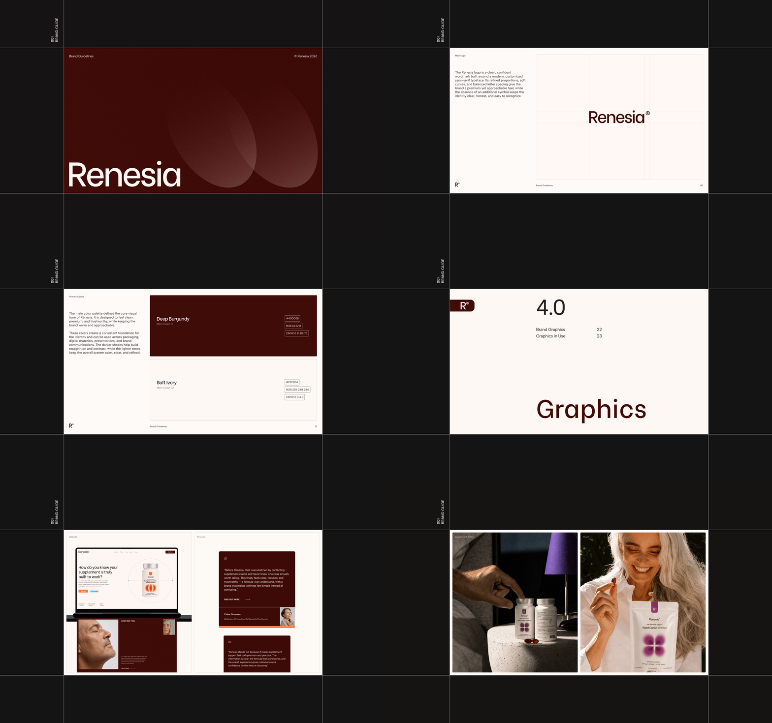
Renesia is a premium supplement brand built around the concept of renewal, botanical science, and long-term wellbeing. Combining clinically backed ingredients with transparent formulations, the brand supports holistic health, from hair renewal and hormonal balance to metabolic and cardiovascular wellness. The goal was to create a cohesive visual language that merges clinical credibility with a modern, approachable wellness aesthetic.
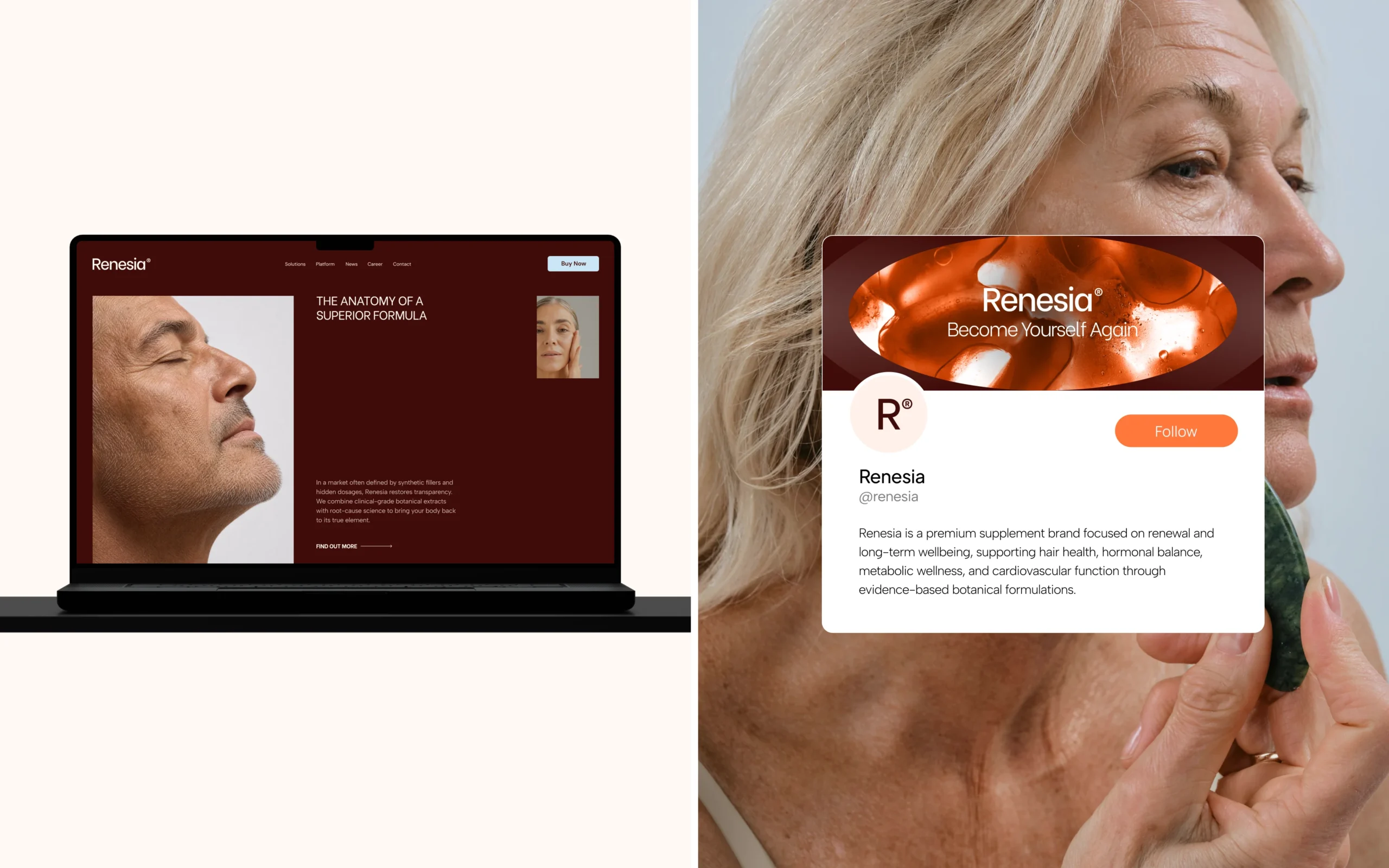
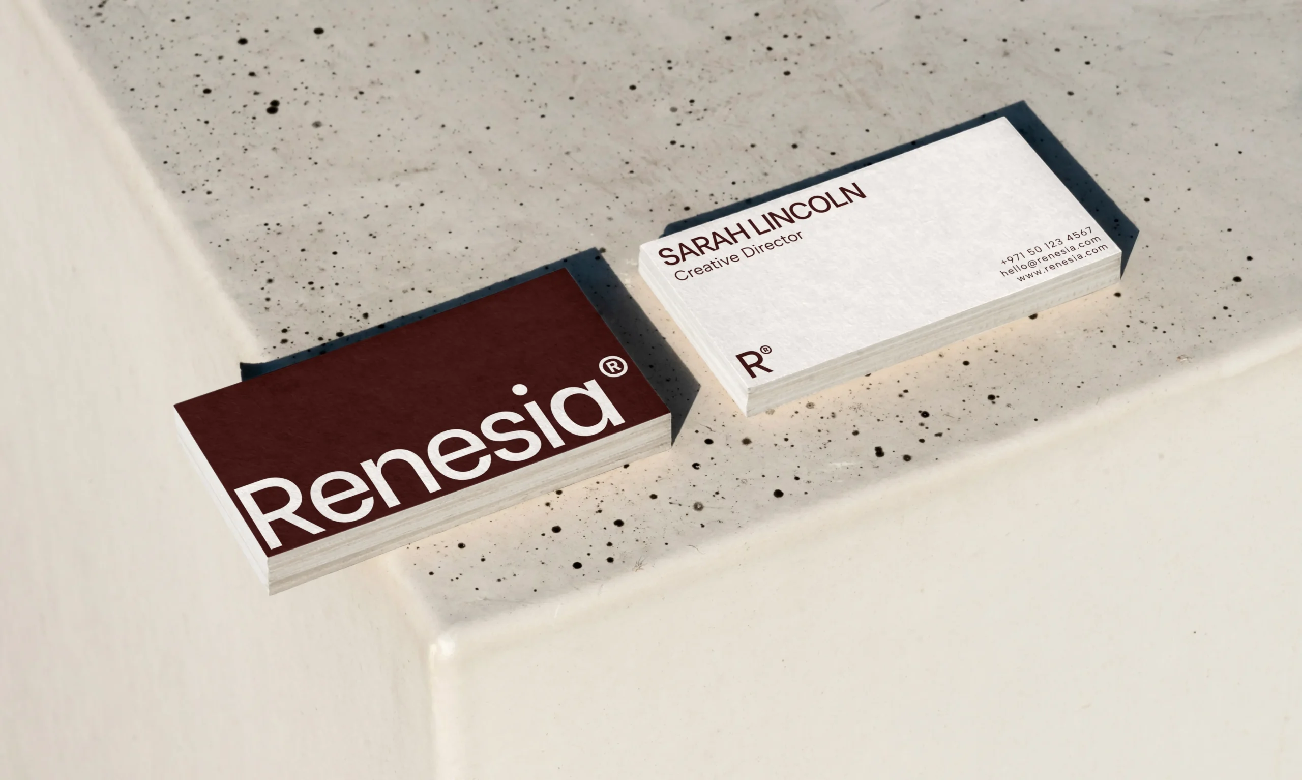
The Renesia identity is built around a clean, confident visual language that balances clinical credibility with the warmth of modern wellness. The customized sans-serif wordmark features refined proportions, soft curves, and balanced letter spacing, creating a premium yet approachable character.
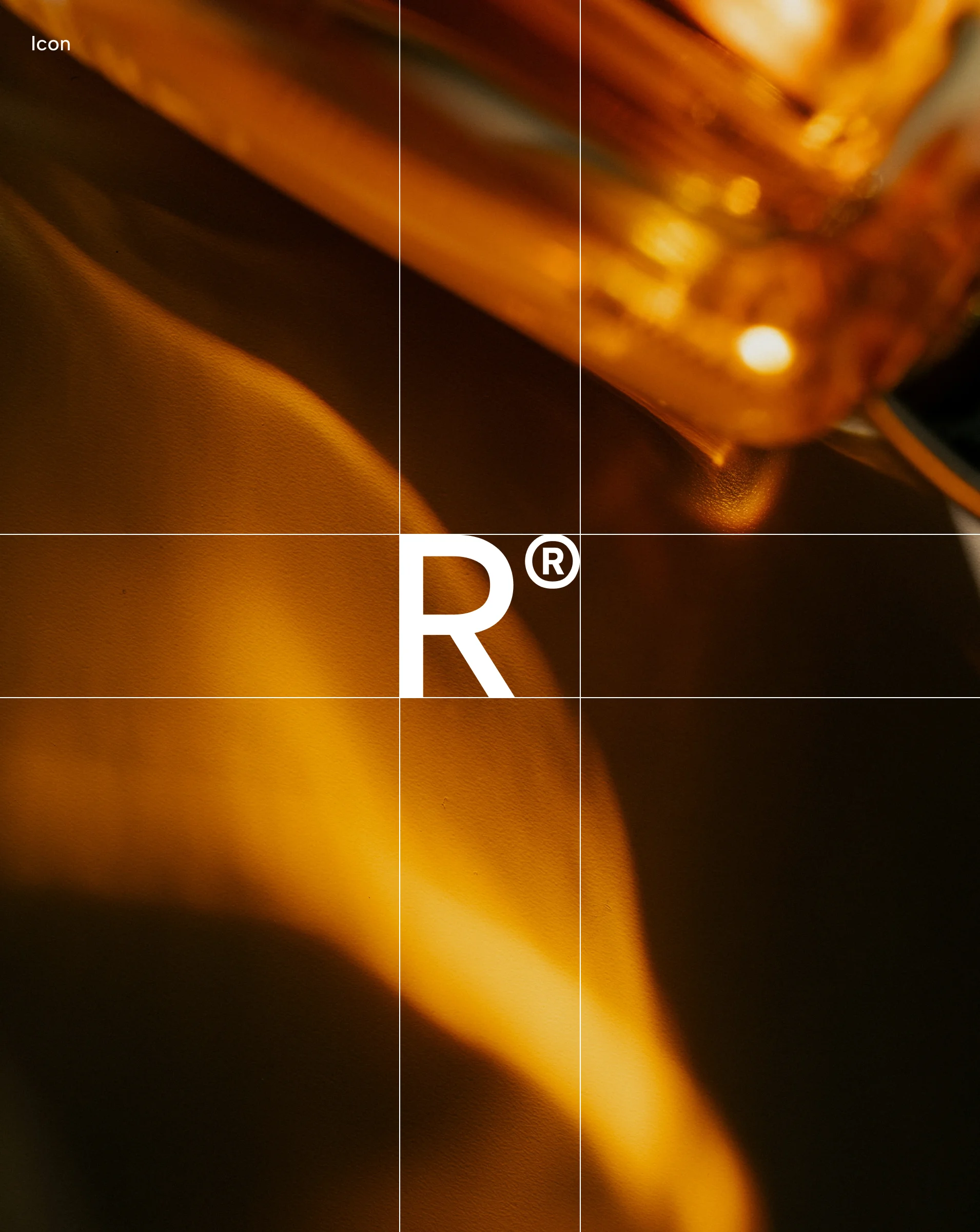
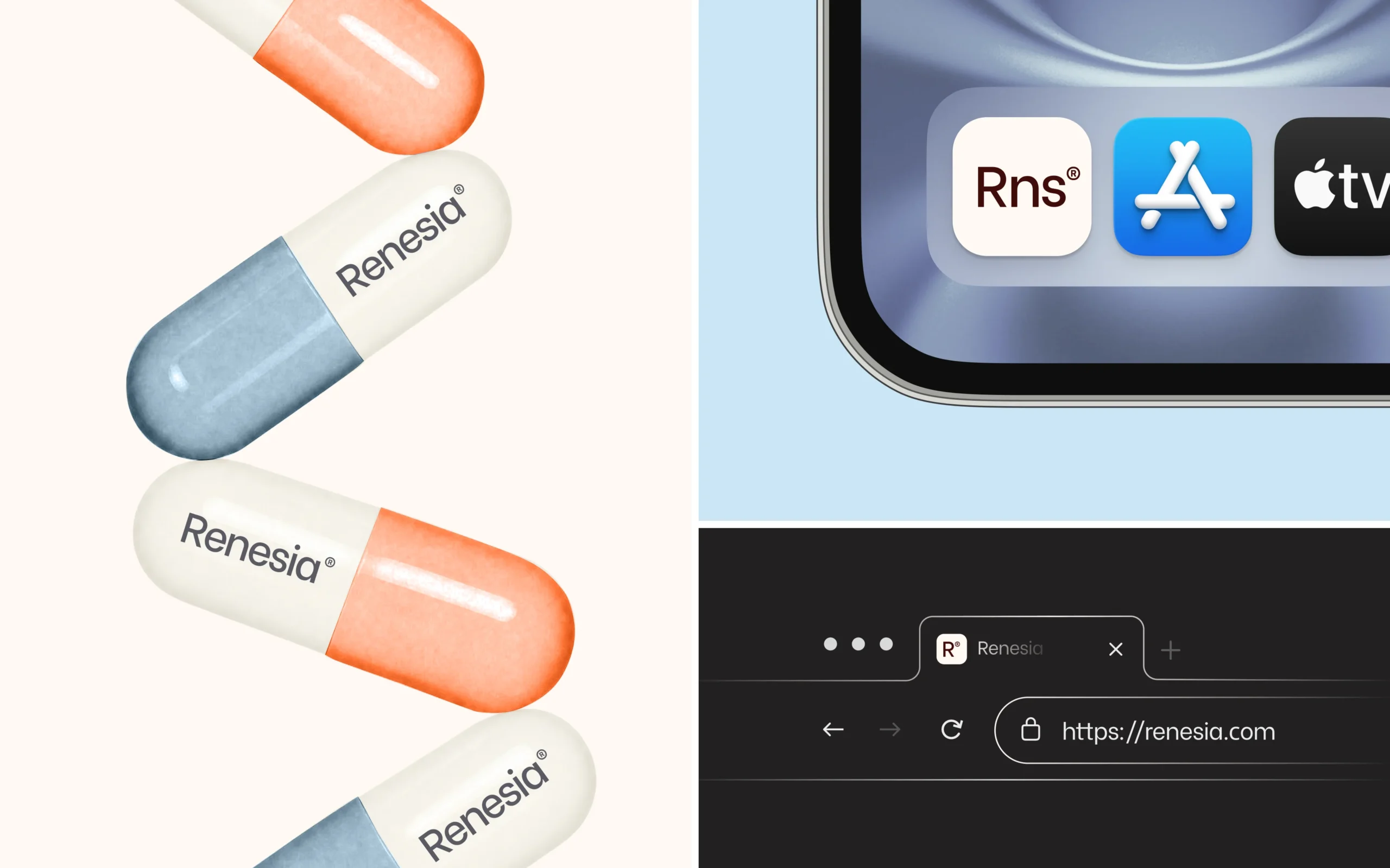
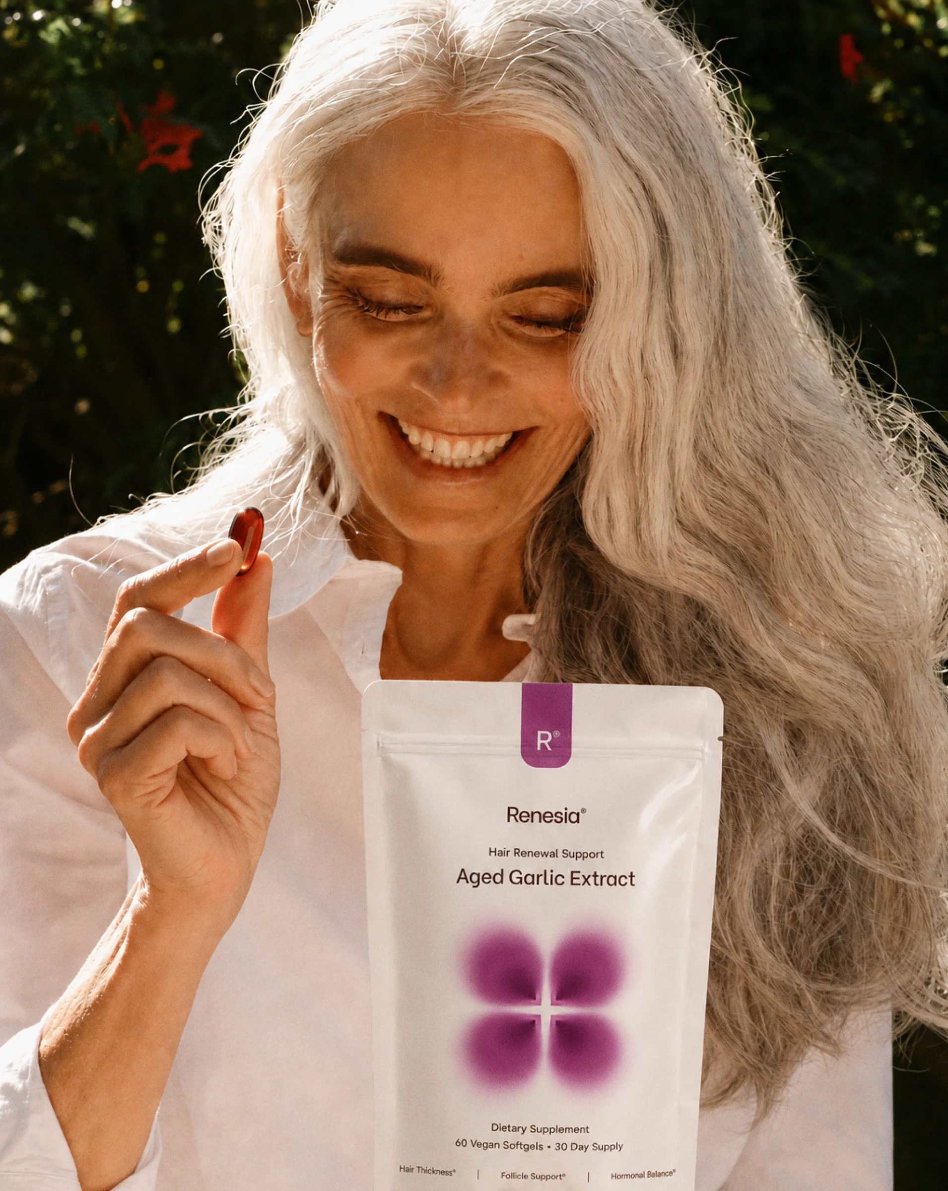
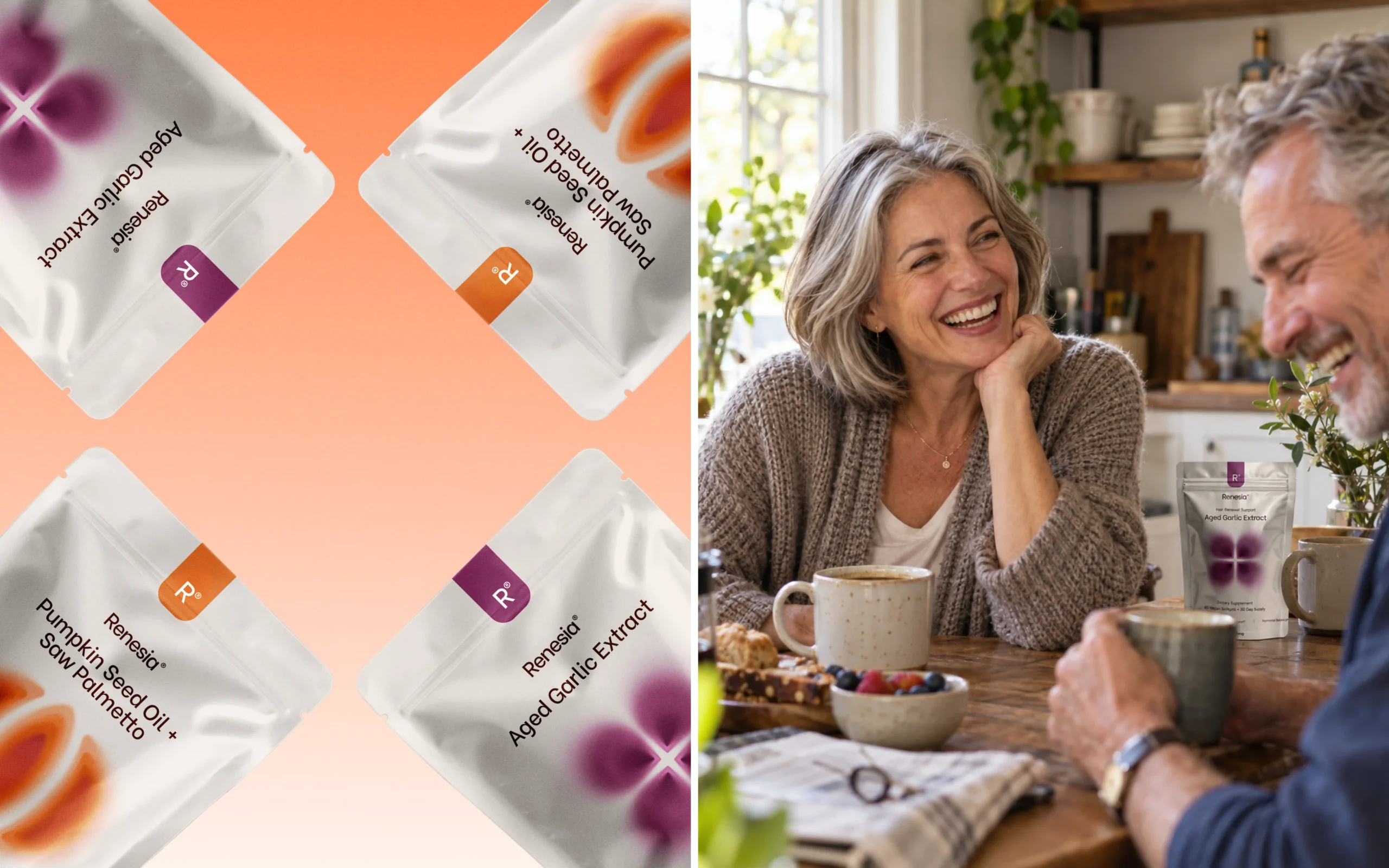
A simplified "R" icon extends the identity into smaller digital applications. Natural, human-centered photography and carefully considered product imagery bring warmth to the system, connecting the brand's scientific approach with everyday wellbeing. Together, these elements create a cohesive, recognizable identity that feels modern, trustworthy, and adaptable across digital and physical applications.
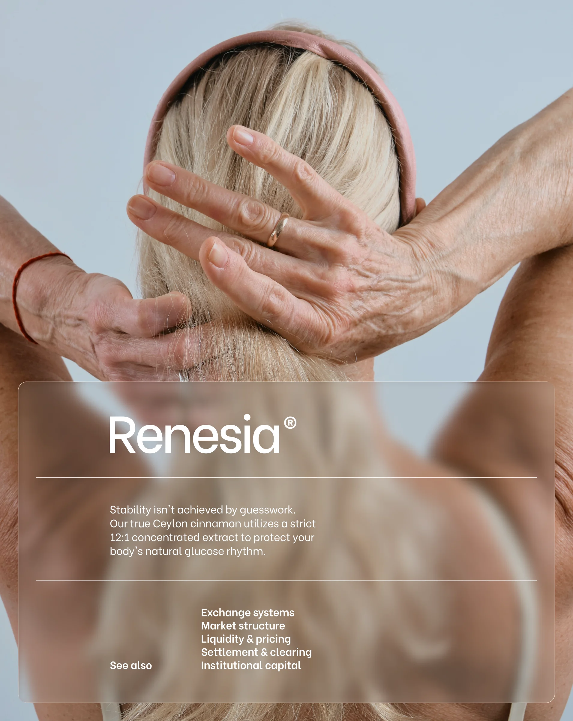
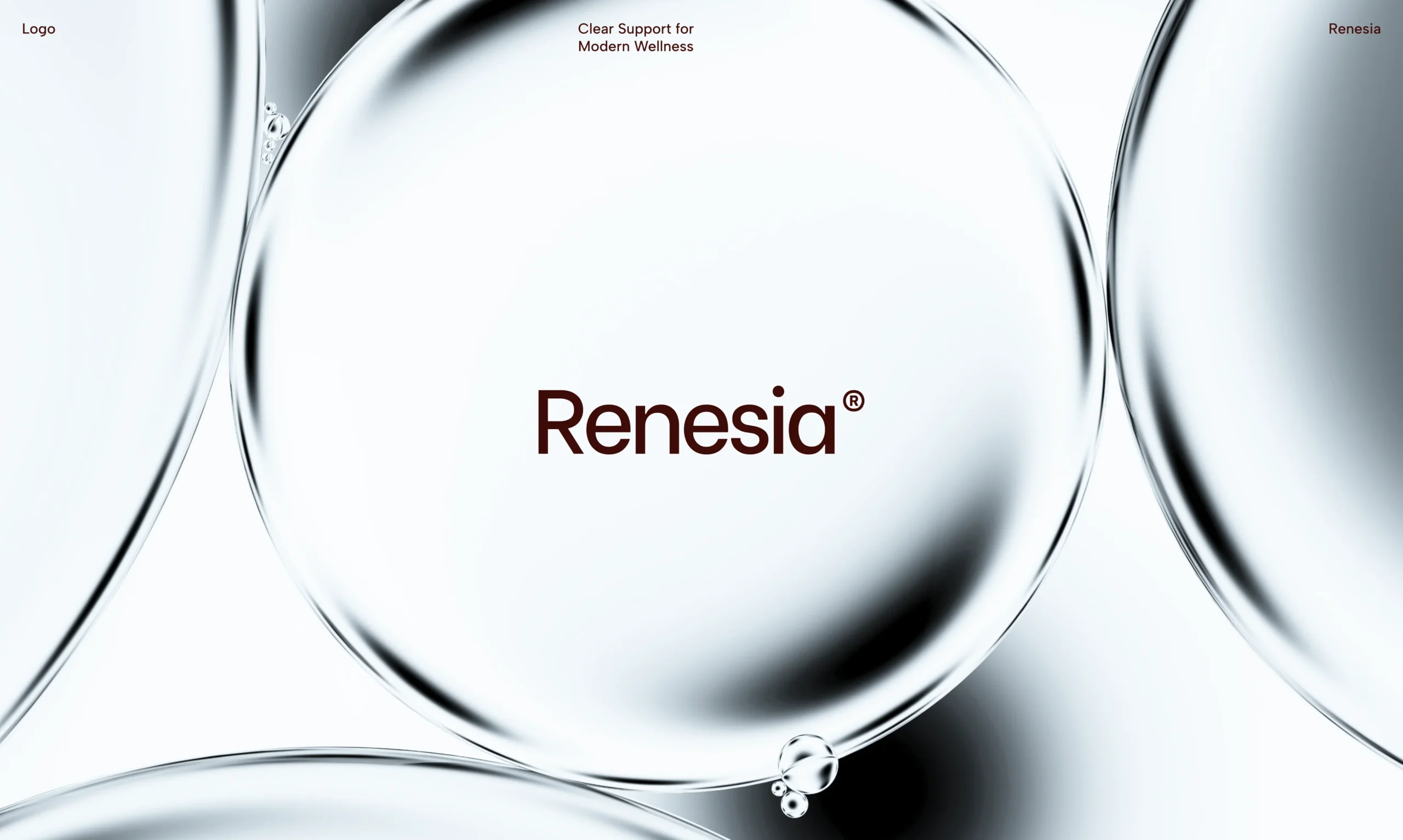
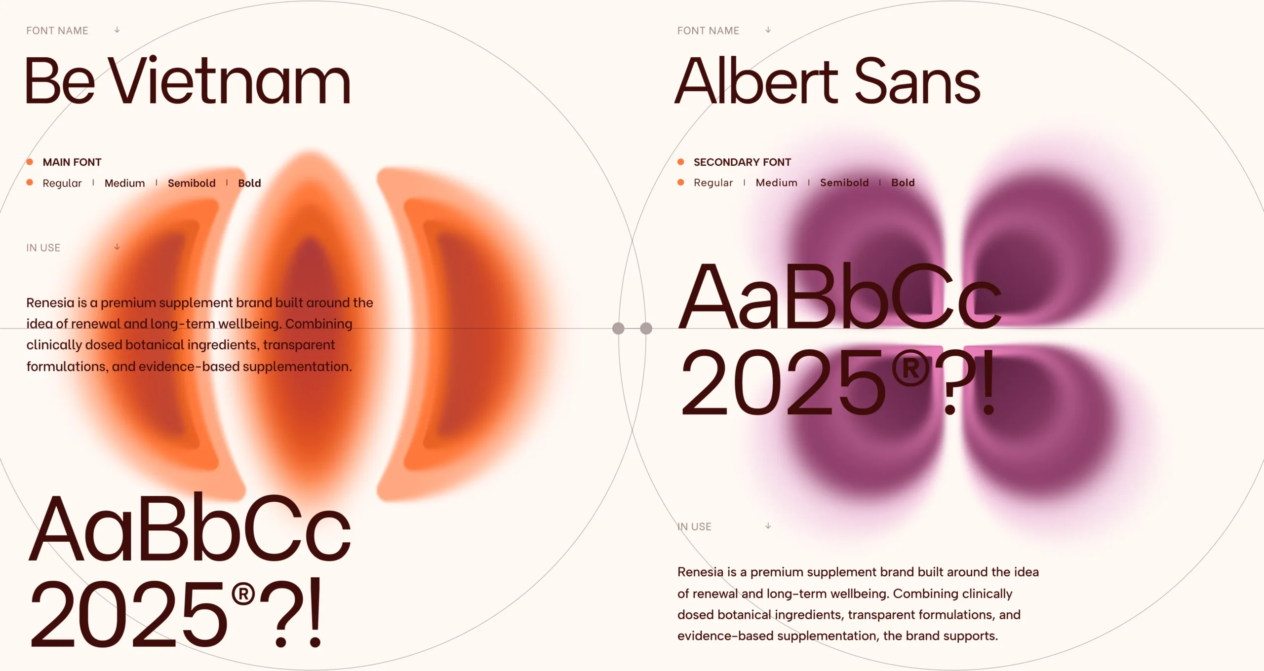
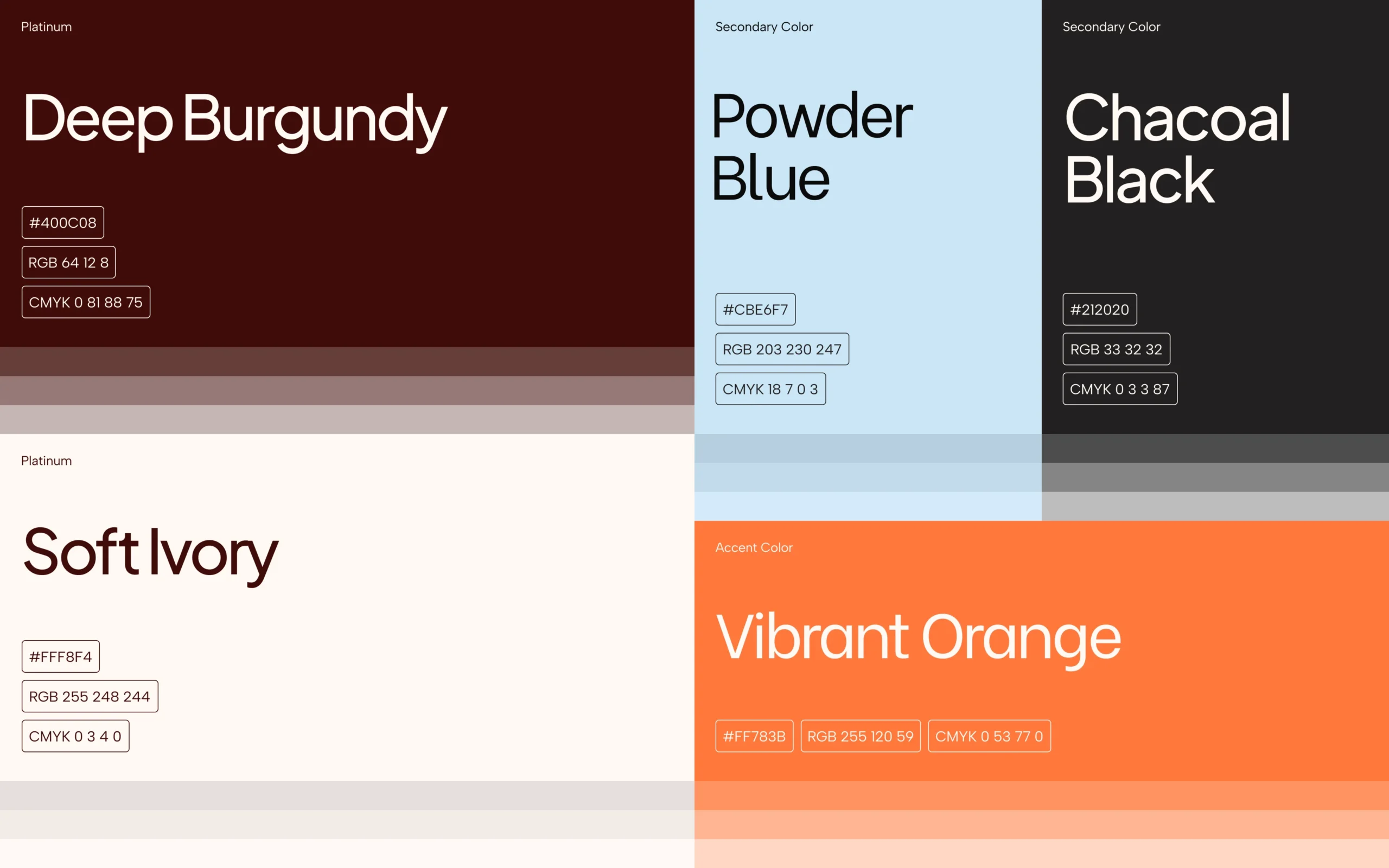
The color system relies on warm, foundational neutrals — Soft Ivory, Powder Blue, Charcoal Black, and Deep Burgundy — paired with Vibrant Orange as an energetic accent to highlight key interactions, product categories, and vital health metrics. The typographic hierarchy pairs Be Vietnam as the primary display face for strong, modern headlines with Albert Sans for clean, accessible body copy, secondary messaging, and UI elements. Soft, organic gradient forms are integrated alongside the typography to symbolize vital energy and biological balance.
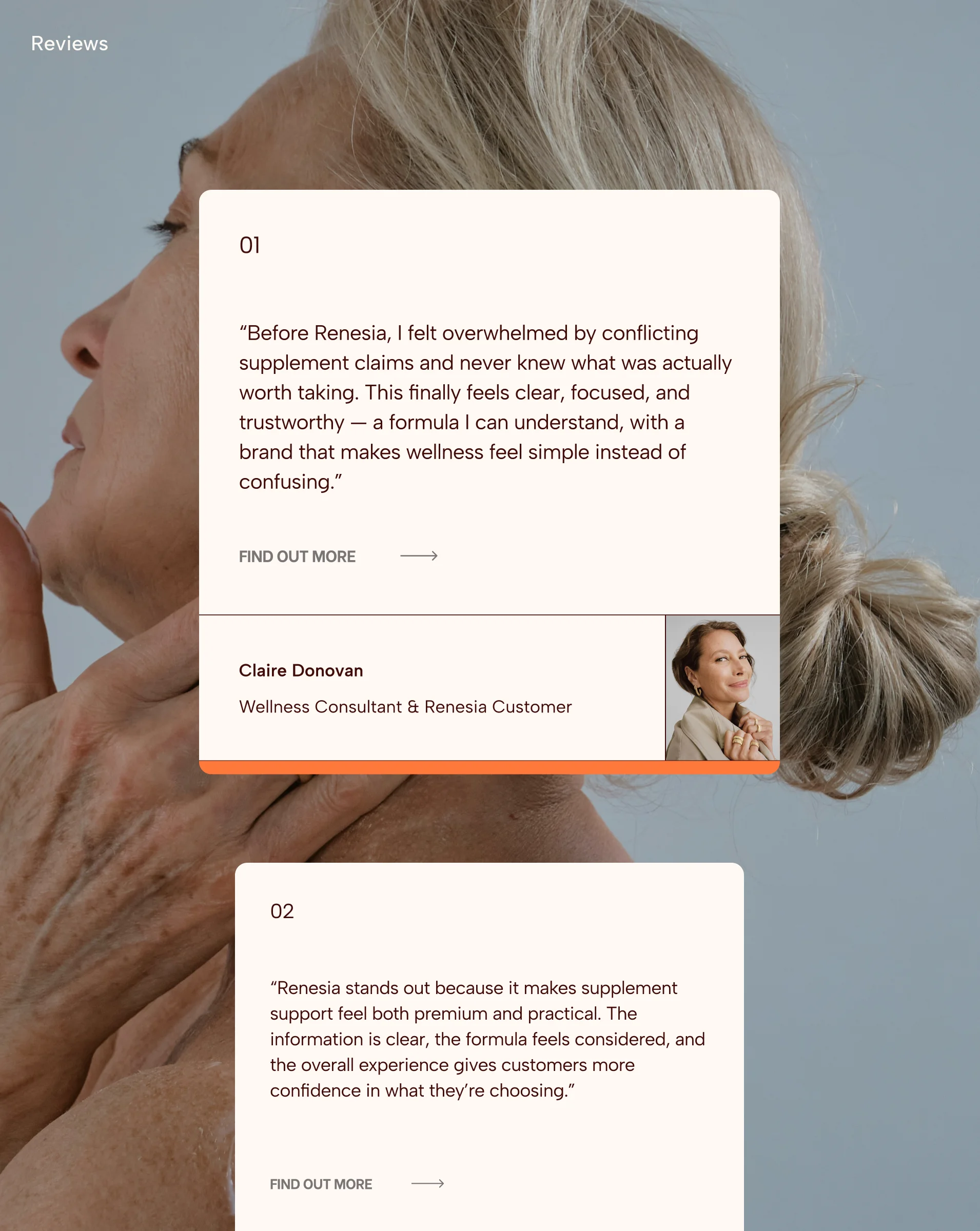
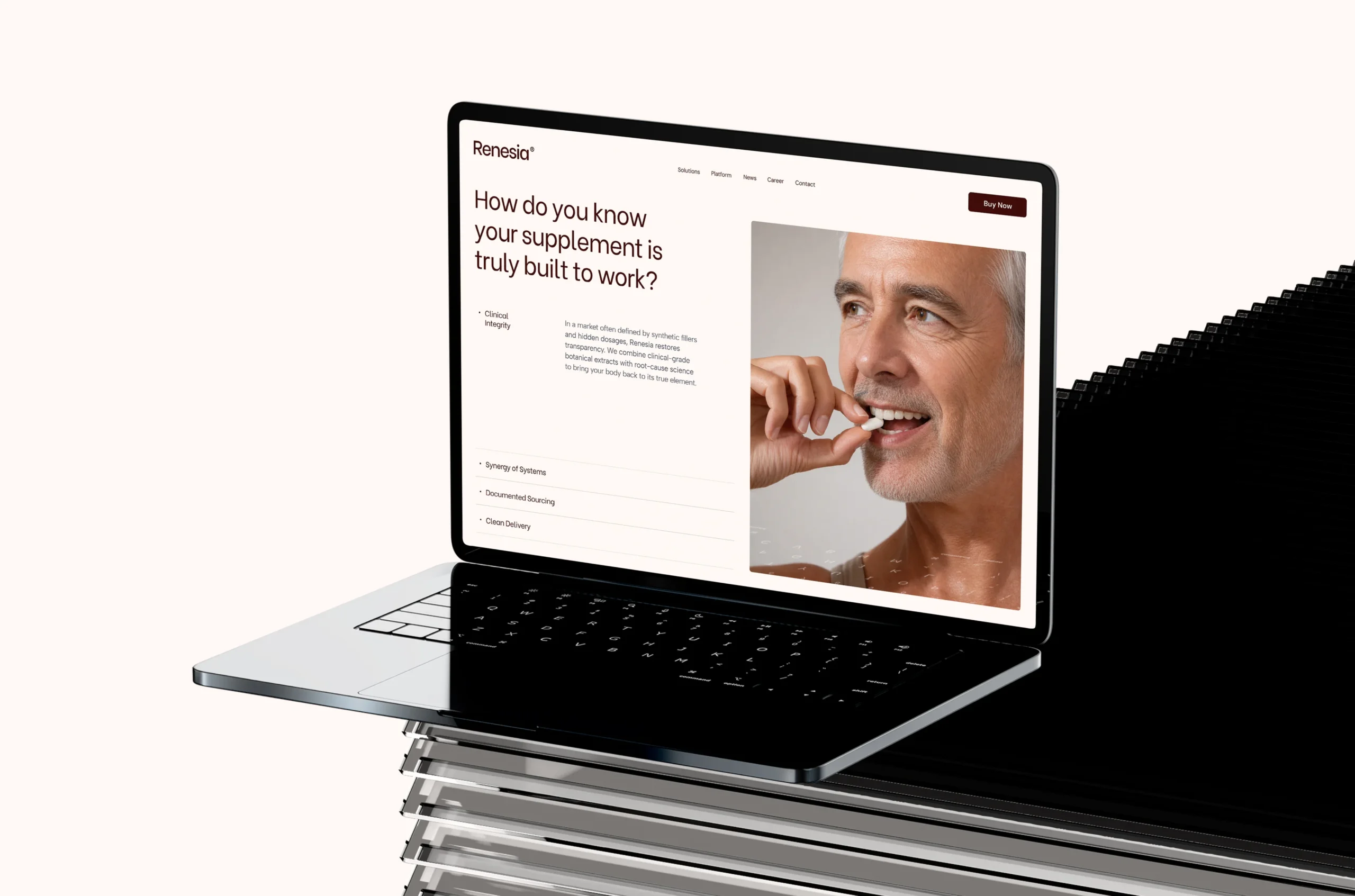
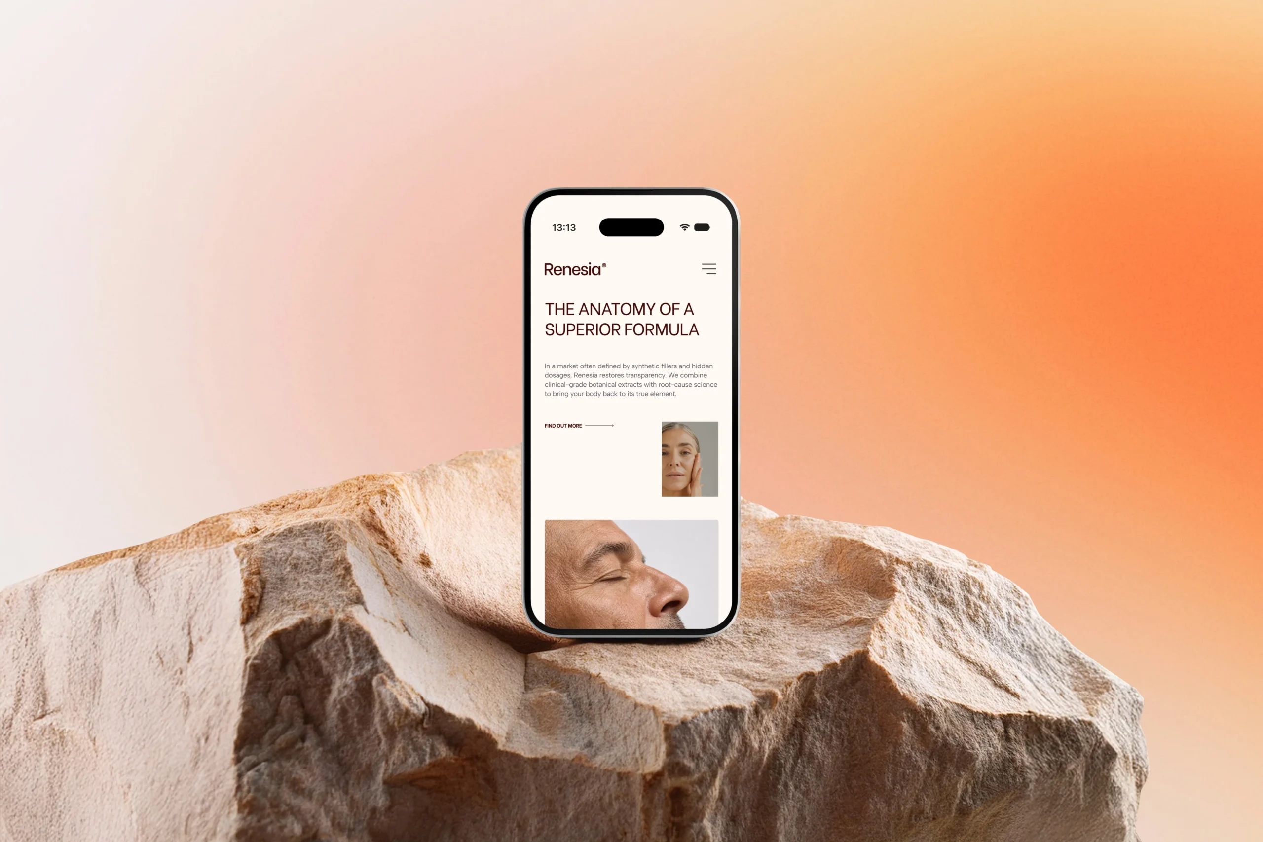
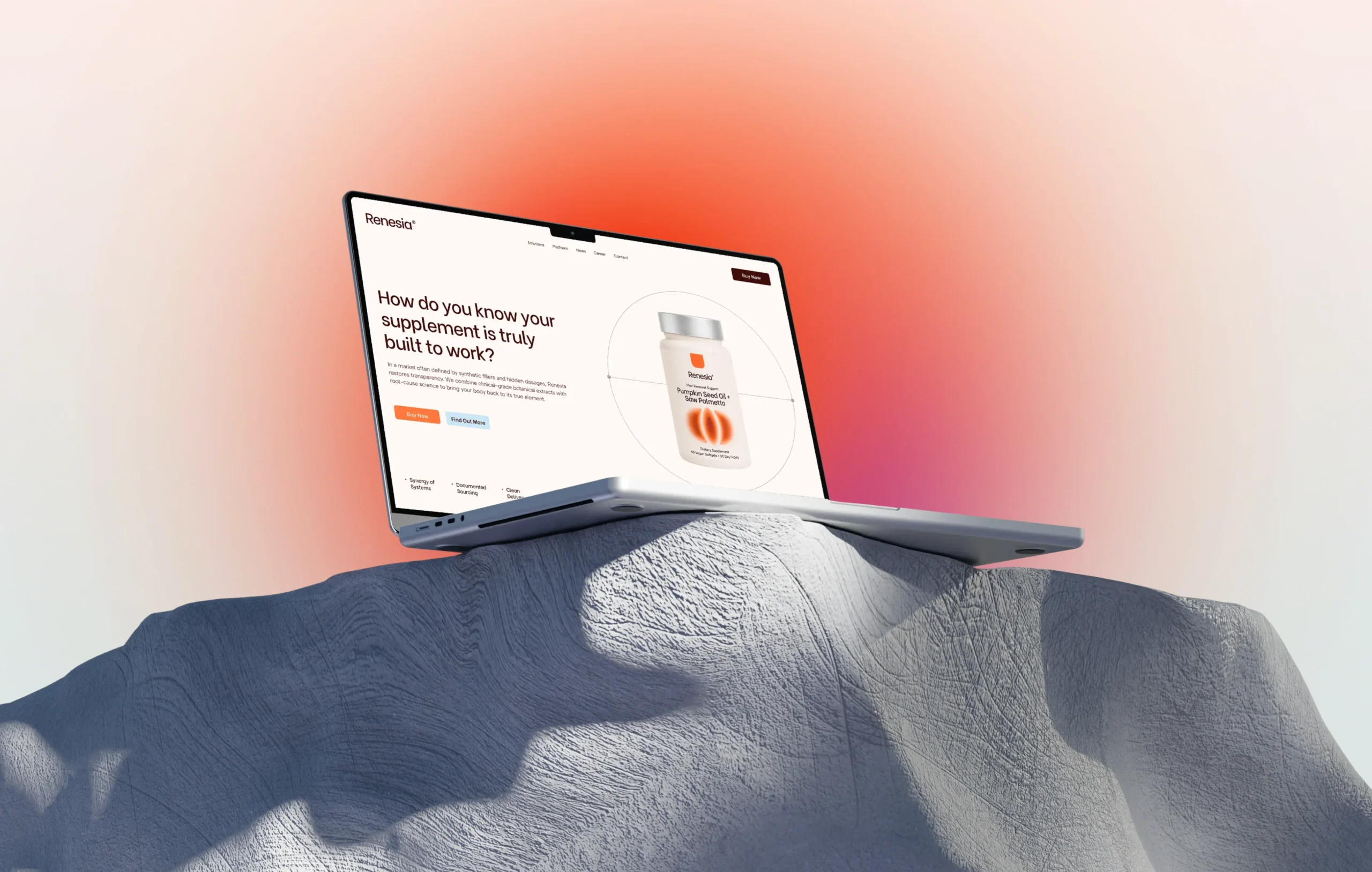
Designed for responsive e-commerce and digital platforms, the web experience prioritizes clarity, performance, and intuitive navigation. The layout incorporates spacious grids, clear typography, and soft gradient visuals to make complex health and formulation data transparent and effortless to navigate.
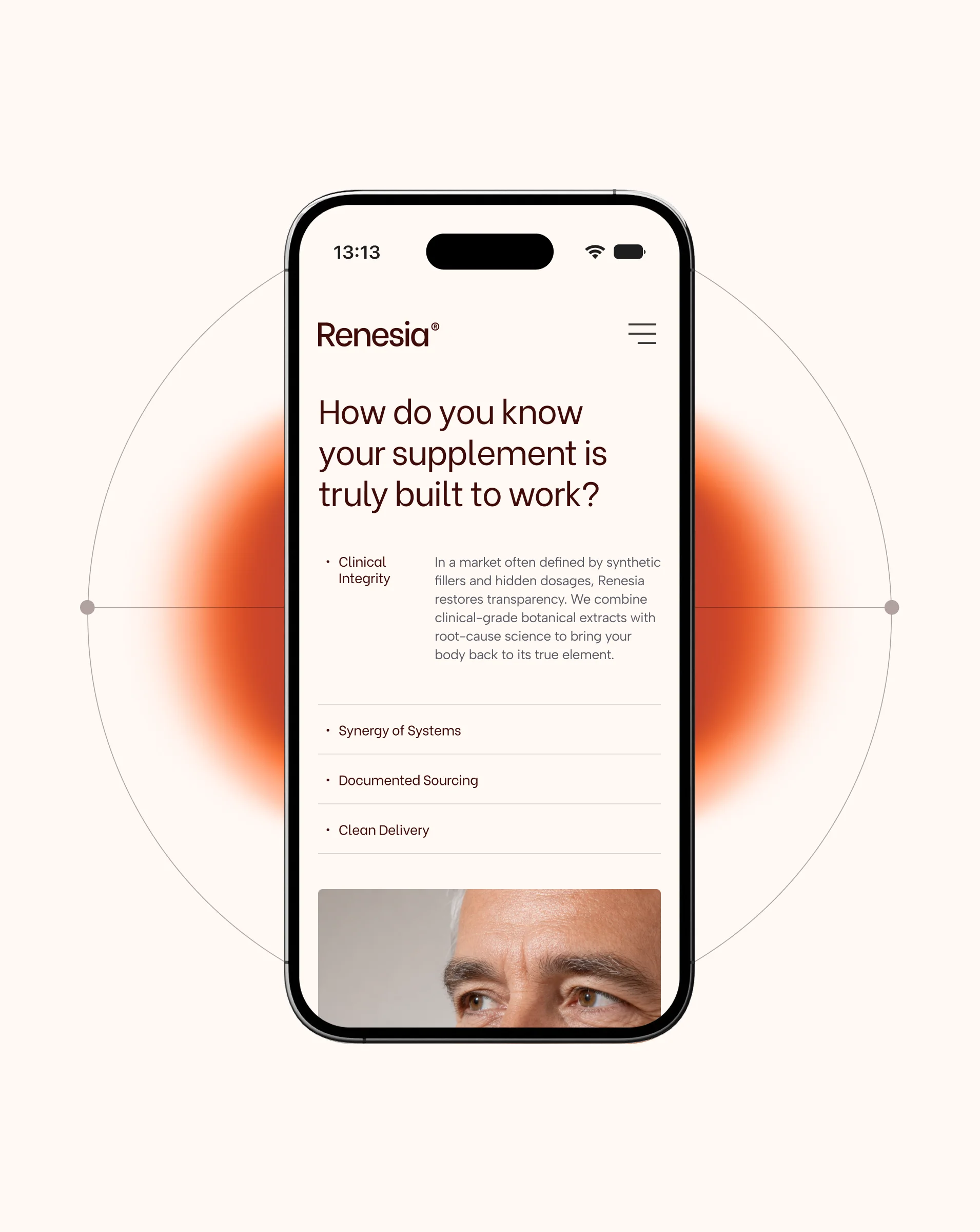
The system adapts seamlessly across mobile and desktop environments, featuring modular content blocks, clear calls-to-action, and lifestyle photography that reinforces the brand's human-centric wellness approach.
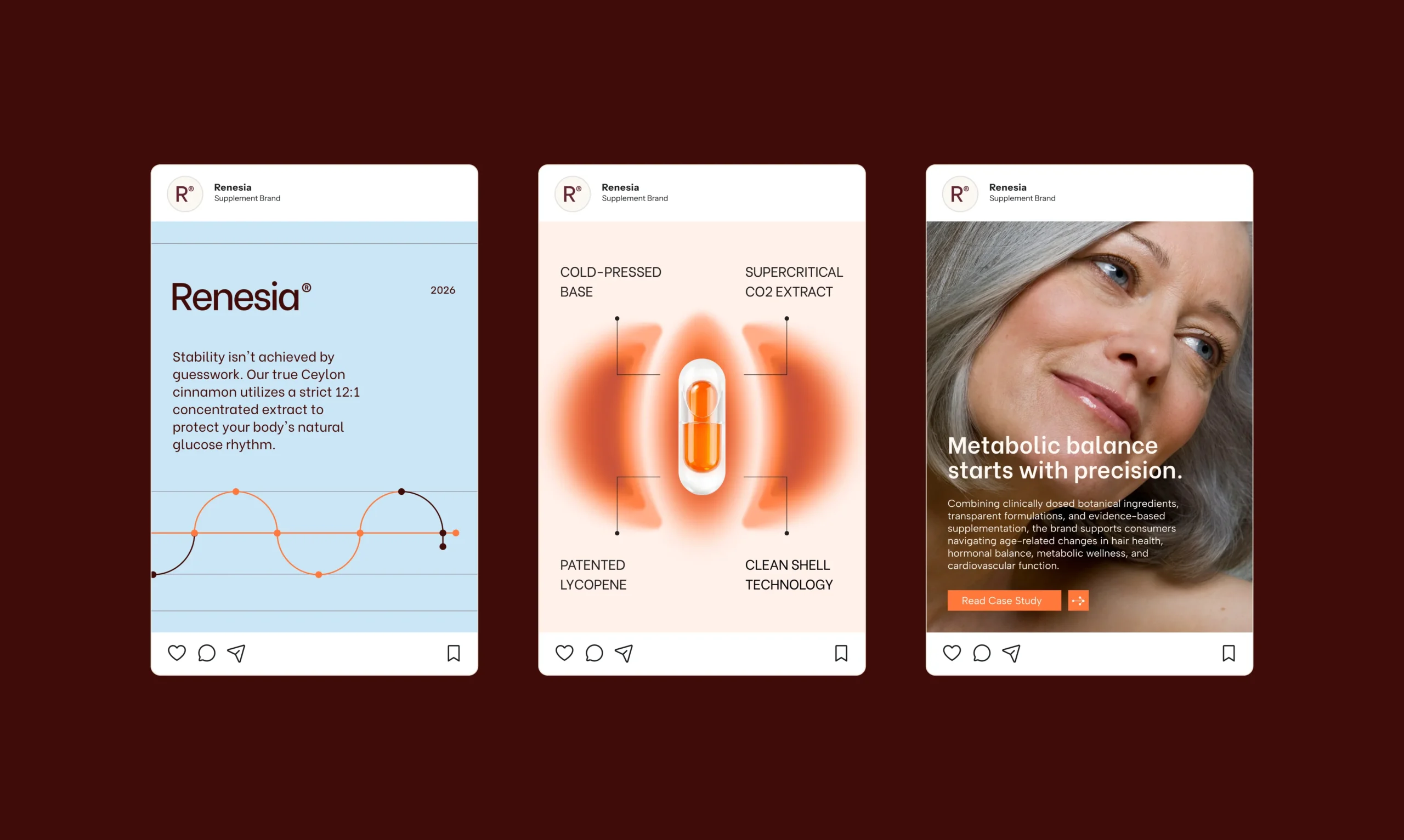
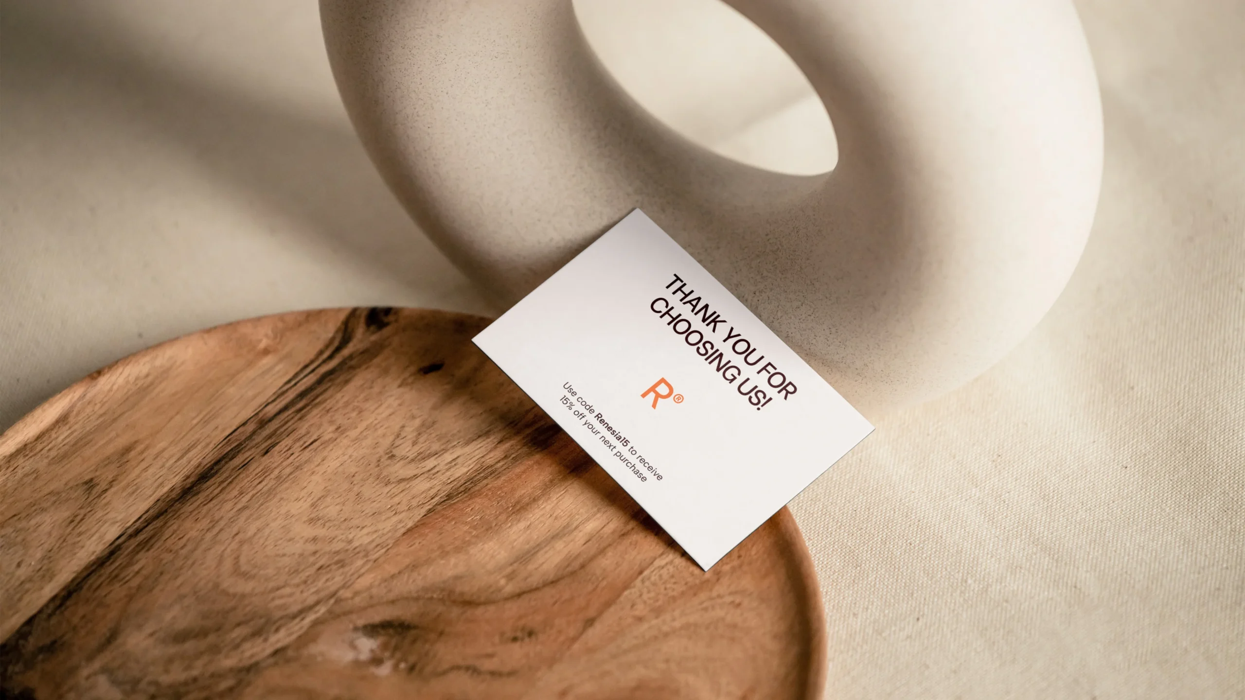
The physical touchpoints extend the identity across minimal packaging labels, supplement bottles, pouches, and print collateral. Packaging layouts feature clean typography, clear ingredient transparency, and distinct color-coded organic graphic icons that differentiate individual formulas and product lines.
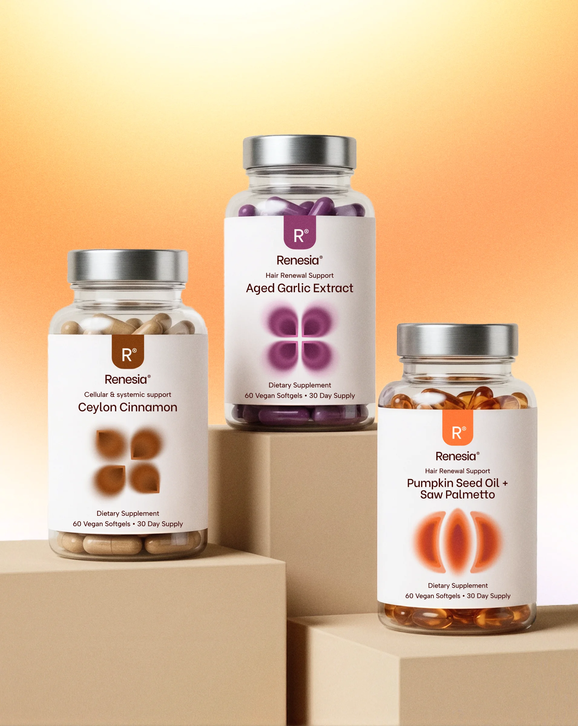
High-quality tactile finishes and structural material choices reinforce the sense of safety, purity, and clinical reliability in hand. The system maintains a balance between scientific authority and modern lifestyle design, delivering a premium and trustworthy unboxing experience.



 BOOK A CALL
 has been sent successfully!
Our managers will contact you as soon as possible.