The Wild Garden Box is an e-commerce brand offering curated products designed to support biodiversity in UK gardens. Built around the idea of “feed the now, grow the future,” the brand encourages people to take small, meaningful steps toward creating thriving wildlife habitats in their own outdoor spaces.
The goal of the project was to develop a refined brand identity and a flexible visual system that could grow alongside the product range, while remaining simple to use in everyday applications like packaging and digital content.
The original logo concept already communicated the right idea — combining a box with wildlife elements — but lacked the clarity and flexibility needed for a growing product range. The challenge was to transform this idea into a more polished and scalable identity that could adapt to different product variations without losing consistency. At the same time, the system needed to work within practical constraints, including home-printed labels and easy editing in Canva. Another key objective was to create a visual language that feels natural and calm, while staying clean and structured enough for packaging and digital use.
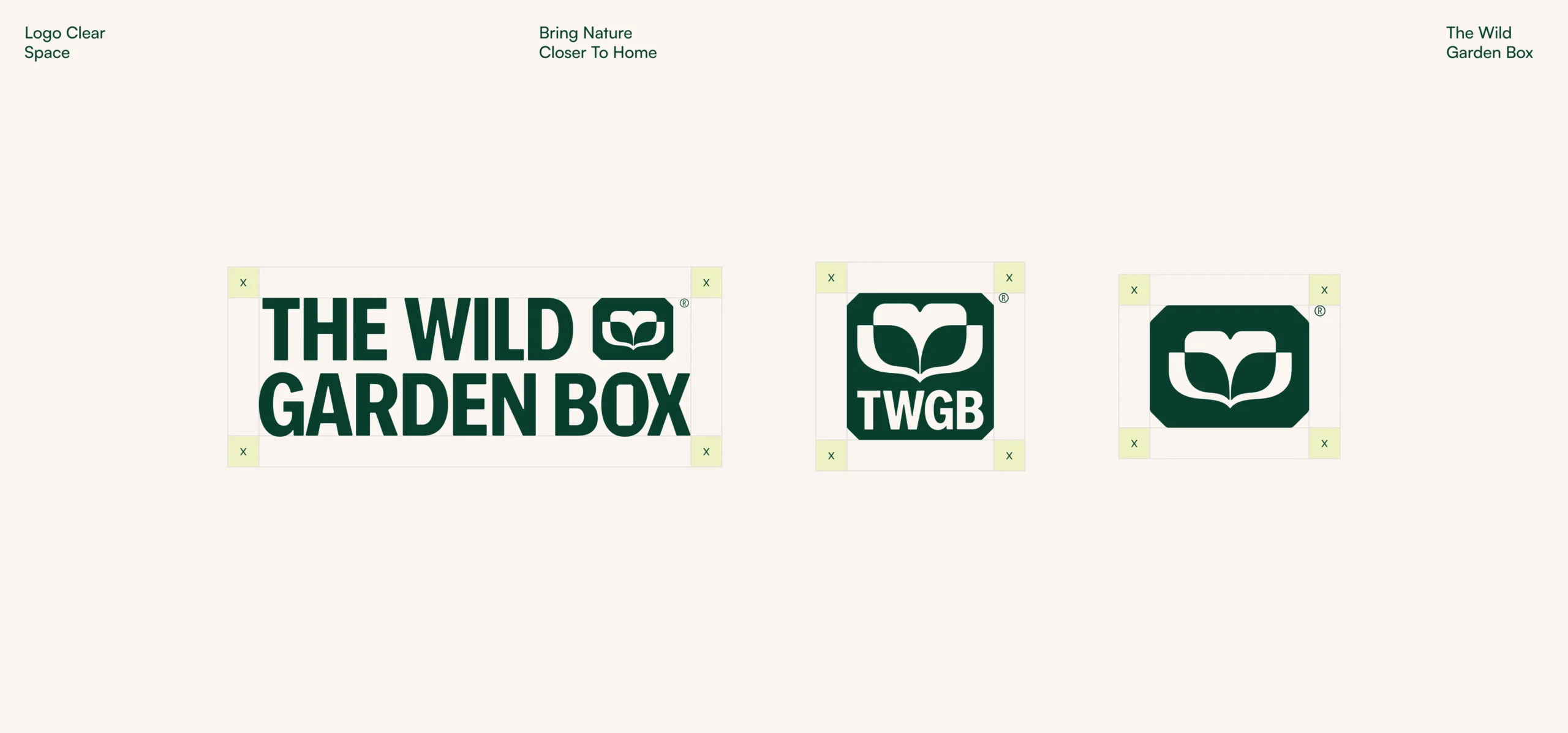
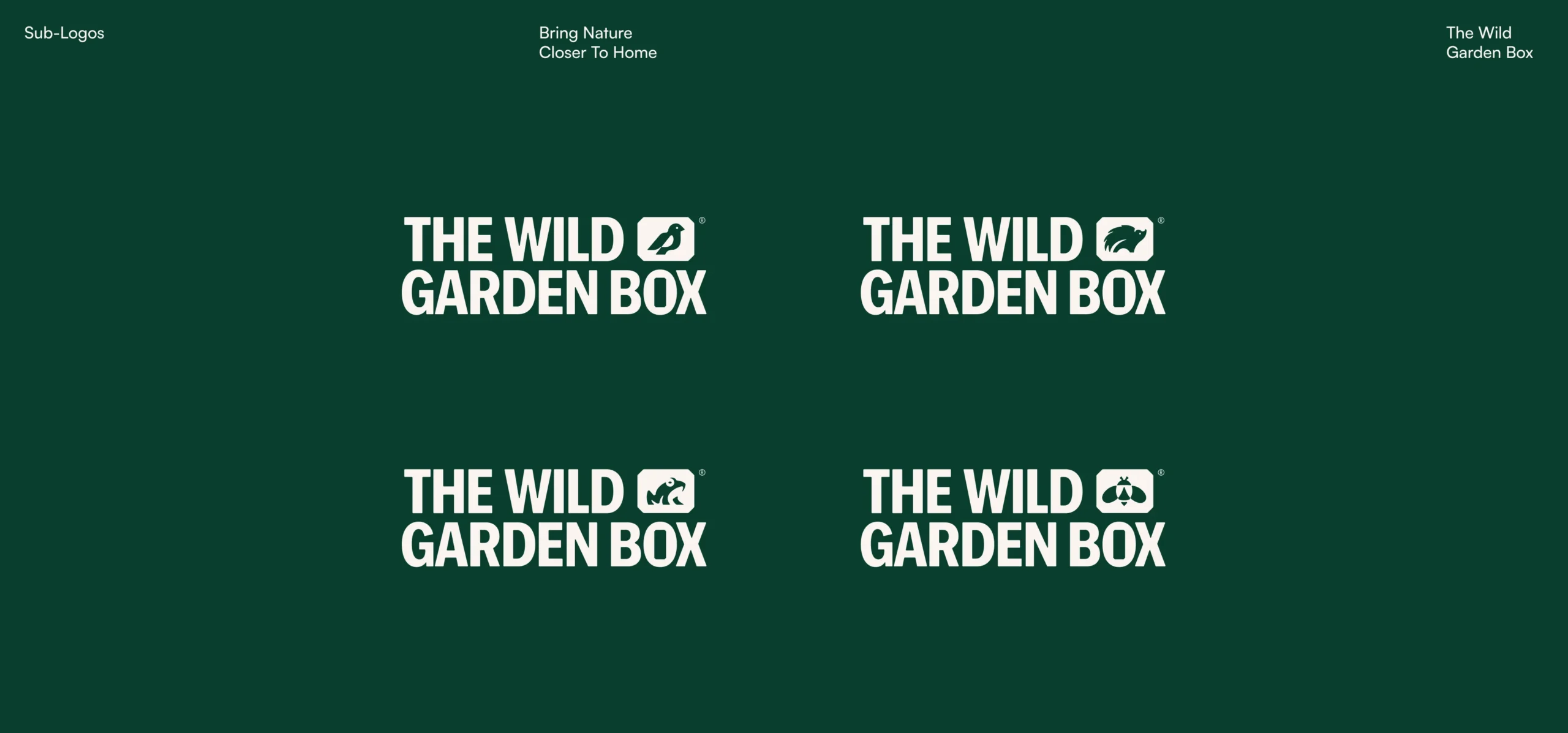
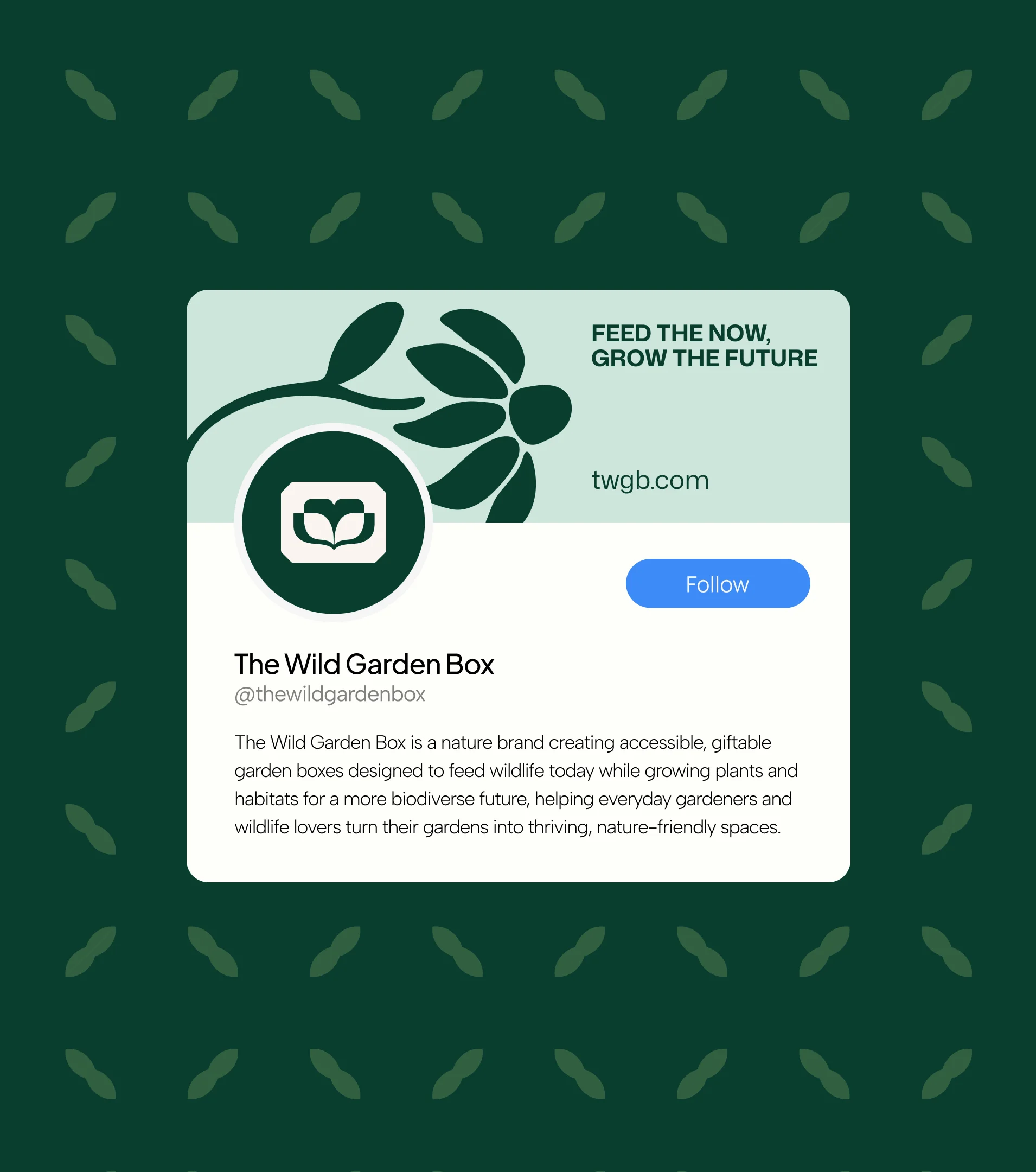
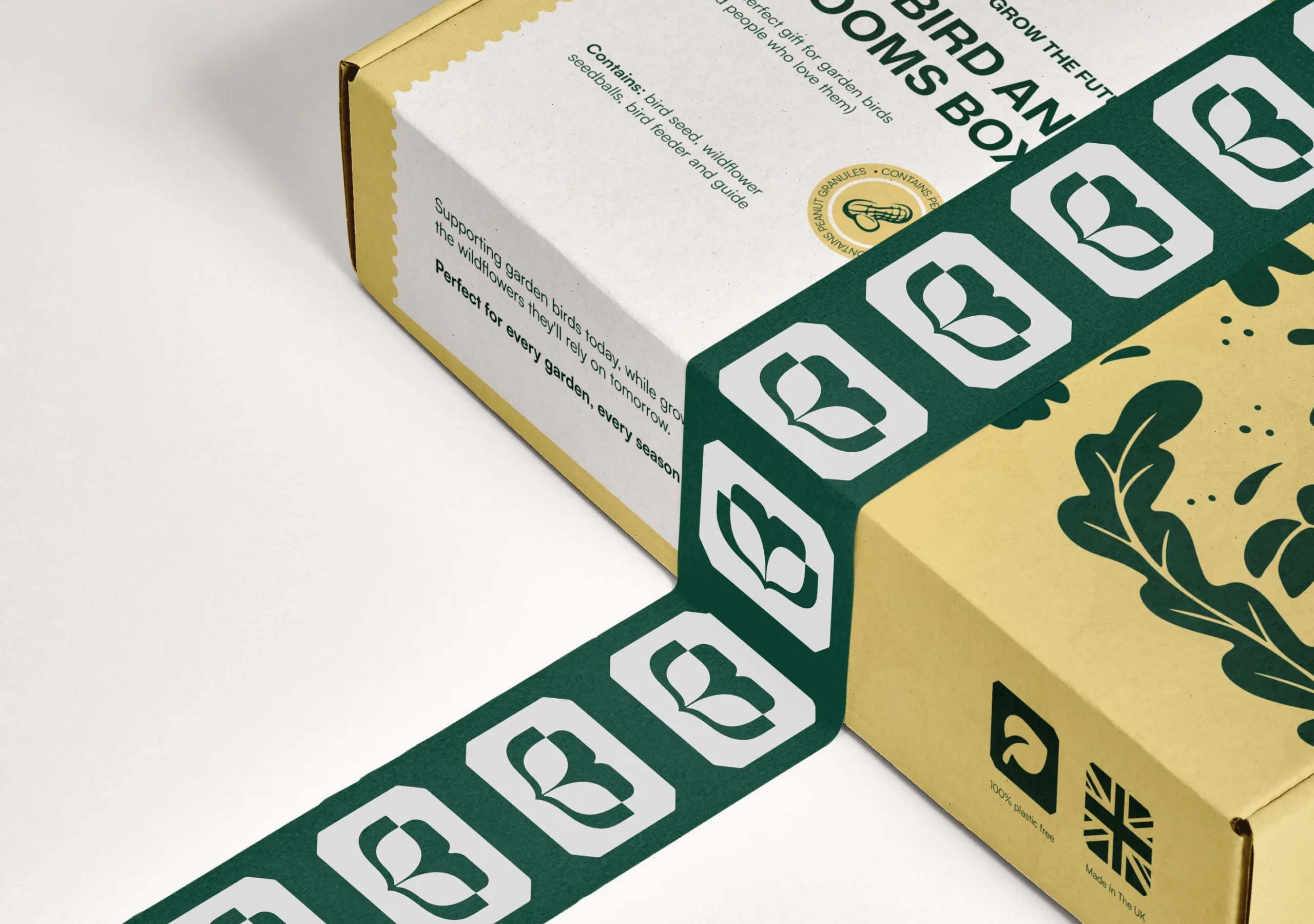
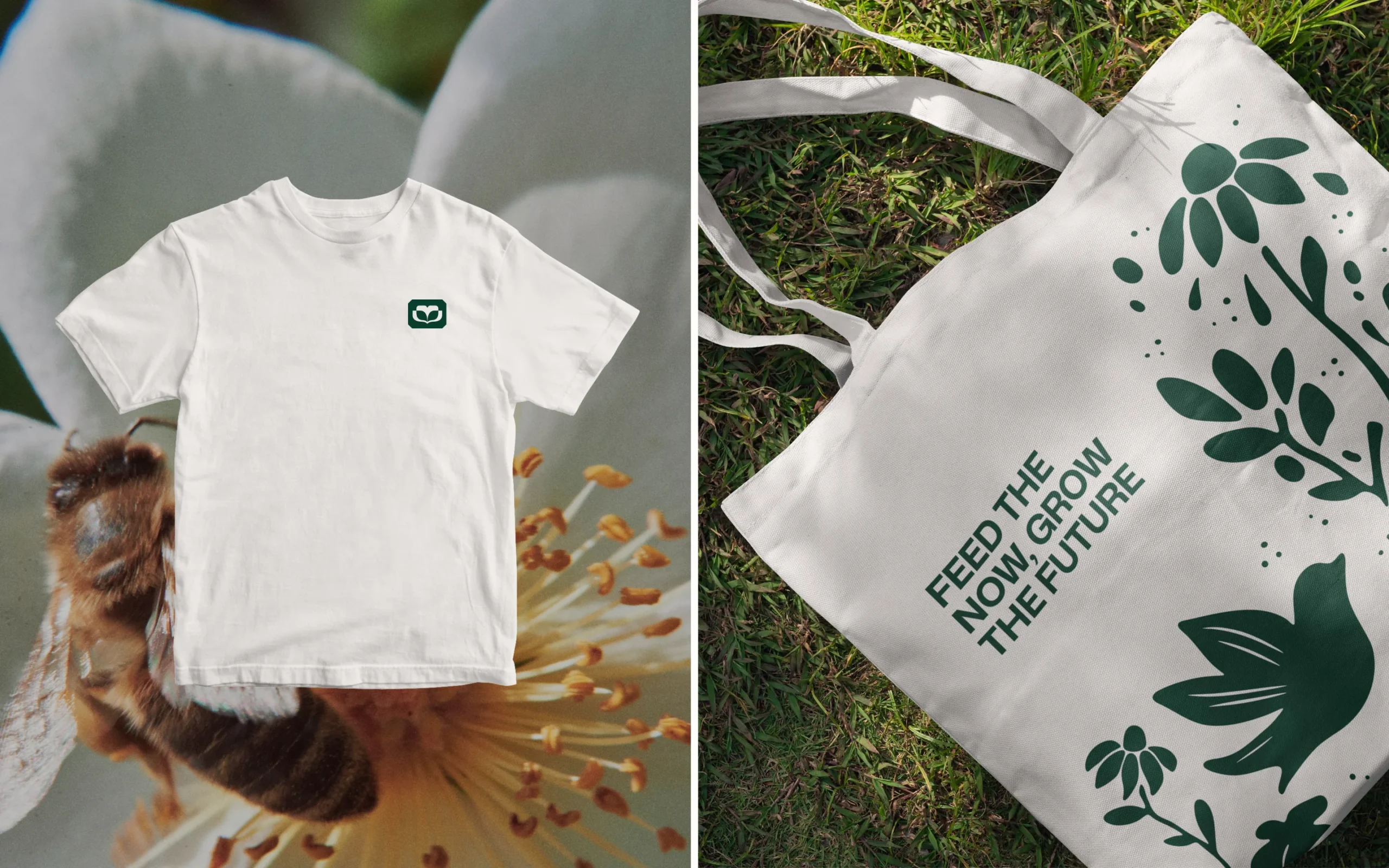
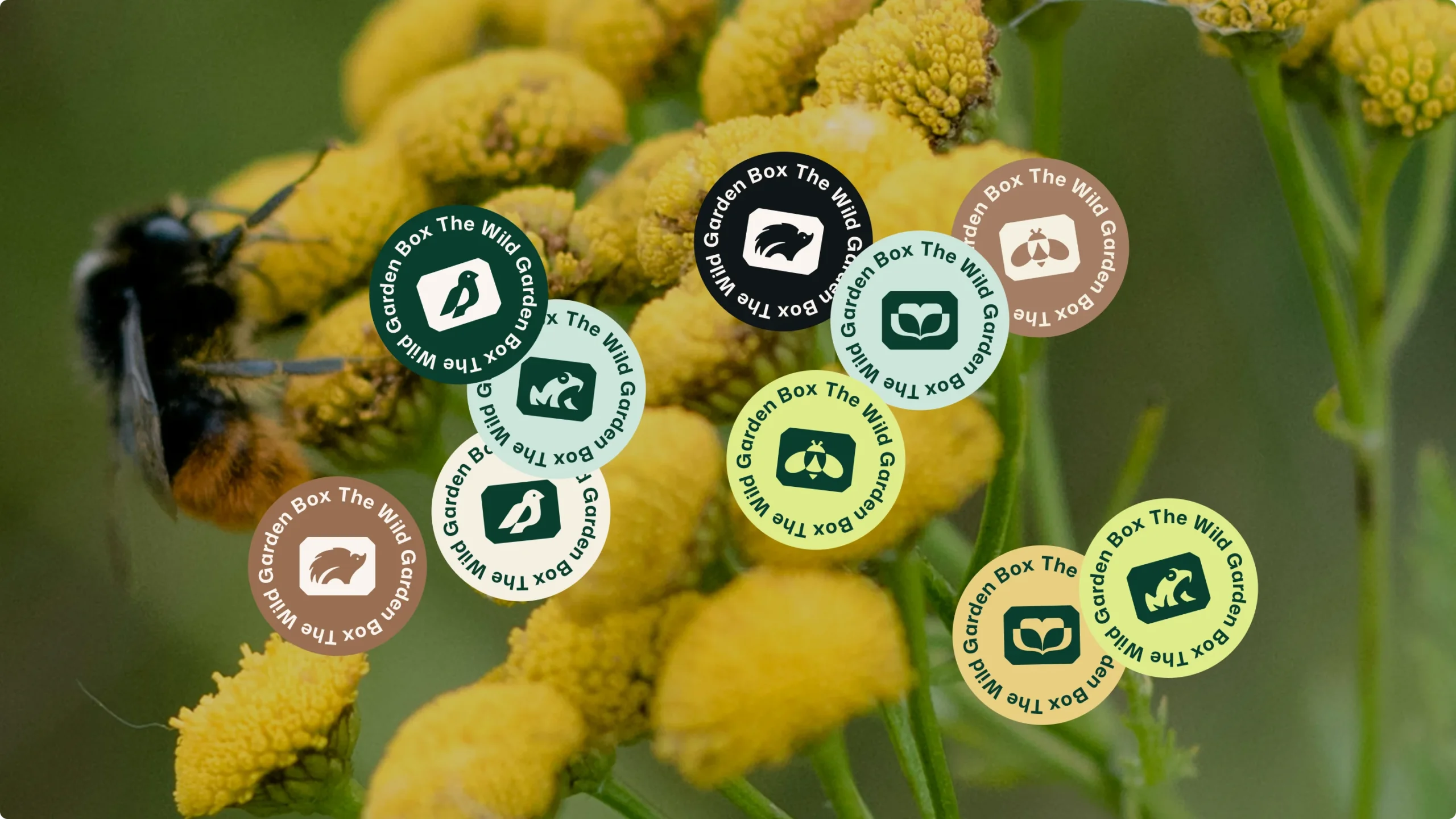
The redesigned logo keeps the essence of the original concept while simplifying it into a more controlled and versatile form. The box element is retained as a central idea, now expressed through a minimal, balanced mark that subtly references growth and containment. The typography is bold and modern, giving the brand a clear and confident voice while remaining highly legible across different formats. The structure of the logo allows for easy modification of the product name, making it adaptable for variations such as The Wild Bird Box or The Wild Pond Box. Supporting logo variations ensure the identity works across different use cases, from larger applications to compact labels and tags.
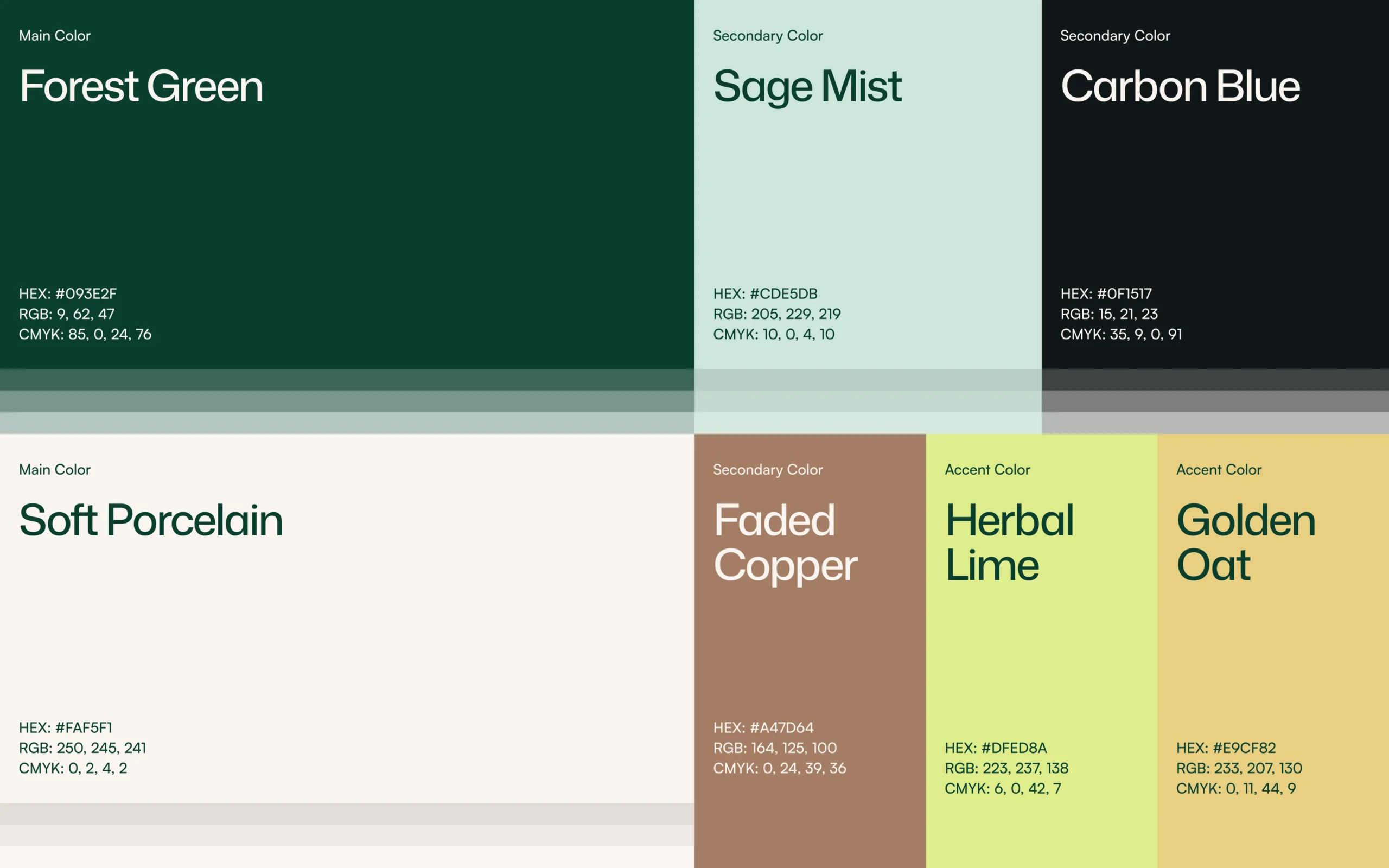
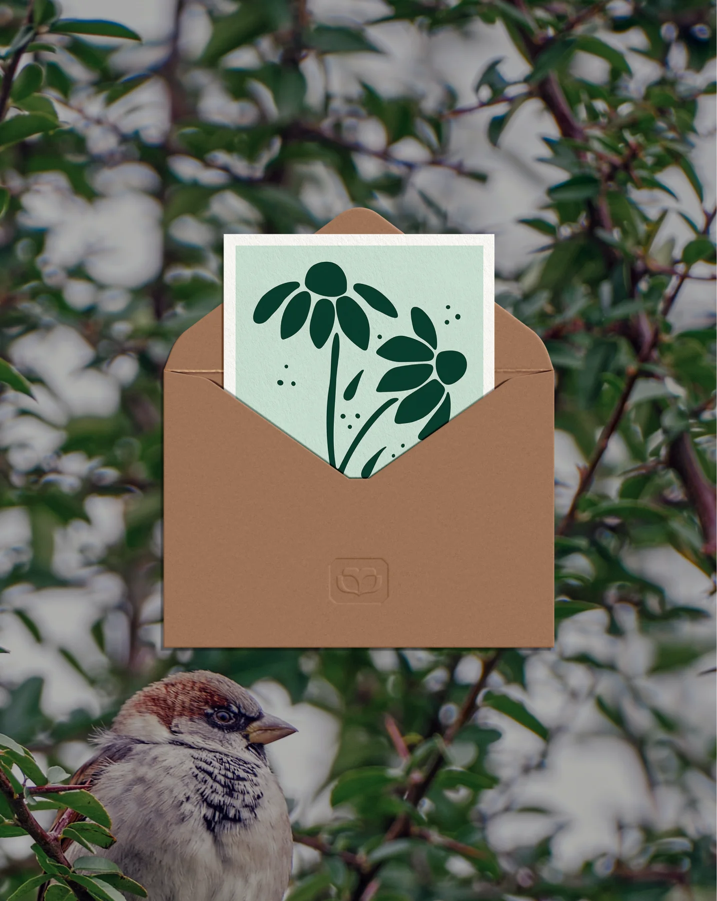
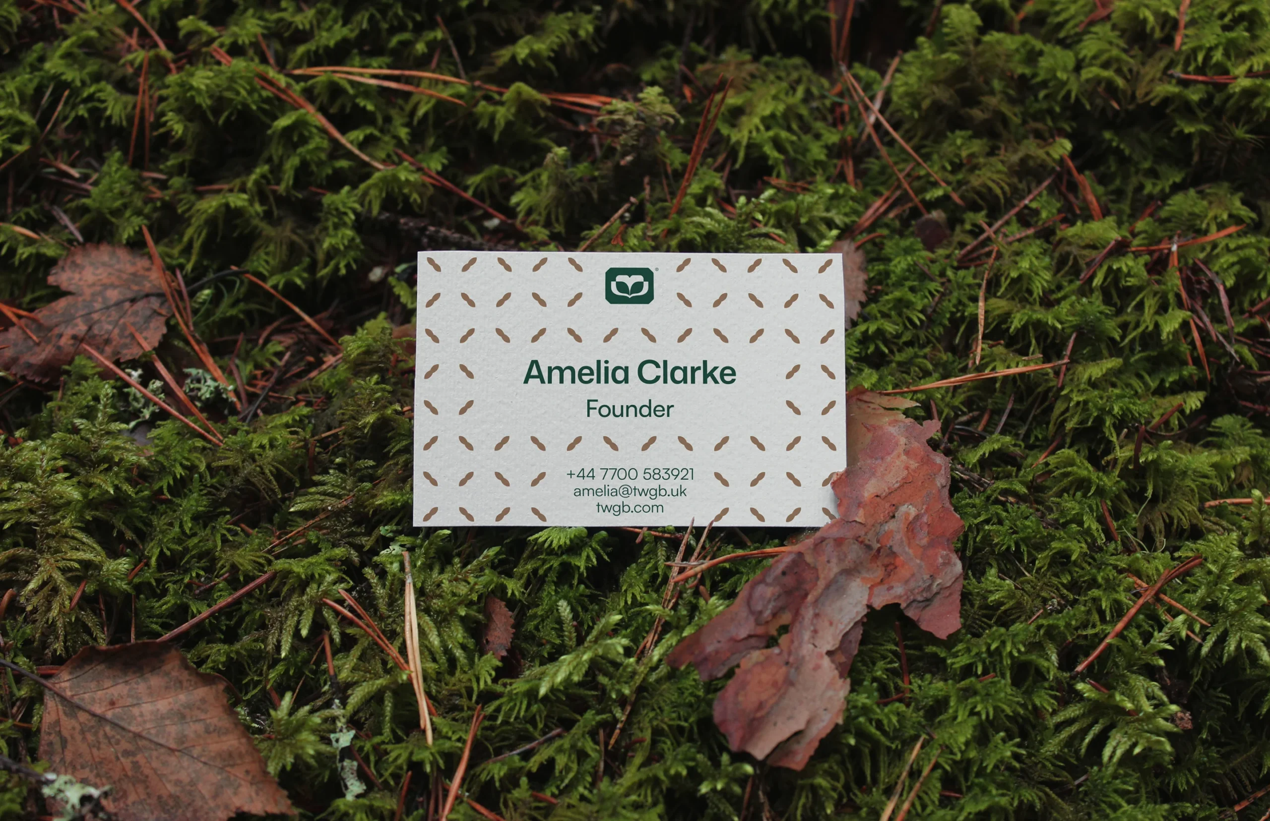
The color palette is inspired by natural tones, combining depth with softness to reflect the brand’s connection to the environment. Forest Green acts as the primary anchor, supported by lighter neutrals like Soft Porcelain for balance and clarity.
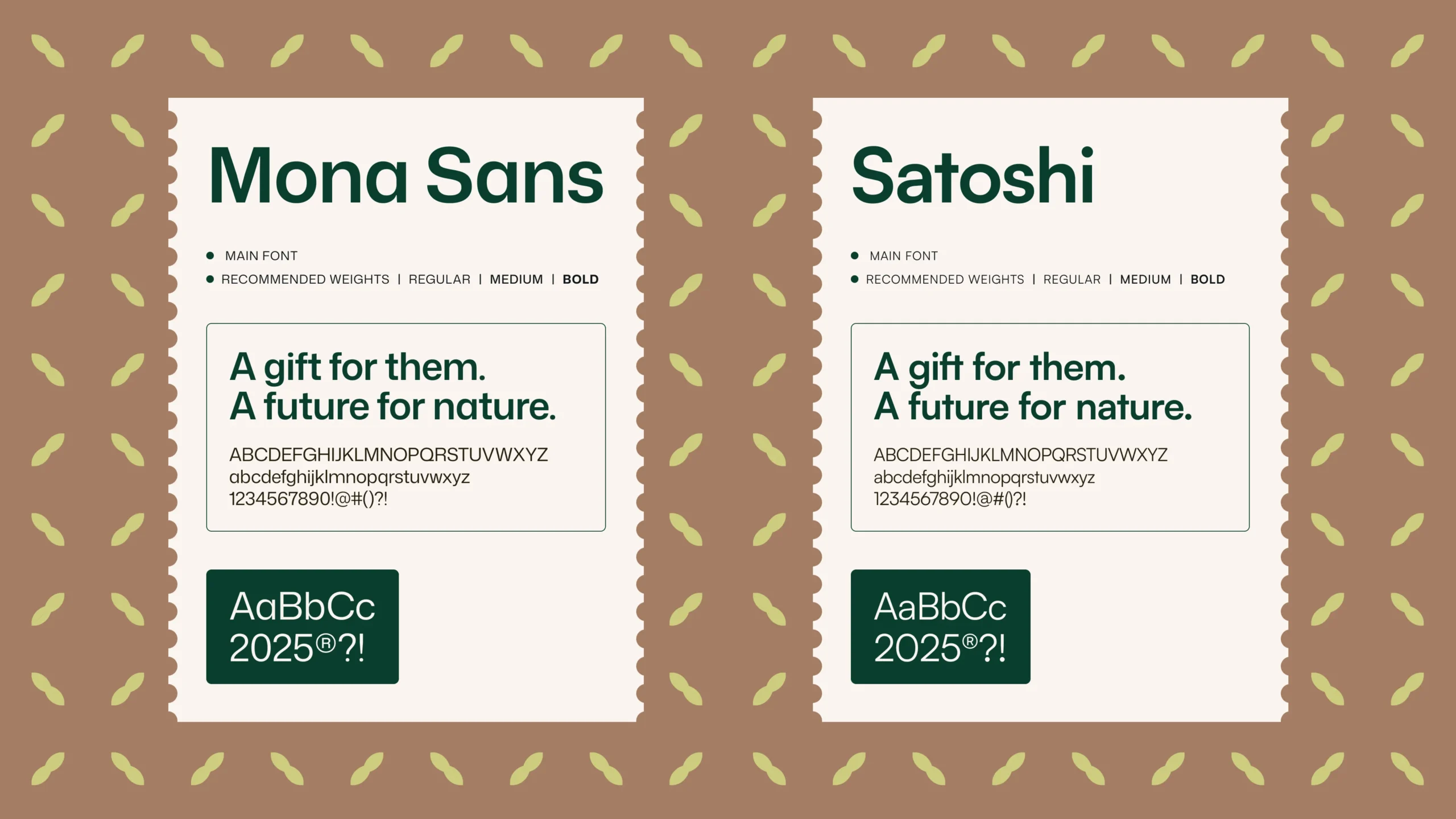
Secondary tones such as Sage Mist and Carbon Blue add contrast, while warmer accents like Herbal Lime, Golden Oat, and Faded Copper introduce flexibility across different product categories. The palette is carefully balanced to remain visually rich while still being practical for low-ink printing. Typography is kept clean and straightforward, using a modern sans-serif that ensures readability across packaging, labels, and digital formats. The simplicity of the type system also makes it easy to manage and update within tools like Canva.
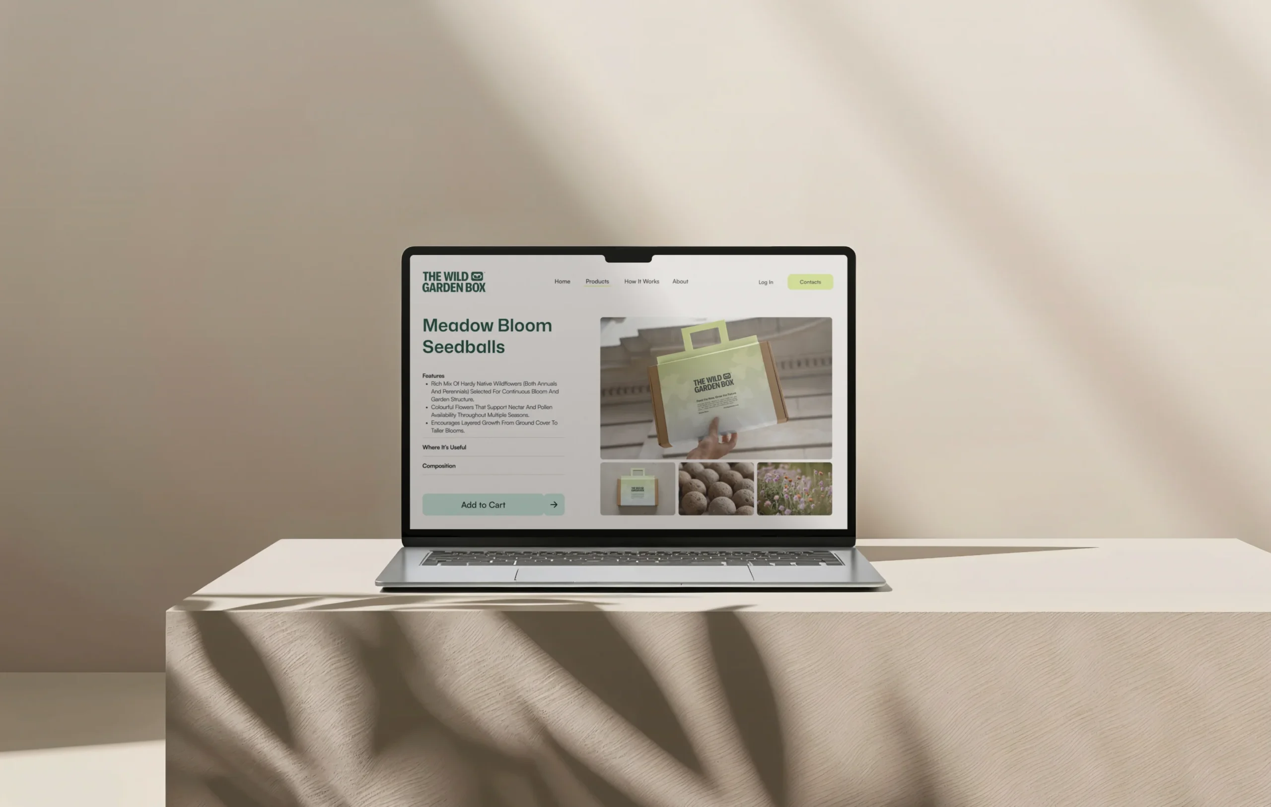
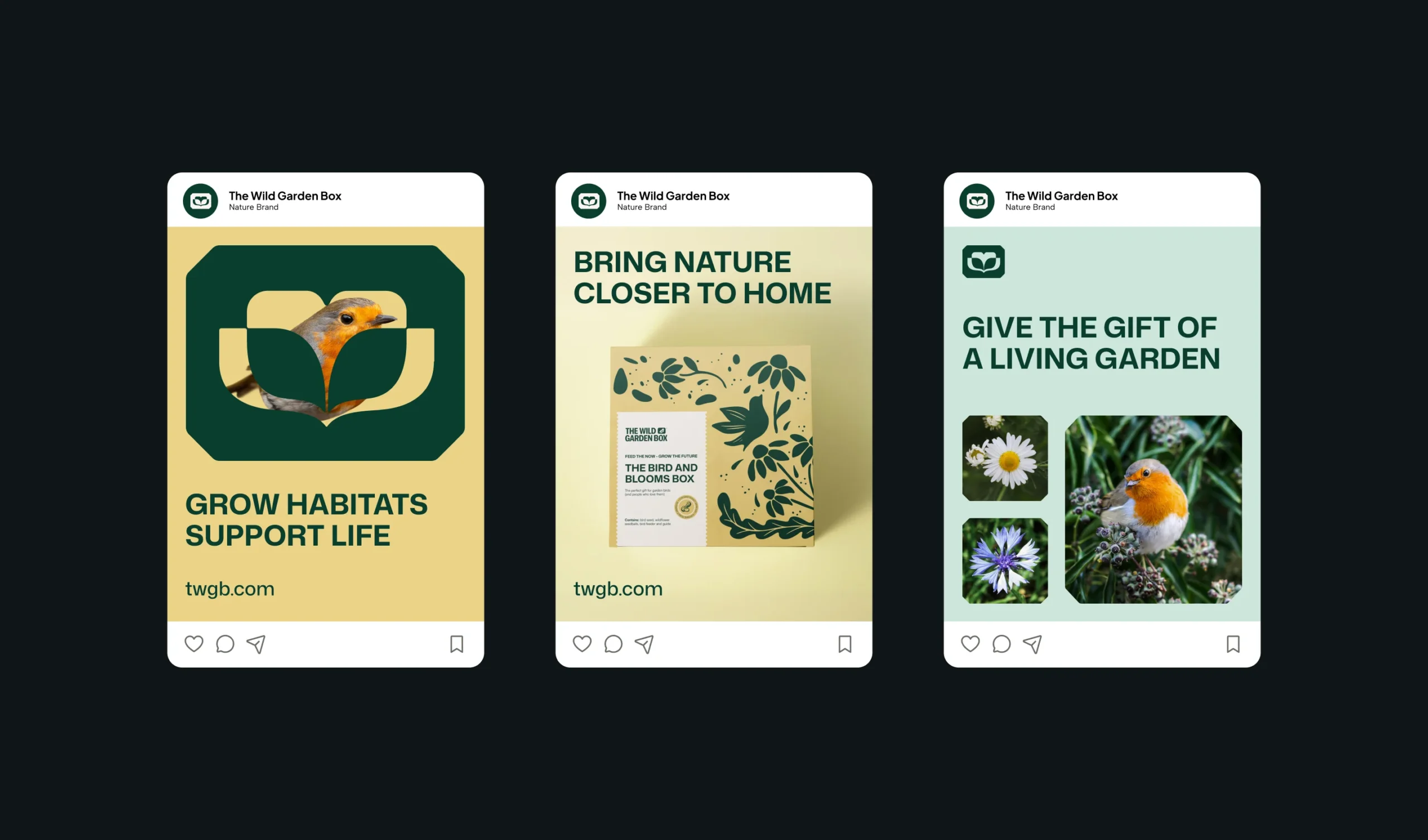
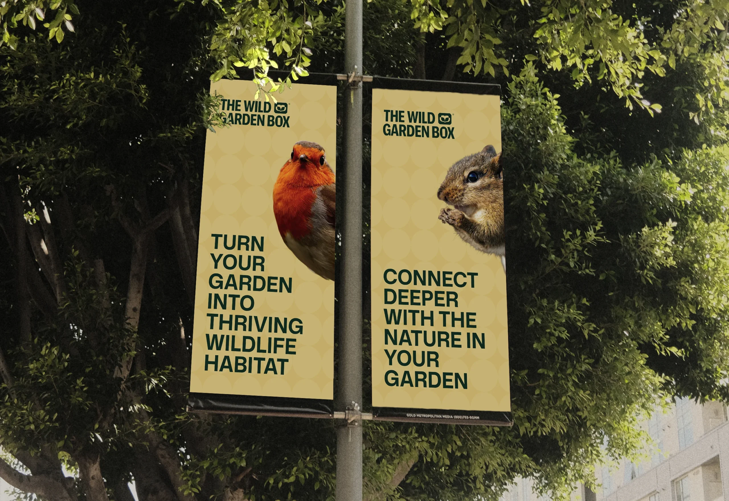
The visual system translates naturally into digital applications, maintaining a consistent tone across the website and social media. The layouts rely on clear hierarchy, generous spacing, and restrained use of graphic elements to keep the content easy to navigate and visually calm. Nature-inspired illustrations and color accents add character without overwhelming the design, helping the brand communicate both educational and product-focused content in a cohesive way. The system is designed to be reusable, allowing new content to be created quickly while maintaining a consistent look and feel.
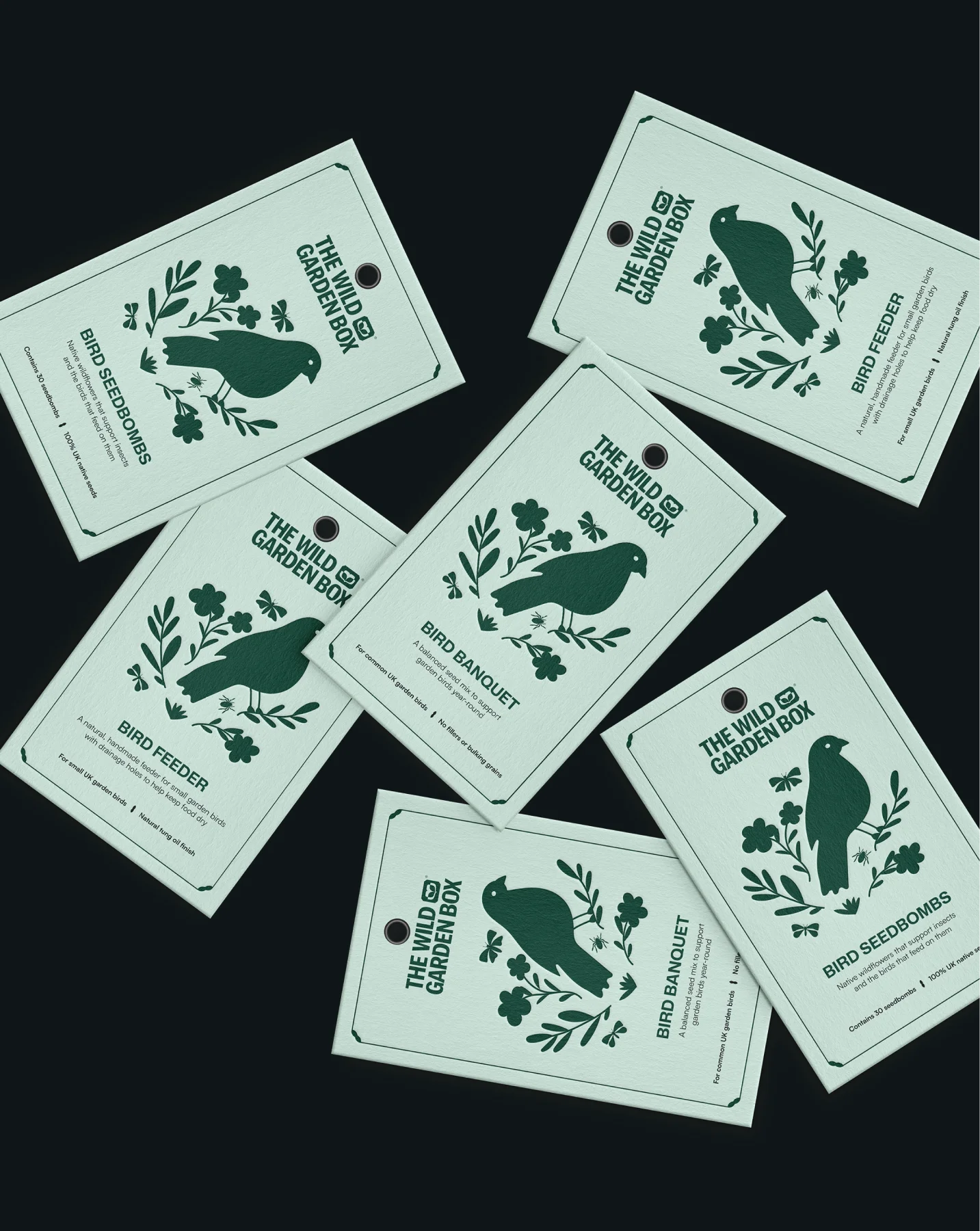
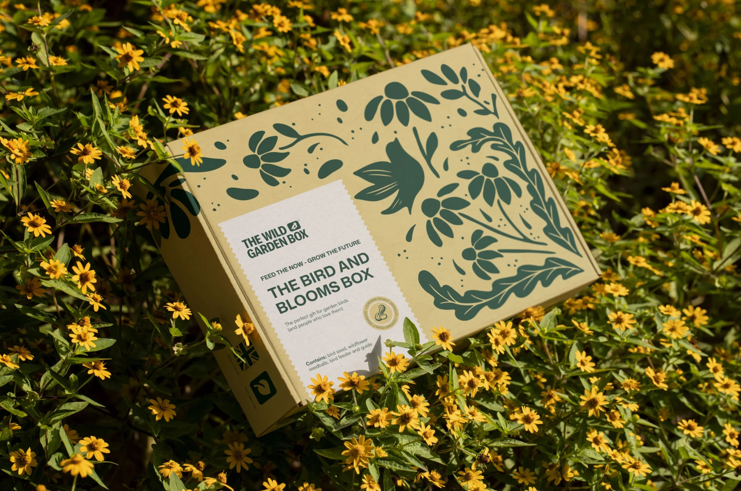
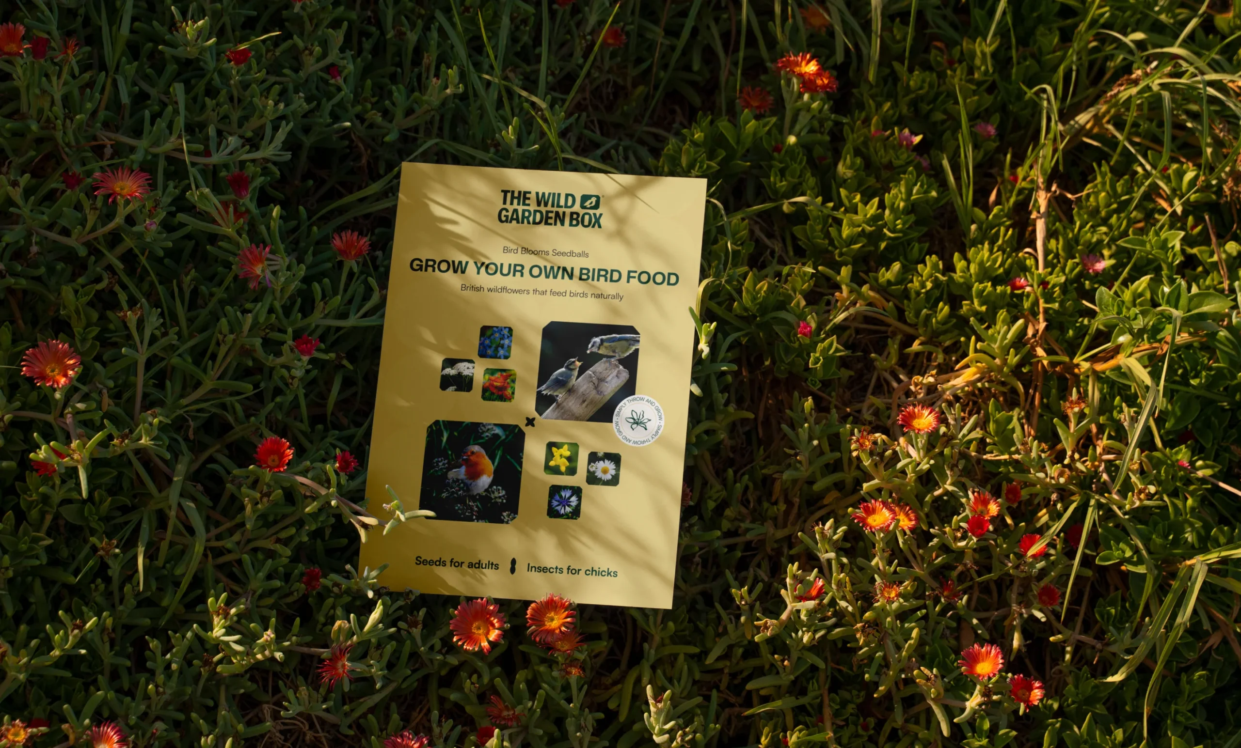
Packaging focuses primarily on a flexible label system that can be applied across different products. The design is intentionally clean and structured, making it easy to adjust sizes and content depending on the format.
Instead of relying on photography, the labels use simple botanical illustrations and icons, which keeps printing efficient while reinforcing the brand’s visual identity. The layouts are consistent across all variations, creating a unified product range while still allowing each item to feel distinct. All elements are optimized for practical use, from easy export to compatibility with home printing, ensuring the system works in real production conditions.
 BOOK A CALL
 has been sent successfully!
Our managers will contact you as soon as possible.