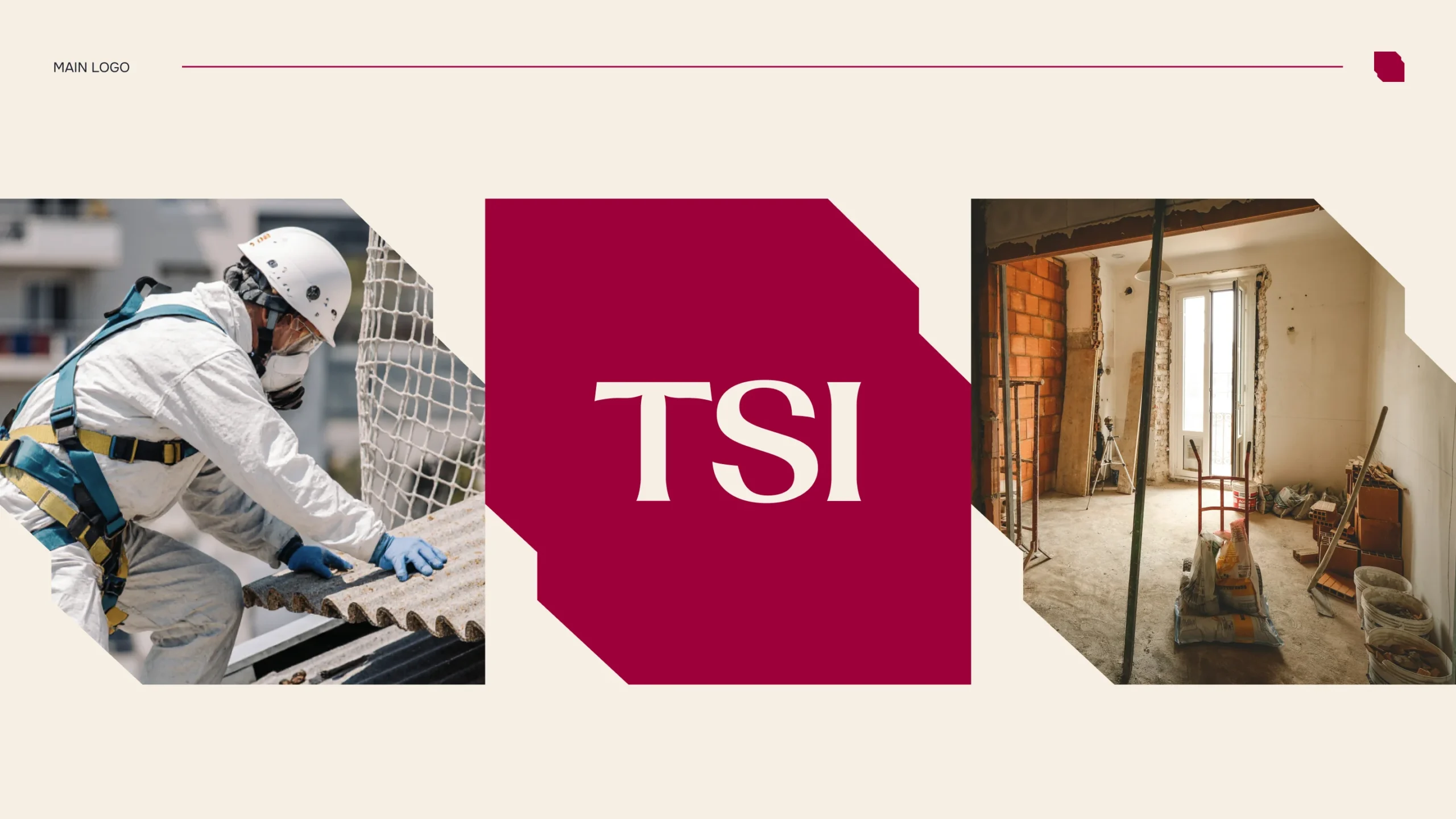
TSI is an established environmental education company with over 28 years of experience in asbestos training and OSHA awareness. As the company expanded into inspections, surveillance, and consulting, the goal was to reposition the brand to reflect its growth and broader expertise.
This project included a full rebrand, covering brand identity, website direction, presentation templates, manuals, and digital communication assets.
TSI had strong content and long-standing credibility, but its visual identity no longer reflected the scale and evolution of the company. The key challenges included lack of consistency across materials, outdated presentation of educational content, and a website structure that did not fully support the expanding range of services. The brand also needed to communicate its transition from a training provider to a more comprehensive consulting and inspection partner.
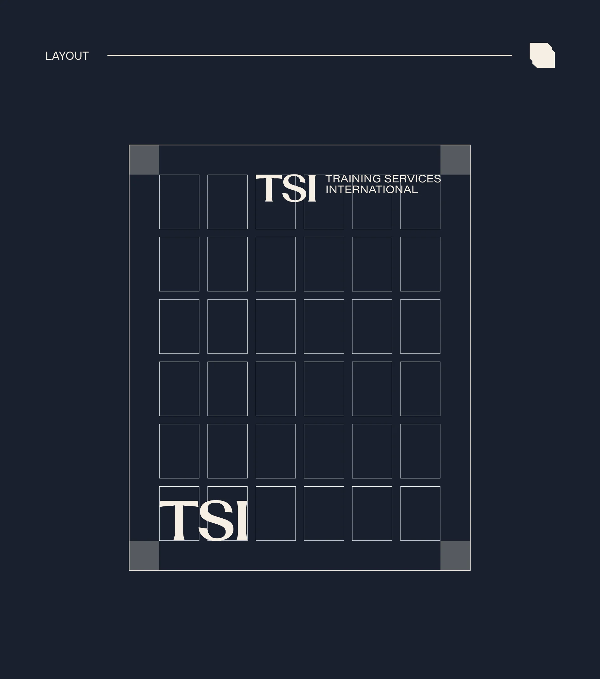
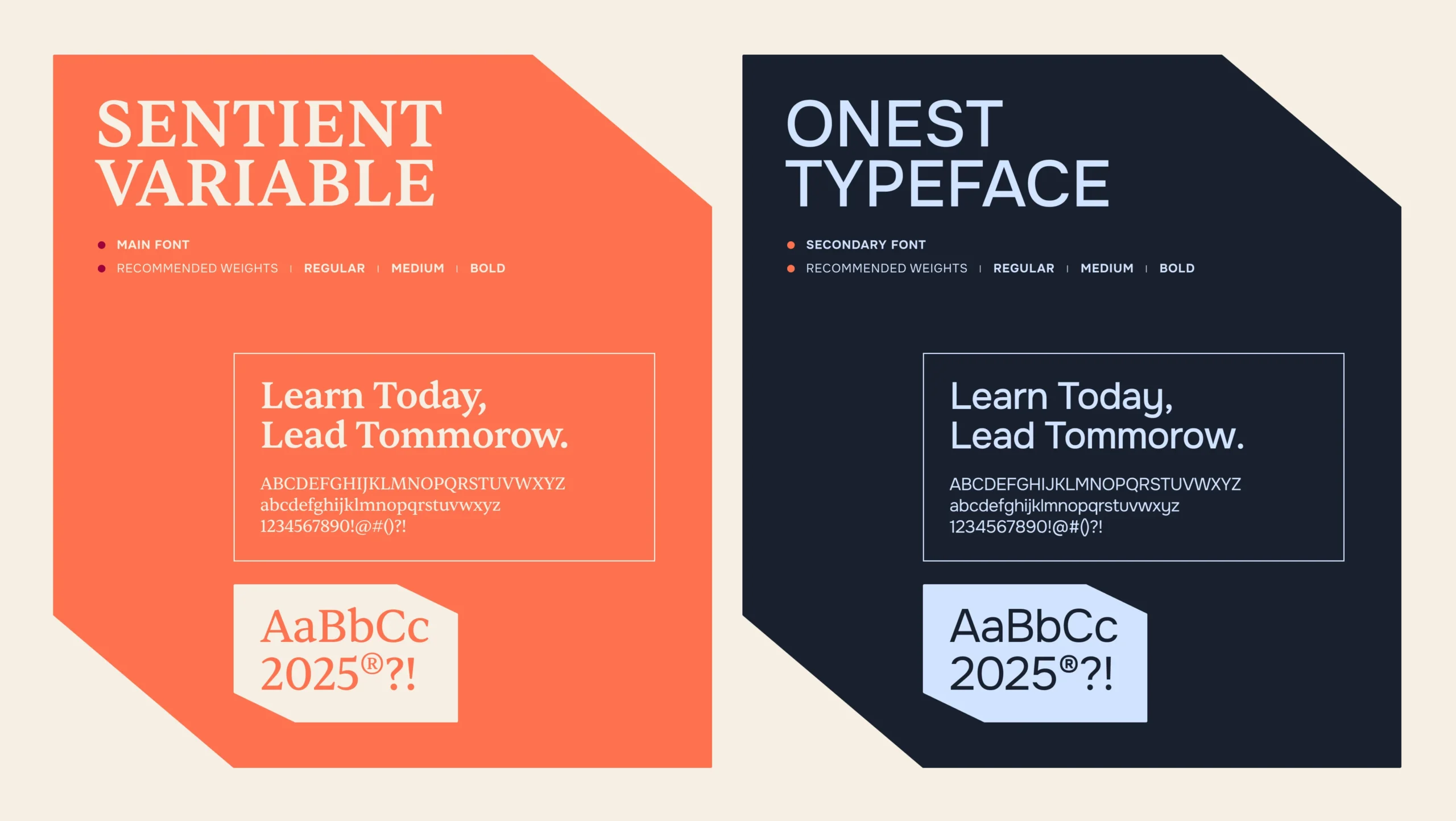
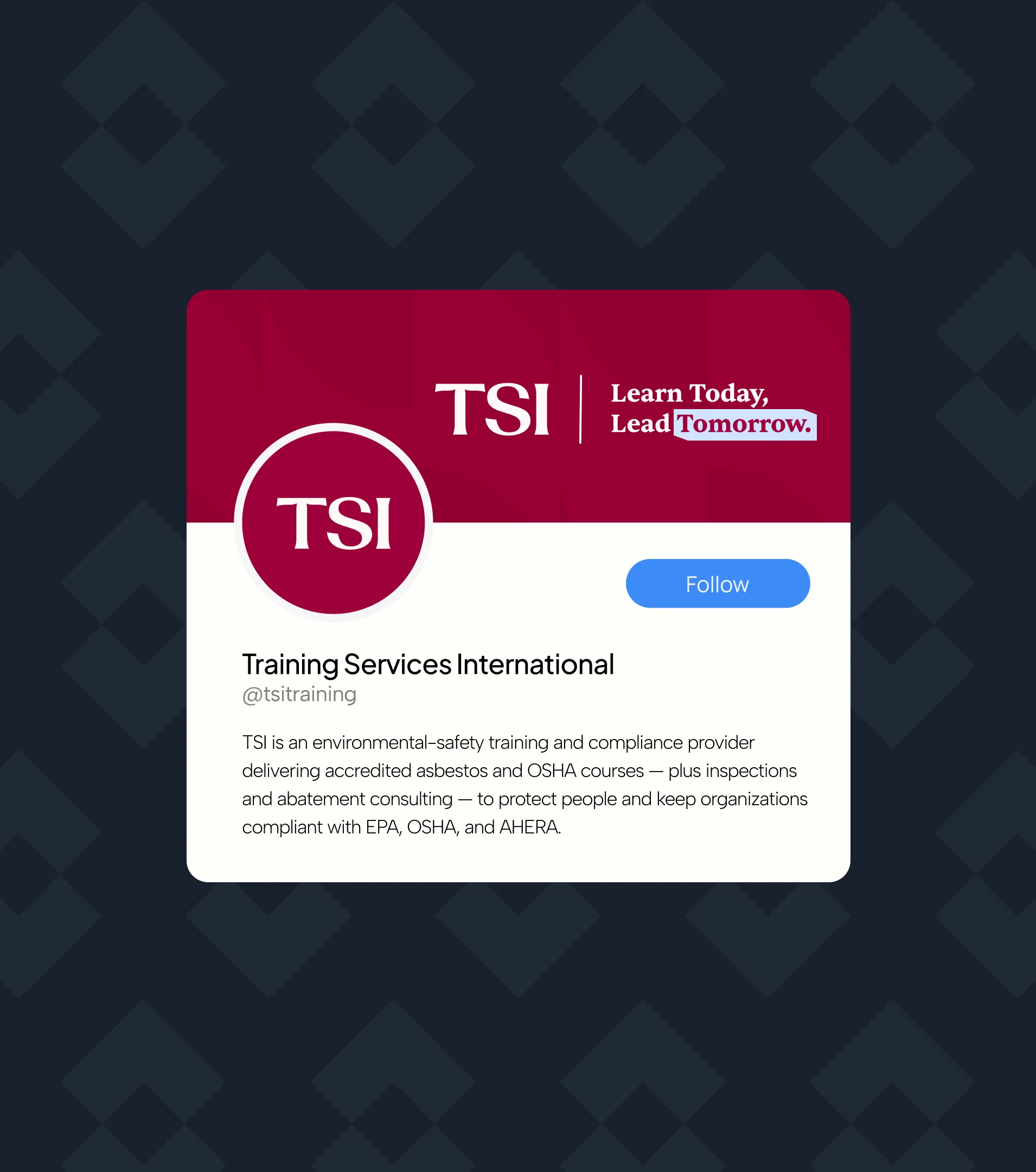
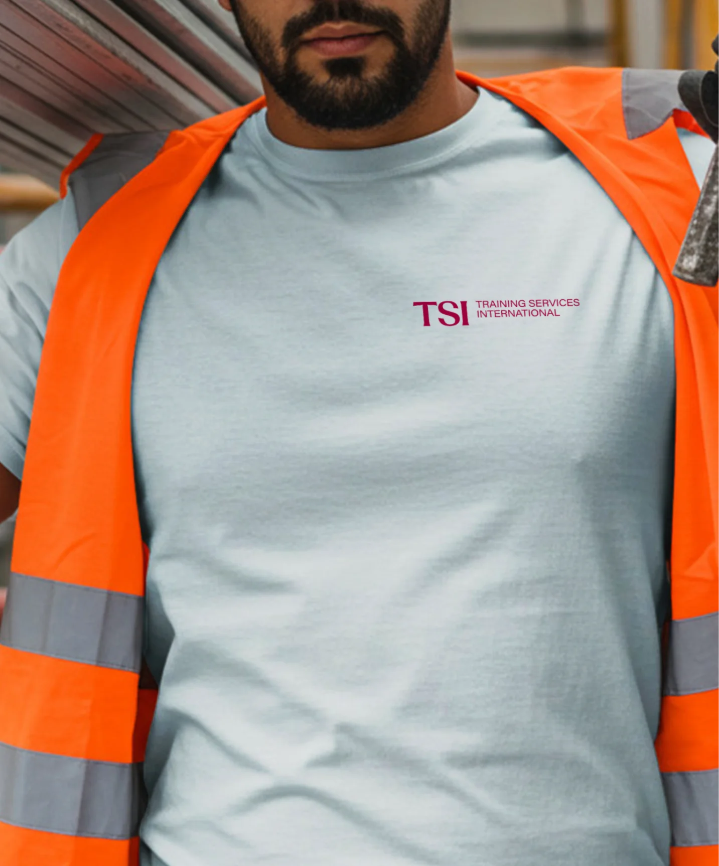
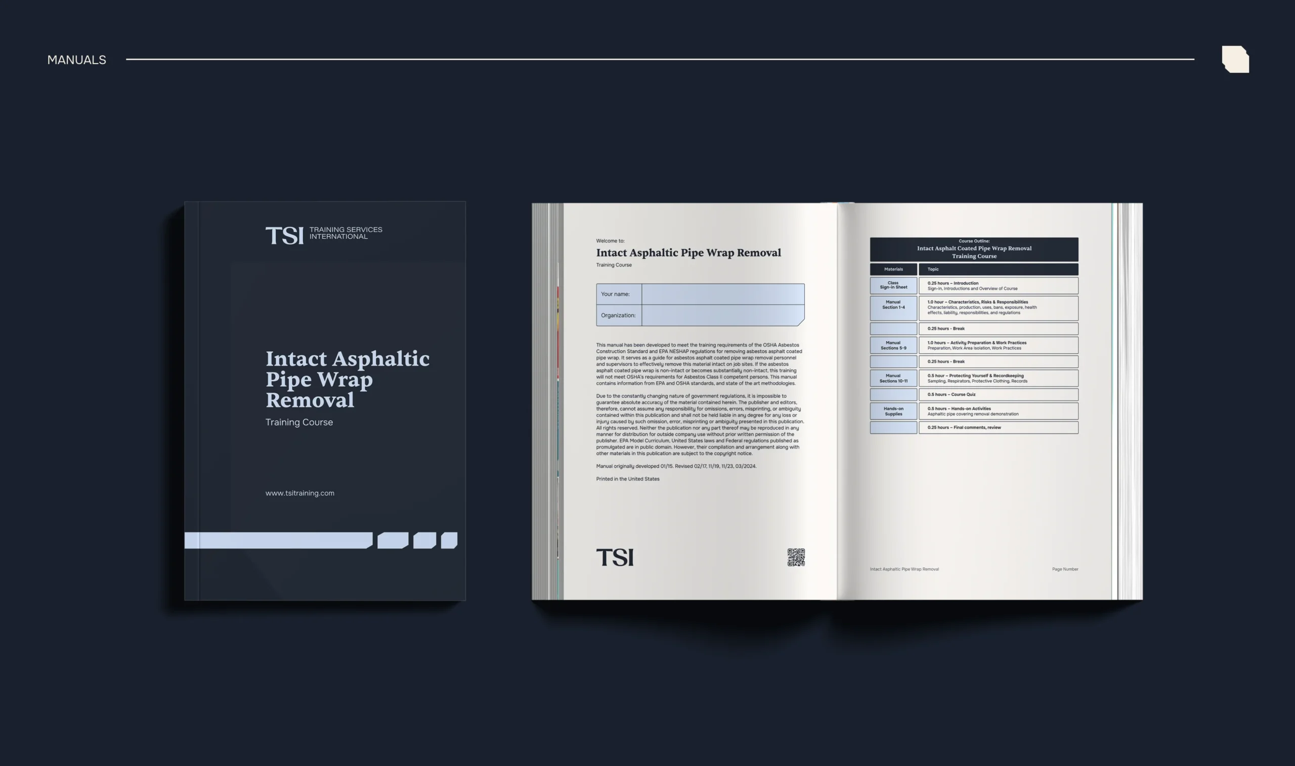
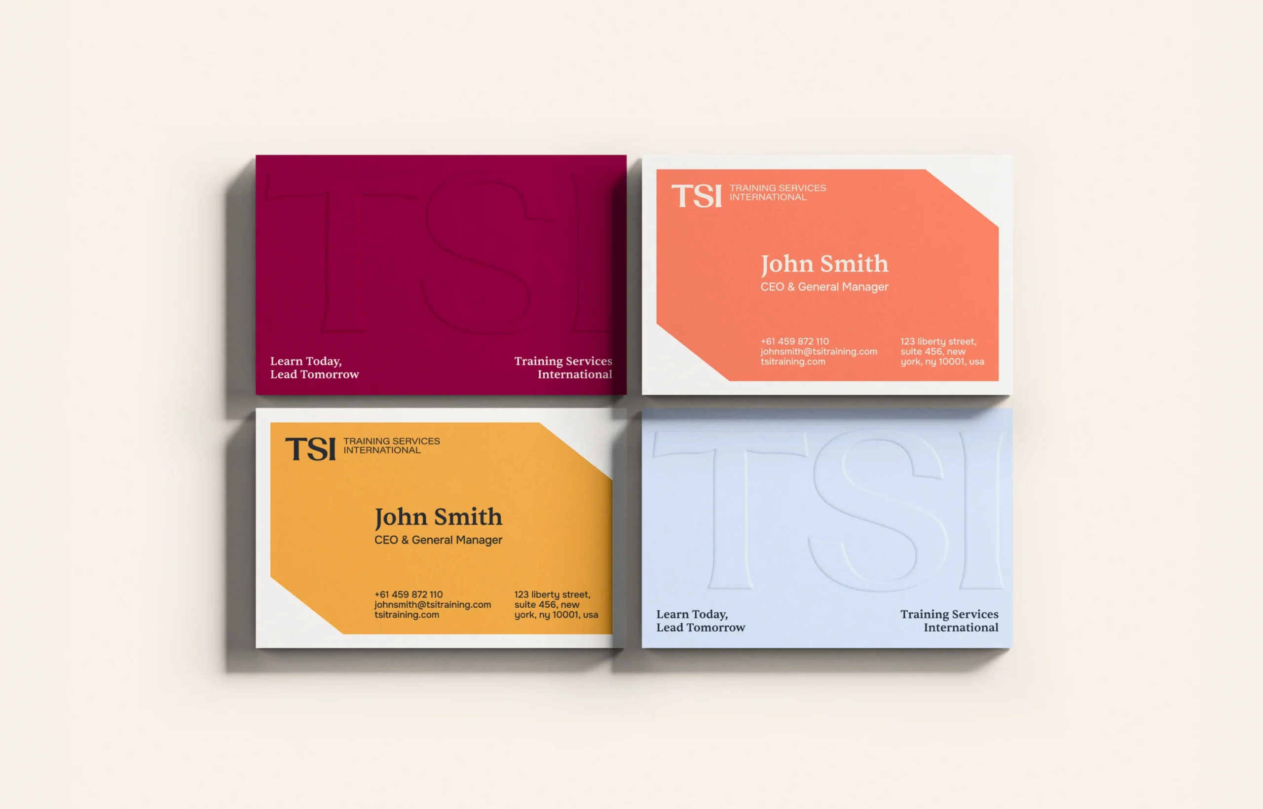
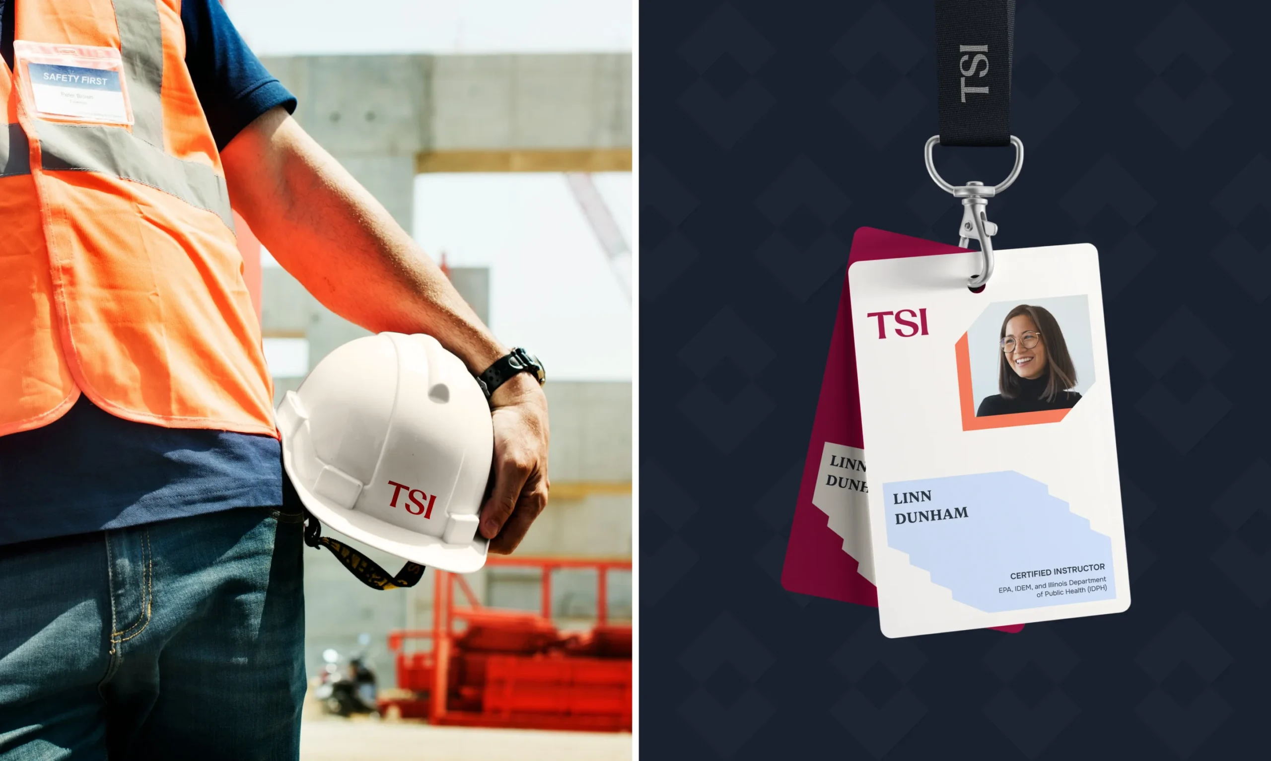
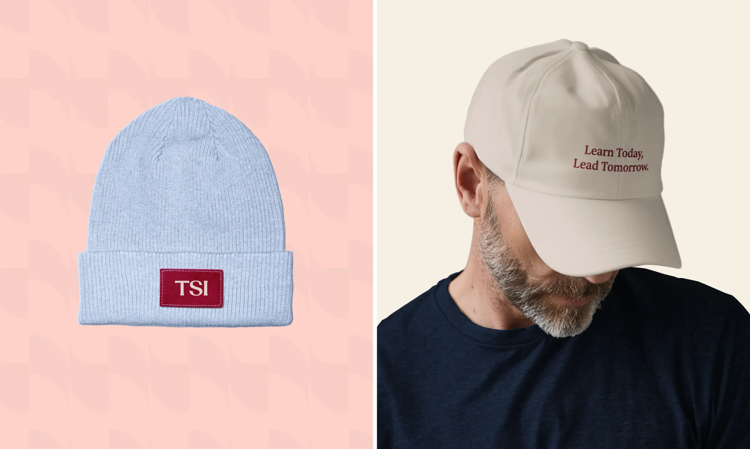
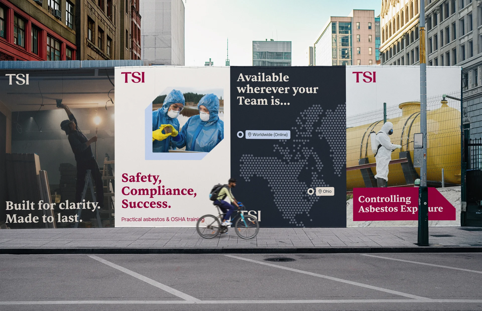
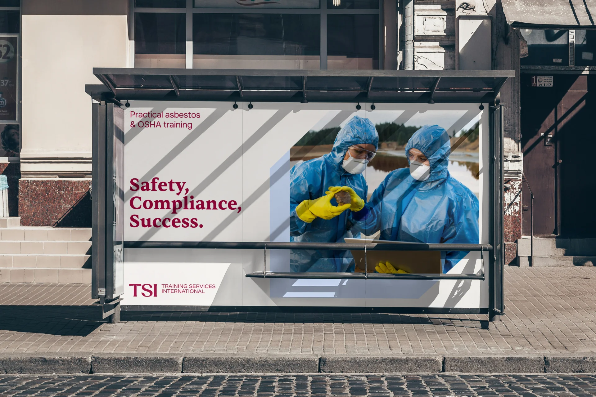
The new identity is built around a refined serif logo that communicates authority and experience. The typography choice reinforces trust while maintaining a modern and clean appearance. A distinctive geometric frame surrounds the logo, introducing a structured and industrial character that reflects the nature of the work. This shape becomes a core visual element used across layouts, helping create a recognizable and consistent system. The identity is designed not as a single mark, but as a flexible system that works across digital platforms, printed materials, and branded applications.
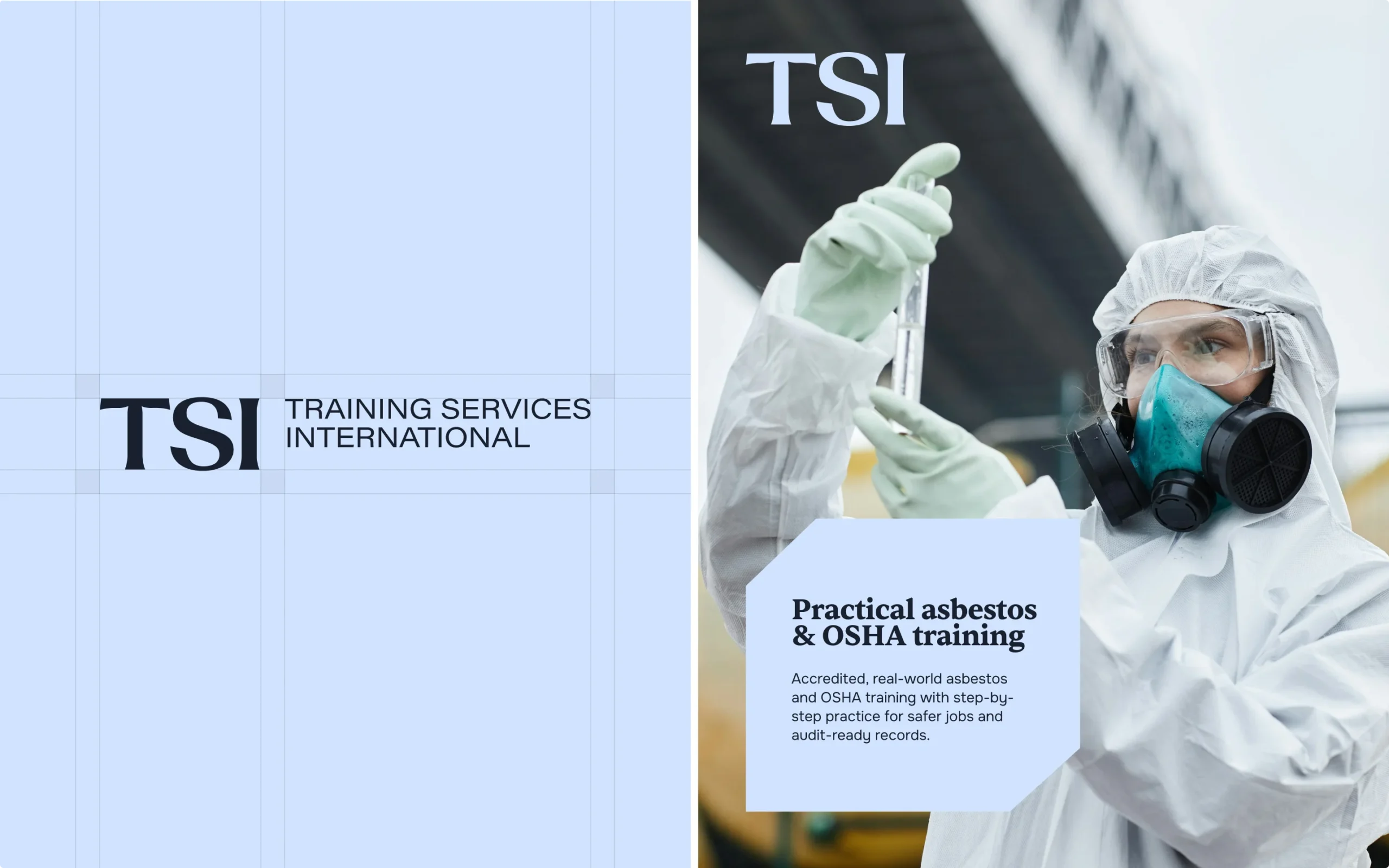
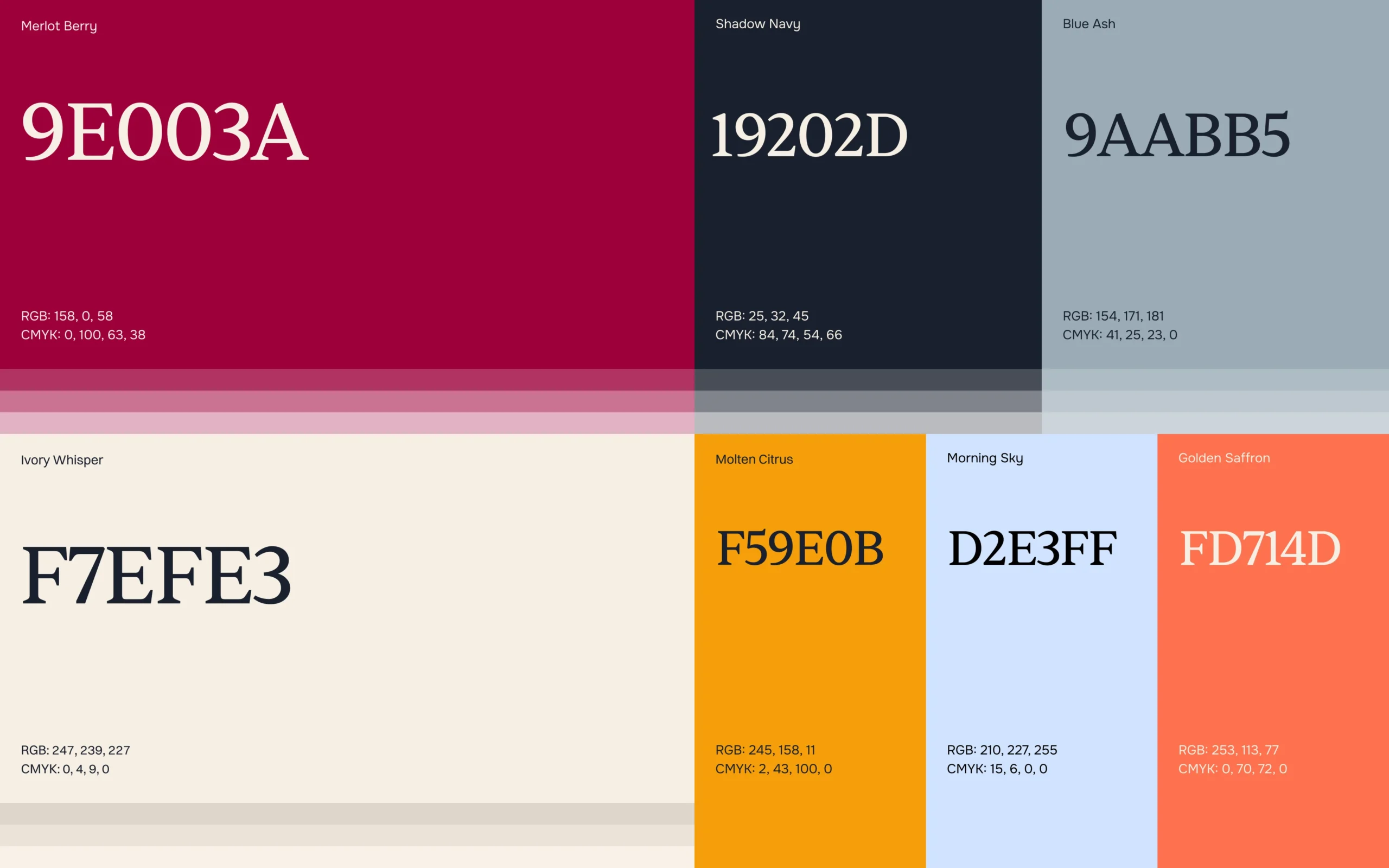
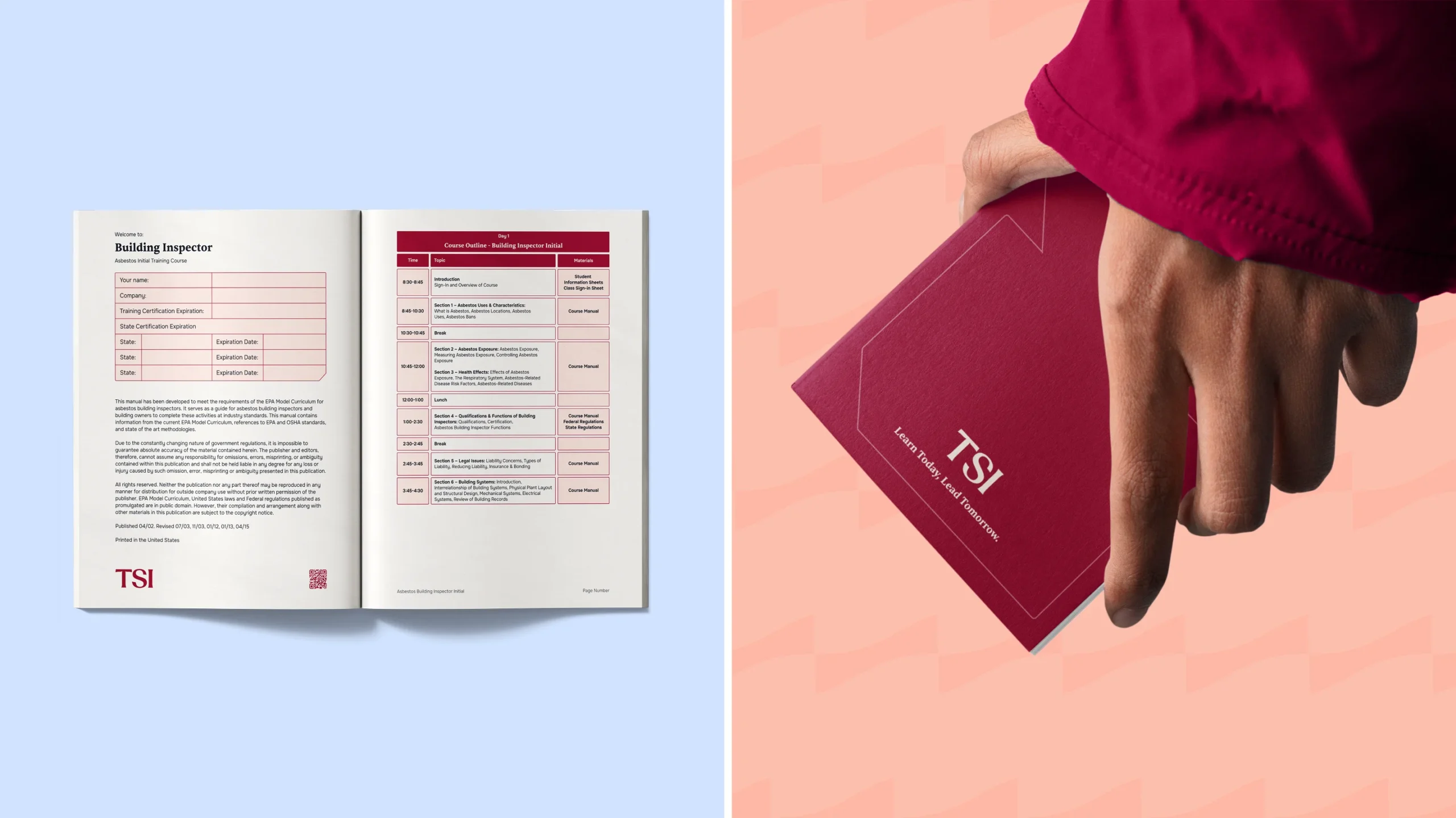
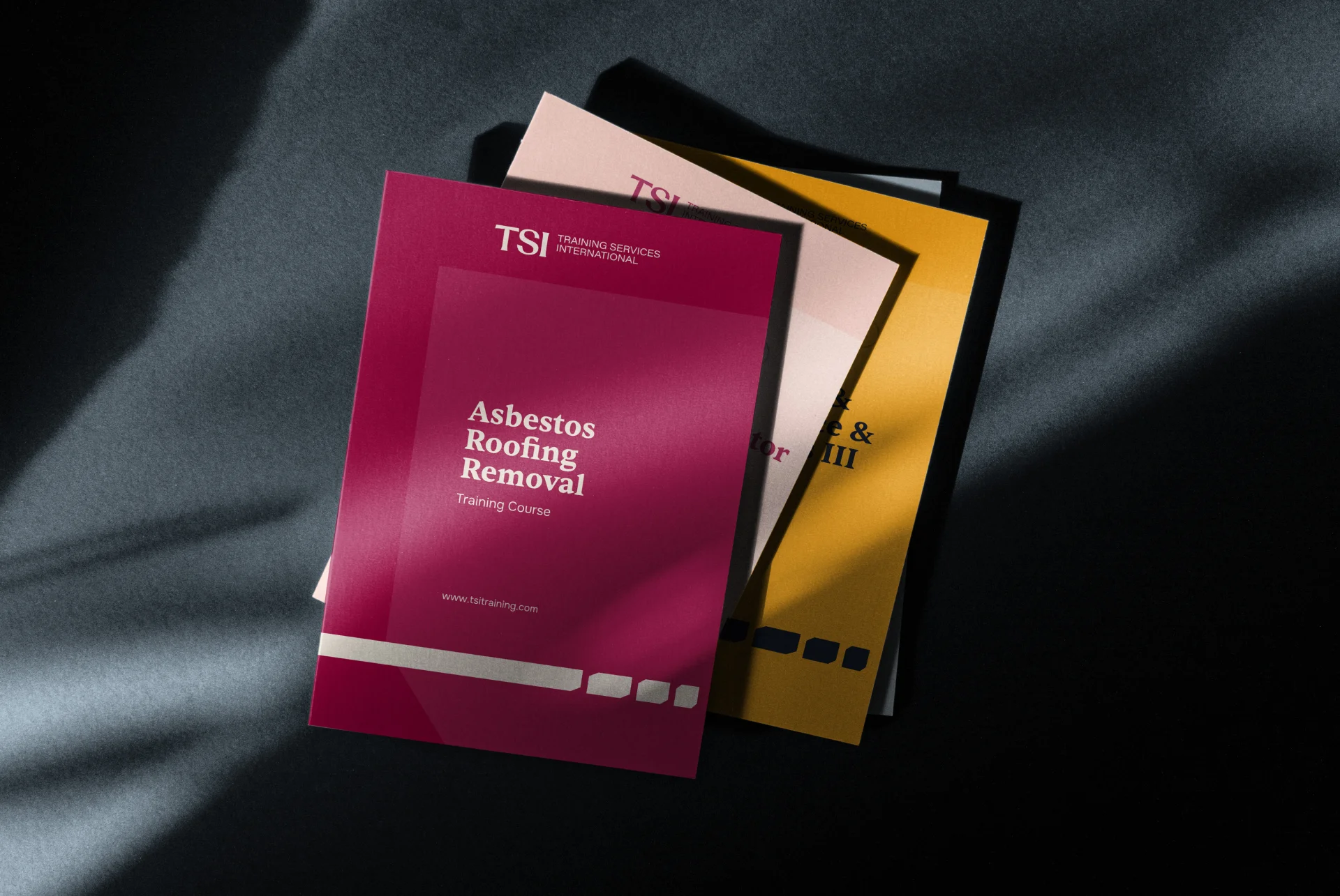
The color palette balances strong, professional tones with functional accents. The primary color, a deep merlot, establishes a confident and recognizable brand presence. It is supported by dark navy tones that add depth and reliability, while soft neutrals provide clarity and space for content-heavy materials. Accent colors are introduced to differentiate training subjects and categories, especially across manuals and presentations. This allows the system to stay cohesive while remaining practical for internal use. Typography combines a serif style for headings and key messaging with clean, highly readable fonts for body text, ensuring clarity across both print and digital formats.
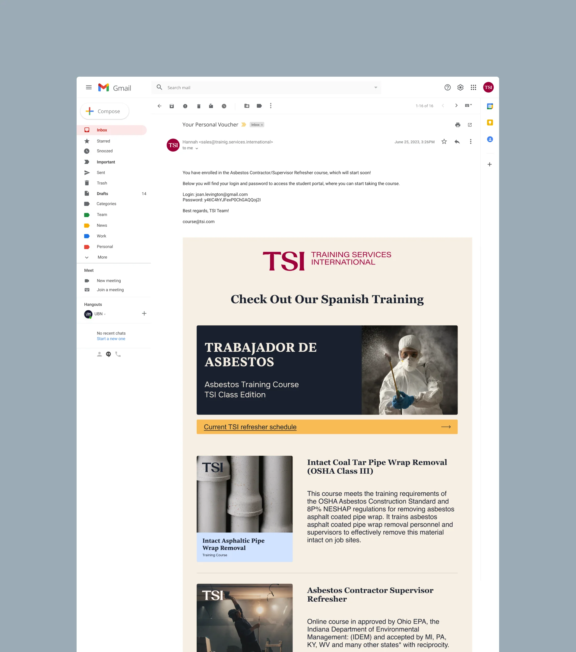
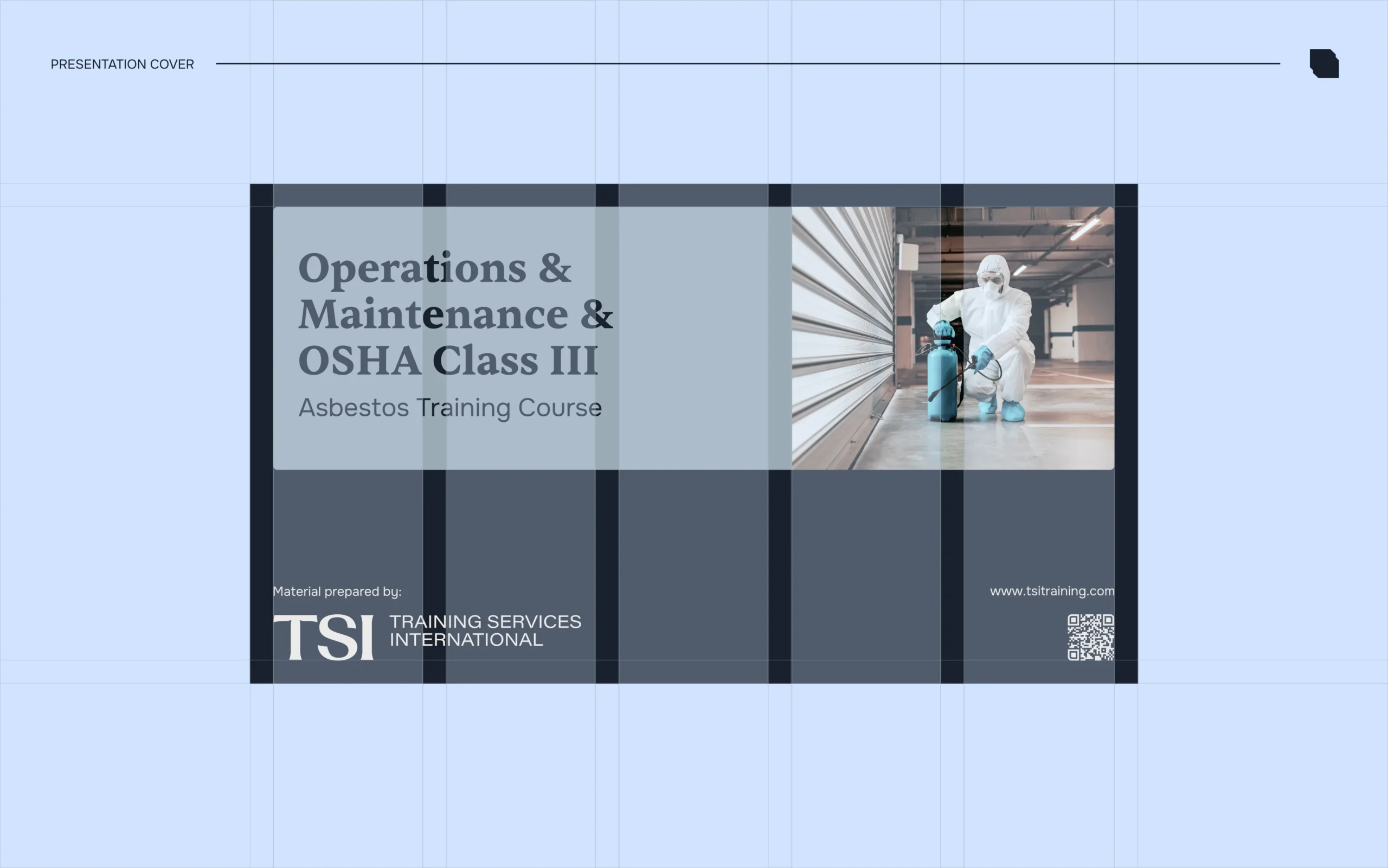
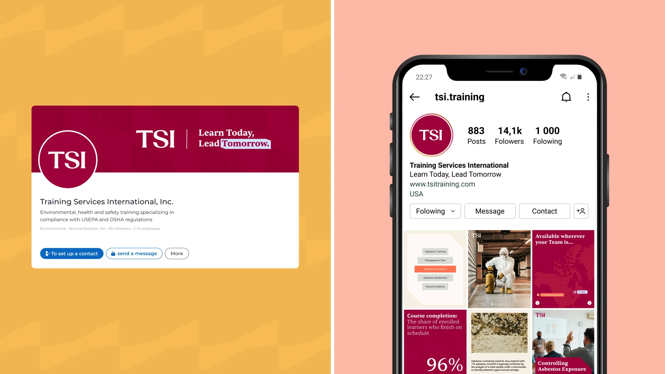
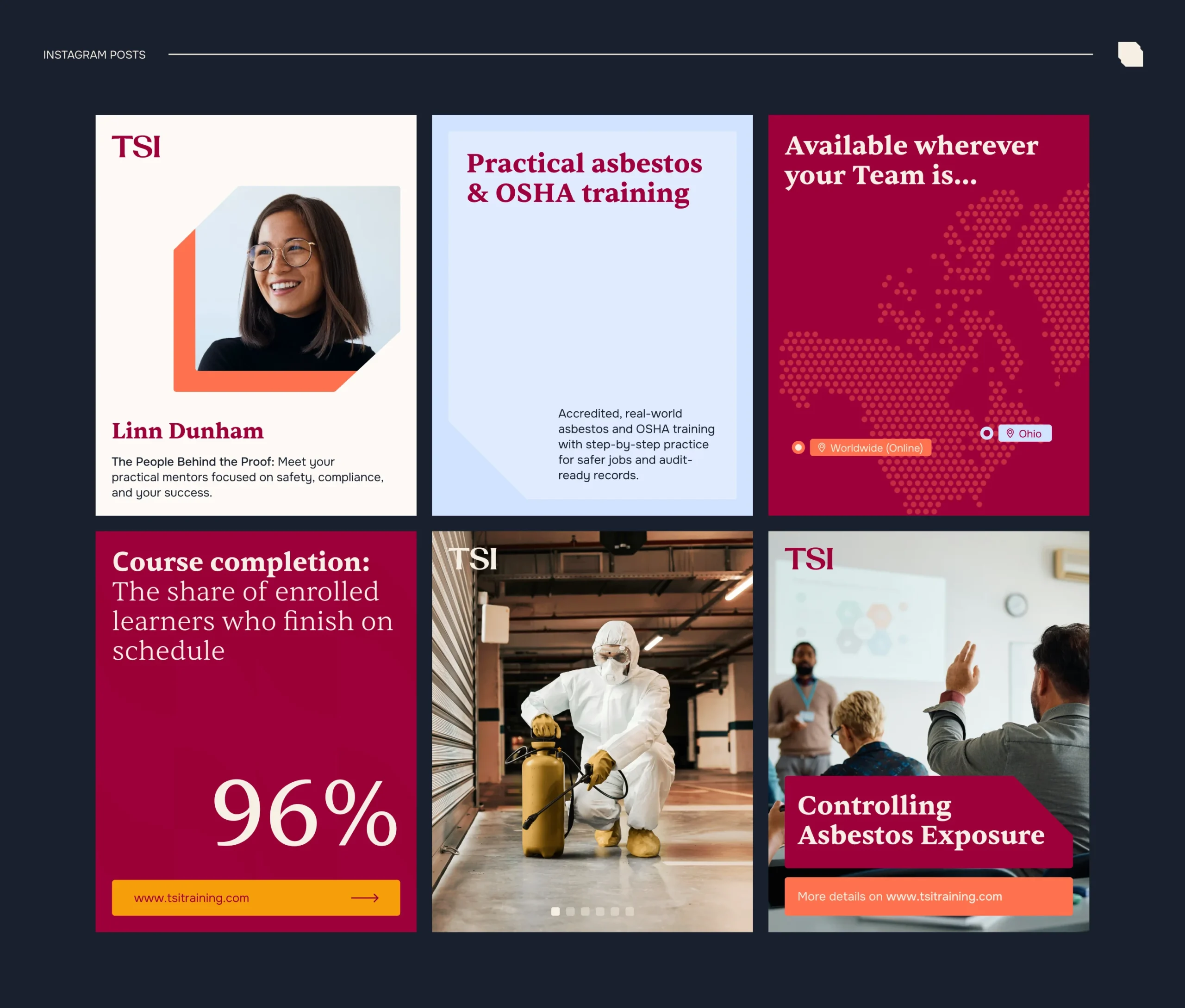
The digital system was designed to unify all communication touchpoints. Presentation templates were redesigned to align with the new identity, improving structure, readability, and visual consistency while keeping the existing educational content intact. Email templates were created with a clear and flexible layout, allowing the team to easily update and maintain consistent communication through campaigns and announcements. The visual system ensures that all digital materials feel connected and professional.
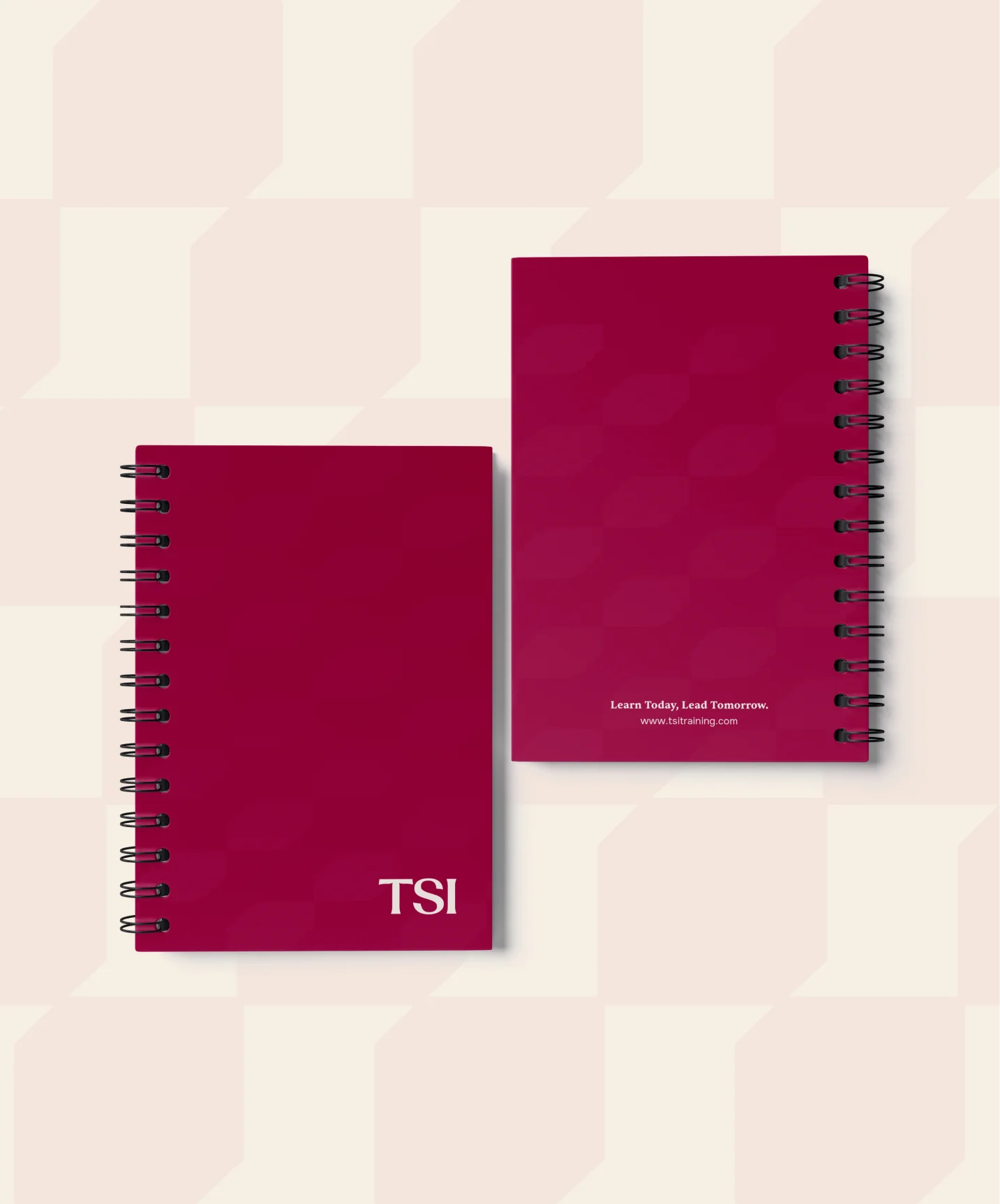
The printing collateral features a premium suite of branded materials, including custom spiral notebooks and technical documentation. Each piece utilizes a sophisticated deep burgundy palette paired with a subtle, geometric brand pattern to maintain visual depth and corporate elegance. This stationery system is designed to provide a tactile and professional experience for both internal teams and training participants. By prioritizing high-quality finishes and clear typography, the collateral ensures the brand’s authority is felt at every physical touchpoint.
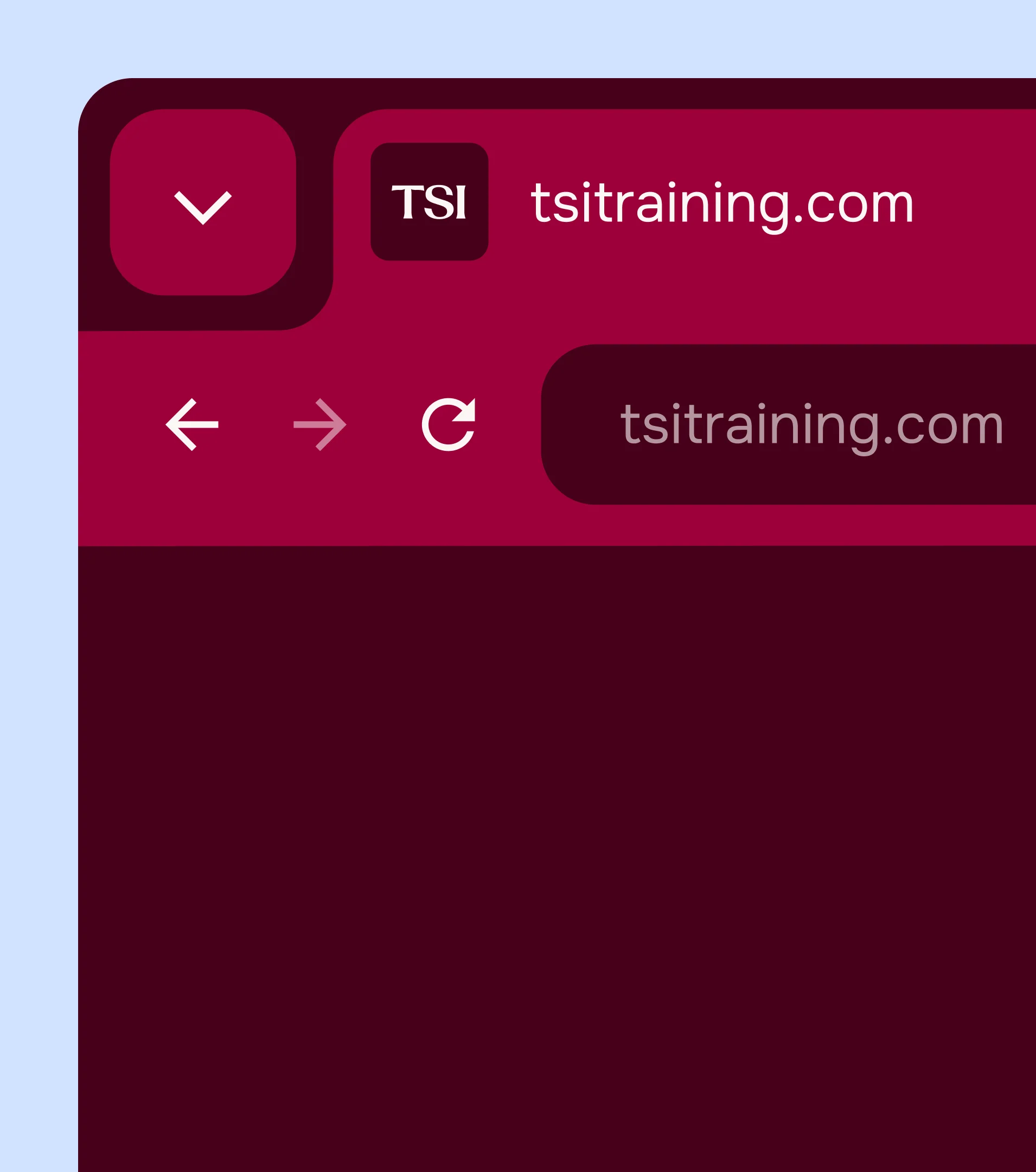
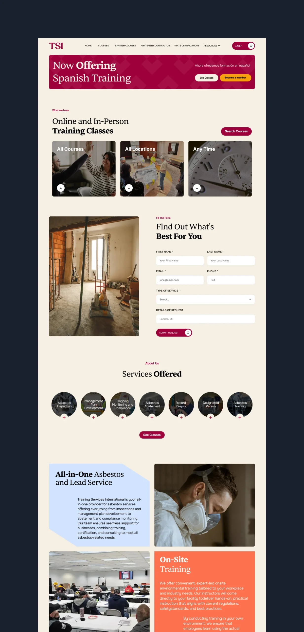
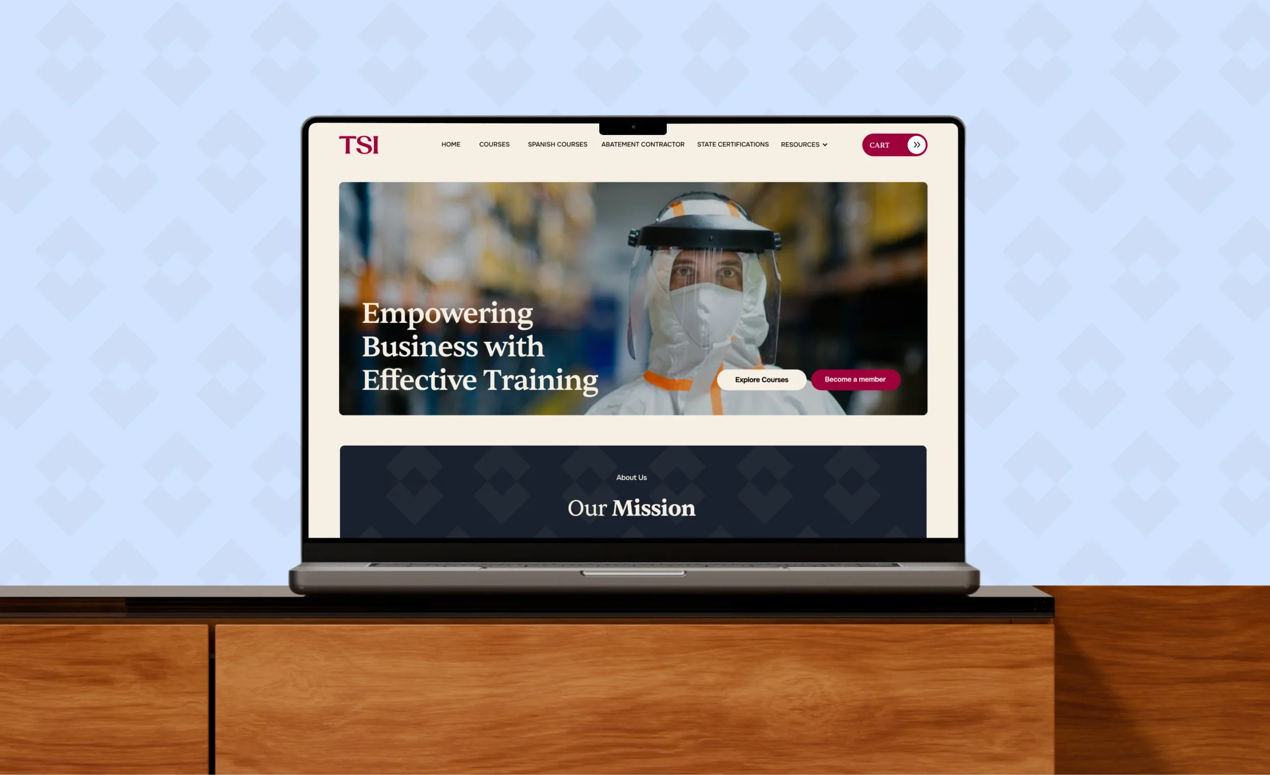
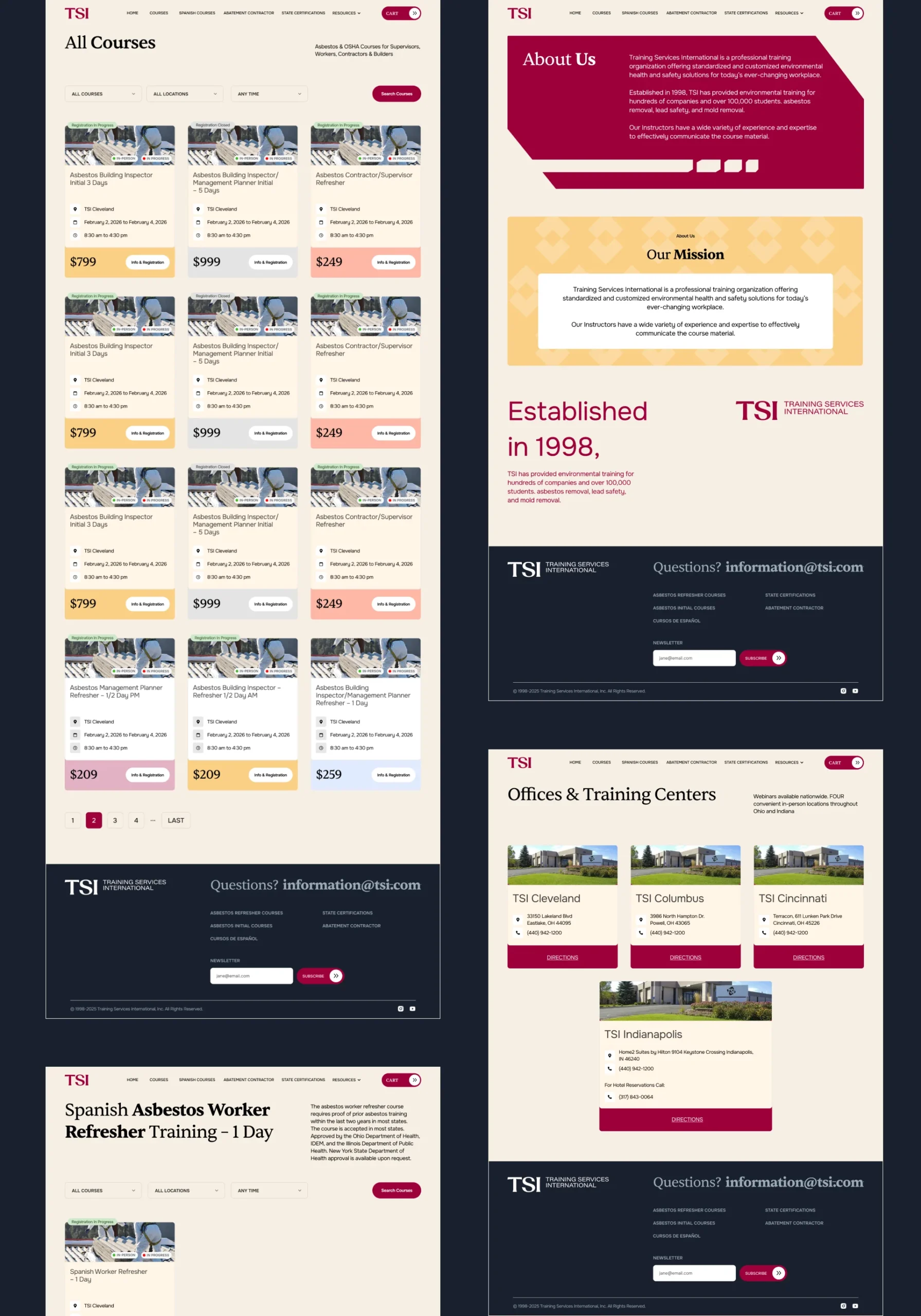
The digital presence for TSI is built upon a high-performance interface designed to streamline user access to complex training information. By implementing a modular grid system, the website maintains a clean and organized structure that scales effectively from desktop to mobile environments. The UI utilizes a high-contrast color palette of Merlot Berry and Ivory to guide the user’s eye toward key calls to action and course enrollment details. Every digital touchpoint is engineered to reflect the brand's professional authority, ensuring a seamless and intuitive experience for organizations seeking technical certification and safety training.
The new brand system provides TSI with a clear, professional, and scalable identity. All touchpoints, from manuals and presentations to digital communication and the website, now follow a consistent visual language. The brand better reflects the company’s experience, growth, and future direction. The result is a stronger and more unified presence that supports both internal use and external communication.
 BOOK A CALL
 has been sent successfully!
Our managers will contact you as soon as possible.